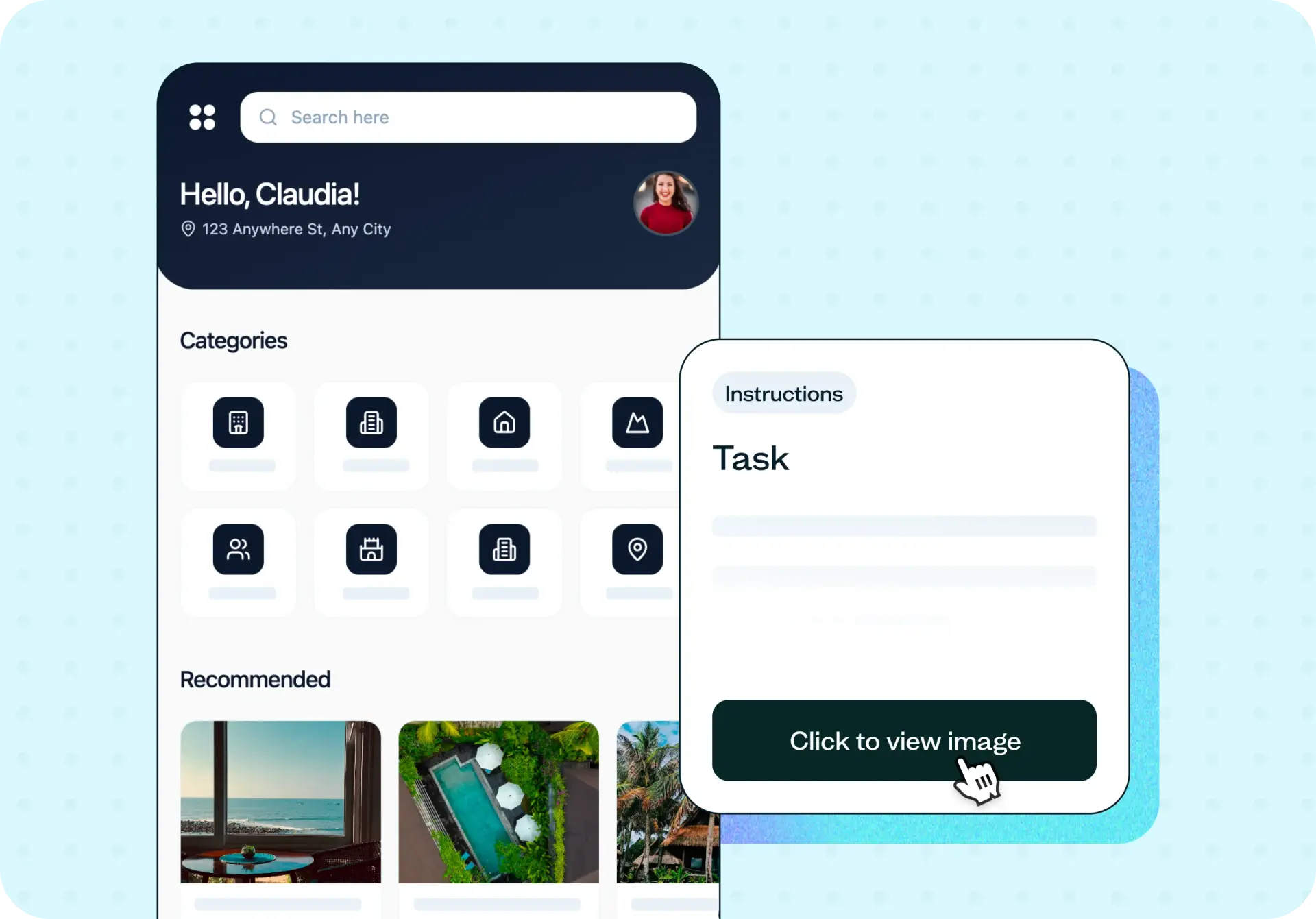

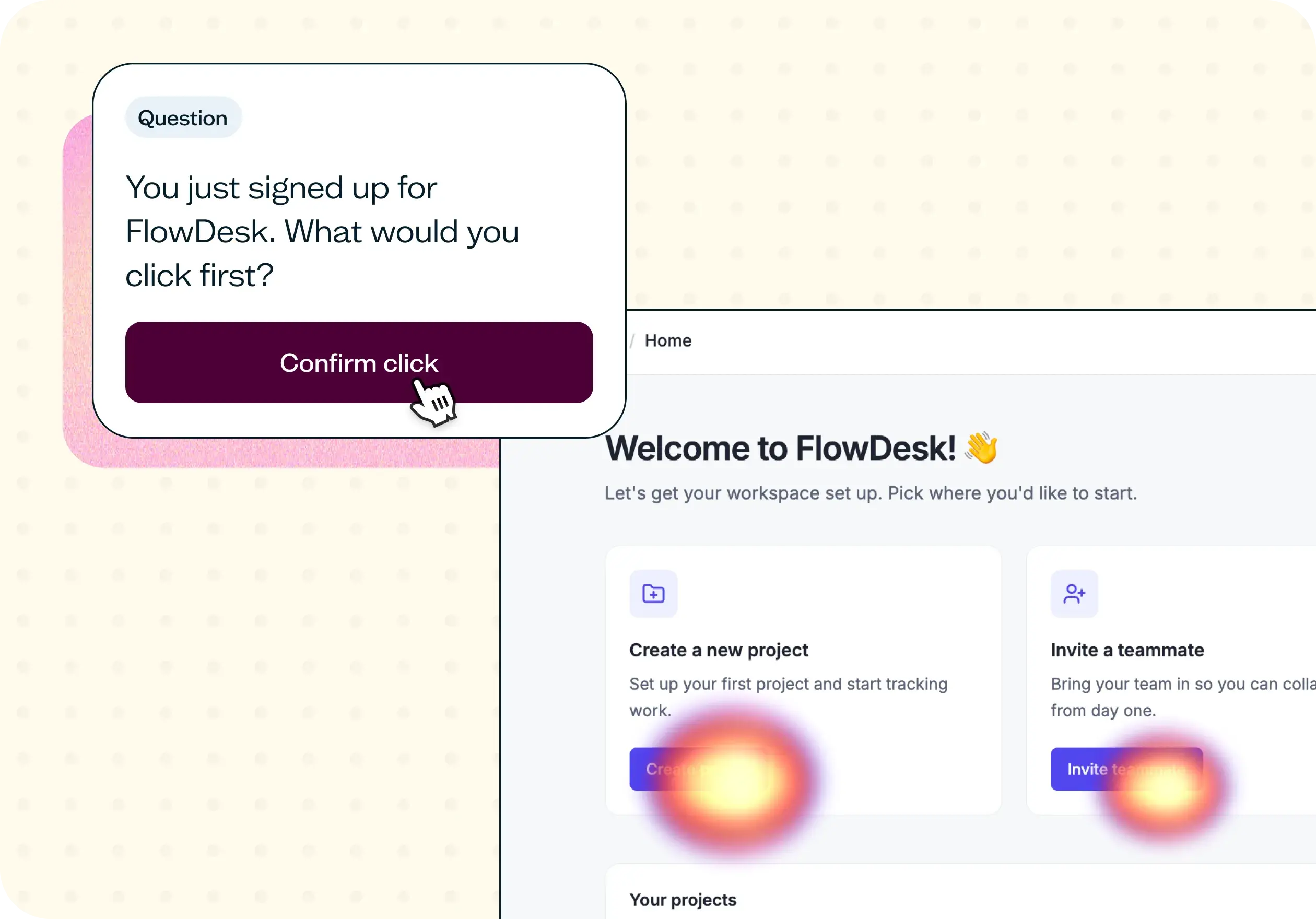
Feature discoverability is whether users can find a feature without being told where it is. It's tested with a first click test: participants see a screenshot of the interface and are asked where they'd click to complete a specific task, and the test records where that first click lands and how long it takes.
Clicks that concentrate on the intended element mean the feature is findable; clicks that scatter mean it isn't, regardless of how well the feature works once someone finds it. Follow-up questions then rate how easy the feature was to find and how likely participants are to use it – separating two different problems that look identical in an adoption dashboard: couldn't find it, and found it but wouldn't use it.
The problem with features nobody can find
You spent a quarter building a feature, and your usage dashboard says almost nobody has touched it. The easy conclusion is that users don't want it – but that's rarely the full story. More often, the feature is exactly where your team expects it to be, because your team is the one who put it there. To someone opening the product for the first time, or the fiftieth time, it might be invisible.
This is the gap between built and found. A feature that ships without a way to check whether users can actually locate it is a bet, not a validated decision. Teams end up debating whether to invest further, redesign the navigation, or quietly sunset something that was never really given a chance to be discovered.
A few signs it's time to run a discoverability test:
Adoption of a new feature is well below what you expected at launch.
Support keeps fielding "where do I find" questions about features that are technically visible.
Your navigation has grown by addition, and nothing has ever been removed.
You're weighing whether to sunset a feature based on usage data alone.
A recent redesign moved things around, and nobody has checked where users look now.

This template will help you discover
Running this template surfaces four distinct signals, each pointing to a different fix.
Where users look first
The first click reveals someone's mental model before they've had a chance to second-guess it. If most participants click toward the same element, that's where your feature genuinely lives in users' heads – whether or not it's where you placed it.
How easy they say it was
A linear-scale follow-up asks participants to rate how easy it was to find the feature, separate from whether their click landed in the right place. A correct click that took real effort is a different result from a correct click made instantly, and the ease score tells you which one you actually got.
Whether they would use it
Findability and desirability are two separate questions, and this template keeps them separate. A participant might click the correct spot immediately and still tell you, honestly, that they wouldn't use what's there – which points you toward a different problem than a navigation fix.
What would make it easier
An open-text follow-up asks participants directly for suggestions on improving discoverability, in their own words. It's often the most actionable result on the page – a specific fix, not just a score.
What you'll test
What you're testing is a single screen and a single task – not a full user journey. Upload a screenshot or mockup of the interface where your feature lives, then write a task that asks participants to act, not to search.
The way you word the task changes what the data tells you. A task like "Where would you click to export your data?" gives participants a goal and lets their first click show you their honest mental model. A task like "Find the export feature" gives the answer away before anyone has clicked, and the data you get back tells you nothing about discoverability – only whether people can follow instructions.
Keep the task specific enough that there's one clearly correct answer, so a scattered set of clicks is meaningful rather than ambiguous.
How the research works
This template runs on two connected pieces: the first click itself, and the questions that follow it.
First click test
A first click test shows participants a static screen and records exactly where they click first, along with how long it takes. First click testing (see the guide to first click testing) captures this automatically, so you get a heatmap and click data without building the study logic yourself.
Follow-up questions
After the click, this template adds three follow-up questions: a linear-scale rating of how easy the feature was to find, an open-text question asking what would make it easier to find, and a second linear-scale rating of how likely participants are to use the feature now that they've found it. Together, they separate "couldn't find it" from "found it, didn't want it" – two problems that look identical in an adoption dashboard but need completely different fixes.
It's worth being precise about scope here: this template tests a single screen with participants who match your target audience. It shows you where people expect a feature to be – it doesn't show you how they behave across a full session, and it doesn't replace product analytics. Think of it as the diagnostic that explains what your analytics has already flagged. If you need to understand how findable content is across your entire information architecture rather than one screen, Tree testing is the better tool for that broader question.
How to use this template
Getting a discoverability test running takes minutes:
Start exploring with a free plan. You can build and launch your first discoverability test without a credit card.
Upload a screenshot or mockup of the screen where your feature lives, so participants see exactly what real users would see.
Write your task as an action, not a search – describe what someone needs to accomplish, not what to find.
Add your follow-up questions rating how easy the feature was to find, what would make it easier, and how likely participants are to use it, so you can separate the two failure modes.
Launch to your own users or recruit from Lyssna's panel, then review the click map and answers together.
When to use this template
The best time to run this test is before you've committed to a bigger, more expensive fix. A few moments where it pays off:
After launching a feature and watching adoption come in well below expectation.
Before a navigation or information architecture change, so you know what's actually working today.
When product analytics shows a drop-off you can't otherwise explain.
Before deciding to sunset a feature based on usage numbers alone.
When you're adding a new feature to an interface that's already dense with options.
Running the test at these moments turns a guess – "maybe nobody wants it" – into an answer you can act on, whether that's a label change, a new placement, or evidence that the feature genuinely isn't wanted.
Who this template is for
This template is built for anyone who needs to know whether a feature is being missed, not just whether it's being used.
Product managers use it to separate a findability problem from a genuine lack of demand before making a roadmap call. UX and product designers use it to test navigation, labeling, and layout decisions before or after a feature ships, rather than relying on assumptions about where things "should" be. Growth teams use it alongside adoption metrics, as the diagnostic step that explains a flat activation curve.
Whether you're investigating one feature that's underperforming or auditing a navigation that's grown cluttered over several releases, the same test structure applies: show the screen, set the task, and see where people actually look.
FAQs about how to test feature discoverability
You may also like these templates

The navigation test is god's gift to UI designers. It probably has the best power-to-simplicity ratio of any software, ever.

Nick Franklin
CEO at ChartMogul