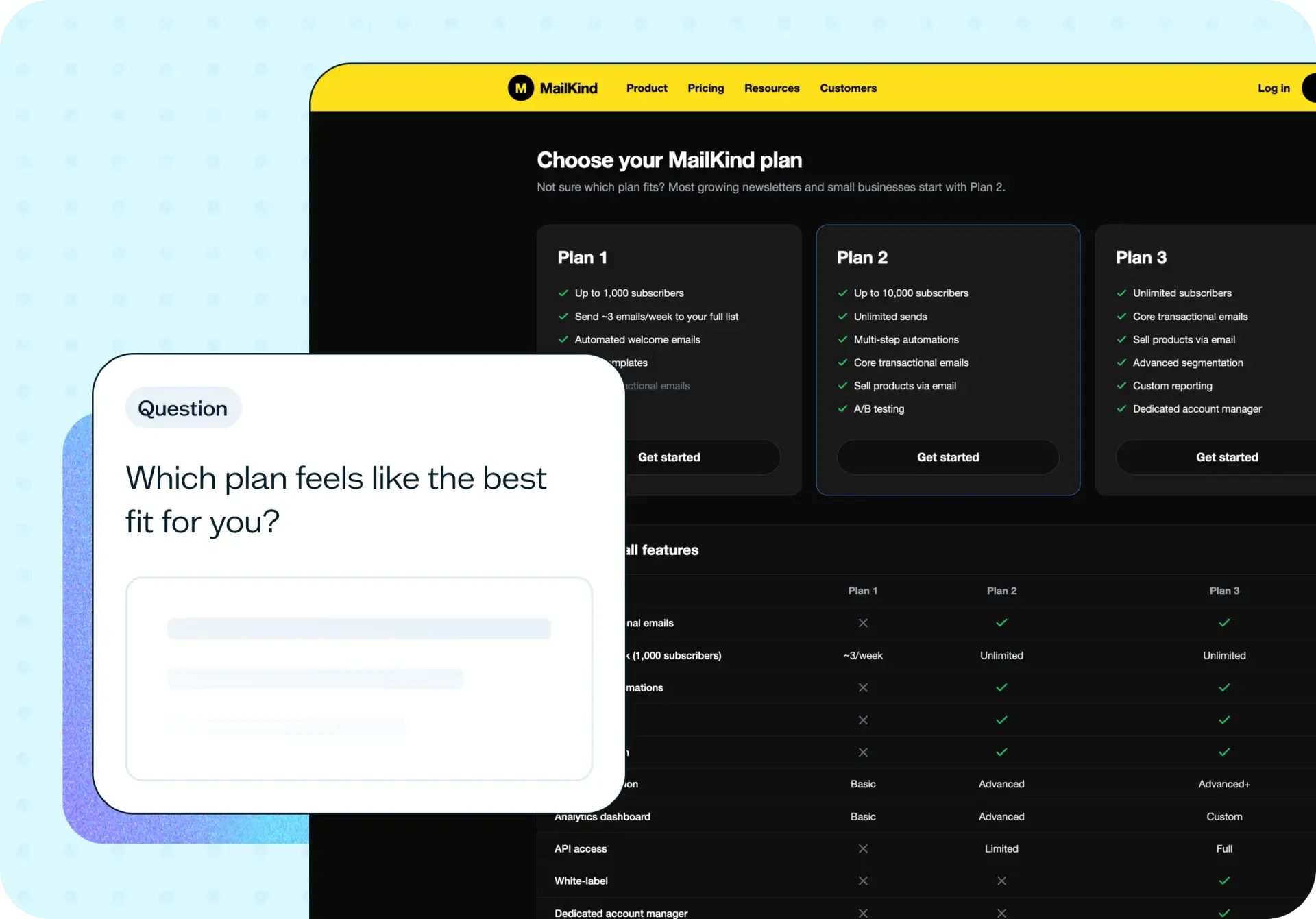

Your pricing page only gets one shot to help someone choose the right plan.
Even a well-designed page can fail here – not because the price is wrong, but because the plans are described in internal, platform-specific language instead of the words your users actually use to think about their own needs.
Without testing, that gap stays invisible. Teams debate button colors and plan names while the real problem – a feature that's just labeled wrong – goes unnoticed, and conversion keeps underperforming with no clear reason why.
This template helps you test whether your pricing page gives users what they need to choose confidently, using a first click test that removes price from the equation and asks people to explain their reasoning in their own words.
The problem with untested pricing pages
Users decide fast on a pricing page. If they can't tell which plan fits their situation within a few seconds of scanning it, they either default to the most expensive option, guess, or leave without converting at all.
Teams struggle here because of proximity bias – after weeks of internal debate about plan names, feature bundles, and tiers, the language on the page feels obvious to the people who built it. It rarely feels as obvious to someone evaluating it for the first time, and that gap is exactly what a pricing page test is built to catch.
Common signs your pricing page needs testing:
Users pick a plan but aren't confident it's the right one.
Clicks are spread evenly across plans instead of clustering around an obvious fit.
Features exist on the page but participants say they can't find them.
Feedback mentions confusion about integrations, add-ons, or team seats.
Conversion is underperforming and the reason isn't obvious from analytics alone.
This template will help you discover
Whether you're launching a new pricing page or trying to work out why an existing one isn't converting, this template gives you a clear picture of what's actually helping users choose – and what's getting in the way.
You'll find out:
Which plan users choose when price isn't a factor, and how confident they feel about that choice.
Whether your feature names match the language your users actually use to describe their needs.
What's getting missed, misread, or overlooked in your plan descriptions.
Where users get stuck comparing plans, and why.
What specific wording changes would make the page easier to evaluate.

What you'll test
Plan selection
Which plan do users choose when the decision is based purely on fit, not price? Removing the price lets you see whether your positioning – not your discounts – is doing the work of guiding someone to the right plan.
Decision confidence
Does choosing a plan feel easy and clear, or does it feel like a guess? A user can click a plan and still feel unsure – this is where you find out whether the page is actually building confidence or just forcing a choice.
Feature clarity
Are your feature names using the words your users would use themselves? A feature can be present, accurate, and still invisible if it's labeled in internal or platform-specific terms that don't match how people describe their own needs.
Scope and integration clarity
Do users understand exactly what's included – which tools it connects to, how many people can use it, what a feature actually does? Vague phrasing here creates hesitation even when the underlying capability is exactly what they need.
How the research works
A first click test sits at the center of this approach, paired with follow-up questions that dig into how users feel about their choice and why.
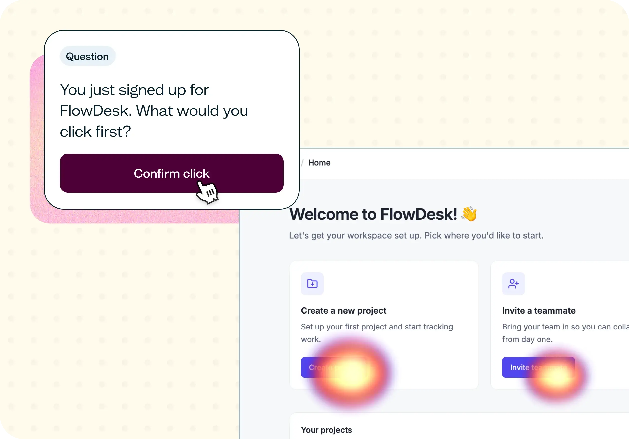
First click test
Show participants your pricing page with the prices removed, then ask them to click the plan that best fits their own business or use case. Removing price keeps the focus on whether your plan descriptions – not your numbers – are doing the work of guiding a confident choice.
An agreement rating asks how confident users felt in their choice, revealing whether a clicked plan reflects real clarity or just a guess.
An open-ended follow-up asks what helped or what was missing, confusing, or hard to find – this is where the specific wording and gaps surface.
Together, the click data and the follow-up responses show you not just which plan users pick, but whether they actually understood enough to pick it with confidence.
How to use this template
The best way to see this template in action is to watch it applied to a real pricing page. In the video below, we walk through a working example using MailKind – a fictional email marketing tool built for small businesses, independent creators, and people selling online. The pricing page had all the right features, but the team suspected it wasn't converting as well as it should.
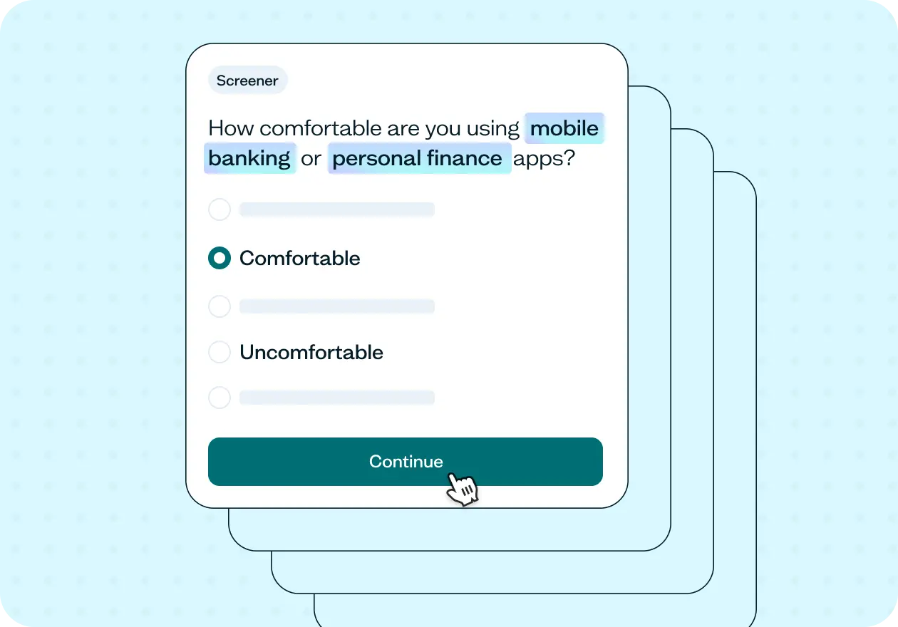
The walkthrough covers how to adapt the template to your own pricing page, set up a first click test with prices removed so participants evaluate on fit rather than budget, and write a screener that filters for people who actually match your target customer. You'll also see how to recruit quickly using the Lyssna panel, how to read a low agreement score alongside open-ended feedback to find the real story behind the clicks, and how to turn specific, recurring feedback into concrete copy changes you can test again.
Whether you're building a new pricing page or trying to work out why an existing one isn't converting, you'll come away with a practical process for finding out what's actually getting in the way.
When to use this template
When launching a new pricing page.
When conversion on an existing pricing page is underperforming.
When you've recently added or renamed plans, tiers, or features.
When stakeholders disagree about whether the pricing page is clear enough.
When you suspect users are choosing a plan without fully understanding what it includes.
Who this template is for
Whether you're a UX researcher running a formal study or a founder who just wants to know if their pricing page actually makes sense to a stranger, this template gives you a fast, structured way to find out.
It's designed for:
UX researchers and designers evaluating pricing page effectiveness.
Product marketers testing plan names and feature descriptions.
SaaS founders and product teams launching or updating a pricing page.
Growth and conversion teams trying to diagnose underperforming pricing pages.
FAQs about pricing page testing
You may also like these templates

The navigation test is god's gift to UI designers. It probably has the best power-to-simplicity ratio of any software, ever.

Nick Franklin
CEO at ChartMogul