This template is for:
Conversion rate optimization (CRO)
Product
Research
Design
Marketing
First click testing
Created by:
Lyssna
Overview
New users don't leave because your product is bad. They leave because the path forward isn't obvious.
That moment right after sign-up – when someone lands on your dashboard and asks "okay, now what?" – is one of the highest-stakes moments in your product experience. If the answer isn't clear, most users won't recover. And your analytics won't tell you why.
A first click test cuts through that uncertainty. This template shows you exactly where new users click first on your onboarding screen – and whether that click is taking them in the right direction.
The problem with untested onboarding
First impressions in onboarding are made in seconds. Research shows that when a user's first click is correct, they're far more likely to complete their next task successfully. When it's wrong, most users don't recover – they get lost, lose confidence, and disengage before they've had a chance to experience any real value.
The difficulty is that onboarding problems are hard to spot from the inside. Your team has context that new users don't: you know what the product does, what the ideal first action is, and what each button leads to. That context creates blind spots. You may have strong internal opinions about what users should do first – but without real user data, those opinions are just guesses.
Common signs your onboarding needs testing:
New users sign up but don't take a meaningful first action.
Activation rates are lower than expected but it's not clear where the breakdown is happening.
Different team members disagree on what the ideal first action should be.
Users reach out to support shortly after sign-up with basic "where do I start?" questions.
Drop-off happens early in the onboarding flow, before users have experienced any core value.
The onboarding has been recently redesigned but activation hasn't improved as expected.
This template will help you discover
Whether you're diagnosing an onboarding drop-off problem or validating a recent redesign, this template gives you a clear picture of what new users actually do first – and how confident they feel about it.
You'll find out:
What users click first when they land on your onboarding screen.
Whether the most common first click aligns with your intended onboarding path.
How confident users feel about where to get started.
What's driving their decision – and whether it matches your assumptions.
Which calls to action are being overlooked or deprioritized by new users.
What you'll test
First click behavior
Where do users click the moment they arrive on your onboarding screen? This is the single most important signal in early onboarding – it tells you whether your design is directing users toward the right first action, or leaving them to guess.
Confidence at the start
Even if users click in the right place, low confidence is a warning sign. A user who feels uncertain about where to begin is a user at risk of dropping off. The confidence score alongside click data helps you understand not just what users do, but how they feel about it.
CTA clarity and hierarchy
Are the right actions prominent enough? If users are splitting between two options that should have a clear priority order, or ignoring a CTA you expected them to notice, the issue is likely visual hierarchy or copy – not the product itself.
Reasoning behind the click
Qualitative follow-up reveals why users chose what they chose. This is where you'll find out whether users understood the options, made an informed choice, or just made their best guess – and that distinction shapes what you actually need to fix.
How the research works
This template uses a first click test with follow-up questions to capture both behavioral and attitudinal data about your onboarding screen.
First click test
Participants see a screenshot of your onboarding screen and are asked one open question: what would they click first to get started? There's no right or wrong answer framing – you're capturing natural behavior, not testing knowledge. The result is a heatmap showing exactly where clicks landed, broken down by percentage across each possible action.
Click distribution shows you which CTAs are attracting attention and which are being ignored, revealing whether your intended first action is actually the most prominent one.
Time-to-click data shows how quickly users made their decision – a fast, confident click is a good signal; hesitation or a slow click may indicate confusion.
Follow-up questions
After clicking, participants answer two follow-up questions that add the qualitative layer the click data alone can't provide.
An open-text question asking why they clicked where they did surfaces the reasoning behind the behavior – whether users understood the CTA, made an assumption, or just went with what felt most familiar.
A confidence scale (1–5) asks how confident they felt about where to start, giving you a quantitative read on whether the design is creating clarity or uncertainty.
Together, the click data and follow-up responses give you a complete picture: not just what users do, but why – and how to fix it.
How to use this template
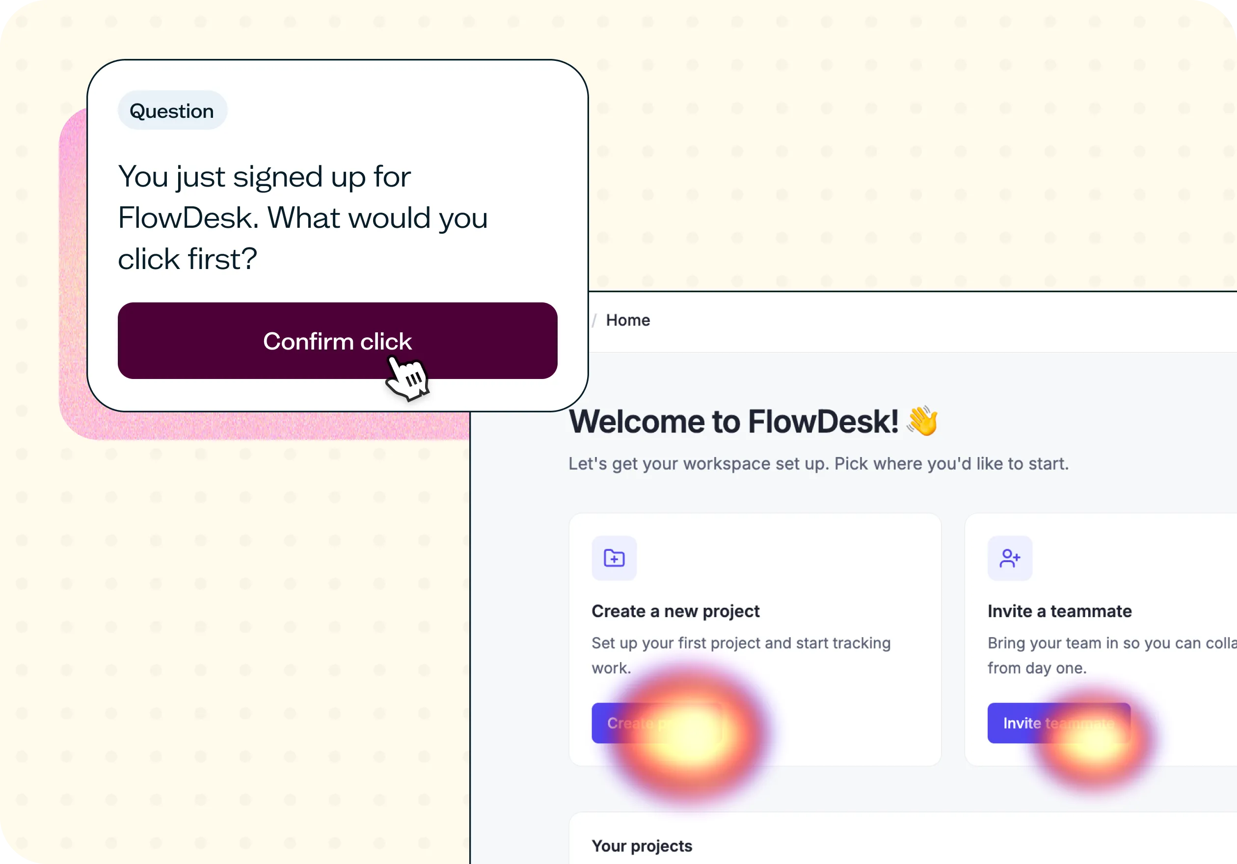
The best way to see this template in action is to watch it applied to a real product challenge. In the video below, Ramli John – founder of Delight Path and author of Product-Led Onboarding – walks through a working example using FlowDesk, a fictional project management tool for SaaS teams. FlowDesk had recently redesigned their onboarding flow, but signups weren't converting into active users the way the team expected. The question was whether new users actually knew what to do first.
The walkthrough covers how to adapt the template to your own onboarding screen, how to write a task scenario that captures natural behavior without leading participants, and how to set up your screener to recruit the right participants. You'll also see how to recruit using the Lyssna panel, how to read the heatmap and confidence score results, and how to turn what you find into a prioritized set of design recommendations.
Whether you're investigating an onboarding drop-off problem for the first time or validating changes after a redesign, you'll come away with a clear process for getting real answers fast.
When to use this template
When new users are signing up but not taking a meaningful first action.
When you've recently redesigned your onboarding flow and want to validate the changes.
When your team has conflicting opinions about what the ideal first action should be.
When activation rates are lower than expected and you need to find where the breakdown is happening.
When you're preparing to invest in a significant onboarding overhaul and want a baseline before you build.
When support tickets suggest new users are confused about where to start.
Who this template is for
Whether you're a UX researcher running a formal onboarding study or a product manager trying to figure out why users aren't activating, this template gives you a fast, structured way to find out what's actually happening at that critical first moment.
It's designed for:
Product managers diagnosing activation and onboarding drop-off problems.
Product designers validating onboarding screen layouts and CTA hierarchy.
UX researchers running first click tests as part of a broader onboarding audit.
Growth and product marketing teams working on improving sign-up to activation rates.
Founders and early-stage teams who want to make sure their onboarding flow makes sense to a brand-new user.
Anyone who has ever wondered whether new users actually know what to do first.
FAQs about first click testing for product onboarding
You may also like these templates

The navigation test is god's gift to UI designers. It probably has the best power-to-simplicity ratio of any software, ever.

Nick Franklin
CEO at ChartMogul


Try for free today
Join over 320,000+ marketers, designers, researchers, and product leaders who use Lyssna to make data-driven decisions.
No credit card required