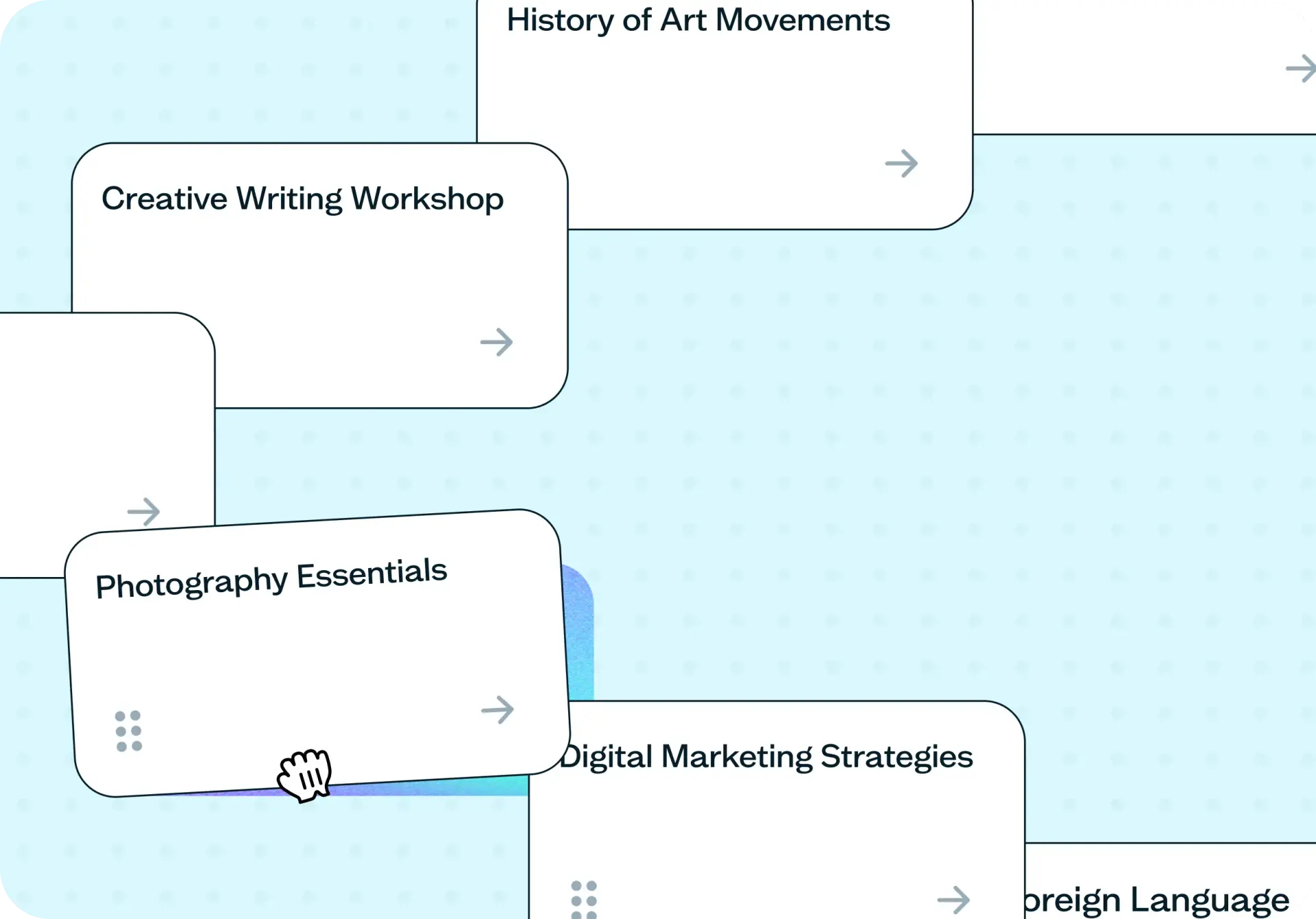

Optimizing your information architecture (IA) means checking whether your navigation, menus, and categories actually match how your users think – not just how your team organized them.
This template uses an open card sort, where participants group your content into categories they create and name themselves, paired with follow-up questions that turn those groupings into decisions you can act on. You'll see whether people would rather browse your menu or search for what they need, which items confused them, and what content matters most to prioritize. Run it before you build or rebuild a navigation structure, and you'll know what to change before a single line of code does.
The problem with an unoptimized IA
If your navigation structure hasn't been tested with real users, there's a good chance it reflects how your team thinks about content, not how your audience looks for it. Labels pulled from internal vocabulary can leave visitors guessing, and structures that made sense at launch tend to quietly break as content grows.
Common signs your IA needs testing:
Users rely on search to reach content your navigation already links to.
Support answers the same "where do I find" question repeatedly.
Your categories mirror your org chart rather than your users' mental model.
You're planning a redesign and have no evidence about what's actually confusing people.
You've added enough content that the original structure doesn't really fit anymore.

This template will help you discover
Running this template gives you more than a list of categories. It tells you what to actually change about your navigation.
How users naturally group your content
The categories participants create without any prompting show you the mental model your navigation should be built around instead of the one your team assumed.
Which items are confusing or hard to place
A direct follow-up question asks participants which cards were confusing or difficult to categorize. You're not just inferring a labeling problem from a messy matrix; participants tell you where the problem is.
Whether people would rather browse or search
A follow-up question asks how participants prefer to find specific content, through a navigation menu or through search. That's a direct read on how much weight your menu structure needs to carry versus your search function.
What to prioritize in your structure
An open-ended follow-up asks which categories or content matter most to participants, so you know what to put front and center in the structure you build, not just how to group everything you already have.
What you'll test
This template runs as an open card sort: participants sort a set of your content items (page titles, course names, product names, or topics) into categories they create and name themselves, with no structure supplied in advance. Aim for 30 to 60 items; fewer and the groupings become trivial, more and participants start to fatigue partway through the sort.
Alongside the sort, a short set of follow-up questions asks what confused participants, how they'd rather find content day to day, and what matters most to them. That context is what turns a card sort from an interesting exercise into a specific set of changes for your navigation.
How the research works
Your study runs in two parts, each giving you a different kind of evidence about your navigation structure.
Open card sort
Participants see your full set of content items and sort them into groups that make sense to them, then name each group themselves. Card sorting from Lyssna runs this remotely, so participants complete it in their own time. For the deeper mechanics of this method, including how it compares to a closed card sort, see the guide to running an open card sort.
Reading the results
Your results give you two views: a similarity matrix showing which items participants repeatedly grouped together regardless of what they called the group, and an agreement matrix showing how consistently a given item landed in categories with a similar name or theme. Expect a long tail of one-off category names alongside a handful of strong, obvious clusters. That's the normal, honest output of an open sort, not a sign anything went wrong.
Read the matrix alongside the follow-up answers rather than on its own. An item that scattered across categories and that participants also flagged as confusing is a clear priority; an item that scattered but wasn't mentioned in the open feedback might just reflect genuinely reasonable disagreement about where it belongs.
How to use this template
Follow these steps to run your IA card sort and turn the results into specific changes for your navigation:
Start exploring with a free plan. Sign up for a free Lyssna plan to access the Card sorting template and set up your study.
Add your content items as cards. Include 30 to 60 of your actual page titles, product names, or content topics. Using real labels rather than paraphrased summaries gives you groupings you can act on directly.
Add your follow-up questions. Use the built-in set or customize your own to ask what was confusing, whether people prefer to browse or search, and what matters most to them. These answers are what turn the sort into specific decisions.
Recruit your participants. Share with your own network or recruit from Lyssna's research panel to reach an audience that matches who your IA needs to work for.
Review the similarity and agreement matrices. Read them alongside the follow-up answers to see which groupings hold up and which categories need a different label or structure entirely.
When to use this template
Run this template before you design or redesign a navigation structure, while the categories are still easy to change. It's especially useful when you're adding a large body of new content to an existing structure and aren't sure it still fits, when search volume on your own site suggests people can't find things through your navigation as it stands, or when the team keeps disagreeing internally about what the categories should be.
Once this template has told you how people group your content and what to prioritize, a closed card sort is the natural next step if you want to validate a specific proposed structure with a fresh set of participants. Tree testing can then confirm people can actually navigate the structure once it's built.
Who this template is for
Information architects and UX designers who need evidence for a navigation structure before it goes into design or development, not just a sense that the current one feels off.
Content designers who need to know what to actually call things, grounded in participants' own words rather than internal shorthand.
Product managers who need a clear, stakeholder-ready answer about whether people can find what they're looking for.
Founders or small teams redesigning a site's structure without a dedicated research function to lean on.
FAQs about optimizing your IA with card sorting
You may also like these templates

I consistently receive responses on the same day or the following day, greatly aiding my interactions with various stakeholders.

Sonal Malhotra
UX Research Lead at Klarna