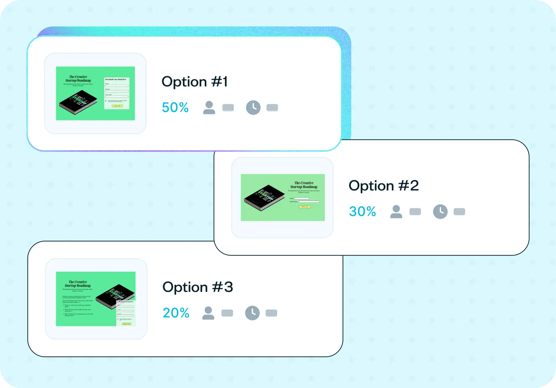

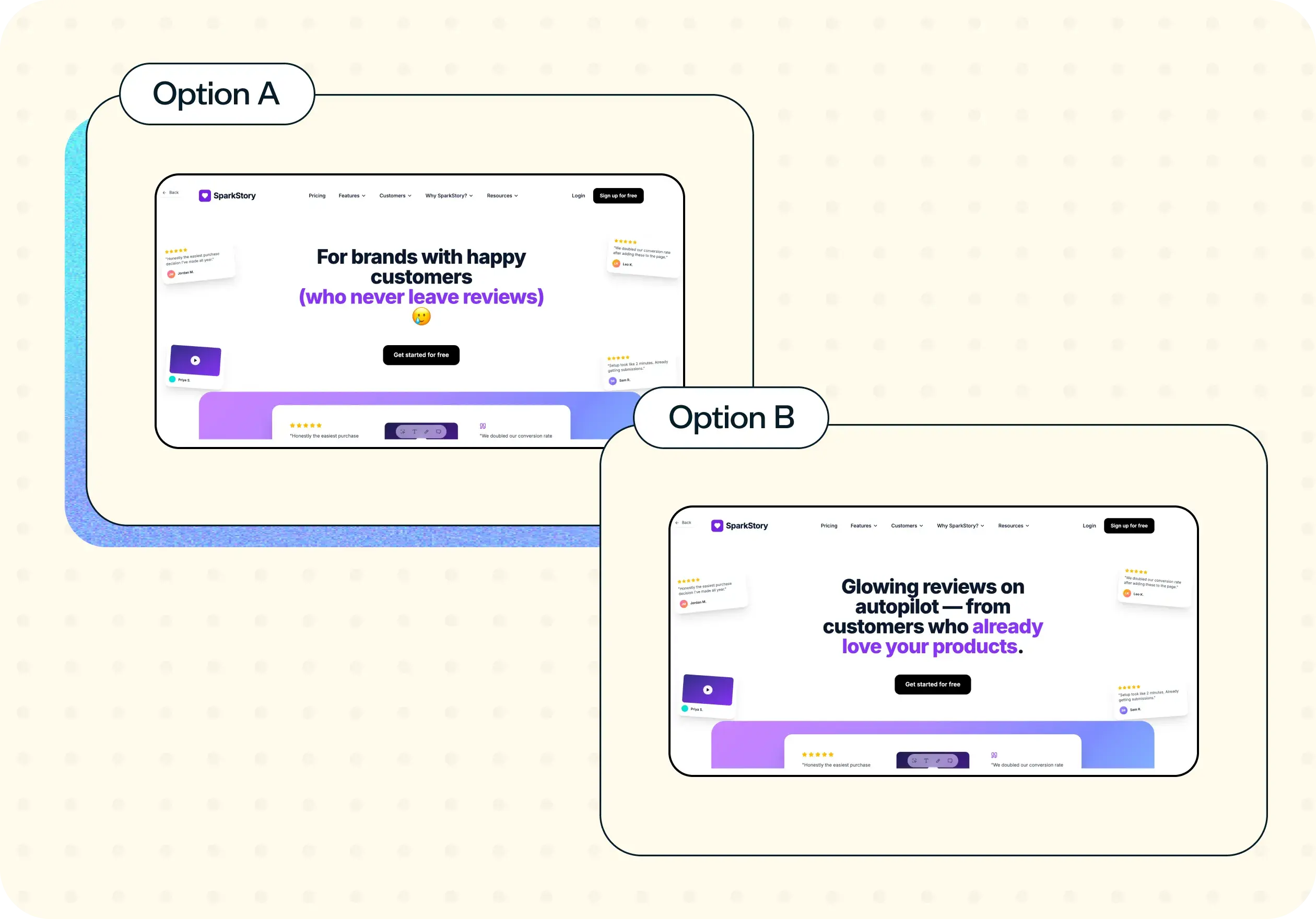
When you're choosing between form designs, it's easy to default to the version that feels right internally. But the form your team prefers isn't always the one your users will complete. Website form testing lets you put your options in front of real people before anything goes live, using a preference test to find out which design they'd choose, why they prefer it, and what might stop them from finishing it.
Why you should test your website form designs
Choosing between form designs often comes down to opinion. Someone on the team prefers one layout, someone else prefers another, and the decision lands with whoever has the loudest voice or the most authority. That's a risky way to make a call on something that directly affects conversion.
Comparing your options with real users gives you evidence for a decision you'd otherwise be making on assumption alone. Even a short preference check can surface a confusing label, a layout that feels cluttered, or a field order that doesn't match how people think about providing their information. These are the kinds of issues that feel obvious in hindsight but rarely get caught in internal reviews.
It's also a lightweight way to bring user input into the process before you commit to building anything. You don't need a full usability study or a live A/B test. You need a quick signal from real people about which direction to go and why.

What this template helps you discover
This template helps you uncover specific, pre-launch signal about your form designs:
Which form design users prefer, and by how much
The reasoning behind that preference, in participants' own words
Self-reported pain points: what participants say would make them hesitate or give up, before they encounter the form live
Whether a required field feels unnecessary to your actual audience
What you'll test
This template focuses on three dimensions of your form designs:
Design and layout preference
You'll find out which version of your form feels clearer or more trustworthy at first glance. The preference split, combined with the time participants take to decide, gives you a quantitative starting point for the conversation with your team or stakeholders.
Comprehension and labels
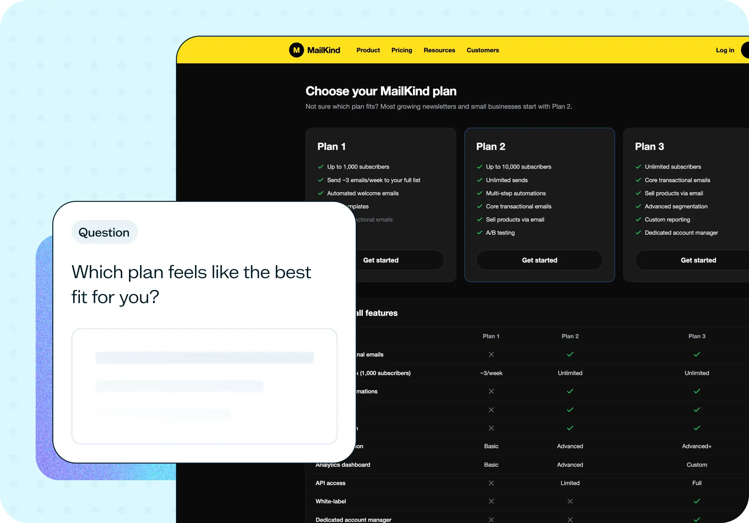
You'll learn whether people understand what's being asked in each field without needing to read help text. When a label splits your audience by interpretation, you'll hear about it directly in their responses.
Self-reported friction
Participants tell you what would make them hesitate or give up on the form, before they encounter it live. This is self-reported friction, not observed behavior, which means you're getting their expectations and gut reactions rather than watching them struggle in real time.
When to use this template
This template is most valuable when you're choosing between options or validating a direction before launch:
Before launching a new sign-up, application, checkout, or lead capture form
When comparing an existing form design against a redesigned version
Before adding new required fields to an existing form
When stakeholders disagree about which form layout to launch
When localizing a form into a new market or language
How to use this template
Start a new test with this template. Click "Use this template" and log in to your Lyssna account. If you don't have an account yet, you can start exploring with a free plan.
Add your form design options. Upload the images or mockups you want to compare. Two or three options works best for getting a clear signal without overwhelming participants.
Write the preference question. Ask something direct, like "Which form would you prefer to fill out?" Keep it in your own words so it feels natural for your context.
Add the follow-up questions. Ask why they prefer that option, and what (if anything) might stop them from completing the form. These open-text responses are where the most useful insights come from.
Recruit your participants. Share the test with your own network, or recruit from Lyssna's research panel of 690,000+ participants across 124 countries with 395+ targeting options. You can filter by device type if you want to compare mobile and desktop preferences separately.
Review the results. Look at the preference split, time to decide, and the open-text answers that explain the reasoning behind the numbers.
Example outcomes
After running this test, you'll have a clear set of results to inform your form design decisions:
A preference split between your design options, with participants' reasoning attached to each choice
Self-reported pain points you can address before the form goes live
Evidence for or against a specific required field, grounded in real reactions from your target audience
Who this template is for
This template is built for anyone making a decision about a form's design before it goes live:
Web designers deciding between form layout options
Conversion rate optimization specialists gathering pre-launch signal
Product managers protecting onboarding completion in a new flow
Customer success teams anticipating support tickets before launch
Engineering leads wanting user input before building a specific version
FAQs about website form testing
You may also like these templates

I love that Lyssna lets me be lightweight and fast. As a UX practice of one in a large enterprise, my stakeholders won't slow down for research. Lyssna lets me provide insights at speed.

Kevin Boulier
Lead UX Strategist & Designer at ManpowerGroup