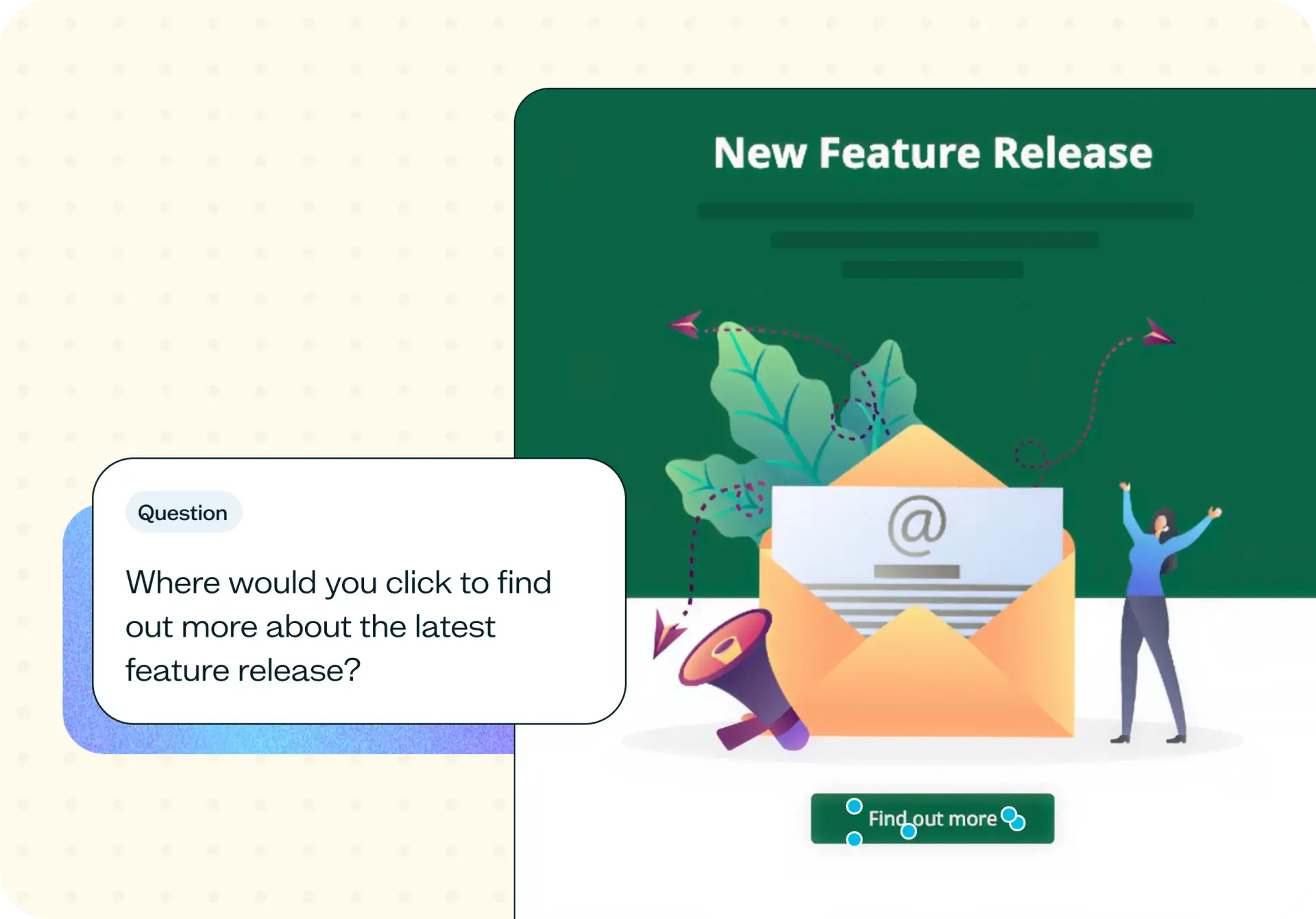

Testing an email call to action (CTA) means checking whether it's findable, not just whether it's well-written. In a first click test, participants view your email design and click where they'd go to complete a specific action, then rate how confident they felt and how easy the CTA was to locate. Use this template to see whether your CTA holds its own, or whether it's losing out to everything else competing for attention in the email.
The problem with untested CTAs
Most email CTAs are positioned by whoever built the template, not tested with anyone who'll actually receive it. A button competes with a text link two paragraphs above it. Three separate CTAs sit in the same email, each asking for a different action, with no clear signal about which one matters most. And the whole design gets reviewed on a desktop monitor by a team that already knows exactly where the button is, which tells you nothing about how a reader sees it cold.
None of that shows up until send day, when click-through drops and nobody can say why.
Common signs your email CTAs need testing:
Click-through is falling and the copy hasn't changed.
Your email has more than one call to action and no clear hierarchy.
The CTA sits below a long preamble.
The team disagrees about button placement and there's no evidence to settle it.
You're redesigning your email template and want to check it before rollout.

This template will help you discover
A first click test turns button placement from an argument into a result you can point to. Here's what it shows you.
Where attention actually lands
The click map shows where clicks actually concentrate, rather than where your team assumes the button is. A concentrated result on the intended CTA means prominence isn't a guess – it's a result.
Whether the label matches the action
If participants hesitate before clicking, or click through expecting something different from what the destination delivers, your CTA copy might be promising one thing while the design points somewhere else.
How confident readers were
This goes beyond whether participants clicked correctly. A correct click made after hesitation is a different result from a correct click made instantly, and the confidence score tells you which one you actually got.
How easy they say it was
This is a separate rating, distinct from confidence, that captures how easy or difficult participants found it to locate your CTA. The two don't always move together. Someone can feel confident about a click that took real effort to find, and that gap is worth knowing about.
What you'll test
What you upload is an email design: a mockup from your design tool, an export of the finished HTML, or a screenshot of a sent campaign. It doesn't need to be production-ready. It just needs to look like what a reader will actually open.
Alongside it, you write a task: a specific action you want participants to imagine taking. The wording matters here. A vague instruction produces a vague heatmap, because participants won't have a clear goal to click toward.
A good task instruction names the outcome, not the button: "You've just received this email. Click where you'd go to see the discount code mentioned in the subject line." That's concrete enough for someone to act on immediately, and specific enough that a scattered result actually means something.
How the research works
This template runs as a first click test, with two linear scale follow-up questions added to turn a single click into a fuller picture.
First click test
A first click test shows participants your email design and asks them to click where they'd go to complete a specific task. The test records where that first click lands and how long it takes, which matters because the first click is often the only one a rushed reader ever makes. Read more about First click testing as a Lyssna feature, or see the full guide to first click testing for the method in more depth.
Follow-up questions and the click map
After the click, two linear scale questions ask how confident the participant felt and how easy the CTA was to find. Pair those scores with the click map (an exportable heatmap of every response overlaid on your design) and you get both where attention landed and how sure people were about it.
It's worth being clear about what this measures. A first click test tells you where people click on a design and how confident they felt, with participants who match your audience. It doesn't tell you your actual campaign click-through rate, which depends on your list, your subject line, send time, and inbox placement.
How to use this template
Setting up a first click test for your email CTA takes four steps:
Start exploring with a free plan and create a new first click test from your Lyssna dashboard.
Upload your email design as an image export, screenshot, or mockup so participants see it the way a reader would.
Write your task instruction naming the specific action you want participants to take. A concrete task ("click where you'd go to see the discount code") gives you a click map you can actually interpret.
Share the test with your own contacts or recruit participants who match your audience through the Lyssna panel, then review the click map alongside the confidence and ease ratings as responses come in.
When to use this template
Test your email CTA before it goes anywhere near your full list. It's most useful in a few specific moments:
Before a campaign send: Catch a placement problem while it's still a design file, not a click-through report.
When you're redesigning your email template: A new layout changes where every element sits relative to everything else, including your CTA.
When click-through drops and the copy hasn't changed: If the words are the same but the results aren't, the problem is more likely findability than wording.
When an email carries more than one action: A "read more" link, a "shop now" button, and a "refer a friend" banner all compete for attention. Testing shows which one readers actually see first, so you can decide whether to keep, reorder, or cut the extras.
Who this template is for
Email and lifecycle marketers use this template to settle a CTA placement disagreement before a send, or to check that a template redesign hasn't buried the one link that matters. It replaces a debate about aesthetics with a click map that shows what actually happened.
Marketing designers use it earlier, while an email is still a design file or an export, to see whether a layout choice (a button color, a position below a hero image, a link styled to look secondary) is helping or working against the CTA before it ships.
Growth teams use it to protect a metric they're accountable for. If click-through is the number that gets reported upward, knowing whether a drop is a findability problem or something else in the funnel makes the next fix easier to prioritize.
FAQs about email CTA testing
You may also like these templates

We used to spend days collecting the data we can now get in an hour with Lyssna. We're able to get a sneak preview of our campaigns' performance before they even go live.

Aaron Shishler
Copywriter Team Lead at monday.com