
Even a design your whole team loves can still say the wrong thing to the people looking at it. Design comprehension testing checks whether people understand what a design is communicating, rather than whether they like how it looks, using a design survey where participants see the design and explain what they took away from it in their own words. That's different from five second testing, which measures a brief glance – this measures whether the message holds up under a proper look. Run it before a message goes out into the world, and you'll know whether it lands as intended.
The problem with untested designs
By the time a design is ready for review, the people looking at it are usually the people who wrote it, and they can't un-know what it's supposed to say. A pricing page your team finds perfectly clear can read as ambiguous to a customer seeing it for the first time, and a support inbox full of questions your page already answers is often a comprehension failure wearing a different hat. It's easy to assume that a design which tests well for appeal also communicates well, but those are two different questions with two different answers.
A few signs it's time to check:
Support answers questions your page already answers.
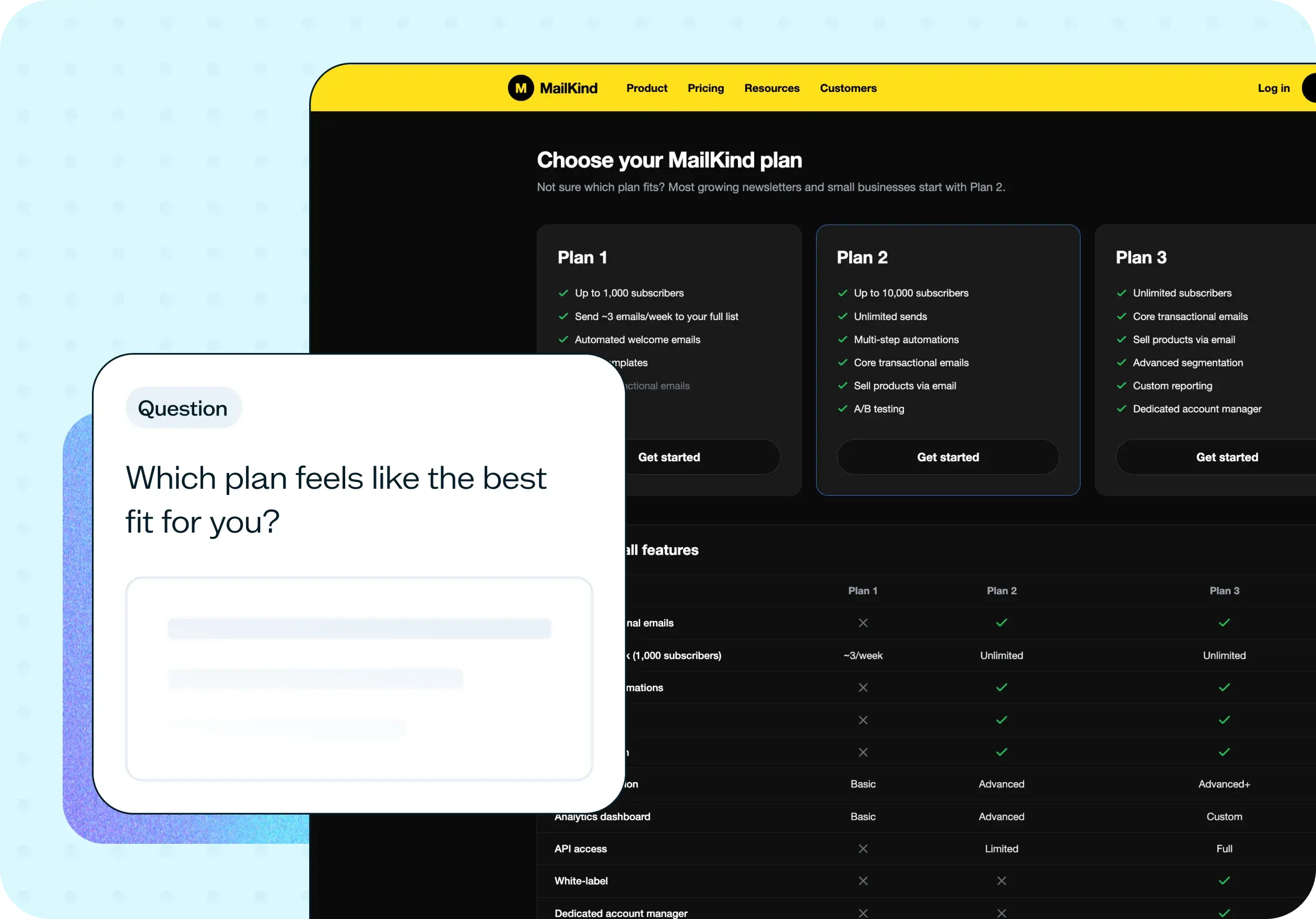
Your pricing or plan structure generates repeated confusion.
The team debates wording with no way to settle it.
A page performs poorly and the design looks fine.
You're localizing or simplifying a page and need to check the message still carries.
If any of that sounds familiar, the fix usually isn't a redesign. It's finding the exact word or line where the message breaks down, and a comprehension test is the fastest way to find it.

This template will help you discover
A design comprehension test gives you more than a pass or fail. Because participants answer in their own words with the design in front of them, you get a clear read on where a message works and where it doesn't.
Whether your message lands
You'll find out what people actually understand your design to be saying, in their own language, not whether they claim to have understood it.
Where interpretations diverge
If participants describe the page's purpose in noticeably different ways, that spread is itself the finding: a design that lands clearly produces the same answer from most people, not several plausible-sounding but different ones.
Whether anything reads as confusing
A direct follow-up asks participants if anything about the design confused them, so you're not left inferring confusion from the purpose answers alone. Some people will tell you outright.
What to change
You'll come away with feedback specific enough to act on: the exact line or element to rewrite, not just a general note that it "wasn't clear."
What you'll test
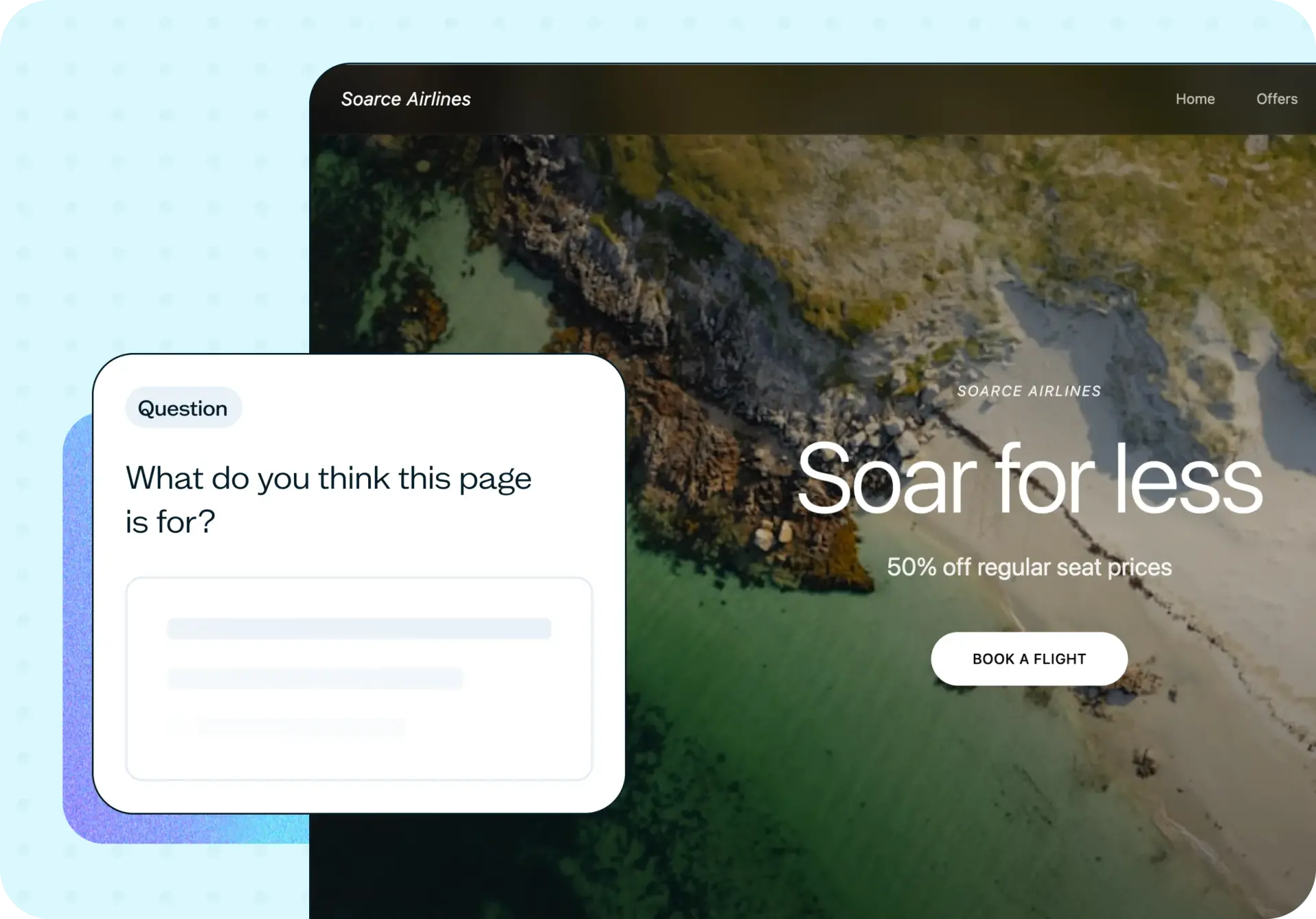
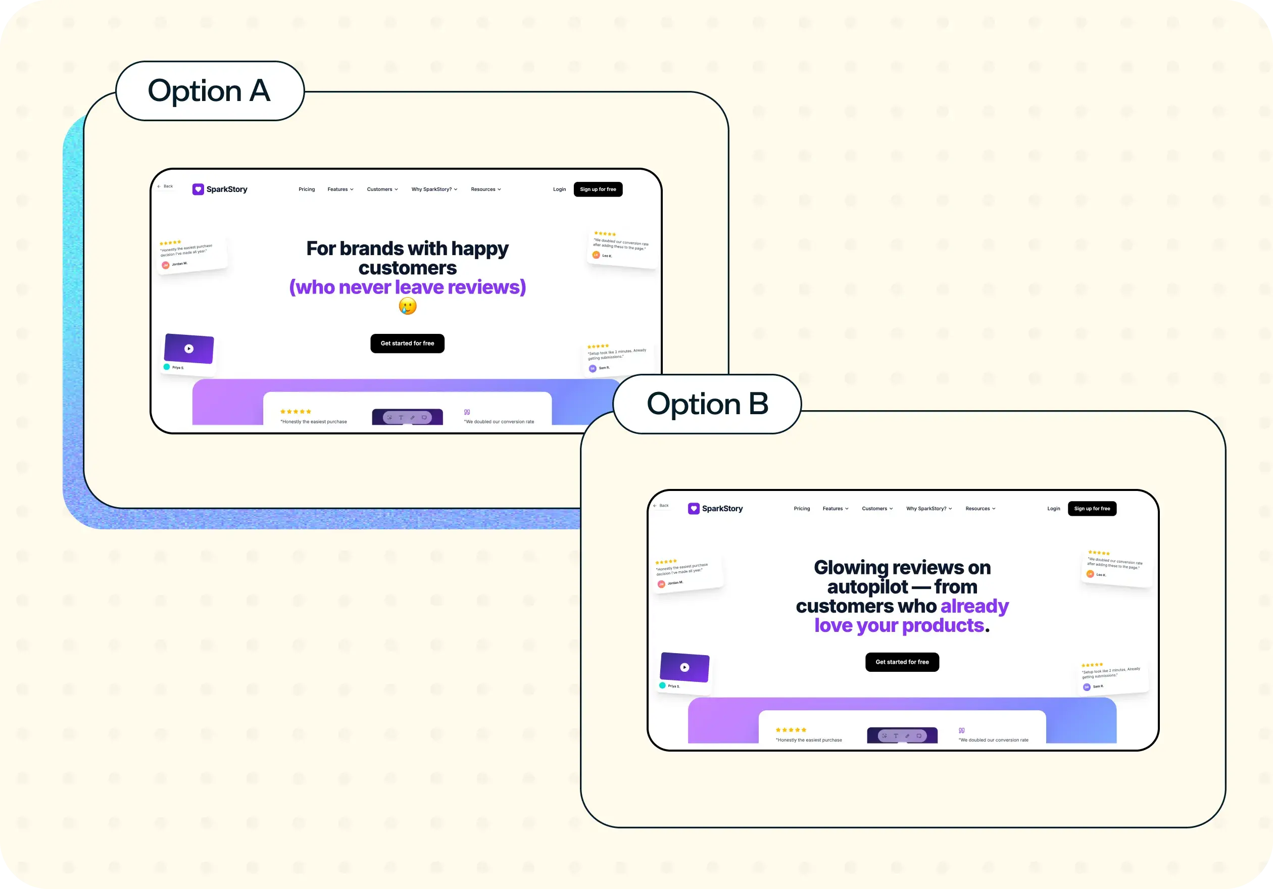
You can run a design comprehension test on any design where the message matters as much as the layout: a landing page, a pricing page, a product screen, or a set of instructions. The design and the questions render together, so participants can look back at the design as they answer.
Question design is where comprehension tests usually go wrong, so ask people to explain the page in their own words rather than asking whether they understood it:
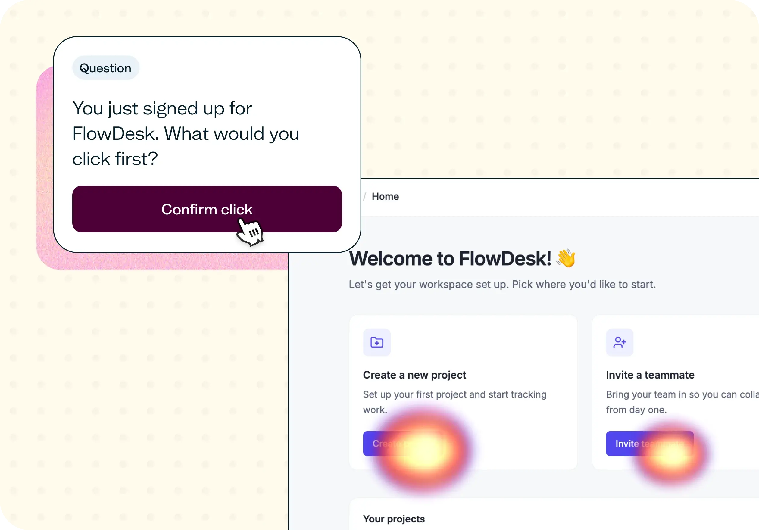
Good: "What do you think this page is for?" and "Is there anything about this design that you find confusing?"
Bad: "Did you understand what this page was saying?"
The first two give you evidence: an interpretation you can compare across participants, and a direct check for confusion. The last just gives you a yes, which tells you nothing about whether that yes is true.
How the research works
A comprehension test relies on a specific research setup and a particular way of reading the results.
Design survey
A design survey shows participants the design and the questions side by side, so they can refer back to the design while they answer instead of relying on memory. That's the detail that makes comprehension testing possible. If the design disappeared before the questions appeared, you'd be testing recall, not comprehension. Lyssna's Design survey feature is built around exactly this pairing.
Reading the results
Open-ended answers are read for themes, not scored right or wrong. If several participants describe the page's purpose in words that differ from what you intended, the wording is the problem. And if several flag the same section in the direct confusion follow-up, that's usually a more reliable signal than a vague sense that something's off.
It's worth being clear about the scope, too. A design comprehension test measures understanding of a static design among people who match your audience. It doesn't measure whether they'd buy, and it doesn't measure usability in a live, interactive product. For that, see our usability testing guide. Surveys like this sit alongside methods such as interviews and usability testing, each suited to a different kind of question.
How to use this template
Start exploring with a free plan. You can build and preview this template on a free Lyssna plan, no credit card required.
Add your design. Upload the landing page, pricing page, product screen, or instructions you want to test.
Write your questions. Ask people to explain the page in their own words rather than asking whether they understood it. See the good and bad examples above.
Recruit your participants. Use your own network, or recruit from Lyssna's research panel of 690,000+ participants across 124 countries with 395+ targeting options to reach people who match your audience.
Launch and read the themes. Group open-ended answers by theme rather than scoring them, and look for where people's understanding drifts from your intent.
When to use this template
A design comprehension test is worth running whenever a message is about to go out into the world, or whenever you've lost confidence that it says what you think it says:
Before launching a new landing page or pricing page, while changes are still cheap to make.
After a copy rewrite, to check the new wording communicates as intended.
When you're simplifying a dense screen and need to confirm nothing important got lost in the edit.
When you're localizing a page for a new market and need to check the message still carries.
When a page is underperforming and the design looks fine, so the problem is likely in what it's saying rather than how it looks.
Who this template is for
Content designers use this template to test whether their wording carries the intended meaning before it ships, rather than relying on a read-through from colleagues who already know what the copy is meant to say.
UX and product designers use it alongside visual and usability checks, to confirm that a design communicates clearly and not just that it looks right or functions correctly.
Product marketers use it on landing pages and campaign messaging, where a misunderstood headline or value proposition costs conversions long before anyone reaches a usability problem.
Conversion specialists use it to rule out messaging as the cause of a page's poor performance, so design and development time isn't spent fixing the wrong thing.
FAQs about design comprehension testing
You may also like these templates

I love that Lyssna lets me be lightweight and fast. As a UX practice of one in a large enterprise, my stakeholders won't slow down for research. Lyssna lets me provide insights at speed.

Kevin Boulier
Lead UX Strategist & Designer at ManpowerGroup