05 Aug 2025
|11 min
Website heatmaps
Want to know what's really going on with your website visitors? Website heatmaps are the ultimate tool for uncovering user behavior and making your website better.


Ever wondered what your website visitors are actually doing on your pages? Website heatmaps give you a visual window into user behavior, showing exactly where people click, scroll, and move their cursor using color-coded overlays. Think of them like weather maps – red and orange areas show where there's lots of activity, while blue and green indicate cooler spots with less engagement.
These tools take all the confusing data about user behavior and turn it into something you can actually see and understand. They track everything from where people click and how far they scroll, to where their mouse hovers and which areas grab their attention.
The idea of using colors to visualize data isn't new – it goes back to German scientist Hermann von Helmholtz in the 1800s. But today's website heatmaps have become game-changers for anyone trying to understand their audience better, whether you're a designer, researcher, marketer, or product manager.
Instead of staring at spreadsheets full of conversion rates and click data, heatmaps let you see the story your users are telling through their actions. This makes it so much easier to spot problems, identify opportunities, and make decisions that actually improve your site.
In this guide, we'll walk you through everything you need to know about heatmaps – the different types available, real examples in action, how to make sense of the data, and which tools can help you get started.

Why should I use a website heatmap?
Website heatmaps provide actionable insights into user behavior that help optimize website performance, increase conversion rates, and improve user experience. Organizations use heatmap analytics to make data-driven decisions about website design, content placement, and user interface improvements.
Key benefits of website heatmap analysis
Conversion rate optimization (CRO): Website heatmaps identify conversion bottlenecks in your marketing funnel by revealing which calls-to-action (CTAs), forms, and buttons receive insufficient user attention. This data helps optimize element placement, design, and messaging to improve conversion performance.
User experience research: Heatmap data shows precise user interaction patterns, revealing where visitors focus their attention versus where they ignore content. This information supports A/B testing hypotheses and guides design iterations based on actual user behavior rather than assumptions.
Website usability testing: Heatmaps identify areas of user confusion by highlighting unexpected click patterns, scroll behavior, and navigation difficulties. This analysis helps remove friction points and create more intuitive user experiences.
Content optimization: Scroll heatmaps and attention maps reveal which content sections engage users and which get overlooked, informing content strategy decisions about placement, length, and presentation.
Cross-device performance analysis: Mobile vs desktop heatmap comparisons identify platform-specific usability issues and optimization opportunities for responsive design improvements.

What are the different types of website heatmaps?
Website heatmaps encompass various visualization types that track different aspects of user interaction and behavior on web pages. Understanding each heatmap type helps organizations choose the right analytics approach for their specific optimization goals.
Primary heatmap types

Click heatmaps (Click maps) track where users click or tap on web pages, displaying click density through color intensity. Click heatmaps reveal which page elements attract user interaction, identify non-functional elements that users attempt to click, and show competition between different CTAs and navigation elements.
Scroll heatmaps (Scroll maps) visualize how far users scroll down web pages, showing the percentage of visitors who reach different page sections. Scroll depth analysis helps identify content visibility issues, optimal placement for important information, and points where user engagement drops off significantly.
Movement heatmaps (Hover maps) track mouse cursor movement and hover behavior across web pages. Also called hover heatmaps, these tools capture unconscious user attention patterns that may not result in clicks but indicate visual interest and cognitive processing.
Attention heatmaps combine data from click, scroll, and movement tracking to create comprehensive visualizations of overall user attention and engagement patterns across web pages.
Specialized heatmap types
Eye-tracking heatmaps use specialized hardware to precisely track where users look on web pages, providing the most accurate attention data but requiring controlled testing environments and higher costs.
Mobile vs desktop heatmaps compare user behavior patterns across different devices, helping identify responsive design issues and platform-specific optimization opportunities.
Rage click heatmaps identify areas where users repeatedly click in frustration, typically indicating broken functionality, misleading design elements, or technical issues that prevent expected interactions.
Dead click heatmaps show locations where users click but no action occurs, revealing missed opportunities for interactive elements or areas where users expect functionality that doesn't exist.
Heatmap website analytics
Effective heatmap analysis transforms raw user interaction data into actionable insights that drive website optimization, improve conversion rates, and enhance user experience. Understanding how to interpret heatmap visualizations and extract meaningful patterns is essential for data-driven decision making.
How to interpret heatmap data
Heatmap color coding follows consistent patterns across most analytics platforms: red and orange indicate high user activity and engagement, yellow shows moderate interaction levels, blue and green represent lower activity, and areas without color overlays indicate minimal or no user engagement.
Successful heatmap analysis focuses on identifying behavioral patterns rather than individual user actions. Dense click clusters reveal user expectations and interaction preferences, while scattered clicking patterns often indicate confusion or unclear navigation pathways.
Scroll heatmap interpretation requires attention to color transition points where warm colors fade to cool tones. These dropoff zones show precisely where you lose user attention and can inform decisions about content restructuring, page length optimization, and information hierarchy.
Movement heatmaps reveal unconscious user attention patterns through cursor tracking. High movement activity in specific areas indicates visual interest even without clicks, while cursor patterns can show reading behavior, decision-making processes, and areas of uncertainty.
Key metrics and KPIs for heatmap analysis
Click-through rates (CTR) on different page elements provide quantifiable measures of CTA performance, button effectiveness, and navigation success. Track these metrics across different user segments, traffic sources, and device types to identify optimization opportunities.
Scroll depth percentages show what portion of your audience engages with different content sections. Monitor average scroll depth, 25%/50%/75% scroll milestones, and complete page scroll rates to understand content consumption patterns.
Time-based metrics including session duration in specific page areas, hover duration on key elements, and time-to-click measurements provide insights into user decision-making processes and cognitive load.
Conversion funnel analysis using heatmap data reveals where users exit your desired pathways and which elements contribute to or detract from conversion goals.
Converting insights into optimization strategies
Heatmap patterns directly inform A/B testing hypotheses and website improvement initiatives. When users consistently click non-interactive elements, consider adding functionality or removing misleading visual cues that suggest clickability.
Content placement optimization uses scroll heatmap data to move important information to high-visibility areas. If critical content appears below significant dropoff points, restructure page layouts to surface key messages earlier in the user journey.
Navigation and user interface improvements stem from movement and click pattern analysis. High attention areas that don't align with business goals may need design modifications to redirect focus toward conversion elements.
Form optimization leverages heatmap insights to reduce abandonment rates by identifying problematic fields, improving visual hierarchy, and streamlining completion processes based on actual user behavior patterns.
Integrating heatmap data with other analytics tools
Combine heatmap visualizations with Google Analytics data to understand both user behavior patterns and performance metrics. While traditional analytics show what happened, heatmaps reveal why users behaved in specific ways.
Session recording integration provides context for heatmap patterns by showing individual user journeys that contribute to aggregate heat patterns. This combination offers both macro-level trends and micro-level behavioral insights.
A/B testing platforms benefit from heatmap data by providing behavioral context for performance differences between test variations. Heatmaps can explain why one version outperforms another by showing attention and interaction differences.
Customer feedback tools and survey responses paired with heatmap data create comprehensive user research insights that combine quantitative behavioral data with qualitative user motivations and preferences.
Best website heatmap tools
Selecting the right heatmap software depends on your organization's specific needs, budget constraints, and technical requirements. Most heatmap tools offer free tiers or trial periods, making it possible to evaluate features before committing to paid plans.
When evaluating heatmap tools, consider factors including data accuracy, ease of implementation, reporting capabilities, integration options, and pricing structure based on monthly sessions or page views.
Here's a quick comparison of the top heatmap tools to help you narrow down your options:
Tool | Best for | Key features | Starting price |
|---|---|---|---|
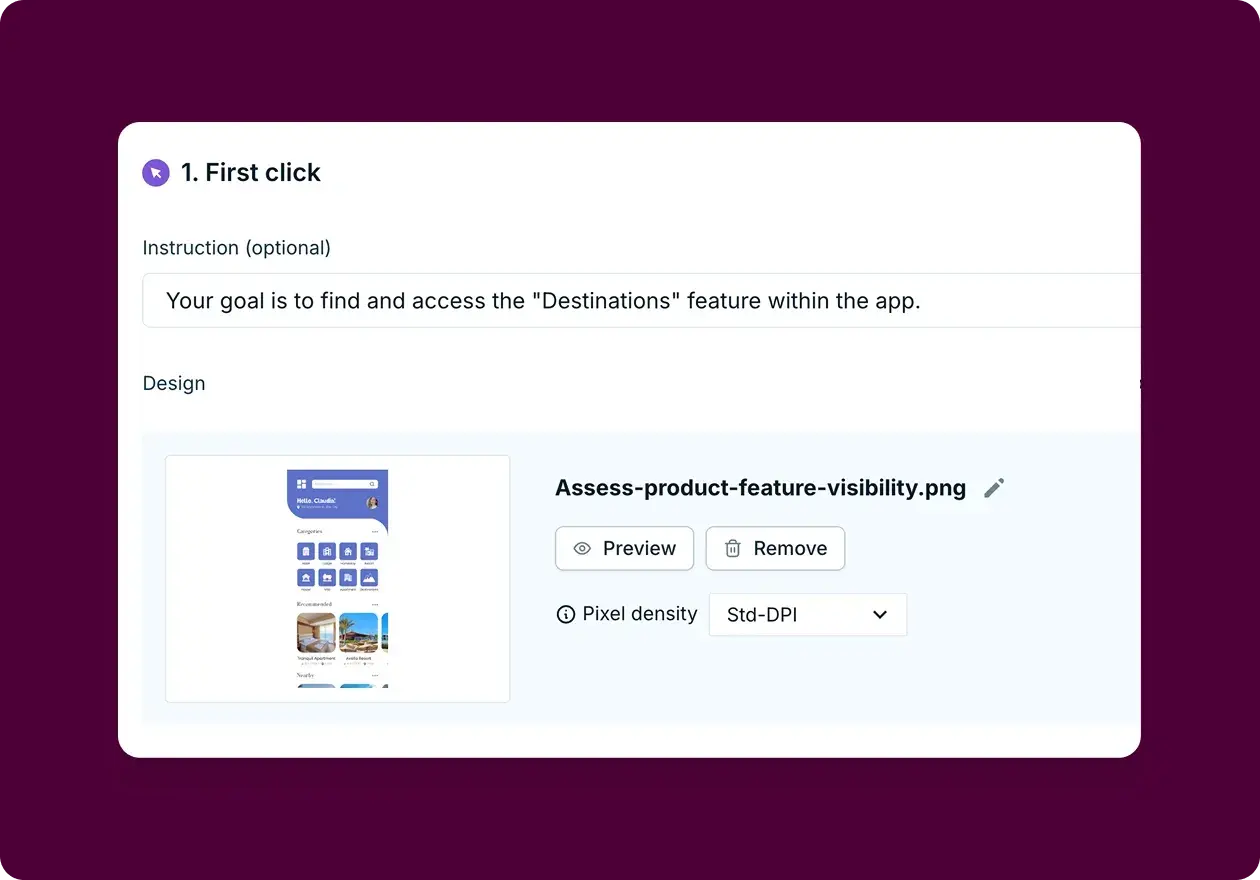
Lyssna | User research and testing | Heatmaps from research tests (first click, navigation, prototype), participant insights + surveys | • Free plan included • Paid plans start at $/month |
Hotjar | Beginners & small teams | Click/scroll/movement maps, session recordings, annotations | • Free plan included • Paid plans start at $32/month |
Mouseflow | Growing businesses | Real-time data, funnel tracking, session recordings | • Free plan included • Paid plans start at $219/month |
Crazy Egg | Small-medium businesses | Snapshot analysis, confetti view, A/B testing | • Paid plans start at $29/month |
FullSession | Advanced analytics needs | User segmentation, real-time monitoring, detailed recordings | • Paid plans start at $32/month |
Contentsquare | Enterprise/ecommerce | Revenue tracking, business intelligence, advanced analytics | • Free plan included • Paid plans start at $40/month |
Lyssna
Lyssna takes a different approach to heatmaps by integrating them with user research tests rather than live website tracking. You can generate heatmaps from first click tests, navigation tests, and prototype tests, showing you exactly where participants clicked during these controlled research sessions. This lets you create highlights to analyze click clusters, measure time-to-click metrics, and filter results by specific user segments. What makes Lyssna unique is the ability to connect your heatmap data with follow-up survey responses, so you can understand not just where people clicked, but why they made those choices.

Hotjar
Hotjar offers an accessible entry point for organizations new to heatmap analysis, featuring click maps, scroll maps, and mouse movement tracking alongside session recording capabilities. The platform includes annotation and timestamp features for collaborative analysis.
Mouseflow
Mouseflow delivers real-time heatmap data with comprehensive user journey tracking through conversion funnels. The platform provides click tracking, scroll analysis, and session recordings with advanced filtering capabilities.
Crazy Egg
Crazyegg specializes in snapshot-based heatmap analysis with unique "confetti" visualization for granular click analysis. The platform supports A/B testing integration and error tracking alongside traditional heatmap functionality.
FullSession
Fullsession provides advanced user segmentation capabilities distinguishing new versus returning visitors with real-time monitoring features. The platform offers comprehensive heatmap analysis with detailed session recordings and user behavior tracking.
Contentsquare
Contentsquare serves enterprise-level organizations with advanced heatmap analytics integrated with revenue performance tracking and business intelligence features. The platform provides sophisticated user journey analysis, conversion optimization tools, and detailed financial impact reporting suitable for large-scale ecommerce operations and complex digital properties.
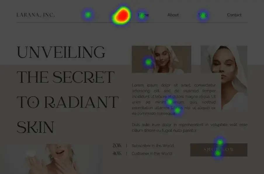
Website heatmap examples
See how Lyssna's research-based heatmaps reveal user behavior patterns in real scenarios. These examples come from our template library, showing how first click, navigation, and prototype tests generate actionable insights.
Navigation and user flow optimization

Conversion optimization

Feature and product discovery
Early-stage validation


FAQs about website heatmaps
You may also like these articles