
Your team signed off on the design, but real users are bouncing. The page that felt intuitive to the people who built it might be quietly confusing the audience it was built for. This template uses a first click test to show you where real users click when given a specific task, then asks how confident and how easy they found it – so you can see whether the page guides people the way you intended.
Why first clicks and confidence matter
A page can look polished and pass every internal review, and still leave a real user unsure where to click. "Looks great" is common feedback from stakeholders, but it doesn't tell you whether people can actually use the page.
Where someone clicks first, on a real task, tells you whether your hierarchy and labeling are working. How confident and how easy they say it was tells you whether that click felt obvious or was more of a guess. Together, they give you a concrete read on a design before it ships, rather than an opinion after.

What this template helps you discover
Where real users click first when given a specific task on your page
Whether that first click matches where you intended people to go
How confident users felt that they found the right place
How easy or difficult they found the task
Which pages or sections need a clearer path before you ship
What you'll test
First click accuracy
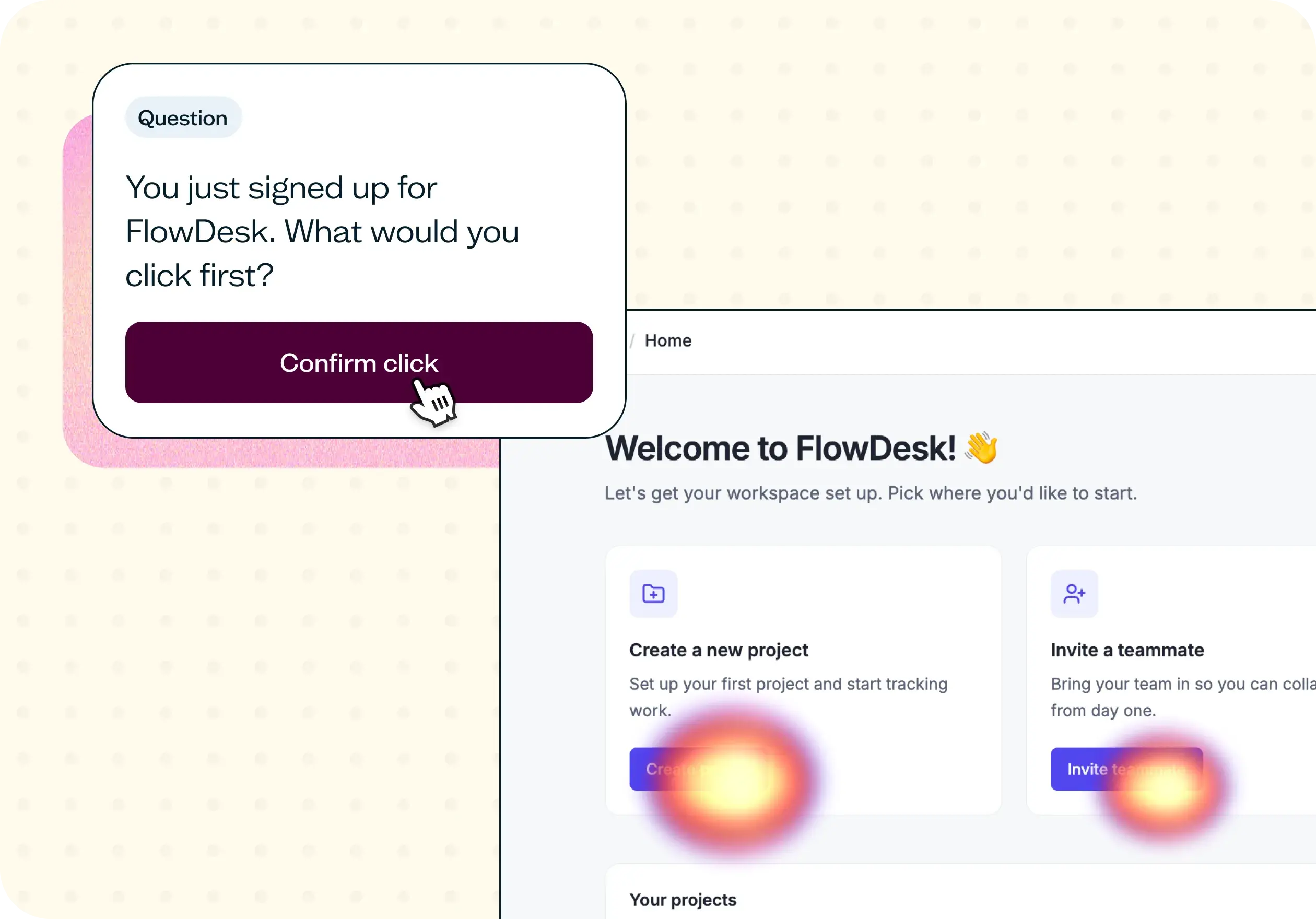
Give participants a task – like finding where to get help, or where to check pricing – and see where they click first on your page. A heatmap and click map show you exactly where clicks landed, so you can see whether people found the right spot or went somewhere else entirely.
Confidence and ease
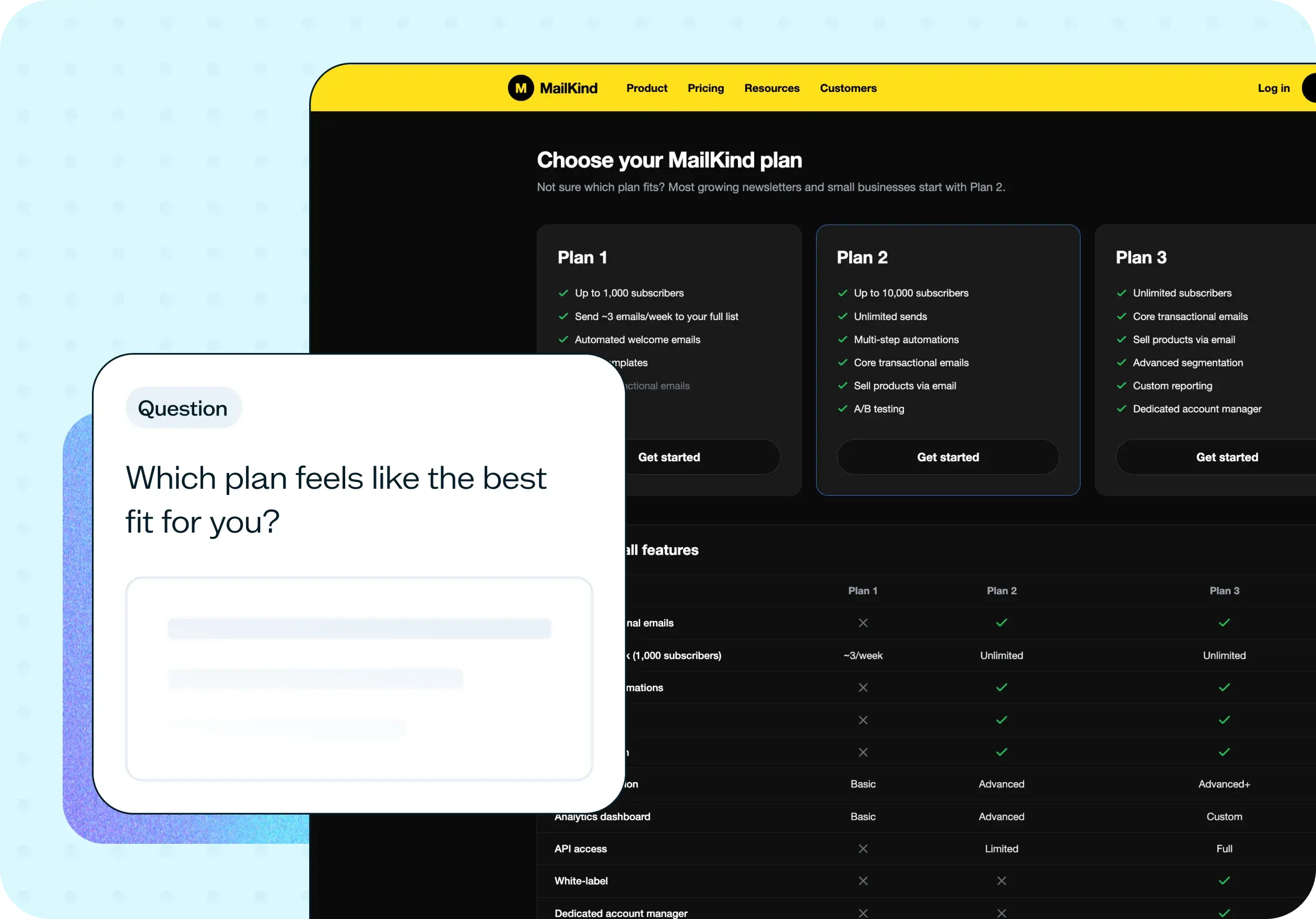
After the click, ask participants how confident they were that they found the right place, and how easy the task felt. These two ratings tell you whether a correct click was a sure thing or a lucky guess – and whether a wrong click was a small stumble or a real dead end.
When to use this template
Before locking a homepage, landing page, or key product page redesign
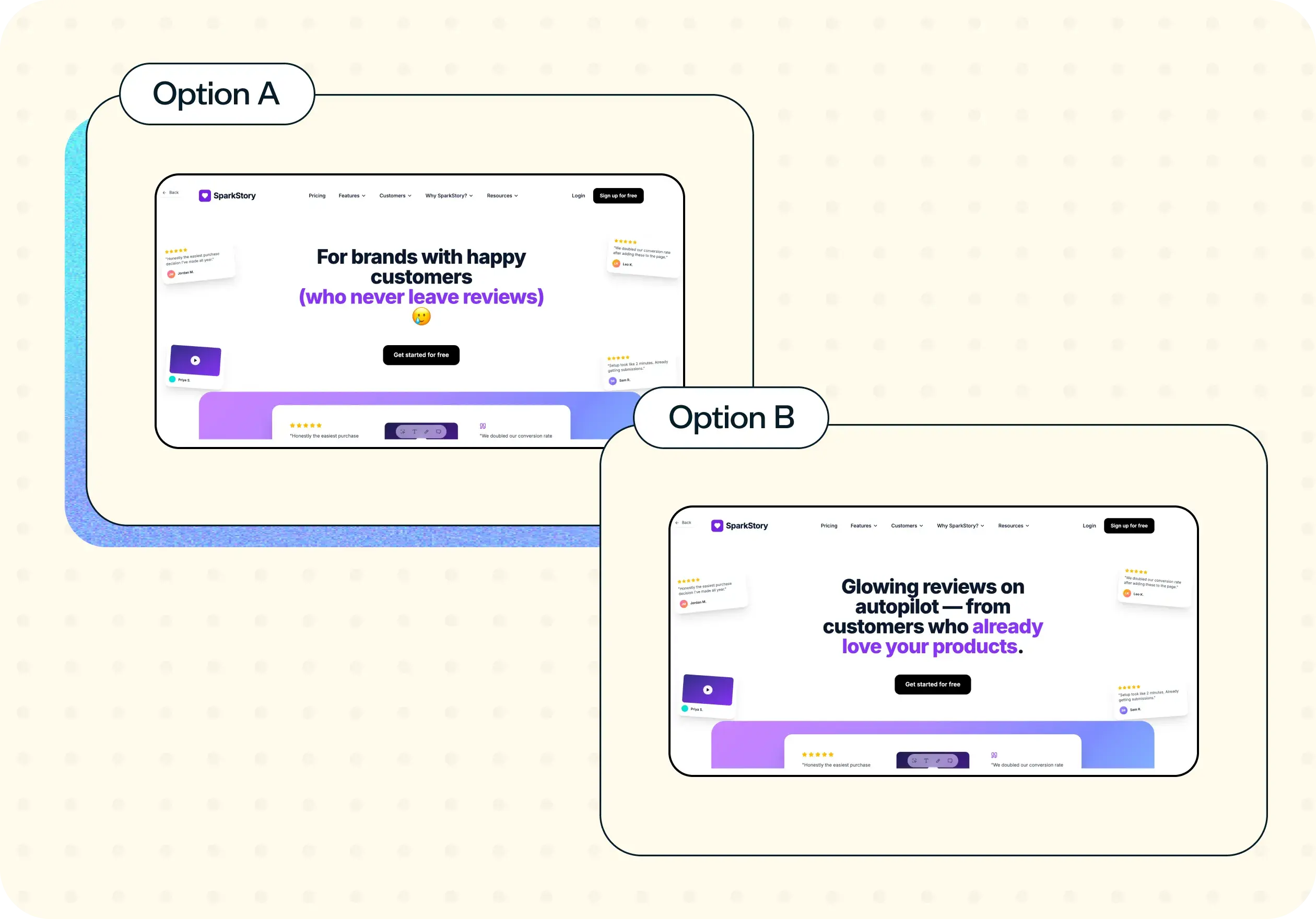
When two design directions are competing and you need an audience signal
After a launch that didn't move the metric you expected
When entering a new market or audience and the existing UI may not translate
After heatmap or analytics data raises a question the data alone can't answer
How to use this template
Getting started with this template takes just a few minutes:
Click "Use this template" and sign in to your Lyssna account. If you don't have one yet, you can start exploring with a free plan.
Upload your design or screenshot. This template supports multiple image types, so you can test low-fidelity mockups, high-fidelity designs, or screenshots of your live website.
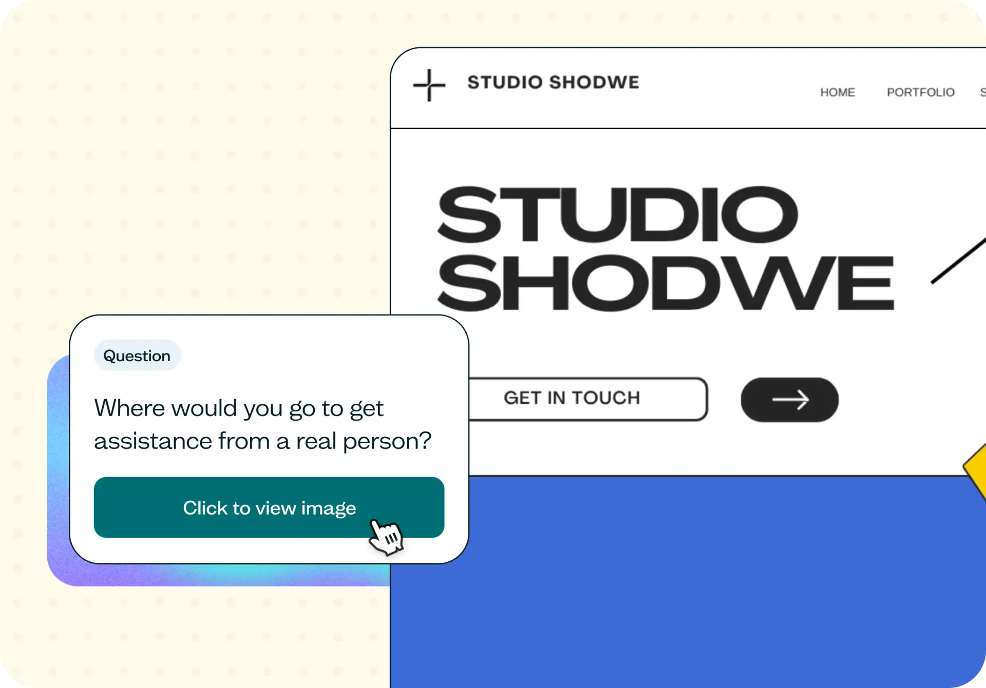
Write your task. Ask participants where they'd go to complete a specific action – for example, "Where would you go to get assistance from a real person?"
Recruit participants. Use the Lyssna research panel to reach your target audience, or share the test link with your own network.
Launch your test and review the results. Your results will include click maps and heatmaps showing where participants clicked, along with response data for each question. You can select regions of the design to see total clicks and average click times within that area.
Example outcomes
A heatmap and click map showing exactly where users clicked for a given task
A confidence score showing how sure users were they'd found the right spot
An ease score showing how straightforward or difficult the task felt
A clear signal on whether a page's layout and labeling guide users correctly
Who this template is for
UX researchers running quick evaluative studies before sprint commit
Product designers comparing two directions before stakeholder sign-off
Web and growth teams pressure-testing a homepage or campaign page
Marketing leads checking a positioning or layout change before launch
FAQs about how to evaluate website UI intuitiveness
You may also like these templates

I love that Lyssna lets me be lightweight and fast. As a UX practice of one in a large enterprise, my stakeholders won't slow down for research. Lyssna lets me provide insights at speed.

Kevin Boulier
Lead UX Strategist & Designer at ManpowerGroup