
03 Oct 2023
|10 min
Color blind-friendly palette
Learn how to create user interfaces for color blind people that are efficient, usable, and appealing. Improve the accessibility of designs through color-blind friendly palettes, keeping design simple and uncluttered, and considering different types of color blindness.


Color plays a huge role in design. But what if some of your users are color blind? It's possible to improve the accessibility of your visuals by making sure those who are color blind or visually impaired can navigate your designs.
Designing a color blind-friendly website or app will improve the overall user experience, which can have an impact on purchase decisions and influence conversion rates.
In this article, we’ll discover how to create user interfaces for color blind people that are efficient, usable, and appealing.
What is color blindness?
Color blindness is a condition where people frequently confuse colors or lose the capacity to recognize colors at all. It can take many different forms, but they all involve seeing color poorly, mingling colors, or having trouble telling some colors apart.
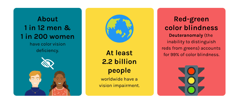
Color blindness affects 4.5% of people, according to Colour Blind Awareness. If men make up the majority of your audience, this rises to 8%. This means charts, diagrams, infographics, and other color-related information on your page aren’t seen the same way by all your audience members.
Source: venngage.com
The idea that color blind people can only view the world in black and white, or monochromatically (a separate condition), is a common misconception. In reality, color blindness has a varying impact on each individual, ranging from being unable to tell two or three colors apart to having difficulty with specific hues.
What are the types of color blindness?
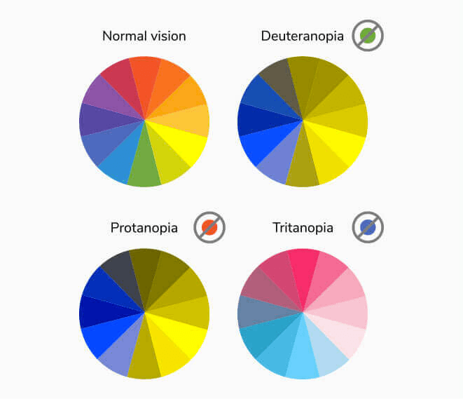
The most common type of color blindness, known as red-green color blindness, causes individuals to mistake all colors that contain either red or green as a part of the overall hue. People with deuteranopia are less sensitive to green light, while those with protanopia color blindness are less sensitive to red light.
Source: coolwinks.com
There are seven formal classifications of color blindness, including:
Green and red: The most common type of color blindness is red-green. People with deuteranopia aren’t able to sense "green" light because they lack green cones, and people with protanopia are unable to see any "red" light.
Brown and green: Those who are red-green color blind may mistake the lighter shade of brown for the color green, whereas the darker shade of green may be mistaken for brown. Hence, people who are color blind aren’t able to distinguish between the two hues.
Blue and green: Light green appears as yellow and dark green as brown in the red-green variant. Blue-green or turquoise is seen as gray.
Gray and blue: A red-green color blind person might not be able to see the green hue of turquoise and instead perceive it as gray.
Blue and purple: Those with protanopia aren’t able to see the color purple; instead, they see it as a dark blue.
Blue and gray: Depending on the shade, it is preferable to avoid the color combination of gray and green.
Green and black: People with protanopia are more likely to confuse different shades of red with black.
The role of color in UI/UX
A well-considered color palette may take a design from good to excellent, whereas a subpar or poor color palette can ruin the user experience and even make it difficult for some users to navigate you website or app.
Even though the use of color in UX/UI design involves much more than just selecting a pleasing palette – such as accessibility and the psychological effects of even subtle variations within the same hue – you can gradually improve the use of color without having to reevaluate your entire workflow.
One of the most satisfying aspects of color theory is learning to use more unusual hues in designs once you’ve mastered the fundamentals.
How to make the most of colors in your UX/UI designs
A color palette should be created with your brand values in mind. But they aren’t the only thing to consider – industrial standards and colors used by competitors are also important.
Choosing a color scheme that’s almost identical to your competitors is a certain way to create confusion and guarantee that your product won't stand out.
The 60-30-10 rule
A straightforward approach for developing color palettes that are harmonious and visually appealing is the 60-30-10 rule.
The concept is that 60% of the color palette is made up of one color, which is typically something neutral (either literally or psychologically). 30% of the color palette is made up of a complementary color. And then a third color is used as an accent for the remaining 10% of the design.
By using this technique, you can start experimenting with unique color schemes without deviating too far from accepted standards. By adding a touch of an unexpected color, a design that would normally be associated with your brand can be enhanced or improved.
It can also be the initial step in developing a brand palette that’s significantly more innovative than what your competitors are doing, differentiating your brand and enhancing its recall.
How to create color blind-friendly color palettes
Why should I bother designing for such a small group of users, you might be asking. In general, the features that are helpful to color blind users are regarded as good design principles in the broadest sense. So if your site is well-designed, it should already be accessible to the majority of users.
Designing for accessibility doesn’t mean that the aesthetic integrity of your design needs to suffer. With that in mind, here are the top five elements you should focus on for a color blind-friendly UX/UI design.
Keep your design simple and uncluttered
Your visuals should be as straightforward and organized as feasible when creating for accessibility. Whether or not your target audience is color blind, taking a minimalistic approach will make your content easier to understand.
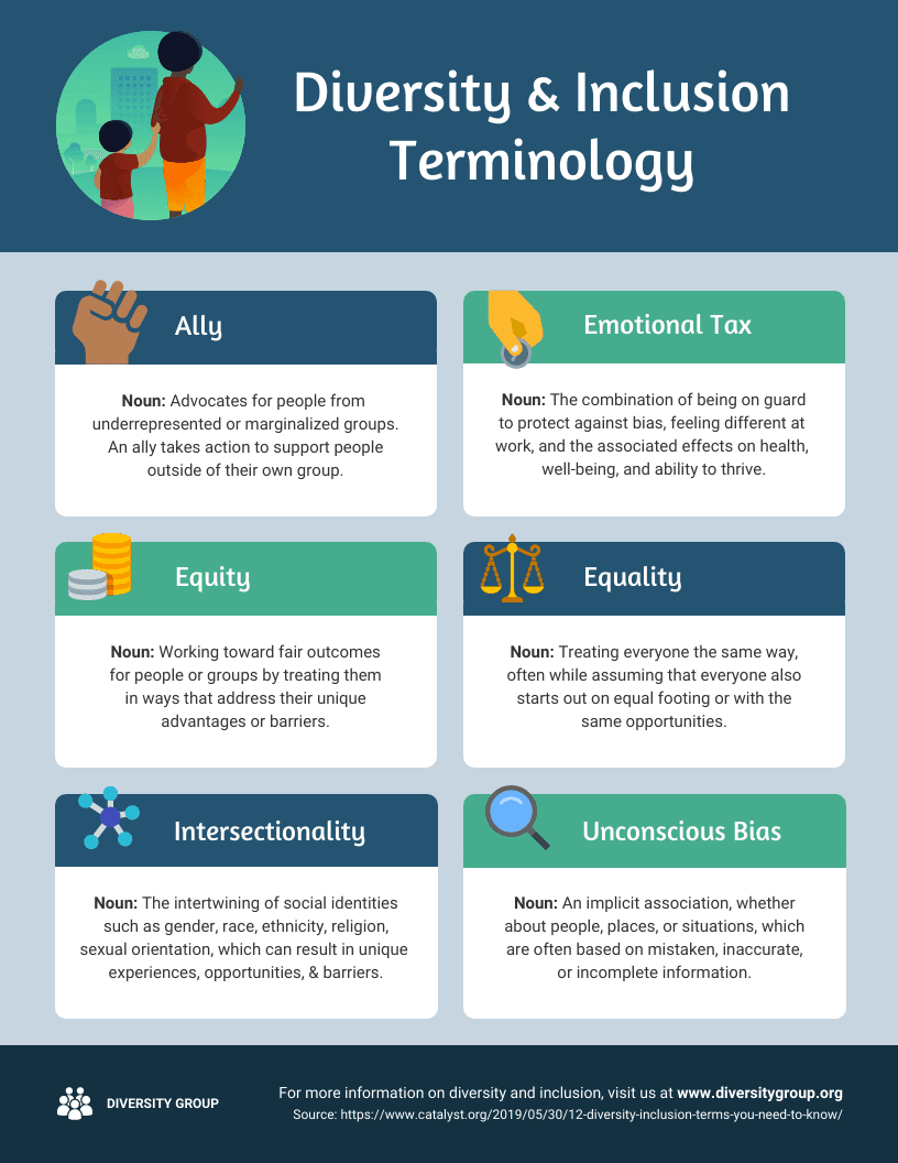
For example, if your site contains infographics, using an infographic template makes it easier to achieve this. Here’s an example that uses icons and forms to reinforce and highlight data.
Source: venngage.com
Minimalism can also apply to user interfaces. Neal Taparia, who runs the gaming site Solitaired explains, “We found that removing options help our users focus on the buttons that helped them advance in our games. This increased our overall engagement with our games.”
Add contrast to your color scheme
The contrast between background and foreground is one of the key components of using accessible colors.
Consider the contrast between the color of a button and the button text. You can ensure a clear contrast by establishing color pairings that work well together.
You can also specify several contrast levels for each background. For example, the contrast in body copy can be set to a stronger level than a visual explanation. Verify that each level has enough contrast with the background by testing it using an emphasis scale.
Another option is to make a contrast scale that emphasizes a color's contrast rather than its intended usage, for instance high contrast, mid contrast, and so on.
Use simple color combinations
Color pairs are a great way to ensure the contrast between foreground and background colors, but what about fill colors?
It’s unrealistic to test every combination, but it’s possible to ensure that the most likely combinations function well.
You could, for instance, test your primary color against different backgrounds. People with color blindness will be able to at least navigate your products if you guarantee that it works for them.
Checking the contrast between the text and background is also important for identifying links in a paragraph of text
Enhance infographics
When designing infographics, charts, and graphs, it’s important to make lines and fills distinct. For those who suffer from red-green color blindness, start by picking colors with lots of contrast.
There are other design elements you can use too. For instance, patterns can be used on graphs and flow charts in addition to color fills. As a result, your graphs can be distinct, even in grayscale.
For line charts, use dotted, dashed, and solid lines. Connecting lines to labels is made easier by adding shapes to the beginning, end, and middle points. Whenever you use these visuals in emails or social media, they can help make things easier for your audience to understand.
Avoid using bold colors
When practical, stay away from vivid and brilliant colors. If that isn't possible, try to avoid combining vibrant colors. Bright color combinations can produce an "afterimage" effect that can disrupt other colors and create visual vibrations. This can be experienced by anyone, including those who aren’t color blind.
Create monochromatic images
Consider making your images and charts monochromatic. Color blindness has no effect on the capacity to discern between various shades, so using a limited color palette will result in fewer opportunities to apply unfavorable color combinations.
Final thoughts
A well-designed color scheme is more than just a matter of taste, especially when it incorporates some surprising tones. Users can experience psychological effects from it, so this is something that UX and UI designers should be aware of in order to create more effective experiences.
It's crucial to ensure your designs are accessible and inclusive for people who are color blind. However, using the tips in this article, it is possible to achieve this without compromising the aesthetic appeal of your final product.
At Lyssna, we provide various tools to help UX and UI designers create better user experiences.
Elevate your research practice
Join over 320,000+ marketers, designers, researchers, and product leaders who use Lyssna to make data-driven decisions.

You may also like these articles





Try for free today
Join over 320,000+ marketers, designers, researchers, and product leaders who use Lyssna to make data-driven decisions.
No credit card required