
Icons are small, but they carry a lot of weight in an interface. An icon that users can't decode at a glance becomes a support ticket, a dropped task, or an accessibility risk, depending on the audience and the context.
This template shows you whether real users recognize and understand your icons before you ship them, so you're not relying on internal convention or preference to decide.
A familiar icon isn't always a clear one
A "universal" icon only works inside the platforms that already use it. The hamburger menu is clear in a navigation bar, but put it on a dashboard and comprehension drops. Your team might read a gear icon as "settings," but a user could just as easily read it as "tools" or "configuration."
Design systems can hide this problem rather than solve it. Once an icon makes it into a standard library, it's easy to assume it's already been tested for comprehension – but standardizing an icon set and validating it are two different things.
The risk is highest with icon-only controls. When there's no label to fall back on, the icon has to carry the full meaning on its own. If it hasn't been tested with real users, you're asking them to guess – and guessing shows up later as errors, support tickets, and accessibility problems.
And that risk doesn't fix itself over time. An icon that confuses people the first time doesn't get clearer just because it's live – it just becomes something people learn to work around. Testing your icons early, while it's still cheap to change, is what actually solves it.

What this template helps you discover
Icon design testing surfaces the specific gaps between what your icons are intended to communicate and what users actually understand. This template helps you discover:
Whether users can name the action an icon represents without a label
Which icons in a set are confused with each other
How recognition changes across audience segments and experience levels
Where an icon needs a label, tooltip, or rework before shipping
Which icons in a design system deserve keeping, redrawing, or retiring
What you'll test
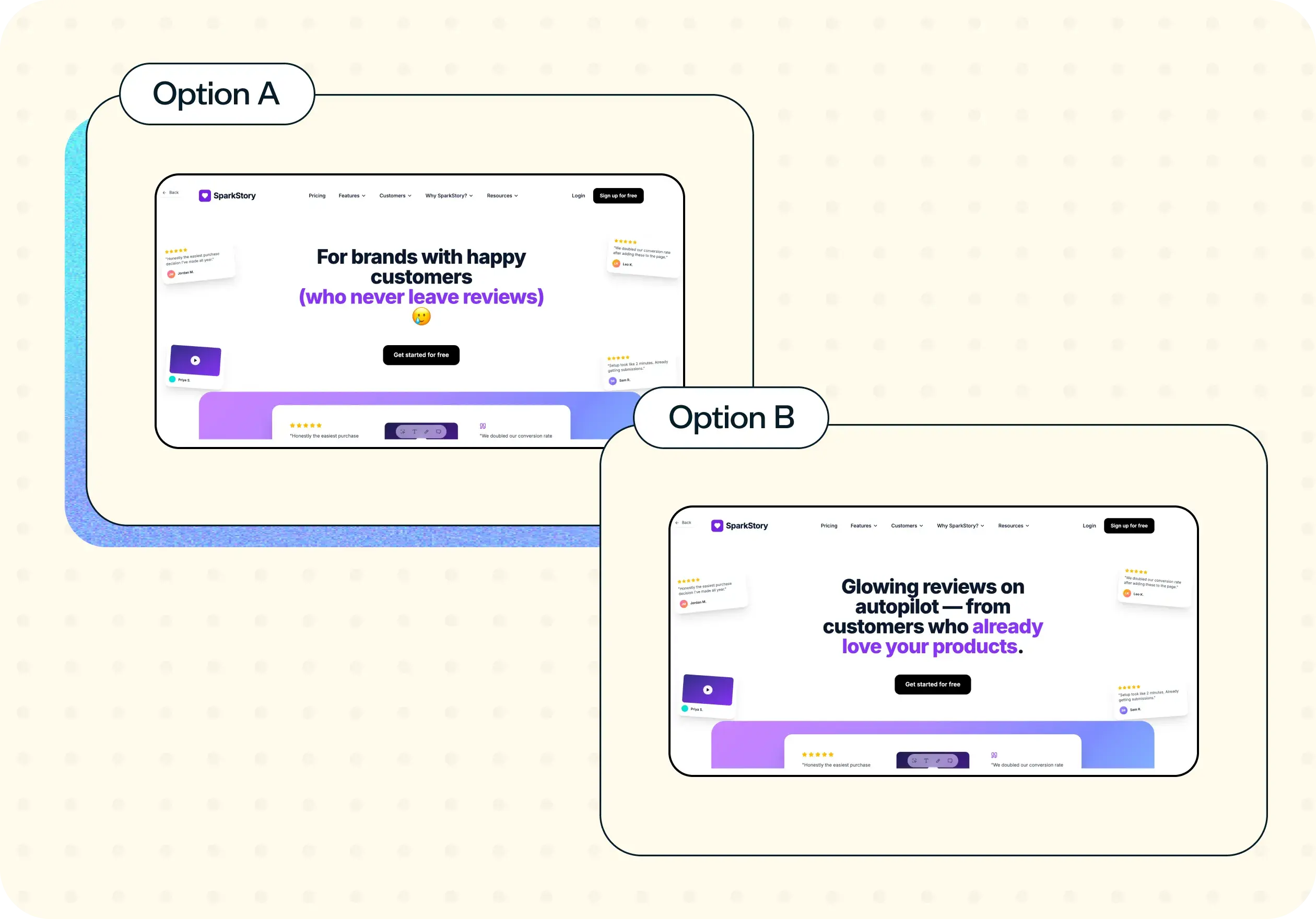
This template runs as a preference test: show participants a few icon options for the same action and ask which one they'd choose. The choice tells you which icon wins on first impression. The follow-up question – asking why they picked it – tells you whether that's because the icon is genuinely clear, or just familiar, distinctive, or easy to describe.
Run this with individual icons to test comprehension on their own, or within a realistic UI to see how context changes the read. Either way, you'll end up with a clear preference split across options, plus the reasoning behind it in participants' own words.
How to use this template
Start with the template. Click "Use this template" to load it into your Lyssna account. If you don't have an account yet, you can get started with a free plan.
Upload your icon designs. Add the icons you want to test – either as individual icons for comprehension testing or as a set for preference comparison. You can present them in isolation or within a realistic UI context.
Customize the questions. Tailor the follow-up questions to match what you need to learn. For comprehension, ask participants to describe what the icon means in their own words. For preference comparisons, ask why they chose one icon over another.
Recruit participants. Share the test link with your own users, or recruit from Lyssna's research panel of 690,000+ participants across 124 countries to reach your target audience.
Review your results. Analyze participant responses to identify which icons are clearly understood, which cause confusion, and where labels or redesigns are needed before shipping.
When to use this template
Icon testing fits at several points in the design and development process:
Before shipping a new icon set in a product or marketing surface
When adding icons to a design system or updating an existing library
When support tickets or analytics point to a specific icon as the source of friction
When aligning a multi-product suite around a shared visual language
Before a redesign locks icon-only controls across the interface
When validating localization – some icons travel well across cultures, and some don't
Example outcomes
Icon testing produces specific, actionable results that resolve debates and inform design decisions:
A comprehension score for each icon with clear pass, review, or redraw recommendations
Evidence that a set of icons is distinct enough to ship without labels
Specific recommendations on which icons need a paired label or tooltip
A shared reference that ends subjective debates about icon choices
A cleaner design system where icons earn their place based on evidence, not convention
Who this template is for
This template is built for anyone involved in choosing, validating, or approving icon designs:
Product designers picking between candidate icons for a new feature
Design system leads validating an icon library before rollout
UX researchers supporting an accessibility or localization review
Content designers deciding where labels should pair with icons
Engineering leads reducing ambiguity before icon-only controls ship
FAQs about how to test icon designs
You may also like these templates

I love that Lyssna lets me be lightweight and fast. As a UX practice of one in a large enterprise, my stakeholders won't slow down for research. Lyssna lets me provide insights at speed.
Kevin Boulier
Lead UX Strategist & Designer at ManpowerGroup