
Overview
Discover where users get lost navigating your website – and why. This template reveals how people move through your site, which labels confuse them, and where your navigation structure needs work.
Why navigation problems are invisible to internal teams
Navigation is the backbone of every website. When users can't find what they need, nothing else matters – not the quality of your content, the strength of your offer, or the polish of your design.
The problem is that navigation failures are almost impossible for internal teams to see. You're too familiar with your own site. The labels that feel obvious to you – the ones built around your internal taxonomy, your team names, your product logic – often mean nothing to the people you're trying to reach. That gap between how your team thinks and how users think is exactly where navigation breaks down.
Poor navigation doesn't just frustrate visitors. It pushes up bounce rates, kills conversion paths, and makes your best content invisible. And without user data, it's nearly impossible to convince stakeholders that the problem is real – or to agree on how to fix it.
This template helps you test website navigation with real users so you can pinpoint where confusion happens, understand why it happens, and make data-backed decisions about how to fix it.

This template will help you discover
Running a navigation test gives you a direct view into how users experience your site structure. You'll learn:
Where users get lost or confused in your navigation.
Which labels and categories match user expectations – and which don't.
How users expect content to be organized.
What paths users take to complete common tasks.
Which parts of the navigation are ignored or misunderstood.
What you'll test
Navigation clarity
The first thing this template reveals is whether users understand your navigation labels at a basic level. Can they predict where content lives before they click? Do category names mean what you think they mean to people outside your organization?
Confusing labels are one of the most common – and most fixable – navigation problems. When users can't decode a label, they don't explore: they leave.
Task completion
Understanding whether users can complete real tasks using your current navigation is where the most actionable insights come from. Where do users abandon a path? Where do they backtrack? Where do they take a wrong turn and not realize it?
Task completion data makes it concrete: this isn't a vague sense that "navigation could be better." It's evidence of exactly which tasks are failing and where.
Information architecture
Beyond individual labels and tasks, this template also surfaces whether your overall content structure matches how users think. Would they organize your site the way you have? If not, what would their version look like? Understanding the gap between your current information architecture and your users' mental models is the foundation of any meaningful navigation redesign.
When to use this template
This template is useful at any point in a navigation project, but it's especially valuable when:
You're planning a website navigation redesign and need a baseline.
Analytics show high bounce rates on key pages.
User feedback or support queries mention difficulty finding content.
You're adding new sections, products, or content to your site.
You're migrating to a new site structure and want to validate it before launch.
Internal teams disagree on how navigation should be structured.
How to use this template
Click "Use this template" and log in to your Lyssna account. No account yet? Start exploring with a free plan.
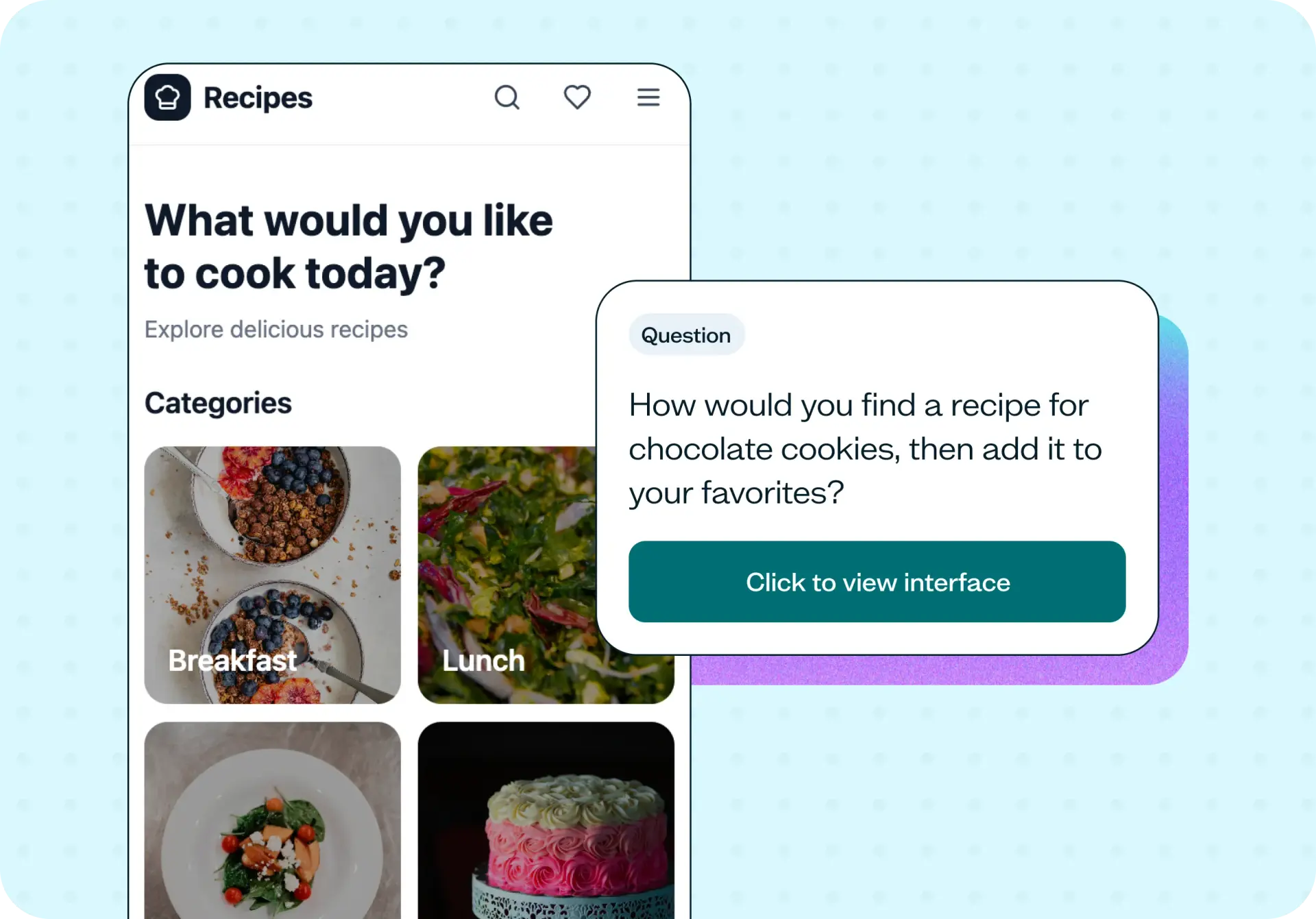
Customize the test for your site. The template includes a navigation task, follow-up questions about task ease, and a first impressions question. Update the task to match a real user goal on your site – for example, "Find a recipe for chocolate cookies and add it to your favorites" is the scenario in the example test.
Preview your test or save and continue to recruit participants. You can share the test link with your own network or recruit from the Lyssna research panel to reach your target audience quickly.
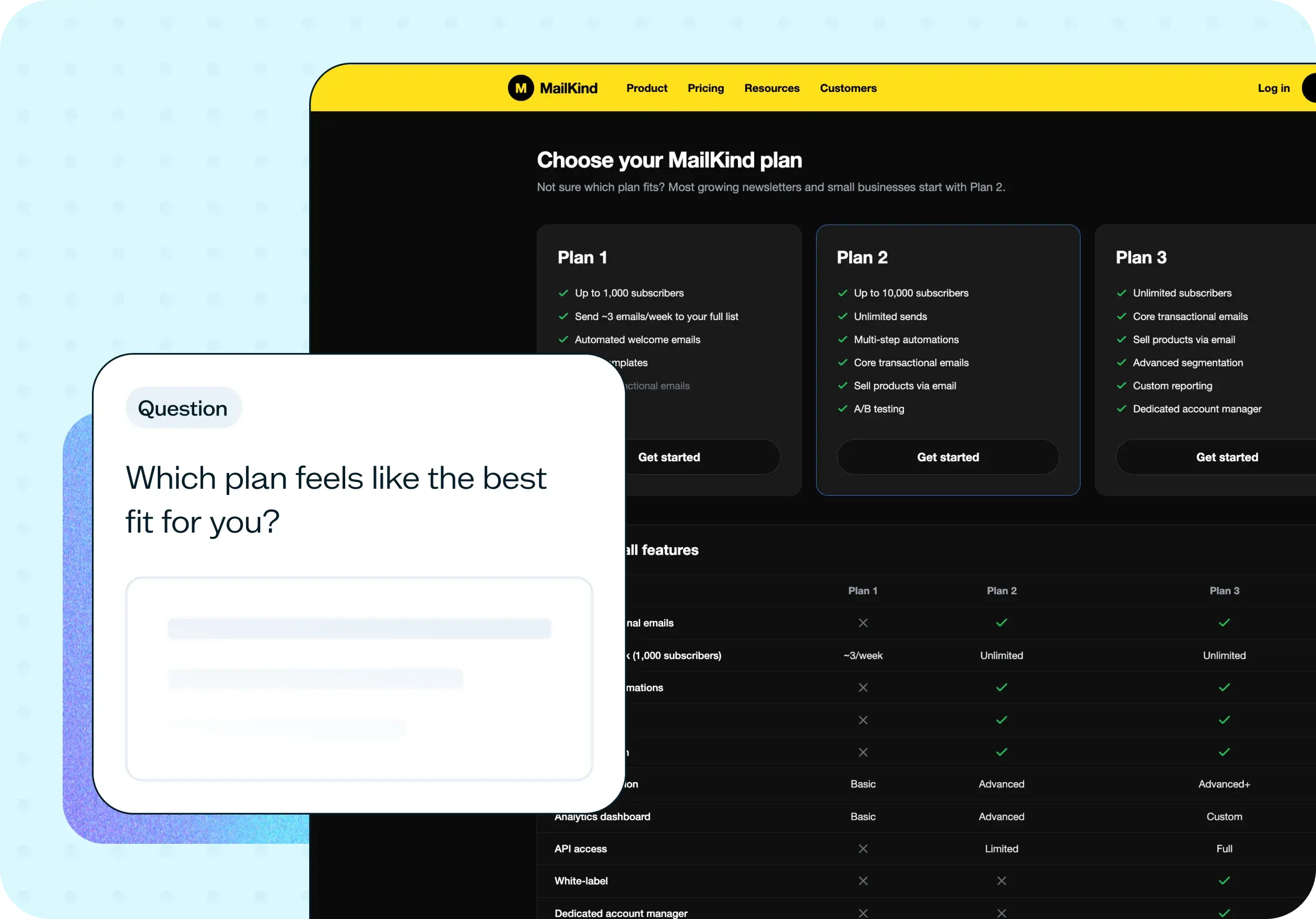
Set your test live and review your results. The results show step-by-step task completion, how easy users found the navigation (on a linear scale), their first impression of the navigation, and open-text feedback. Together, these give you a clear picture of where your navigation is working and where it isn't.
Example outcomes
Teams who run navigation tests with this template come away with:
Identified navigation labels that confuse users – with evidence to back a change.
Validated information architecture before committing to development.
Reduced time-to-content for key user tasks.
Higher task completion rates after navigation updates.
Data-backed decisions instead of internal debates about what users need.
Who this template is for
This template is useful for anyone responsible for how users move through a website:
UX designers improving site structure and navigation systems.
Product managers optimizing user flows and reducing friction.
Web teams planning navigation redesigns or site migrations.
Information architects validating content hierarchy against user expectations.
Marketing teams ensuring their content is discoverable.
FAQs about improving website navigation
You may also like these templates

The navigation test is god's gift to UI designers. It probably has the best power-to-simplicity ratio of any software, ever.

Nick Franklin
CEO at ChartMogul