
Overview
Run a live website test to discover how users evaluate your pricing page against a competitor's. Use this template to understand which pricing page communicates value more clearly, where confusion appears, and what information users need before choosing a plan.
The problem with pricing page assumptions
Your pricing page is one of the highest-stakes pages on your site. It's where potential customers make the call: is this worth it? But most teams design pricing pages based on internal assumptions — what they think is clear, what they assume users will compare, and what they believe communicates value.
The reality is that users almost never evaluate your pricing in isolation. They open competitor tabs, read reviews, and weigh up plans side by side before making a decision. If your pricing page confuses them, loses their trust, or fails to answer the right questions, they'll leave – without telling you why.
Small differences in how plans are structured, how features are labeled, or how pricing tiers are framed can significantly influence conversion. And without real user feedback, those differences stay invisible.
This template gives you a structured way to test your pricing page alongside a competitor's – so you can see exactly how users compare them and where your page has the edge, or where it's falling short.

This template will help you discover
Testing pricing pages with real users surfaces the kind of insight that analytics alone can't give you. You'll learn:
How users compare your pricing page with a competitor's when choosing between plans.
Which pricing page communicates value more clearly and why.
Where confusion or hesitation appears in your pricing structure.
Which pricing elements have the most influence on user decisions.
What information users are looking for before they're ready to commit to a plan.
What you'll test
This template is built around a structured live website test that walks participants through two pricing pages – yours and a competitor's – and captures their reactions at each stage.
Pricing clarity
The first task asks participants to look through a pricing page's plan options as if they were choosing for a real use case. This reveals whether your tiers are immediately legible, whether the differences between plans are clear, and whether anything is creating confusion or hesitation before a user can even evaluate value.
Competitive comparison
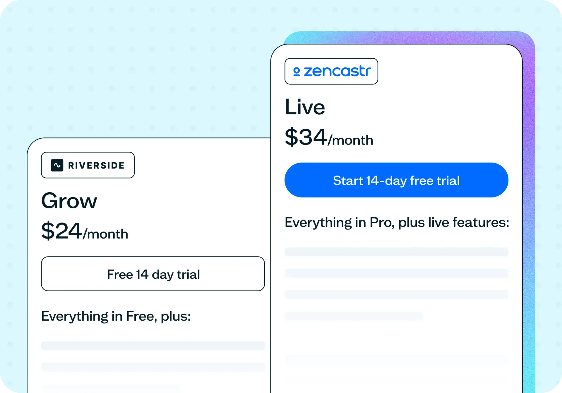
The second task repeats the same scenario on a competitor's pricing page. Running the same task on both pages – with the same framing – gives you a direct basis for comparison. You'll see where users spend more time, where they hesitate, and which page makes the decision feel easier.
Value perception
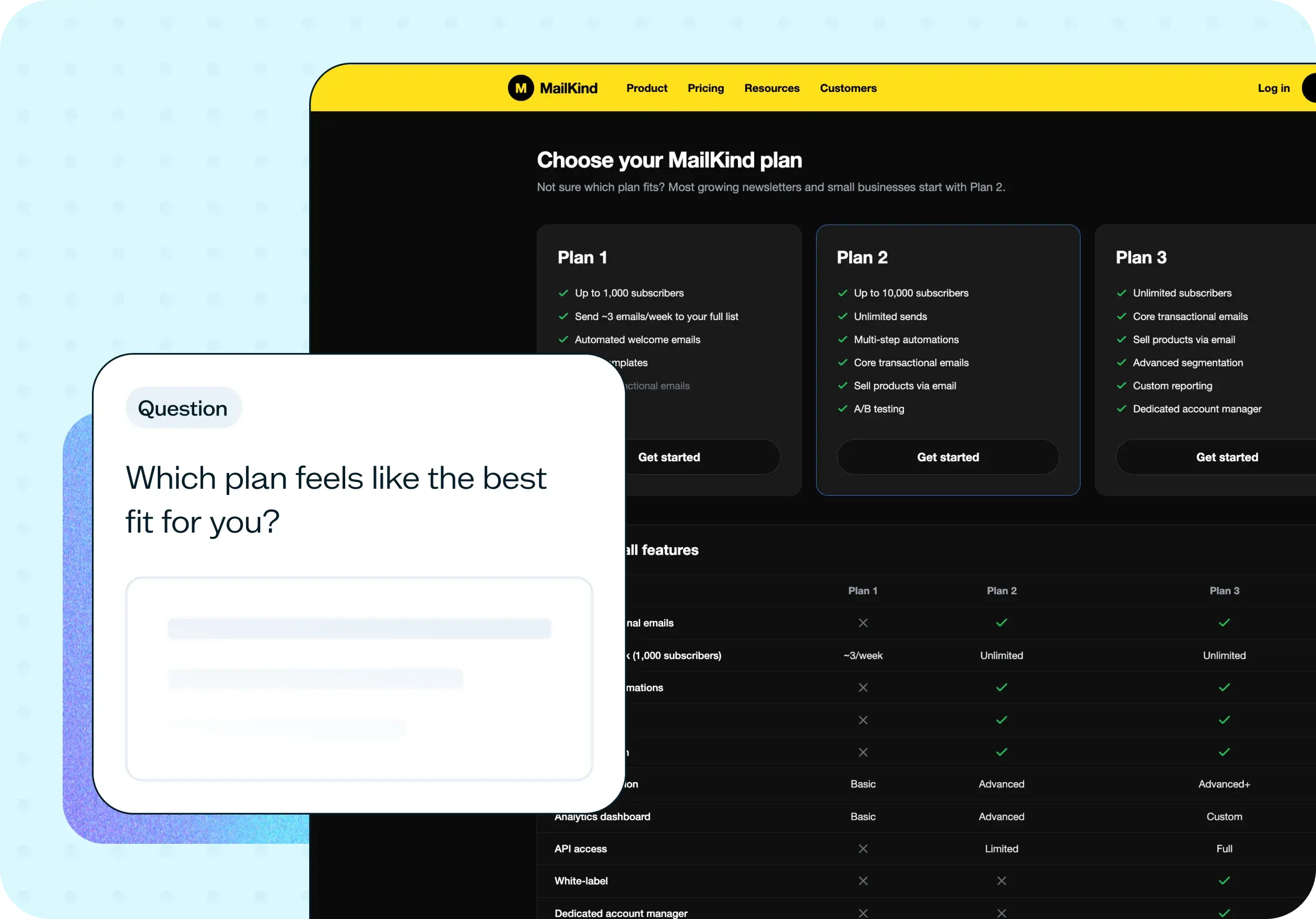
After completing both tasks, participants answer a follow-up question asking which platform's pricing plan they preferred and why. This open-ended response surfaces what users actually weigh up when comparing pricing: feature sets, price anchoring, how plans are named, how value is communicated, and which page earned more trust.
When to use this template
This template is most valuable when:
You're doing a competitive analysis or pricing research.
You're launching or redesigning a pricing page and want to pressure-test it before it goes live.
Conversion rates on your pricing page are lower than expected and you want to understand why.
A competitor has recently changed their pricing and you want to understand how users are responding to it.
You're considering changes to your pricing structure or tier names and want user feedback before committing.
How to use this template
Choose your competitor. Select a competitor whose pricing page is representative of what your target users are likely comparing you against. The more realistic the comparison, the more useful the feedback.
Customize the task prompts. The template comes with task wording you can adapt to your product category. Update the use case in the task prompt – for example, "If you were working on your first podcast" – to match what's most relevant to your users.
Set up the two live website tasks. The template is structured as two sequential tasks, each pointing to a different pricing page URL. Participants complete both tasks before answering the follow-up question, so you get direct comparative data.
Recruit your participants. Use Lyssna's research panel to reach users who match your target audience, or share your test link with participants from your own network. Because pricing decisions are highly context-dependent, recruiting participants who fit your actual buyer profile will give you the most relevant feedback.
Review the results. You'll see task completion times for both pricing pages side by side, recordings of how participants navigated each page, and open-ended responses to the follow-up question. Look for patterns in what participants preferred and why – the qualitative responses here tend to be especially telling.
Example outcomes
Teams who test their pricing pages typically come away with a clearer picture of where their page is working and where it's creating unnecessary friction. Common outcomes include:
A better understanding of how users perceive your pricing relative to a competitor's – and what's driving that perception.
Specific copy or structural changes that would make plans easier to compare.
Clarity on which features users care most about when evaluating pricing tiers.
Reduced confusion in the plan selection experience, which translates to greater confidence at the point of decision.
Who this template is for
Whether you're a product manager optimizing pricing strategy, a UX researcher running a pricing page audit, or a SaaS founder validating pricing before launch, this template gives you a structured way to gather real user feedback at one of the most critical points in the buying journey.
It's also well suited for growth and marketing teams who need to understand how conversion is being influenced by pricing page design, and for designers looking to improve how pricing clarity and plan comparison work in practice.
FAQs about testing pricing pages
You may also like these templates

The navigation test is god's gift to UI designers. It probably has the best power-to-simplicity ratio of any software, ever.

Nick Franklin
CEO at ChartMogul