
Checkout is where hard-won traffic either converts or quietly slips away, and analytics can show you where buyers drop off without ever explaining why. Learning how to improve your checkout process means watching real buyers move through it, so you can tell the friction that costs you sales apart from the changes that only feel urgent.
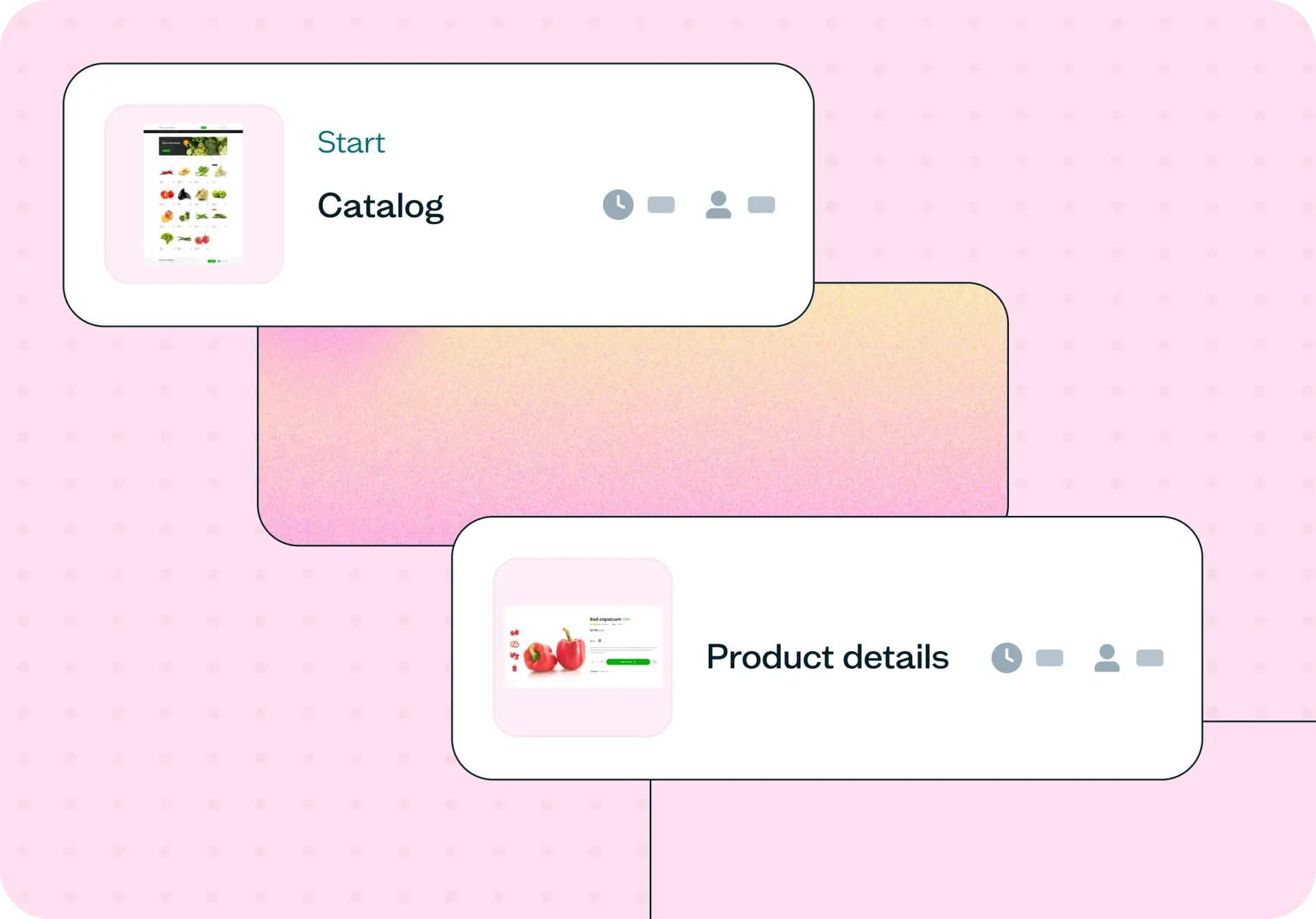
This template runs as a task flow prototype test, where real participants attempt a purchase in a working prototype of your checkout so you can pinpoint where hesitation happens and decide which fixes to ship first.
Stop guessing why buyers abandon checkout
Every checkout redesign starts with a room full of opinions. One stakeholder is sure the shipping costs are the problem, someone else blames the account step, and the mobile experience gets debated without anyone having watched a buyer use it. Meanwhile, the paid traffic you worked hard to earn keeps arriving at a checkout that either converts it or lets it slip away.
Guesswork is costly here because checkout sits at the point of highest intent and highest spend. The Baymard Institute puts the average cart abandonment rate at around 70%, and its large-scale checkout research finds that the top reasons are solvable design problems, not a lack of demand you could win back with more traffic. Unexpected extra costs shown late in the flow, being asked to create an account before buying, or a form that behaves differently on a phone can each be enough to end an otherwise-ready purchase.
Mobile and desktop rarely fail in the same place, so a single fix based on a hunch often solves the wrong problem. Testing your checkout with real buyers replaces the debate with evidence: You see where people hesitate, where they backtrack, and which step quietly loses them. From there you can prioritize the changes that recover the most sales and move forward with confidence rather than a guess.

What this template helps you discover
Running this test on your checkout shows you where real buyers struggle and why, so you can act on evidence instead of assumptions. It helps you discover:
Which checkout steps create the most hesitation, backtracking, and drop-off
How surprise costs, form fields, and trust signals affect whether buyers complete a purchase
Where mobile and desktop buyers run into different friction
Whether guest checkout, wallet payment options, or address handling are quietly blocking completion
Which friction points cost you the most completed purchases, so you know what to fix first
What you'll test
This template centers on a realistic buying task and looks at three things: whether buyers can finish, where they get stuck, and whether they trust the flow enough to commit. Each area maps to a part of the checkout experience you can improve.
Task success
Task success tells you whether buyers can actually complete a purchase in your checkout, on the devices they really use. You set a goal screen – the point that marks a finished order – and see how many participants reach it on both mobile and desktop. Where completion rates fall, and by how much, points you straight to the steps that need attention.
Friction points
Friction points are the moments where buyers slow down, hesitate, or backtrack. Watching a task flow shows you which fields, costs, or steps trigger that reaction, and how buyers respond when they hit a surprise cost, a required field, or a total that isn't clear. These are the small breakdowns that add up to an abandoned cart.
Trust and recovery
Trust and recovery looks at whether buyers feel safe enough to commit and resilient enough to continue when something goes wrong. You can see whether trust signals show up at the point of payment, and whether someone who mistypes a card number or misses a field can recover without losing their progress. A checkout that fails gracefully keeps buyers who would otherwise give up.
When to use this template
This template is most useful at the moments when checkout decisions carry real weight. Reach for it when:
Checkout conversion has dropped and stayed down, and you need to know why before you react
A redesign, a new checkout step, or a payment provider change is on the table
Mobile checkout is converting well below desktop and no one has tested the gap
Support tickets about checkout errors or confusion are climbing
You're about to launch in a new market, currency, or payment method
You want a regular baseline audit of checkout health, run each quarter
Example outcomes
When the test wraps, you're left with a clear, evidence-based picture of your checkout rather than a list of opinions. Typical outcomes include:
A short, prioritized list of the highest-impact fixes to make first
Mobile-specific recommendations kept separate from desktop issues, since the two rarely share the same problems
Task completion rates and time on task, broken down by the buyer segments you recruited
Verbatim reactions from participants that get design, product, and marketing aligned on the same fix
A shared before-and-after reference point, so you can tell a real improvement from a change that only looked good on paper
Who this template is for
This template fits anyone responsible for turning checkout performance into a decision. It's built for:
Ecommerce UX leads auditing the health of an existing checkout
CRO specialists deciding which experiment to run next
Product managers who want to ship checkout changes with confidence
Designers translating funnel data into specific, testable UX decisions
Growth leads protecting the return on paid acquisition
How to use this template
You can go from this template to a live test in a few steps:
Click "Use this template" and log in to your Lyssna account. If you don't have one yet, you can start exploring with a free plan.
Add your checkout prototype and set the goal screen that marks a completed purchase. If you still need to build the flow, you can create a Figma flow and connect it to your test.
Adjust the task instructions and follow-up questions so they match your flow and the decisions you need to make.
Preview the test, then recruit participants from your own network or from our research panel.
Set your test live and review results as responses come in, watching where buyers complete, hesitate, or drop off.
FAQs about improving your checkout process
You may also like these templates

It wasn’t a big sell to move to Lyssna's paid account due to the speed at which you can put together a test, quickly get feedback, and recruit good participants. It just makes monetary sense. It's so cheap and the feedback is valuable.

Alan Dennis
Product Design Manager at YNAB