This template is for:
Message testing
Marketing
Preference testing
Surveys
Created by:
Lyssna
Overview
Your messaging can make or break whether the right person feels like your product is for them. Even two well-written, high-quality versions of your copy can land very differently with your target audience – and without testing, you have no way to know which one is actually connecting.
This template gives you a faster, more reliable way to decide: a preference test that shows both versions to real users side by side, followed by conditional open-ended questions that surface not just which direction won – but why, and where the gaps are.
The problem with untested messaging
Messaging decisions often get made without any external input. A team writes two versions, debates them in a doc, and someone makes the call. The problem is that everyone involved is too close to it – they know the product, the strategy, and the intent behind every line. Real users don't have any of that context.
What looks like a clear, compelling headline to your team might read as vague or generic to someone encountering your product for the first time. And messaging that feels too salesy internally might be exactly what builds confidence for a first-time buyer. Teams that skip testing tend to optimize for what sounds good internally rather than what actually lands with the people they're trying to reach.
Common signs your messaging needs testing:
Users engage with the page but don't convert.
Different team members prefer different directions – and no one can say why.
The product is reaching some audience segments but not others.
Messaging feels accurate but doesn't feel distinctive or personal.
You've updated your copy but have no way to tell if it's performing differently.
Stakeholders are split on direction and the decision keeps getting pushed.
This template will help you discover
Whether you're choosing between two fully developed landing pages or testing early-stage copy directions, this template gives you a clear picture of what's actually resonating – and what isn't.
You'll find out:
Which messaging direction your target audience actually prefers.
What specific words, phrases, or details are driving that preference.
Whether your aspirational copy is connecting emotionally or feeling too vague to trust.
Whether your feature-focused copy is building confidence or leaving users cold.
What's missing from either version – and what to build toward in the next iteration.
Whether the gap between your two directions is decisive or close enough to warrant further testing.
What you'll test
Messaging preference
Which direction users choose when shown both options side by side – and how decisive that split is. A strong result gives you a clear direction to move in. A close result is equally useful: it tells you both versions have something worth keeping, and points you toward a synthesis rather than a choice.
Emotional resonance
Whether the messaging makes users feel like this product was made for someone like them. A page can be technically accurate and still feel generic. This dimension gets at whether your copy is speaking to a person or just describing a product.
Specificity and credibility
Whether each version gives users enough concrete detail to feel confident moving forward. Aspirational copy can inspire without grounding. Feature-led copy can inform without connecting. Both failure modes show up in the follow-up questions – and they often point at the same underlying gap.
Hesitation and gaps
What would need to change for users to feel more confident. This is where the most actionable insights come from. Across both groups, you'll often find users are asking for the same thing – just describing it from different starting points.
How the research works
This template combines a preference test with conditional design surveys – one routed to each group based on their choice – so participants explain their decision in their own words immediately after making it.
Screener survey
Before participants see either version of your messaging, a screener question filters for your target audience. This matters more for messaging tests than almost any other study type – feedback from outside your target audience can point you in the wrong direction. The screener ensures you're hearing from the people you're actually trying to reach.
Preference test
Participants see both versions of your messaging side by side and choose the one that makes them feel most confident. The prompt is specific to the decision context – not just "which do you prefer?" but something grounded in the outcome your messaging is trying to drive. The more specific your prompt, the more reliable the result.
The preference split tells you which direction has broader appeal with your target audience.
A decisive result (70/30 or stronger) gives you a clear winner to build on.
A close result signals that both versions are doing something right – and that the next iteration should probably combine elements of each.
Design survey (conditional)
After choosing, participants are routed to follow-up questions shown alongside the version they selected. The questions are the same for both groups; the stimulus changes.
The first question surfaces what specifically influenced the choice – the words, phrases, or details that stood out. This tells you what's working and why.
The second question asks what's missing or unclear. This is where gaps emerge – and where you'll often find both groups pointing at the same thing from opposite directions.
Together, the preference test and follow-up design survey tells you not just which direction won, but what to take forward and where to focus the next iteration.
How to use this template
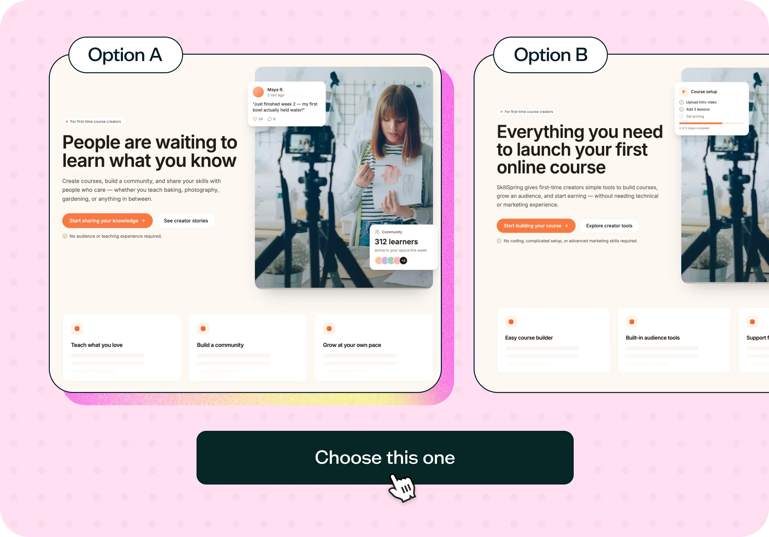
The best way to see this template in action is to watch it applied to a real product challenge. In the video below, we walk through a working example using SkillSpring – an online course platform that had built a strong following in established categories like marketing and design, but was expanding to reach a new audience: makers, hobbyists, and independent educators who'd never thought about packaging their knowledge into a course. They had two landing page directions ready. The question was which one would actually make that new audience feel like the platform was built for them.
The walkthrough covers:
How to adapt the template to your own messaging scenario.
How to write a preference test prompt that's specific enough to generate reliable results.
How to set up conditional logic in the follow-up surveys so each group responds to the version they chose.
You'll also see how to use a screener to recruit the right participants using the Lyssna panel, how to read the preference split alongside the qualitative themes in the open-ended responses, and how to use both together to identify what to carry forward into the next iteration. Whether you're choosing between two polished landing pages or testing early copy directions before committing to a full build, you'll come away with a clear process for getting real answers from real users – fast.
When to use this template
When you have two or more messaging directions and need to choose one.
When expanding to a new audience segment whose preferences you haven't tested.
When your messaging has been updated but you're not sure it's landing differently.
When internal teams or stakeholders disagree on copy direction.
When conversion or engagement is underperforming and messaging may be a factor.
When you want to move from assumption to evidence before a major launch or campaign.
Who this template is for
Whether you're a UX researcher running a structured messaging study or a marketer who needs to choose between two campaign directions before a launch deadline, this template gives you a fast, repeatable way to get the answer from your actual audience.
It's designed for:
UX researchers validating messaging for a product launch or redesign.
Product designers testing how different copy directions affect audience fit.
Marketing teams comparing messaging approaches for a new campaign or landing page.
Founders and product teams trying to reach a new or unfamiliar audience segment.
Anyone who has ever looked at two versions of copy and genuinely not known which one to use.
FAQs about messaging testing
You may also like these templates

The navigation test is god's gift to UI designers. It probably has the best power-to-simplicity ratio of any software, ever.

Nick Franklin
CEO at ChartMogul


Try for free today
Join over 320,000+ marketers, designers, researchers, and product leaders who use Lyssna to make data-driven decisions.
No credit card required