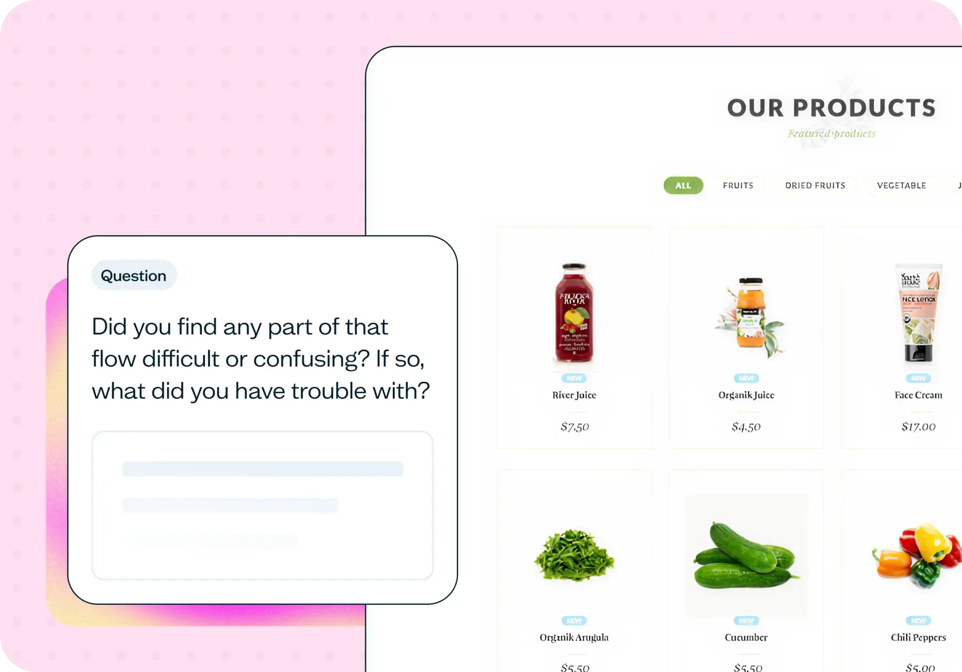

Checkout navigation flow is everything that happens between the main steps of a purchase – going back, editing the cart, changing a shipping address, or recovering from an error. When these in-between paths fail, buyers lose their progress and abandon checkout, even when the core flow itself is well designed.
This template uses first click testing and task-based scenarios to surface the specific navigation friction points that silently erode your conversion rate.
Why you should test your checkout navigation
Your checkout flow might be clean, logical, and well tested, but if the navigation between steps doesn't work, buyers still drop off. A customer who clicks "back" to fix a shipping address and finds their payment details wiped won't try again. They'll leave.
This is the friction that analytics can't explain. Your funnel metrics might show a drop-off at the payment step, but they won't tell you that the real problem is a broken back-button path two steps earlier. Back buttons, edit links, step indicators, and error recovery paths are where form data is most often lost, and where trust breaks down.
Mobile makes it worse. Browser back buttons, fixed navigation elements, and small tap targets all behave differently across devices, and what works on desktop can fail entirely on a phone screen. Without testing these navigation paths with real users, you're guessing at what's causing abandonment.
The upside is significant. Even a small improvement in recovery success – helping buyers go back, fix something, and complete their purchase – translates directly into completed checkouts.

What this template helps you discover
This template helps you uncover specific navigation issues across your checkout experience:
Whether buyers can predict what each navigation element (back buttons, step indicators, edit links) will do before they click
Where progress indicators, back buttons, and edit links lose or preserve the data users have already entered
How users recover from errors, corrections, and late changes without restarting checkout
Where mobile-specific navigation behaviors diverge from desktop, including browser back buttons, fixed elements, and tap targets
Which specific navigation failures lead users to restart their purchase or abandon checkout entirely
What you'll test
This template focuses on three areas of checkout navigation that commonly cause friction:
First click success
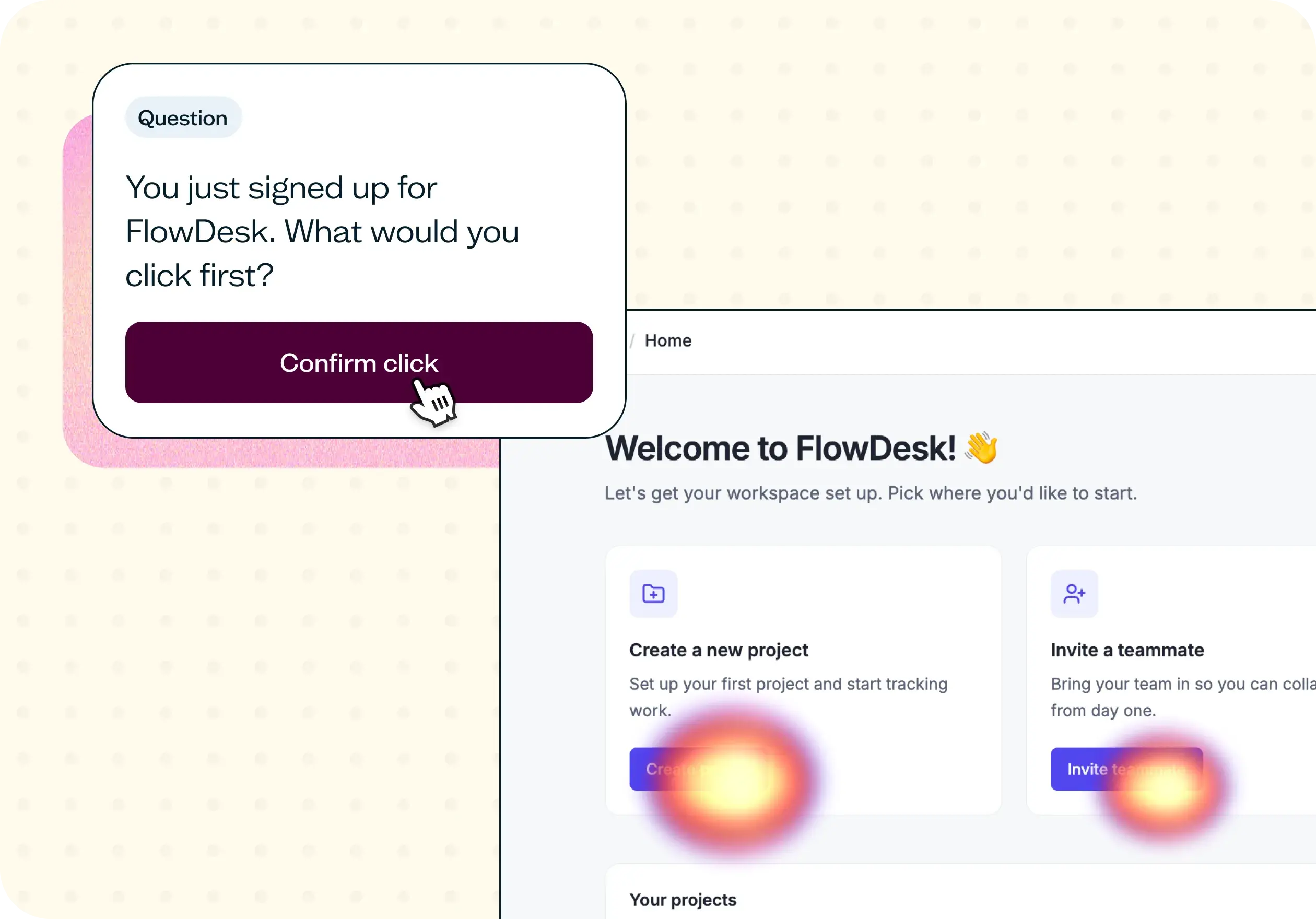
First click testing reveals whether users can predict what each navigation element does before clicking. You'll test whether buyers instinctively click the right element on their first attempt, whether that's a back button, step indicator, or edit link. Elements that fall below an 80% first click success rate are strong candidates for redesign, because users who click the wrong element first are significantly less likely to complete the task.
Recovery scenarios
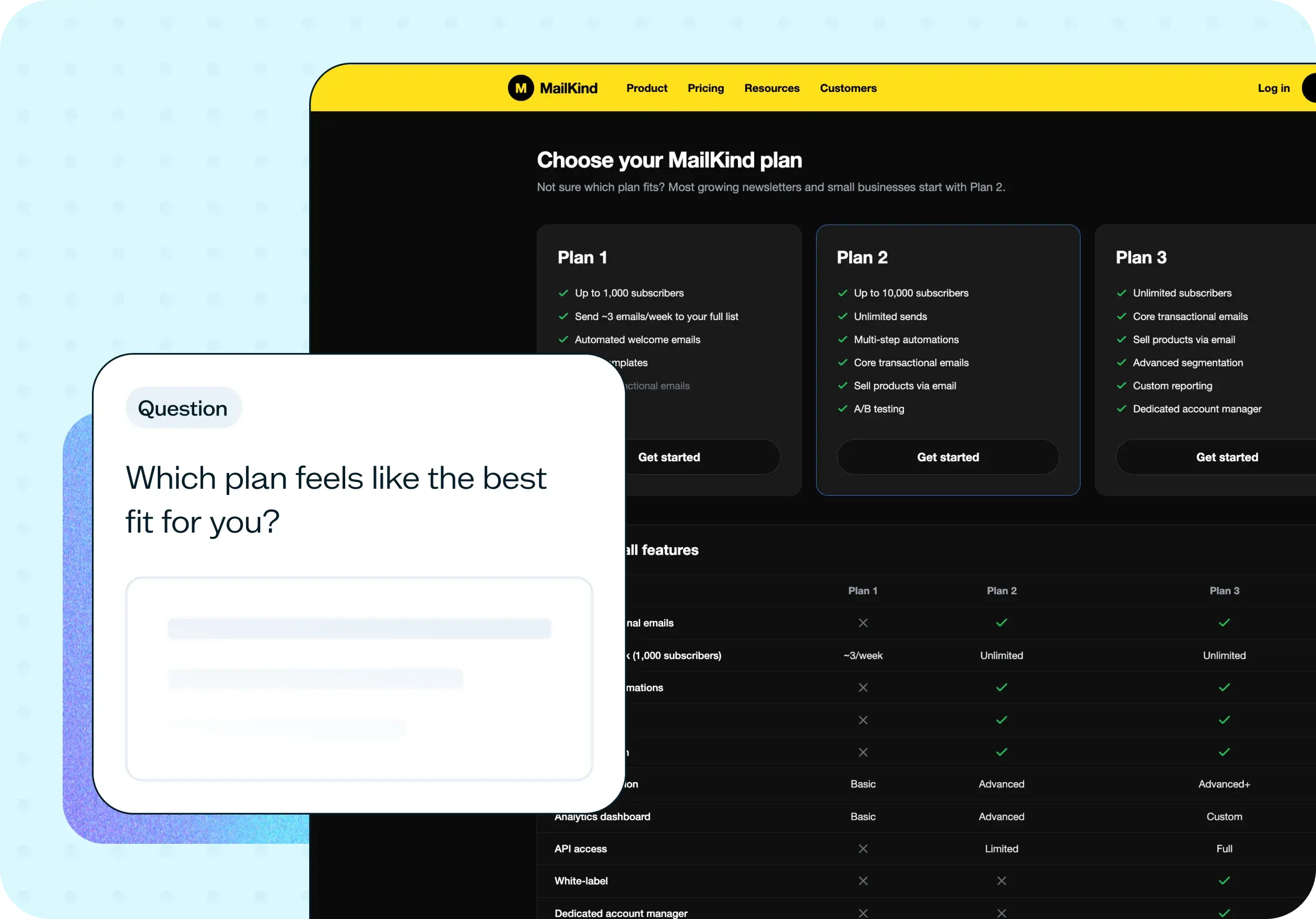
Recovery testing examines what happens when buyers need to go back, edit earlier steps, or fix errors mid-checkout. You'll set up task-based scenarios – for example, asking participants to change their shipping address after they've already entered payment details – and observe whether they can complete the correction without losing progress. These scenarios reveal where recovery paths reset the cart, clear form fields, or force buyers to start over.
Mobile vs desktop
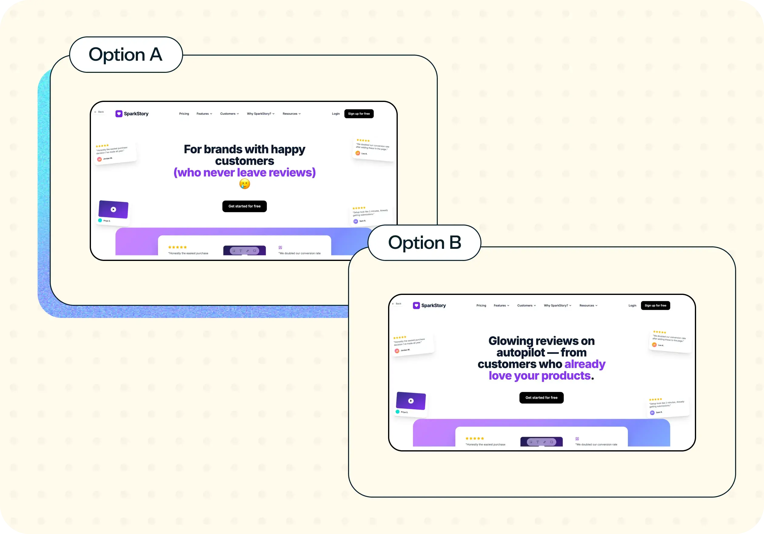
Mobile and desktop navigation often behave very differently, even when the checkout design looks similar. You'll test how browser back-button behavior, fixed navigation elements, and tap targets perform across devices. Mobile-specific issues, like wallet-flow interruptions or small edit links, often go undetected in desktop-only testing.
How to use this template
Click "Use this template" and sign in to Lyssna. If you don't have an account yet, you can get started with a free plan.
Customize the test for your checkout flow. Upload screenshots or prototypes of your checkout pages, and tailor the task scenarios and questions to match your specific navigation elements, including back buttons, step indicators, edit links, and error states.
Recruit participants who match your buyer profile. Use the Lyssna research panel or recruit from your own network. Aim for 15–25 participants across mobile and desktop for reliable navigation insights.
Launch your test and collect results. Participants will complete the navigation tasks independently, giving you first click data and task-based feedback on your checkout flow.
Analyze your results and prioritize fixes. Review first click success rates per element, identify navigation failures tied to recovery and edit paths, and separate mobile-specific issues from desktop findings to build a focused action plan.
When to use this template
This template is most useful at specific moments in your checkout lifecycle:
When support tickets mention lost information after users click "back" or try to edit earlier steps
When high edit-cart or edit-address rates correlate with checkout drop-off in your analytics
Before adding a new checkout step, payment method, or address flow
When mobile checkout conversion underperforms desktop despite a similar design
Before or after a platform migration that changes checkout navigation behavior
As part of a quarterly checkout health audit to catch navigation issues before they compound
Example outcomes
After running this template with real buyers, you'll have a clear picture of where your checkout navigation works and where it breaks down. You can expect to walk away with outcomes like these:
Per-element first click success rates, with a clear list of navigation elements that fall below the 80% benchmark
Specific navigation failures tied to recovery and edit paths – where buyers lose progress, encounter errors, or are forced to restart
A mobile-specific issue list separated from desktop findings, so your team can prioritize platform-specific fixes
Clear recommendations on step-indicator behavior, back-button state preservation, and edit-flow design
Evidence that aligns product, engineering, and design teams on which navigation fixes will have the highest impact on conversion
Who this template is for
This template is designed for teams responsible for checkout performance and ecommerce user experience:
Ecommerce UX leads auditing checkout health and identifying navigation friction across the purchase path
Product managers shipping checkout changes or navigation updates who need to validate that new flows don't introduce friction
Designers validating step indicators, back buttons, and edit flows before handoff to development
CRO specialists recovering silent conversion loss that analytics alone can't explain
Mobile teams testing back-button behavior, wallet flows, and device-specific navigation patterns
FAQs about checkout navigation flow
You may also like these templates

I love that Lyssna lets me be lightweight and fast. As a UX practice of one in a large enterprise, my stakeholders won't slow down for research. Lyssna lets me provide insights at speed.

Kevin Boulier
Lead UX Strategist & Designer at ManpowerGroup