07 Aug 2025
|22 min
What is UI design?
Learn what UI design is, why it plays a critical role in digital product experiences, and how principles, tools, and collaboration shape effective interfaces.

User interface design shapes every digital interaction we have. Whether you're scrolling through a mobile app, navigating a website, or using software, UI design determines how intuitive and enjoyable that experience feels.
If you're curious about what UI design involves, considering a career change, or looking to better understand what UI designers do, this comprehensive guide covers everything you need to know.
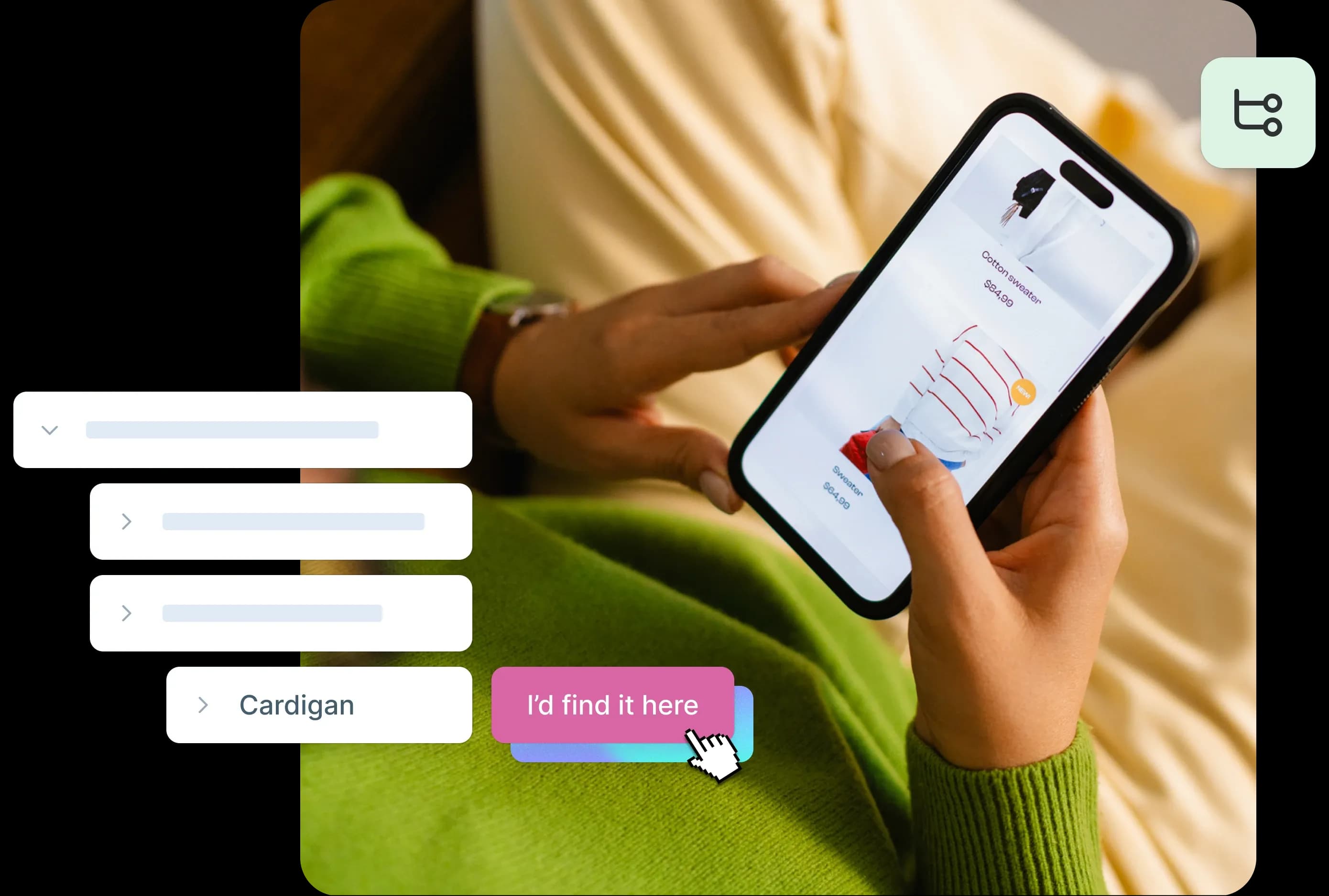
Test your designs
Ready to validate your UI decisions with real users? Start testing your wireframes and prototypes for free with Lyssna.
UI design definition
What is UI design? User interface (UI) design is the practice and process of creating the visual and interactive elements of a device or piece of software. It's what you see on a screen or device – the buttons, menus, forms, and layouts that help you navigate and accomplish your goals.
Quick definition: UI design focuses on the look, feel, and interactive elements of digital products, making them both functional and visually appealing.
The role of a UI designer is to plan for and create the function, look, and style of products. UI designers focus on aesthetics and make decisions about colors, typography, images, animations, spacing, and responsive design. They bridge the gap between what users need and how products should look and behave.
What does a UI designer do day-to-day?
UI designers wear many hats throughout their workday:
Create wireframes and mockups using design tools like Figma or Sketch.
Design interface components such as buttons, forms, navigation menus.
Collaborate with UX researchers to understand user needs and behaviors.
Work with developers to ensure designs are technically feasible.
Test design concepts with users to validate decisions.
Maintain design systems and style guides for consistency.
Present designs to stakeholders and gather feedback.
Nicolene van Staden, UX/UI designer at Oxford Instruments, perfectly captures the core mission of UI designers:
"To make the user journey enjoyable and stress-free and keep the client (end user) engaged. Most importantly, to keep the client from feeling lost or frustrated while navigating the application."
UI design vs UX design vs graphic design
Aspect | UI Design | UX Design | Graphic Design |
|---|---|---|---|
Focus | Visual interface and interactions | User experience and satisfaction | Visual communication |
Goal | Make interfaces beautiful and usable | Ensure products meet user needs | Convey messages through visuals |
Process | Design, prototype, test interfaces | Research, strategy, user testing | Creative concepts, brand identity |
Tools | Figma, Sketch, Adobe XD | Research tools, wireframing | Photoshop, Illustrator, InDesign |
While UI designers and graphic designers are often confused, they perform distinct tasks. Graphic designers tend to focus on visual communication, while UI designers focus on the interactions we have with digital products.
UX designers focus on the overall experience of the product, and UI designers focus on the look and feel. Often UX and UI designers work in close collaboration – and many professionals wear both hats.
UI design principles
There are no set rules to UI design, but the following principles guide UI designers in creating effective, user-friendly interfaces.
Keep it simple
Simplicity means trying to reduce the amount of information a user sees. If something isn't necessary, see if you can remove it. Only add something when it helps the user understand the product.
For example, when designing a contact information form, ask for relevant details only, and nothing more. Every additional field increases cognitive load and reduces completion rates.
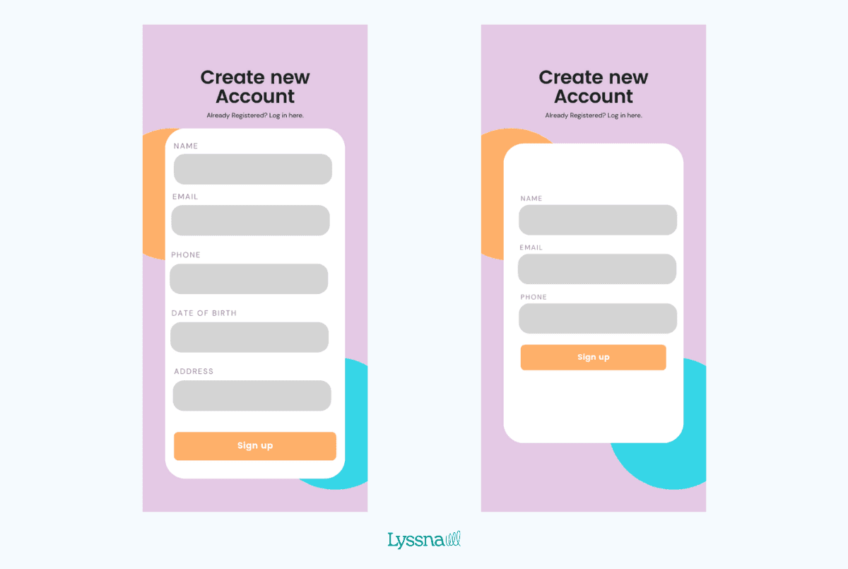
Two examples of a new account registration form. On the left is a complex form, and on the right is simplified version. Consider exactly what information you need from users when they sign up to make this process quick and simple.
Predict and preempt
Show your users what the next step is, and predict what information or action they'll take. Assume there will be mistakes sometimes. Make it easy for users to know what those mistakes are and how to fix them.
Put the user first
Base your design decisions on what the user needs and wants. This means doing thorough research and making decisions based on what users say or do. Test out your ideas many times during the design process.
This principle extends beyond individual features – it means considering your users' contexts, limitations, and goals at every decision point.
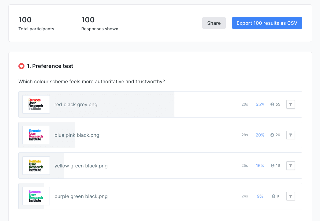
An example of preference test results in Lyssna, used here to help make decisions about which color scheme resonates best with the target audience.
Be consistent
Consistency is about making all the visual elements of your product similar. If you make a button a certain size and color, other buttons should look the same throughout the product.
Consistency means less visual clutter, making it easy for users to understand and navigate. It also builds trust – when users know what to expect, they feel more confident using your product.
Be clear, use common signposts
Don't let users guess where a button leads. And don't try to be too clever with cute but hard-to-identify icons or menu items. Again, keep it simple. Make sure that what the user sees is clear and use text when an image doesn't offer enough information to convey a message.
UI design kits, where commonly used and recognized icons are already designed for you, are a great way to avoid designing signposts that users will find hard to identify.
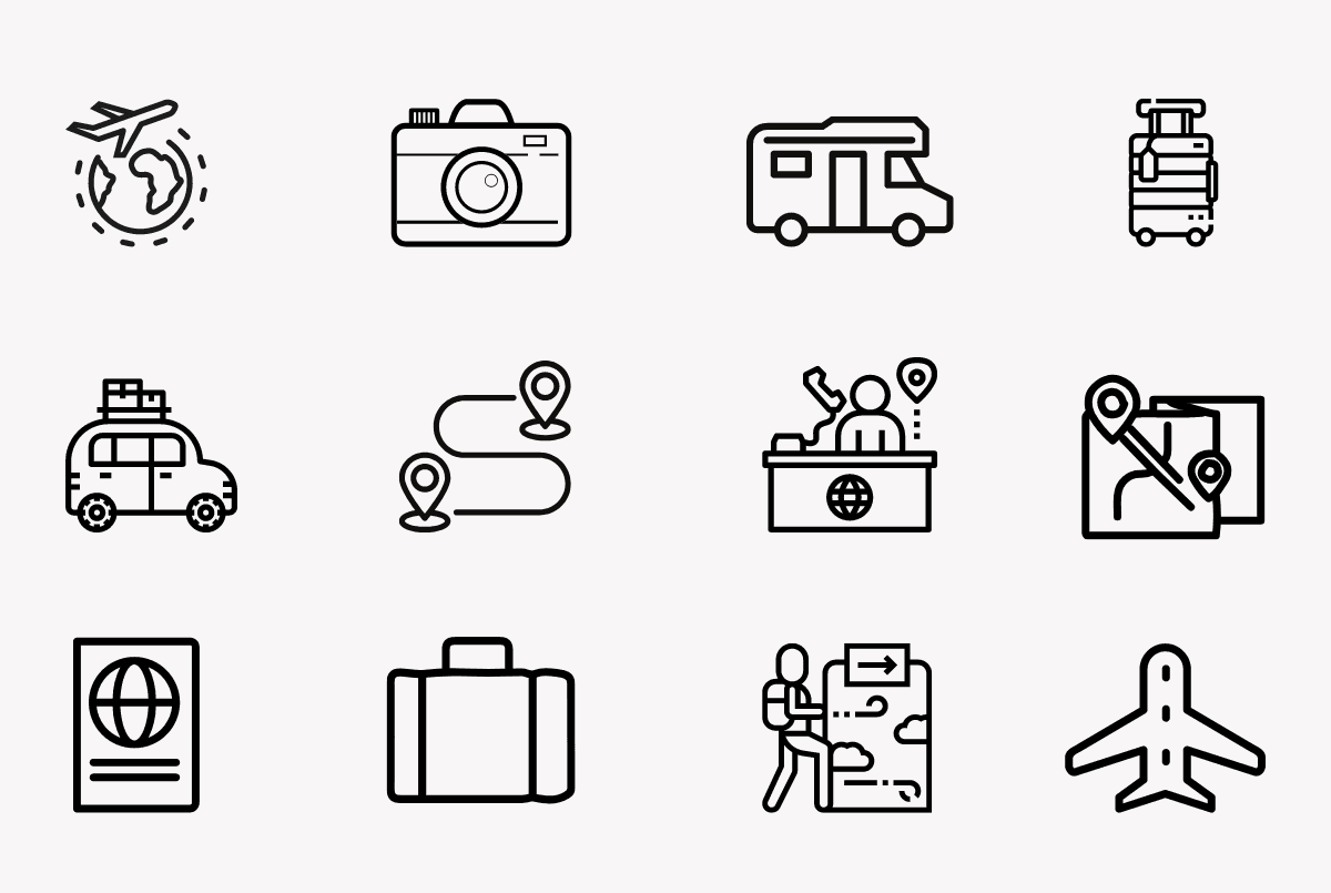
An example of a travel-themed icon kit.
Consider accessibility
What looks good for one user might not work for another, especially if they have accessibility needs. Visual impairments, motor limitations, and neurodivergence all need to be considered.
Key accessibility principles include:
Color contrast: Make sure text meets WCAG guidelines (4.5:1 ratio minimum).
Font sizes: Use readable typography (16px+ for body text).
Focus indicators: Make it clear where keyboard users are navigating.
Alt text: Provide descriptions for images and icons.
Touch targets: Make buttons at least 44px × 44px for mobile.
Establish visual hierarchy
Visual hierarchy guides users through your interface in order of importance. Use size, color, spacing, and typography to help users understand what to focus on first.
Strong visual hierarchy reduces cognitive load and helps users complete tasks more efficiently. Consider how your eye moves across well-designed interfaces – that's visual hierarchy at work.
Design for mobile-first
With mobile traffic exceeding desktop usage, designing for mobile-first ensures your interfaces work well on smaller screens and scale up beautifully. This approach forces you to prioritize the most important elements and interactions.
UI design process
UI designers often follow a similar process, though the specifics can vary depending on the project scope and team structure. Here are the steps most UI designers take to create effective interfaces.
Research and understand the brief
The first step is to make sure you understand what you're designing. In some cases, you might get precise instructions in the form of a brief. Otherwise, you'll need to do more research to understand the goals of the project.
Typical research activities include:
Stakeholder interviews to understand business goals.
Competitive analysis to see what exists in the market.
User research to understand target audience needs.
Technical constraints review with development teams.

Sketch and build a wireframe
Once the goal is clear, you can draw sketches and wireframes. These are initial drafts of what the final product will look like. Wireframes show where all the elements need to be. They're usually simplified, often black-and-white outlines of the imagined design.
This stage is about structure and functionality, not aesthetics. Focus on user flows, content hierarchy, and interaction patterns.
Design the components
This is where you begin to define the project's aesthetics. It's where you define the style and design the core elements of the product. Some designers work with an existing style guide. Others start from scratch.
Key components to design:
Buttons and form elements
Navigation patterns
Typography scales
Color palettes
Icon libraries
Grid systems
Define user journeys and task flows
This is where you clarify how a user gets from point A to point B, plus the detours they may take. UX designers and UX researchers are valuable for this stage of the process.
In some cases, a user journey is as simple as a series of screenshots showing the exact sequence a user will follow. In other cases, the user flow will be interactive. This can depend on the tool you're using.
Create high-fidelity designs
This is the step where UI designers shine. It's where you create all the visual elements, including colors, typography, images, icons, and animations. This is what makes the product look as close to the final version as possible.
Here, UI designers focus on visual consistency and branding. In some cases, the same software is used to design high-fidelity designs and prototypes. When that's the case, there's one less step to the process.
Build and test prototypes with real users
A prototype is an interactive version of a low- or high-fidelity design. Testing your prototypes with users is a necessary step before launching your product. This shows you what's confusing for users, and the results allow you to iron out errors and simplify the user flow.
Modern prototyping tools allow you to create realistic interactions without code, making it easier to test and iterate quickly. To streamline the testing process, many usability testing platforms integrate directly with popular design tools. For example, Lyssna's Figma integration allows you to import your Figma prototypes directly into user tests, eliminating the need to export files or recreate interactions – making the transition from design to testing seamless.

Collaboration touchpoints with developers
Throughout the design process, regular check-ins with developers help make sure your designs are feasible and align with technical constraints. Key collaboration moments include:
Early wireframe review to discuss technical feasibility.
Component design review to establish realistic timelines.
Handoff meetings to discuss implementation details.
QA reviews to ensure designs match the final product.
A special note about usability testing
To create a great product, a UI designer won't wait until the prototype is ready to test it. Instead, they test their designs throughout the product design process. They use card sorting exercises to define the information architecture. They do preference tests as they refine the look of their components. They run design surveys to see where the friction points are.
At Lyssna, we've seen how continuous testing throughout the design process leads to better outcomes. There are research methods and usability tests for every phase of the project – from early concept validation to final usability testing.
UI design tools
There are so many UI design tools available that you could almost use something different for each step of the design process. Thankfully, some tools allow you to do everything in one place. This means that as your project moves from ideation to final design, there's coherence and consistency.
Pen and paper
Before we get into specific software, it's worth talking about good ol' pen and paper. These are ideal when you want to quickly sketch ideas for your wireframes and user journeys. Sometimes, the fastest way to explore ideas is still the most analog.
Wireframing tools
A wireframe is a cleaned-up and simplified version of your pen and paper sketch. It shows all the elements of the design without color, interactive features, images, and videos.
Popular wireframing tools:
Balsamiq: Great for rapid, low-fidelity wireframes.
Sketch: Mac-only but powerful for wireframes and beyond
Whimsical: Excellent for flow charts and wireframes
Miro and Mural: Perfect for collaborative wireframing sessions
Design and prototyping tools
There are many tools available for creating high-fidelity designs and prototypes. When you're getting started, pick a tool and get to know it well. A lot of UI designers use these popular options:
Tool | Best For | Learning Curve |
|---|---|---|
Figma | Collaboration, web-based | Moderate |
Sketch | Mac users, plugin ecosystem | Moderate |
Adobe XD | Adobe ecosystem users | Easy |
InVision | Prototyping and collaboration | Easy |
Axure | Complex interactions | Steep |
Once you know how to use one tool well, learning others becomes much easier. Focus on mastering one before exploring alternatives.
Research and testing tools
There are two primary methods that UI designers use to gather data to support their design choices – moderated and unmoderated usability testing and research.
Moderated usability testing and research is done in person or remotely. Unmoderated usability testing uses online tools to gather insights without a facilitator present.
Online tools like Lyssna are excellent for running remote moderated and unmoderated usability tests like prototype tests, design surveys, five second tests, first click tests, or preference tests. With Lyssna, you can test using your own participants, or get fast results using our integrated research panel – perfect for validating design decisions quickly throughout your process.

AI design tools and emerging technology
The design landscape is evolving rapidly with AI-powered tools entering the market:
Figma AI: Auto-layout and design suggestions.
Adobe Firefly: AI-generated images and graphics.
Framer AI: Website generation from prompts.
Uizard: Transform sketches into digital designs.
While these tools are promising, they're best used to augment human creativity rather than replace the thoughtful design process.
Best UI design tools for beginners
If you're just starting out, we recommend:
Figma – free to start, excellent tutorials, web-based.
Canva – great for learning design principles with templates.
Lyssna – for testing your designs with real users.
Pen and paper – never underestimate analog sketching.
UI design teams
A UI designer rarely works in isolation. The best products emerge from collaborative teams where different expertise areas complement each other. Below are the key team members a UI designer will likely work with.
Product owners or product managers
Product owners or product managers are the captains of the product ship. They make sure the goals of the project are clear and that tasks are assigned to the right people at the right time. They might also take care of administrative tasks related to product and team management.
Typical interactions with UI designers:
Defining feature requirements and priorities.
Setting project timelines and milestones.
Facilitating stakeholder communication.
Making decisions when design and business needs conflict.
UX specialists
UX designers, UX researchers, and UX writers work closely with UI designers. Their research, findings, and decisions often overlap significantly. In some cases, a single designer assumes the role of UI/UX lead.
UX researchers provide insights about user behavior and needs that inform design decisions. UX designers focus on user flows and overall experience strategy. UX writers craft the words that guide users through interfaces.
The collaboration between UI and UX professionals is essential – UI designers bring UX insights to life through visual design, while UX professionals ensure those visuals serve user needs effectively.

Developers
Developers have the technical expertise to make UI designs come to life. They handle the back end of the product (coding, databases, programming) while UI designers work on the front end (what the user sees) of the product.
Frontend developers are UI designers' closest collaborators, as they're responsible for implementing the visual designs users ultimately see and interact with. Backend developers focus on server-side functionality that powers the interface.
Strong UI designer-developer relationships lead to better products and smoother project execution. Regular communication helps ensure designs are both beautiful and technically feasible.
Team structures and reporting relationships
In-house teams typically include:
Product Manager (leads strategy)
UX Designer/Researcher (leads user research)
UI Designer (leads visual design)
Frontend Developer (implements UI)
Backend Developer (builds functionality)
Agency teams might be more fluid, with designers wearing multiple hats depending on project needs.
Remote vs in-house dynamics: Remote teams rely heavily on collaborative tools (Figma, Slack, Zoom) and async communication. In-house teams benefit from spontaneous collaboration but need to be mindful of including remote team members when applicable.
Career progression in UI design teams
Junior UI Designer → Mid-level UI Designer → Senior UI Designer → Lead Designer → Design Director
Each level brings increased responsibility for strategy, mentorship, and cross-team collaboration.

UI design courses
Ready to start a career in UI design? You'll need a good balance of technical and soft skills. The good news is there are many ways to build these skills, from formal education to self-directed learning.
Technical skills
Most UI designers need expertise in several key areas. While some start with a degree in graphic design, others transition from different backgrounds entirely.
Core technical skills include:
Interaction design: Understanding how users interact with interfaces and designing smooth, intuitive experiences.
Branding and style guides: Creating cohesive visual systems that reflect brand personality and create consistency.
Wireframing: Sketching and creating low-fidelity representations of interface layouts and user flows.
Prototyping: Building interactive models of designs to test concepts and demonstrate functionality.
User research and testing: Understanding how to validate design decisions through user feedback and testing methodologies.
Design systems: Creating and maintaining libraries of reusable components and patterns.
Free vs paid learning resources
Resource Type | Free Options | Paid Options |
|---|---|---|
Courses | YouTube, Coursera free courses | Udemy, Skillshare, bootcamps |
Practice | Daily UI challenges, redesign exercises | Premium design challenges |
Tools | Figma free tier, Adobe XD free | Full Adobe CC, advanced Figma |
Testing | Lyssna free plan for basic testing | Professional research tools |
Degree programs vs bootcamps vs online courses
Traditional degree programs (2–4 years)
Pros: Comprehensive foundation, networking, structured learning
Cons: Time commitment, cost, may not reflect current industry practices
Cost: $20,000-$100,000+
Design bootcamps (3–12 months)
Pros: Intensive, job-focused, portfolio development
Cons: Fast-paced, expensive, variable quality
Cost: $10,000–$20,000
Popular options: General Assembly, Springboard, CareerFoundry
Online courses (Self-paced)
Pros: Flexible, affordable, learn at your own pace
Cons: Requires self-discipline, limited networking
Cost: $50–$500 per course
Many successful UI designers have taken the self-taught route, combining online courses with practical projects. Nicolene van Staden, a self-taught UX/UI designer at Oxford Instruments, shares her experience:
"I am self-taught and a lot of my skills were transferable. I was fortunate enough to land a job that was willing to train me for their needs."
This demonstrates that with dedication, the right resources, and opportunities to apply your skills, you can successfully build a UI design career regardless of your educational path.

Recommended courses and certifications
For beginners:
DesignerUp UI Design Crash Course (Free) – Great introduction to fundamentals.
Google UX Design Certificate (Coursera) – Comprehensive program with job placement support.
Figma Design Basics (Free) – Learn the most popular design tool.
For intermediate learners:
CareerFoundry UI for UX Designers – Specialized course bridging UX and UI.
Coursera UI/UX Design Specialization by CalArts – University-level course covering advanced design principles and prototyping.
IxDF (Interaction Design Foundation) – Academic-quality courses at affordable prices.
For advanced practitioners:
Designlab's AI for UX Design – Highly relevant, and specifically designed for experienced designers (2-5+ years).
Designlab's Advanced Figma – Focuses on advanced technical skills with design tokens, auto-layout, and component management.
Creating a design portfolio
After completing courses, most UI designers need to work on a portfolio before landing their first job. Your portfolio is often more important than your formal education when it comes to getting hired.
What to include:
3–5 strong projects showing your design process, not just final designs.
Case studies that explain your thinking, research, and iteration process.
Before and after examples showing problem-solving skills.
Personal projects that demonstrate passion and initiative.
Real work from internships, freelance projects, or volunteer work.
Portfolio platforms:
Personal website (most professional option).
Behance (great for discovery).
Dribbble (popular design community).
Semplice (designed specifically for design portfolios).
Your portfolio can include school projects, volunteer work, or even mock projects that simulate real product challenges. The key is showing your design thinking process, not just pretty visuals.
Soft skills
A degree and a portfolio are not all you need. Because UI designers usually work as part of a team, these essential skills are also crucial:
Creativity: You'll need creativity to convey messages, guide users to the right place, and bring products to life. But this isn't just artistic creativity – it's problem-solving creativity.
Problem-solving skills: Your job will involve helping users, considering what other team members need, and staying on brief. This can often feel like assembling a giant puzzle with constantly changing pieces.
Attention to detail: Writers need to spot typos. UI designers need to spot visual elements that seem out of place. All interactions should work as intended and elements should be consistent across the entire product.
Collaboration: A UI designer works with many other product team members. You'll need to take your team members' concerns into account when making design decisions, even when those concerns conflict with your initial vision.
Communication and presentation skills: As part of the job, you'll present and explain your designs to stakeholders who may not have design backgrounds. Being able to articulate your design decisions and their business impact is crucial.
Start testing today
Transform your UI designs with user insights. Join thousands of designers using Lyssna to create better interfaces.
How long does it take to become a UI designer?
Self-taught route: 6–18 months of dedicated learning and practice.
Bootcamp route: 3–6 months intensive program + 3-6 months job searching.
Degree route: 2–4 years + portfolio development time.
Career transition: 6–12 months while working in your current role.
The timeline varies greatly depending on your starting point, available time for learning, and career goals.
Where to learn more about UI design
While we've covered the basics of what UI design is, you can keep learning and find like-minded UI enthusiasts on these sites:
Lyssna resources: We offer a comprehensive collection of learning materials including our blog, practical guides, templates, videos, and free workshops to help you understand user research and UX/UI design, with actionable content for testing and validating your design decisions throughout the design process.
Dribbble: Part community, part visual blog, Dribbble is a place where you can share your designs, get feedback, and get inspired by other designers.
DesignerUp: While they've got lots of information about design, DesignerUp's free UI designer crash course is worth checking out. From there you can decide if you'd like to deepen your knowledge with the rest of their resources.
Figma Community: An active hub where designers share templates, UI kits, plugins, and design resources. It's perfect for finding inspiration, learning from real projects, and accessing free design assets created by the global design community.
CareerFoundry: This site is ideal if you're looking to change careers in tech. They offer courses on UI design, user experience design, and web development, with a specialized course on UI for UX designers.
Design communities to join:
Designer Hangout (Slack community)
Reddit communities (r/userexperience, r/web_design)
Local meetups and design events
FAQs about UI design

Marie-Pier Rochon
UX copywriter and author
Marie-Pier Rochon is a Brisbane-based UX copywriter who specialises in making complicated technical topics sound simple. She loves learning and writing about UX, design, and technology, and wrote a book called UX Writing Basics. You can also find her on LinkedIn.
You may also like these articles


Try for free today
Join over 320,000+ marketers, designers, researchers, and product leaders who use Lyssna to make data-driven decisions.
No credit card required