03 Oct 2023
|19 min
Information architecture in UX design: A complete guide
Improve your UX with better information architecture. Boost usability, help users navigate, and create a seamless experience.


Key takeaways:
Information architecture (IA) is the backbone of any user-friendly digital experience, helping users find what they need quickly and intuitively.
Strong IA supports both UX and business goals – from boosting conversions to reducing support costs.
The IA design process involves understanding users, auditing content, and structuring information in ways that scale.
Validation methods like card sorting, tree testing, and live testing reveal how users actually interact with your architecture.
Visualizing IA through hierarchy diagrams and design cues improves clarity, usability, and cross-team communication.
There’s a mansion in San Jose you can visit that shows what happens when architecture goes off the rails. A wealthy widow spent decades renovating it, adding staircases to nowhere, doors opening into thin air, and ornate windows facing blank walls. It’s a physical reminder of why architects exist.
The same logic applies to websites. When you can’t find a contact page, search turns up nonsense, and blog posts feel like they belong to another site entirely – you’re looking at poor information architecture.
Information architecture (IA) is the discipline that wrangles content and functionality into a coherent structure. Like real architecture, it lays the foundation for future growth. Without it, a website can quickly become a digital funhouse – all flash, no function.
In UX, IA plays a pivotal role in making digital experiences usable, scalable, and aligned with real user needs. And it's more essential than ever.
Get started with these information architecture templates
Use our expertly-crafted templates to start improving your information architecture today.
What is information architecture in UX?
Information architecture (IA) is the practice of organizing, structuring, and labeling content so users can easily find what they need. It draws on insights from multiple disciplines – including design, marketing, and customer support – to shape how content is presented and connected.
IA and user experience design often work hand in hand, but they’re not the same. UX focuses on the full experience a user has with a product or service. IA is more specific: it ensures that content is arranged in a way that makes sense to the people using it.
Deliverables like sitemaps, navigation systems, and content hierarchies are direct outcomes of IA work. It’s the behind-the-scenes logic that helps digital products feel intuitive from the first click.
Why information architecture matters more than ever – the benefits
The digital landscape is more crowded – and more impatient – than ever. Today’s users expect fast, seamless access to information, whether they’re shopping, researching, or signing up – and they’ll give you just 47 seconds on average before switching focus to something else.
Businesses are under real pressure to make every interaction count. And that’s where strong information architecture makes a measurable difference.
How IA impacts user experience
Good information architecture makes digital experiences feel effortless. When content is organized around user needs, people don’t have to think about where to click next – they just find what they’re looking for.
IA helps you support different search behaviors:
Direct seekers want to get in and out quickly. IA ensures clear paths to key pages.
Explorers are browsing for ideas. IA helps surface related content and suggestions.
Deep divers are digging into detailed research. IA allows them to move deeper without getting lost.
Return visitors want to retrace their steps. IA makes their past journeys easy to revisit.
Take ecommerce, for example: a clean category hierarchy, faceted search, and clear labeling can mean the difference between a bounce and a purchase.
Business wins from better IA
Information architecture isn’t just a UX concern; it has real business upside.
Internally, strong IA boosts team productivity by making it easier to locate and manage content. That means fewer bottlenecks and faster launches.
It also improves conversions. When users find what they need without friction, they’re more likely to act – whether that means buying, signing up, or returning. Better onboarding and navigation paths help reduce drop-off and support long-term engagement.
On the marketing side, IA helps users discover content naturally, cutting down the need to spend on ads or remarketing. Structured, well-linked pages also perform better in search engines, and when self-service flows are easier to follow, support costs go down too.
How to design information architecture
Whether you’re building a digital product from the ground up or attempting to renovate a preexisting website, the process typically follows a few time-honored steps.
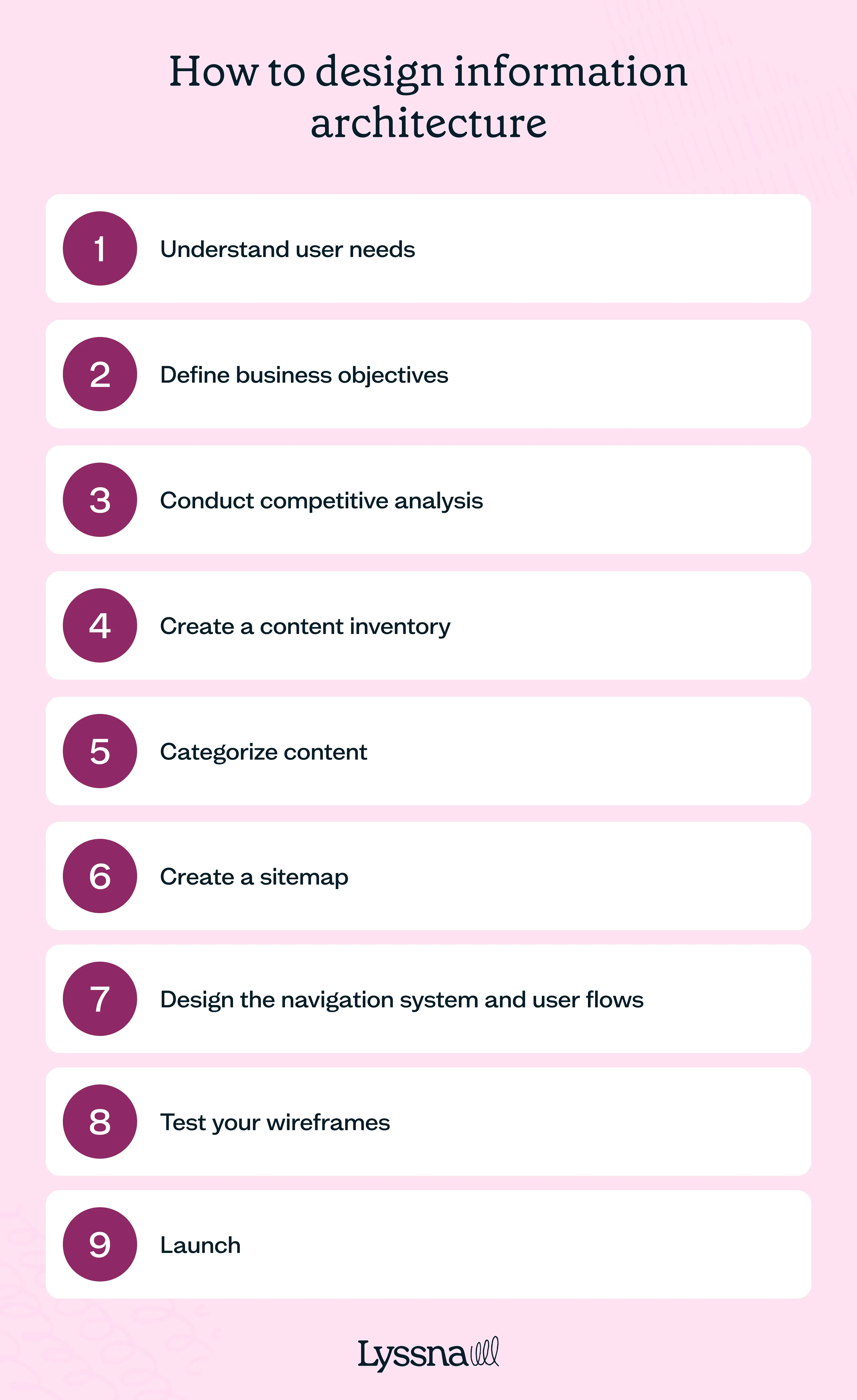
1. Understand user needs
As always, start with users. Who will be using your product and what do they want to do? Conduct remote user research to understand the target audience, their goals, and the tasks they need to accomplish using your website or app. Gather insights through methods like interviews, surveys, and analytics data.
Other user research tools – like mental maps and personas – can be helpful here, as they’ll help you keep specific humans in mind once you’re designing.
Pro tip: During user research, capture edge cases – not just averages.
Personas and analytics often focus on majority behavior, but IA often breaks down for edge-case users: someone using a screen reader, a first-time visitor from a niche segment, or someone accessing content via mobile search. Actively collect insights from outliers – they’ll reveal friction points that typical flows overlook.
2. Define business objectives
Turn to internal stakeholders to get a grip on what the needs of your business are – perhaps even what precipitated this interest in a reorganization of the information architecture.
Typically, this is some sort of growth: more users, more sales, more sales per user. Regardless, understanding the ultimate business objectives provides KPIs and metrics to test against further downstream. It will also help build buy-in when it comes to presenting the sitemap to internal stakeholders: you can clearly explain how it ladders up into business objectives.
3. Conduct competitive analysis
Users don’t arrive at your product in a vacuum. They will have visited competitors’ products and will likely have expectations about how a site or app like yours should be laid out, as well as the words you use to describe similar categories. Conducting a competitive analysis UX can also generate opportunities – perhaps no competitor is producing evergreen informational content, highlighting the potential for a serious SEO campaign. These should all be factored into the IA’s “blueprint.”
4. Create a content inventory
This step will go a little differently whether you’re working on an existing site or creating a new one. If you’re working on an existing site, compile a comprehensive inventory of pages and sections, perhaps on a spreadsheet containing information like page title, URL, type of content, age (how current the content is), and who owns it (perhaps by department). This helps you understand the breadth of information that needs to be sorted and where there are potential gaps.
If you’re building an architecture for a net-new website, this process plays out a little differently, involving conversations with departmental heads about what sort of pages they’d like to see in the short and long term. Still, seek to be comprehensive in this situation, too – a spreadsheet similar to the one described above would still be appropriate, even if the pages are more hypothetical.
Pro tip: When building your content inventory, assess content value, not just quantity.
It’s tempting to treat all existing pages equally, but volume doesn’t equate to value. Audit content using a simple matrix (e.g. by performance, accuracy, and strategic fit) to identify what to keep, cut, merge, or rewrite. This saves time later and ensures your IA supports content that actually matters.
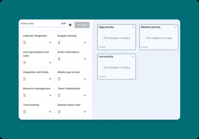
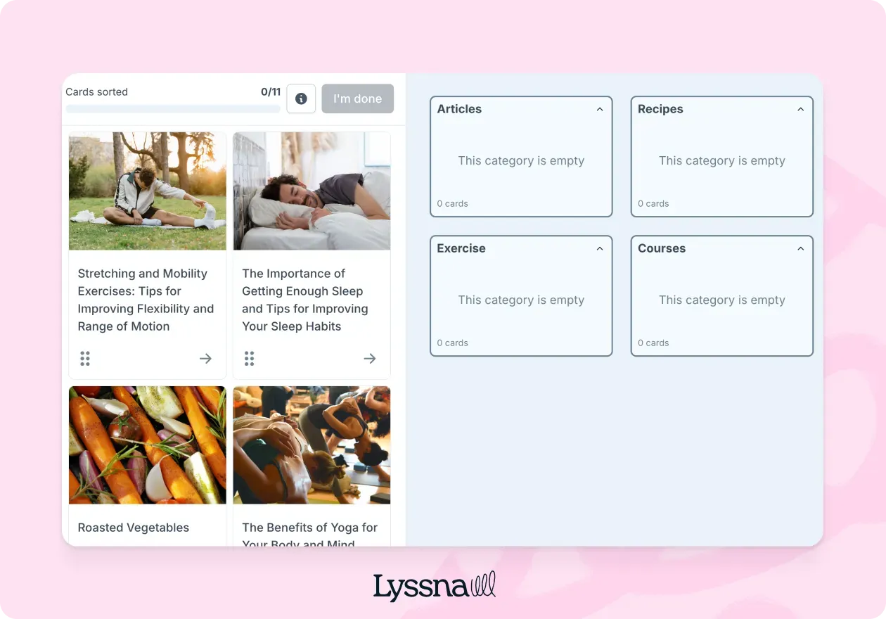
5. Categorize content
All of the content that you’ve inventoried needs to be categorized. There are a number of ways to do this, but card sorting can work well: writing the names of all the different types of content down and having them sorted logically by your target audience. So, pages for “sandals” and “boots” could be grouped under “footwear” for an ecommerce site. A content initiative for a landscaping business may result in categories like “gardening” and “DIY projects.”
All of these categories help you better understand how your users group different types of information, after which they can be nested into a sitemap.
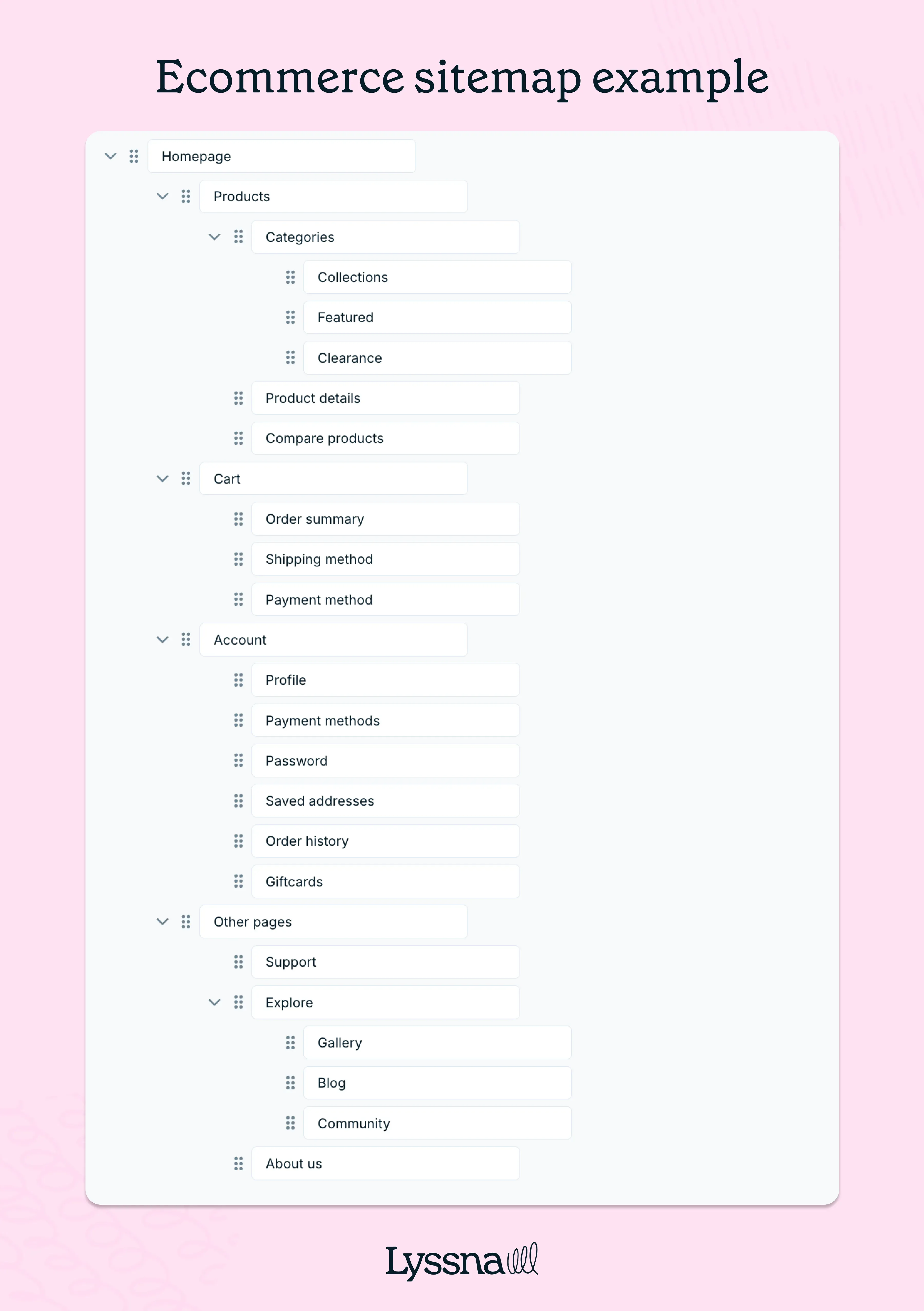
6. Create a sitemap
Here’s where the categories are sorted into a coherent structure. Often this is hierarchical, where top-level categories (like shoes) have subcategories (like sandals). A top-level “Help” category may link to both “contact us” and “troubleshooting” options.
A well-structured sitemap should resemble a diagram, with top-line boxes representing categories and nested sub-sections branching beneath them. As information architect Peter Morville puts it, “Findability precedes usability. In the alphabet and on the Web. You can’t use what you can’t find.”
That clarity is exactly what a strong sitemap delivers – a blueprint that helps users locate content quickly and intuitively.
7. Design the navigation system and user flows
Once you have a sitemap, you can design a system for users to navigate it: perhaps a menu bar at the top of the page that remains visible on all pages, or a pop-out menu on an app that’s always visible as three lines. Then go back to some of those personas and user research you did earlier and test the navigation internally with a few different scenarios.
Can you search for and purchase a particular product? Can you browse for gift ideas? Can a new user who came via search quickly learn more about the company and sign up for the newsletter? These internal validations will eventually get tested by users, but the user flows are important to mock up internally.
8. Test your wireframes
Create wireframes or low-fidelity prototypes to visualize the information architecture. Run a prototype test or navigation test and iterate on the designs, ensuring that the content is organized logically and the navigation is intuitive. Seek feedback from users and stakeholders during this phase.
Pro tip: While testing wireframes, observe hesitation – not just success.
Even when users technically complete a task, hesitation reveals uncertainty. Are they pausing before clicking? Backtracking? Switching tabs? These micro-moments highlight issues with label clarity or category logic. Use screen recordings or in-person observation alongside task completion metrics for a fuller view of your IA's effectiveness.
9. Launch
When the wireframes seem sturdy enough to build out, create the real product and put it in the wild. Of course, like other types of user-centered design, creating an information architecture is iterative, meaning at any point it may be advisable to move back up to earlier steps. This continues even after the product is launched – a wider field of users means more data to be checked against KPIs, such that refinements can continue.
Testing your information architecture: Validation methods
Even the best-planned information architecture needs testing. Why? Because the way you think content should be organized might not align with how your users actually look for it. That’s where IA validation methods come in – helping you check assumptions, reduce friction, and improve findability based on real behavior.
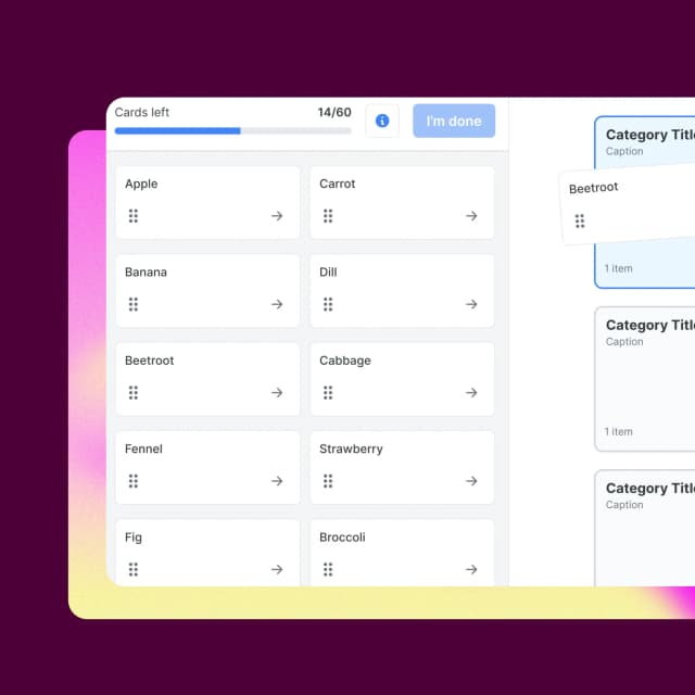
Card sorting: Understanding user mental models
Card sorting helps you uncover how users naturally group and label information. It reveals mental models – the way people expect your content to be organized.
Open card sorting asks users to create their own categories for a given set of content items. This is useful early on, when you want to discover patterns without constraints.
Closed card sorting gives users predefined categories and asks them to slot items accordingly. It’s better when you’re validating or refining an existing structure.
Hybrid card sorting combines both approaches – participants sort into predefined categories while also having the freedom to create their own. It's useful when you want to validate an existing structure without ruling out what you might have missed.
Example: An open card sort for a travel booking site might reveal that users expect “Hotels,” “Flights,” and “Experiences” to be separate – even if your current setup combines them under “Trips.”
Pro tip: For the most complete picture of your IA, pair card sorting with tree testing. Use card sorting first to understand how users naturally group content, then use tree testing to validate whether they can navigate the structure you've built from those insights. The two methods work best in sequence, not in isolation.
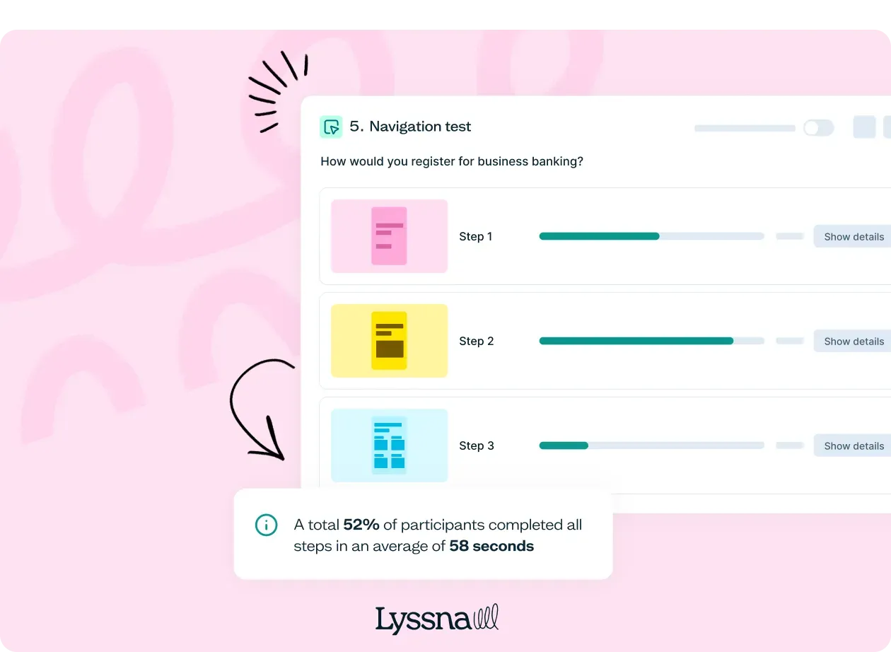
Tree testing: Evaluating navigation structure
Tree testing is a lightweight way to assess whether users can find information in your proposed hierarchy without being influenced by layout, colors, or design.
You present users with a text-based version of your site’s structure (the “tree”) and ask them to complete tasks like “Where would you go to update your billing info?”
Key metrics include:
Success rate – Did users find the correct spot?
Directness – Did they go there without backtracking?
Time on task – How long did it take?
Pro tip: For best results, pair tree testing with card sorting. Start with card sorting to shape your structure, then use tree testing to validate whether people can navigate it effectively. The two methods work best in sequence, not in isolation.
Live website testing: Real-world validation
Once your IA is implemented, live website testing shows how it performs under real conditions – with all the visuals, interactivity, and distractions in play.
You can run task-based usability tests, asking users to complete specific actions while tracking completion rates and time on task. Or use heatmaps and click tracking to see where people focus their attention and where they get stuck.
The value here is in combining:
Quantitative data like success rates, bounce rates, and click paths.
Qualitative insights from open-ended feedback and observed confusion.
This dual lens gives you a fuller picture of what’s working – and what needs adjusting.
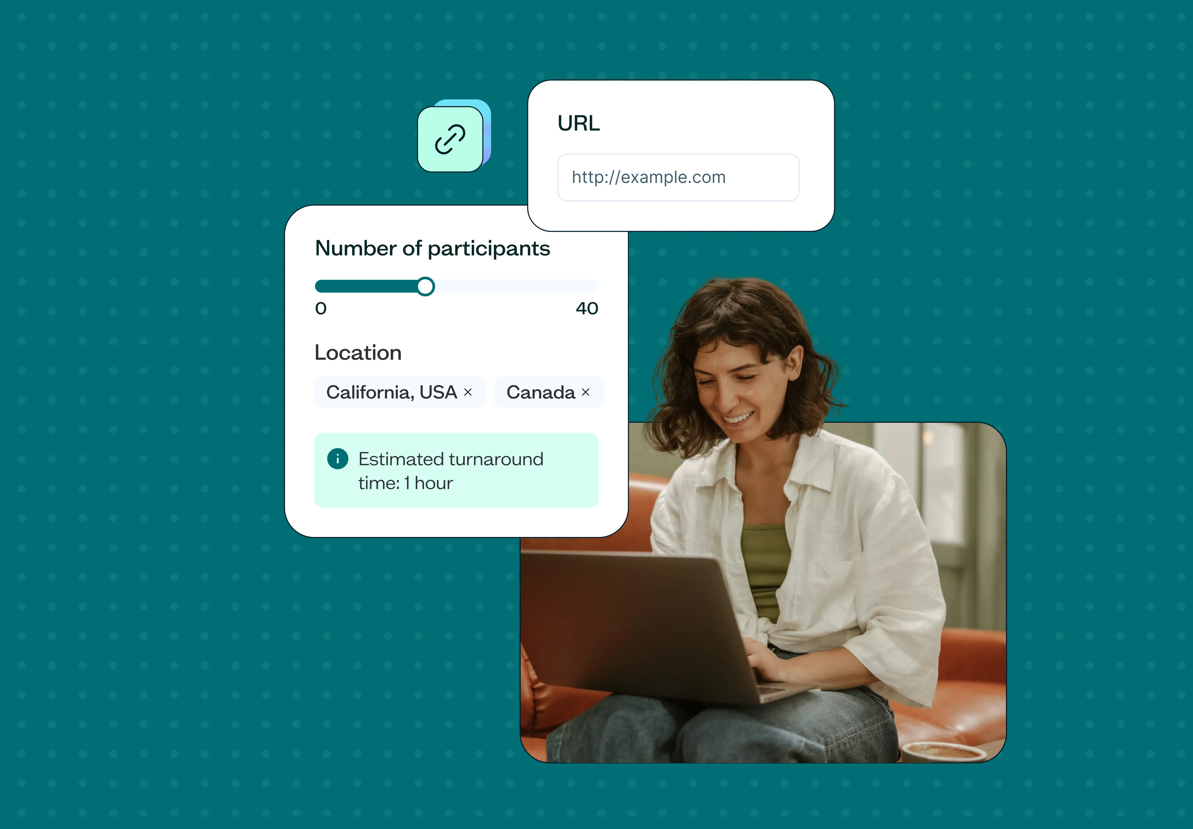
Tools like Lyssna make this type of testing easier by letting you run navigation tests, prototype tests, and surveys with real users, and see where your information architecture may need refinement.
Visualizing information architecture: Hierarchy, flow & clarity
IA doesn’t just live in spreadsheets and strategy docs – it needs to be seen and experienced. Visualizing your information architecture makes it easier to spot inconsistencies, communicate structure to stakeholders, and test usability with real users.
Hierarchy and flow diagrams turn abstract ideas into something tangible. Whether you’re mapping out a sitemap, navigation path, or multi-step user journey, strong visuals help clarify relationships and reveal blind spots early.
Let’s look at how to bring your IA to life visually.
How to build and showcase visual hierarchy
Visual hierarchy shows users what to focus on first, next, and after that. It reflects the structure of your IA – and influences how people interact with your site or product.
Start with clear page-level hierarchy: major sections should be immediately visible, with consistent formatting that distinguishes headings from subheadings and body content. Apply the same logic across your site-level hierarchy, using diagrams like sitemaps and user flow charts to define relationships between pages.
Tools like Lucidchart, Miro, or OmniGraffle make it easy to build and iterate on these diagrams collaboratively. They’re especially useful when aligning cross-functional teams or reviewing with stakeholders.
Using shapes, colors & visual elements to clarify hierarchy
Visual cues like shape, size, and color help users understand structure before they read a word. A well-designed IA diagram should use these cues to clarify meaning, not just look nice.
Shapes can represent different content types (e.g. circles for static pages, rectangles for interactive flows).
Colors can group related content or indicate user pathways.
Lines and arrows show connections, loops, or parent-child relationships between content blocks.
Just keep it consistent. Visual hierarchy loses power when every element competes for attention or uses design cues arbitrarily. Use restraint, test for readability, and make sure your diagrams speak clearly – even without narration.
The 8 principles of information architecture
One way to test your information architecture is to take a look at some of the bedrock principles of the field. Originally formulated by the UX designer Dan Brown, these eight principles have slightly abstract names, but their actual definitions are fairly straightforward.
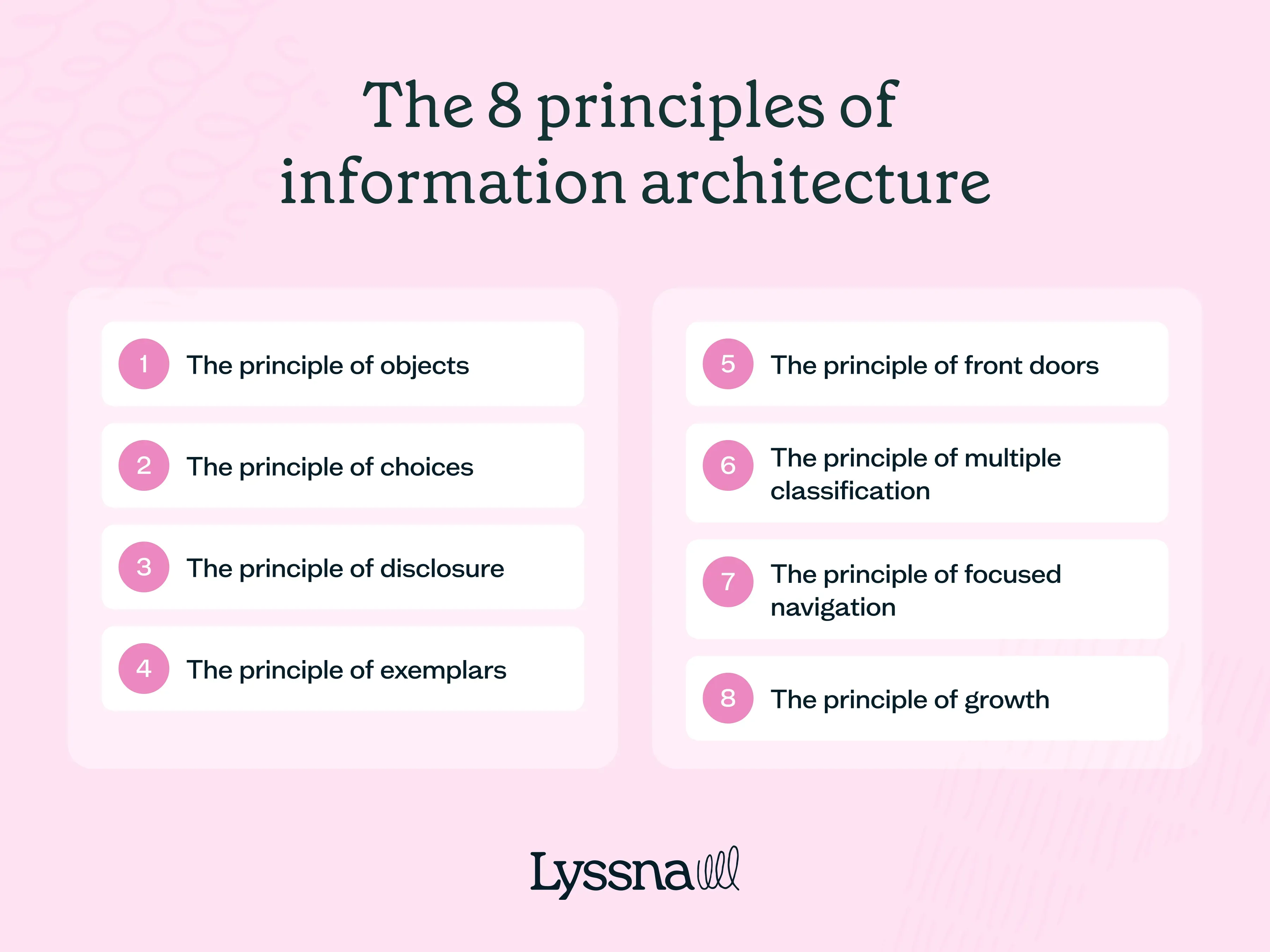
The principle of objects
“Treat content as a living, breathing thing with its own structure, attributes, and behaviors.” For example, a news website may treat each article as an individual object with its own unique URL, metadata, and related content, and it may require more frequent updates for breaking news; the same website may treat its customer service page as a much more static experience.
The principle of choices
“Create pages that offer meaningful choices to users, keeping the range of choices available focused on a particular task.” A landing page at an ecommerce website may offer two paths — “shop” and “learn more” – rather than making users choose between all the possible models and types of content upfront.
The principle of disclosure
“Show only enough information to help people understand what kinds of information they'll find as they dig deeper.” A software application may initially present users with a high-level overview, revealing more advanced features and settings only when users express interest or need for them.
The principle of exemplars
“Describe the contents of categories by showing examples of the contents.” For example, a grocery delivery site may show icons that represent different types of products in each “aisle.”
The principle of front doors
“Assume at least half of the website’s visitors will come through some page other than the home page.” Users who arrive via search, paid campaigns, and direct email blasts likely all have different expectations. Design funnels for each accordingly.
The principle of multiple classification
“Offer users several different classification schemes to browse the site’s content.” For example, a recipe website might allow users to browse recipes not only by cuisine type but also by dietary restrictions and cooking time.
The principle of focused navigation
“Don't mix apples and oranges in your navigation scheme.” This means that navigation systems should be consistent – a bar at the top of the page shouldn’t shift and use different words once users click into different types of content.
The principle of growth
“Assume the content you have today is a small fraction of the content you will have tomorrow.” For example, don’t assume because you don’t want a blog now that you never will.
If you’re wondering if you’ve designed a sturdy blueprint for a website, try running through these principles to see if they apply. Is there room to grow? Is the navigation consistent? Can users learn more as they choose to? These questions will help ensure your information architecture is sturdy enough to support your website or app into the future.
Popular tools for information architecture
Many of the tools used to design information architecture are similar to those used in UX design principles. Some of the most helpful include:
Lyssna: Evaluate the effectiveness of your navigation structures by testing with real people. Run a prototype test or navigation test on the overall usability of your information architecture, recruit your own users or from our research panel, and collect actionable data.
Axure RP: A prototyping tool for creating interactive wireframes and prototypes, including hierarchical structures and sitemaps.
OmniGraffle: A diagramming tool with shapes, connectors, and templates.
Lucidchart: A web-based diagramming tool with collaboration features.
Microsoft Visio: A tool for creating detailed information architecture diagrams and visualizations.
Test your information architecture with Lyssna
Ready to improve the usability and effectiveness of your website’s information architecture for UX? Try Lyssna, a powerful tool that allows you to test your navigation structures and gather valuable insights from real users. With features like prototype testing and navigation testing, you can ensure your information architecture is intuitive and user-friendly.
Test your IA today
Ready to validate your information architecture? Try Lyssna free and see how real users navigate your site structure.
Frequently asked questions about information architecture in UX
You may also like these articles


Try for free today
Join over 320,000+ marketers, designers, researchers, and product leaders who use Lyssna to make data-driven decisions.
No credit card required