19 Aug 2025
|19 min
Ecommerce user experience
Learn how to create exceptional ecommerce user experiences through design, usability, and SEO strategies that increase conversions and customer satisfaction.
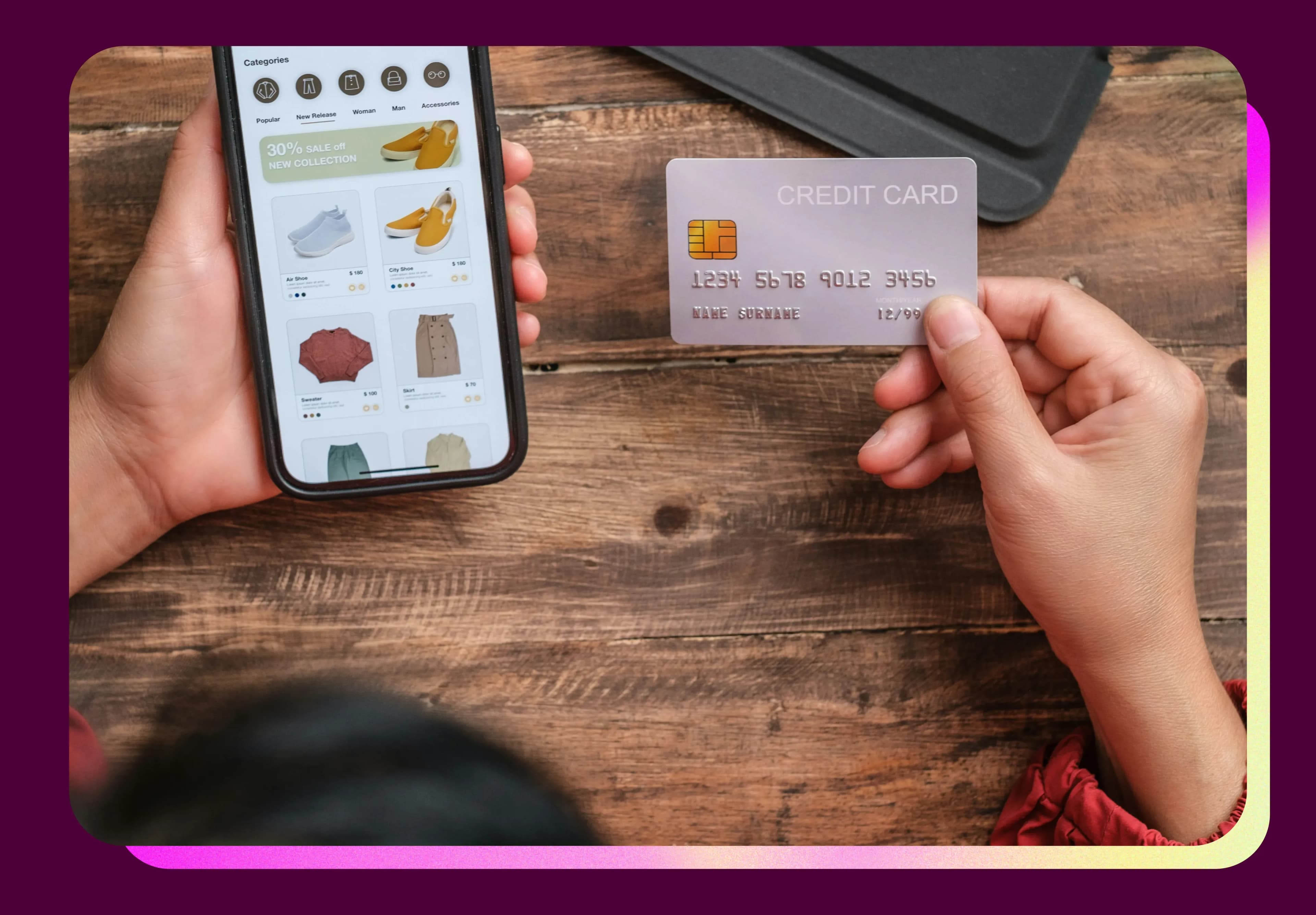
Have you ever wondered why some online stores feel like a breeze to shop on while others make you want to close your browser tab immediately? The difference often comes down to user experience – and the stakes couldn't be higher for your business.
Consider this: 88% of consumers won't return after a bad user experience, and with cart abandonment rates averaging around 70%, every friction point in your shopping experience is costing you real money.
This guide shares proven strategies for creating exceptional ecommerce experiences that drive real business results. You'll discover actionable tactics, see examples from top-performing sites, and learn how to optimize both B2C and B2B shopping experiences.
Key takeaways
User-centered design drives results: Successful ecommerce sites understand their customers' actual needs through research, not assumptions – companies like FORM saw 89% longer engagement times by validating ideas with real customer feedback.
Fix the fundamentals first: Site speed, mobile optimization, and streamlined checkout processes deliver immediate impact – focus on removing friction before adding advanced features.
Test continuously with real users: Run usability tests with 5–8 participants, use behavioral data to identify pain points, and iterate based on actual user behavior rather than internal opinions.
B2B requires specialized approaches: Business buyers need detailed specifications, approval workflows, and multi-stakeholder support – don't apply B2C strategies to B2B platforms.
Measure what matters: Track conversion rates, cart abandonment, and customer lifetime value as primary metrics, but don't forget supporting indicators like page load times and search success rates.
SEO and UX work together: Optimize for search intent, implement rich snippets, and focus on Core Web Vitals – the best SEO strategies improve user experience simultaneously.
Test your UX
Discover what your customers really think about your ecommerce site. Start free user testing with Lyssna today.
Ecommerce user experience best practices
What makes an ecommerce experience truly exceptional? Understanding what your users need and designing experiences that make those needs effortless to fulfill.
Prioritize user-centered design
The most successful ecommerce sites truly understand their customers. User-centered design means putting your shoppers' goals, challenges, and behaviors at the heart of every decision.
Start with user research to understand customer motivations. What brings them to your site? What information do they need to feel confident buying? The insights you uncover will guide every design decision that follows.
Start by building detailed user personas with Lyssna's user persona template to gather insights about demographics, behaviors, motivations, and challenges that guide better product design decisions.
Build trust through transparency
Trust is the foundation of every successful ecommerce experience. Be upfront about shipping costs, return policies, and security. Show real customer reviews, display security badges prominently, and make contact information easy to find.
Remember: customers compare multiple sites before buying. The most trustworthy site usually wins the sale.
Optimize for decision-making
Customers constantly make decisions – which product to view, whether to add to cart, whether to complete purchase. Support confident decision-making by providing the right information at the right time without overwhelming shoppers.
Use progressive disclosure to reveal complexity gradually. Help customers compare options easily and save items for later consideration.

Create seamless cross-channel experiences
Today's shoppers think in brands, not channels. Ensure consistent design language, synchronized shopping carts, and unified customer data across touchpoints. When customers feel remembered regardless of interaction method, it builds loyalty and reduces friction.
Focus on accessibility and inclusivity
Accessible design ensures everyone can shop successfully. This includes customers with disabilities, slow internet connections, older devices, and challenging environments.
Accessibility improvements often benefit everyone – larger tap targets help mobile users, clear contrast helps outdoor shopping.
Continuously evolve based on feedback
The best ecommerce experiences constantly evolve based on customer needs. Create feedback loops through support tickets, reviews, and user research. Be willing to admit when something isn't working and fix it.
How to improve user experience on ecommerce websites
Ready to make your online store more customer-friendly? Let's walk through practical steps you can take to create better shopping experiences that drive real results.
Start by measuring where you are
Before making any changes, you need to understand your current performance. This baseline will help you prioritize improvements and measure their impact.
Once you've established your baseline metrics, use this matrix to prioritize which improvements will have the greatest impact on your business:
Improvement Type | Impact Level | Implementation Effort | Typical Timeline | Success Metrics |
|---|---|---|---|---|
Site Speed Optimization | High | Low-Medium | 1-2 weeks | Page load times, bounce rate |
Mobile Experience | High | Medium | 2-4 weeks | Mobile conversion rate, mobile traffic |
Checkout Process | High | Medium-High | 3-6 weeks | Cart abandonment, conversion rate |
Product Page Enhancement | Medium-High | Low-Medium | 1-3 weeks | Time on page, add-to-cart rate |
Navigation & Search | Medium-High | Medium-High | 4-8 weeks | Search success rate, pages per session |
Personalization | Medium | High | 6-12 weeks | Return visitor rate, AOV |
Trust Signals | Medium | Low | 1-2 weeks | Conversion rate, time on site |
Essential measurement setup:
Install Google Analytics 4 with ecommerce tracking.
Set up heatmapping tools (Hotjar or Microsoft Clarity have free plans).
Document baseline conversion rate, cart abandonment rate, and bounce rate.
Conduct user research to identify real problems
Don't guess what your customers want – ask them directly. The most impactful improvements come from understanding actual user pain points.
FORM, a fitness technology company, learned this lesson when building their smart goggle platform. "What I think and what my colleague thinks doesn't matter if it's not in line with what our customers expect," explains Blaze Jemc, Director of eCommerce at FORM. This realization led them to implement ongoing research rather than relying on internal assumptions.
"We could create structured customer validation instead of just relying on assumptions – Lyssna made that possible," adds Blaze. The result? Their research-driven approach led to 89% longer engagement times and measurable sales improvements.
Run usability tests
Recruit 5-8 participants for realistic tasks like finding products or completing purchases.
Use live website testing (a Lyssna feature) to watch real navigation.
Review heatmaps for rage clicks and form abandonment points.
Document where users struggle, get confused, or express frustration.
TrueCar's approach exemplifies this methodology. "What we need is something that allows us to get up and running very fast, have direct conversations over a trusted tool that allows us to gain insights and take actions in the same week," explains Justin Nowlen, Senior Director of Product Design at TrueCar.
Their research revealed fascinating insights: "We have become more aware of the laser-like focus of our users' eye. There were things that we thought were really additive to someone's understanding of the selection presented, and it was ignored."
Survey your customers
Create focused surveys about specific shopping experience aspects.
Ask recent purchasers what almost stopped them from buying.
Ask cart abandoners what prevented purchase completion.
Reach beyond existing customers to avoid bias.
Bower Collective learned this when trying to understand potential customers who hadn't yet made sustainable choices. "If you're just sending emails or social media messages out to your current customers, there's a big question mark over how unbiased and how non-leading that research is," explains Fiona Cliffe, Head of Product at Bower Collective.
Fix the basics first
Start with improvements that have immediate impact and don't require major restructuring.
Optimize site performance
Compress images (under 200KB), enable caching, use CDN.
Ensure 44x44 pixel touch targets, test on real devices.
Minimize form fields and fix viewport issues.
Implement lazy loading for images.
Improve product pages
Add multiple images from different angles, in use, with size references.
Write benefit-focused descriptions that answer common questions.
Display shipping info, delivery times, and costs upfront.
Make ratings and reviews prominent.
Include trust signals: security badges, return policies, guarantees.
Show stock levels when low and highlight limited-time offers clearly.
Streamline the path to purchase
Once the basics are solid, focus on removing friction from key user journeys.
Simplify navigation and search
Run card sorting to understand how customers organize products mentally.
Implement smart search with autocomplete and typo tolerance.
Create helpful filters by relevant attributes (size, price, availability, ratings).
Add breadcrumbs and test menu structure with new visitors.
Use Lyssna's card sorting template to discover how your customers naturally categorize and organize your products. This closed card sorting template presents participants with your products and predefined categories, helping you understand your target audience's mental model and determine the most logical way to arrange your ecommerce content.
Optimize your checkout process
Offer guest checkout and minimize form fields.
Show progress indicators and transparent costs upfront.
Provide multiple payment options (PayPal, Apple Pay, Google Pay).
Save cart contents for returning users.
Advanced improvements for better conversions
Once you've addressed fundamental issues, these enhancements can further boost performance.
Implement personalization
Show recently viewed items and related product recommendations.
Segment email campaigns based on browsing and purchase history.
Create dynamic homepage content for returning vs new visitors.
Build abandoned cart campaigns with timely reminders.
Add social proof and trust builders
Display customer reviews with photos and verified purchase badges.
Show real-time activity and feature testimonials.
Include trust badges and add live chat support.
Test and iterate continuously
A/B test key elements like button colors, CTA text, and page layouts. Run regular usability tests and monitor user feedback through on-site widgets and support tickets.
International marketplace Joom demonstrates the power of continuous testing. "We had some challenges that seemed quite simple, and they didn't need a long qualitative study in order to be resolved. They needed to be tested quickly, with just a couple of questions to know where we stand," shares Pavel Semenov, Head of Research at Joom.
Their commitment to rapid testing paid off significantly. One messaging test helped them develop their successful "Pay Less, Buy More" slogan. "We tested different slogan approaches in different languages and found that it's not the specific words that matter; it's the order," Pavel explains. The impact was so strong that competitors began copying their approach.
Measure the impact of your improvements
Track these metrics based on your primary business objectives to understand which UX improvements are driving real results:
Business Goal | Primary Metrics | Secondary Metrics | Benchmark Ranges |
|---|---|---|---|
Increase Sales | Conversion rate, AOV | Add-to-cart rate, checkout completion | 1-4% conversion rate |
Reduce Abandonment | Cart abandonment rate, checkout drop-off | Form completion rates, page load times | 70% average abandonment |
Improve Retention | Return visitor rate, CLV | Email signup rate, account creation | 3x better conversion for returning visitors |
Enhance Mobile Experience | Mobile conversion rate, mobile traffic % | Mobile page speed, mobile bounce rate | 50% of desktop conversion typical |
Build Trust | Time on site, pages per session | Review engagement, support ticket volume | Varies by industry |
The impact of research-driven improvements can be substantial. FORM's data-driven approach using customer feedback resulted in impressive metrics:
89% longer average engagement time.
3.4x more sessions per user.
27% higher engagement rate.
Email click-through rates up to 4% (significantly above average).
“Not only did we see better engagement – it translated into sales," confirms Blaze Jemc from FORM. "Having real customer data – graphs, quotes, numbers – really helps sell ideas to leadership."

SEO strategies to improve user experience on your ecommerce site
Great UX and SEO work hand in hand to create ecommerce experiences that both users and search engines love. These SEO strategies directly improve user experience while boosting search visibility:
SEO Tactic | UX Benefit | Implementation | Tools Needed |
|---|---|---|---|
Page Speed Optimization | Faster loading, better experience | Image compression, CDN, caching | Google PageSpeed Insights |
Mobile-First Design | Better mobile usability | Responsive design, touch targets | Mobile testing tools |
Rich Snippets | Better search result clarity | Schema markup implementation | Google Search Console |
Internal Linking | Improved navigation, product discovery | Strategic content connections | Analytics, heatmaps |
Content Optimization | More helpful, relevant information | User intent research, FAQ creation | Keyword research tools |
Local SEO | Better local customer experience | Google Business Profile, local content | Google My Business |
Make your content discoverable and valuable
Optimize for search intent matching
Create content hubs around product categories with comprehensive guides.
Target long-tail keywords with specific solutions ("best running shoes for flat feet").
Build comparison pages between similar products or competitors.
Answer "People Also Ask" questions from Google's PAA boxes.
Implement rich snippets for better visibility
Product schema: Display price, availability, and ratings in search results.
FAQ schema: Show answers to common questions in search listings.
Review schema: Showcase star ratings and review counts.
Breadcrumb schema: Help users understand site hierarchy before clicking.
These enhancements help users make informed decisions about whether your page meets their needs, reducing bounce rates and improving satisfaction.
Optimize for discovery channels
Google Shopping optimization
Ensure accurate product feed data (titles, descriptions, GTINs, categories).
Maintain real-time inventory sync to prevent out-of-stock disappointments.
Use high-quality images meeting Google's requirements.
Monitor pricing competitiveness for Shopping visibility.
Local SEO (for stores or local delivery)
If you have stores or offer local delivery, these tactics connect online and offline experiences:
Optimize Google Business Profile with product categories and real-time updates.
Create location-specific landing pages with local inventory.
Build location-based content serving local search intent.
Voice and conversational search
Target question-based queries ("Where can I buy..." "What's the best...").
Use conversational language and create FAQ pages with natural language.
Optimize for featured snippets that voice assistants read.

Build authority through strategic link building
Create link-worthy resources
Develop industry reports and original customer research.
Build interactive tools (size calculators, product configurators).
Publish comprehensive buying guides for your product category.
Leverage user-generated content
Encourage detailed reviews with photos.
Create customer story pages and community Q&A sections.
Feature social proof galleries with user photos and videos.
Track key SEO-UX metrics
Core Web Vitals scores and organic conversion rates.
Click-through rates from search and dwell time.
Pages per session from organic traffic.
Featured snippet capture rate.
Technical SEO for better UX
Structure XML sitemaps by user priority.
Implement schema for events, availability, return policies, and shipping.
Connect related products through strategic internal linking.
Remember: The best SEO strategies are invisible to users – they simply make it easier for customers to find what they need, when they need it.
Best ecommerce user experience websites
Learning from sites that excel at user experience can spark ideas for your own store. Let's explore some standout examples and uncover what makes their shopping experiences so effective.
Amazon: Functionality and scale
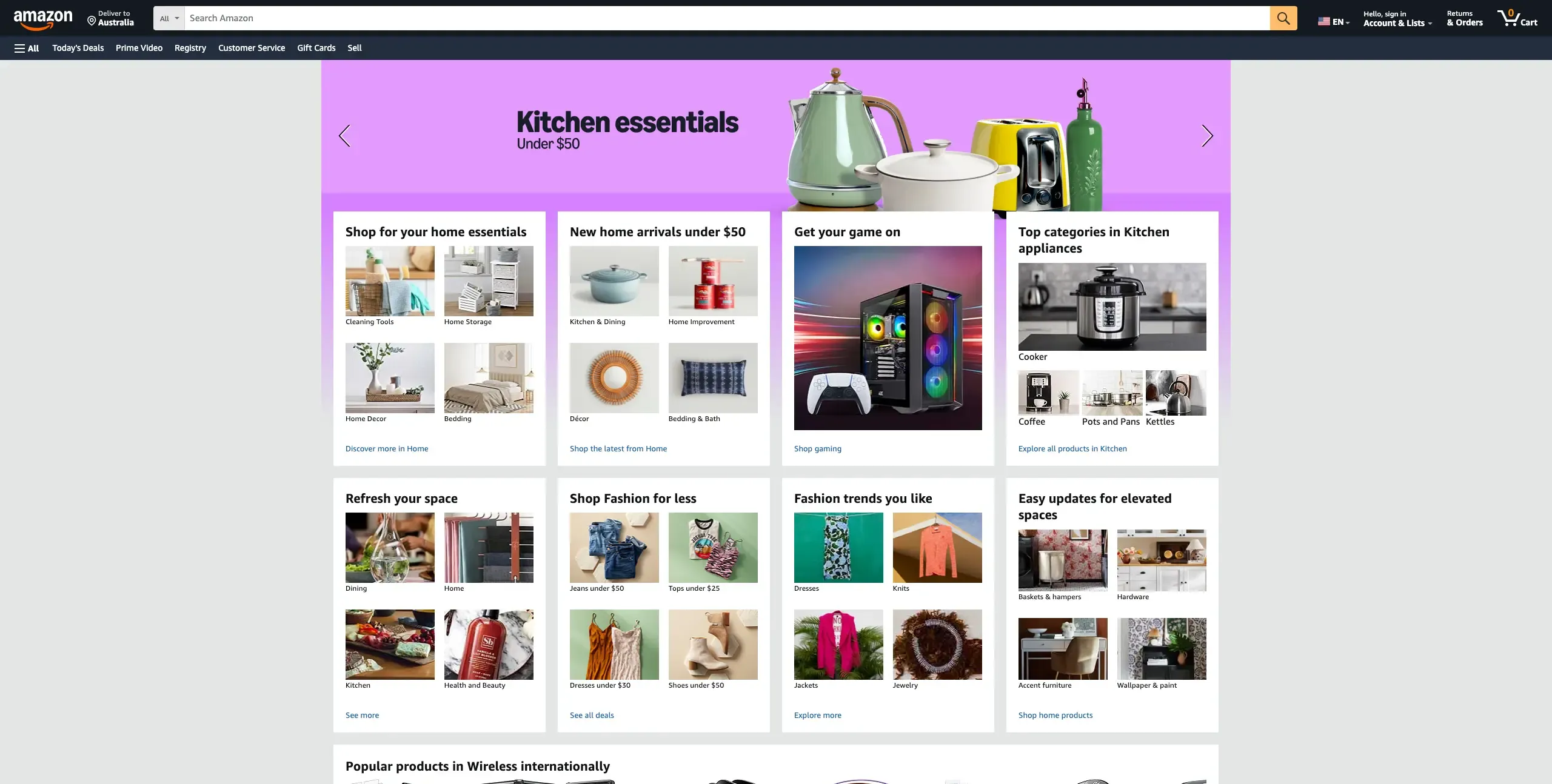
What can we learn from a site that serves millions of customers daily? Amazon proves that functionality trumps flashy design every single time. Their success comes from focusing on making shopping as convenient as possible.
Here's what Amazon gets right:
One-click purchasing removes possible barriers for repeat customers.
Personalized recommendations based on actual browsing and purchase behavior.
Powerful search functionality with filters that help people find specific products.
Comprehensive product information including detailed descriptions and customer reviews.
Transparent shipping and delivery information that sets clear expectations.
The lesson for your store? Amazon's approach shows that customers value convenience and reliability over visual complexity. Every feature serves a specific purpose in making shopping easier.
Apple: Minimalist design excellence
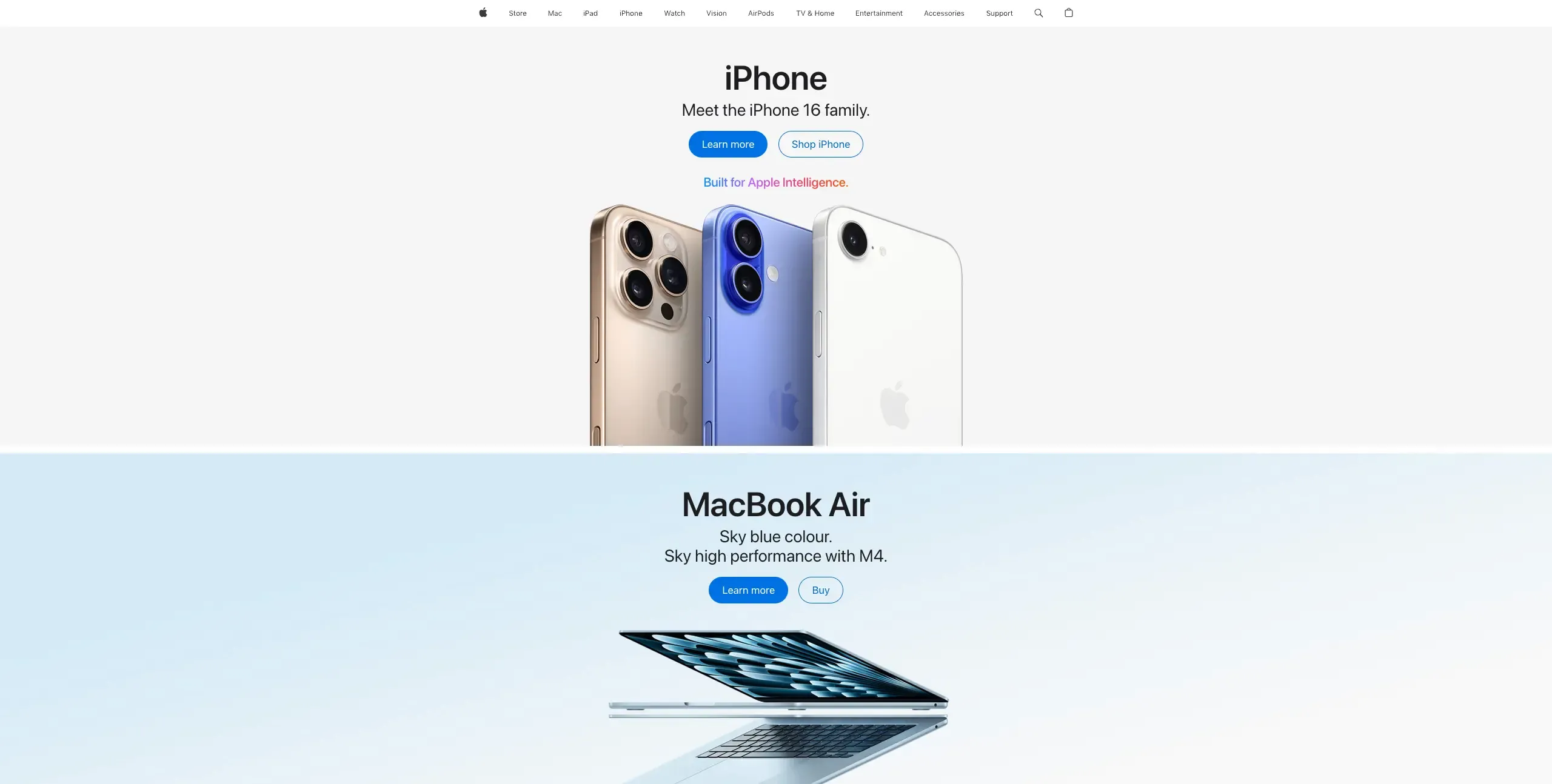
Apple's ecommerce site perfectly reflects their product philosophy – clean, intuitive, and purposeful. Their design demonstrates how simplicity can enhance rather than limit the shopping experience.
Apple's standout UX elements:
Clean visual hierarchy that guides attention naturally through each page.
High-quality product imagery with interactive 360-degree views.
Seamless integration between their website, apps, and physical stores.
Detailed product comparisons that help customers choose the right device.
Educational content that helps customers understand product benefits.
What you can apply: Apple proves that less can be more when every element serves a specific purpose. Their approach shows how focusing on essential information and removing clutter can actually improve sales performance.
ASOS: Personalization and engagement

ASOS has mastered the art of making online fashion shopping feel personal and social. They've created an experience that goes beyond just displaying products – they help customers envision complete looks and connect with a community.
ASOS's innovative features:
Style recommendations based on browsing behavior and stated preferences.
Virtual styling tools that help customers put together complete outfits.
User-generated content featuring real customers wearing products.
Comprehensive size guides and fit information to reduce returns.
Social integration that lets customers share purchases and get feedback.
The takeaway: ASOS shows how personalization and community features can differentiate your shopping experience and build customer loyalty in competitive markets.
Sephora: Customer-centric experience
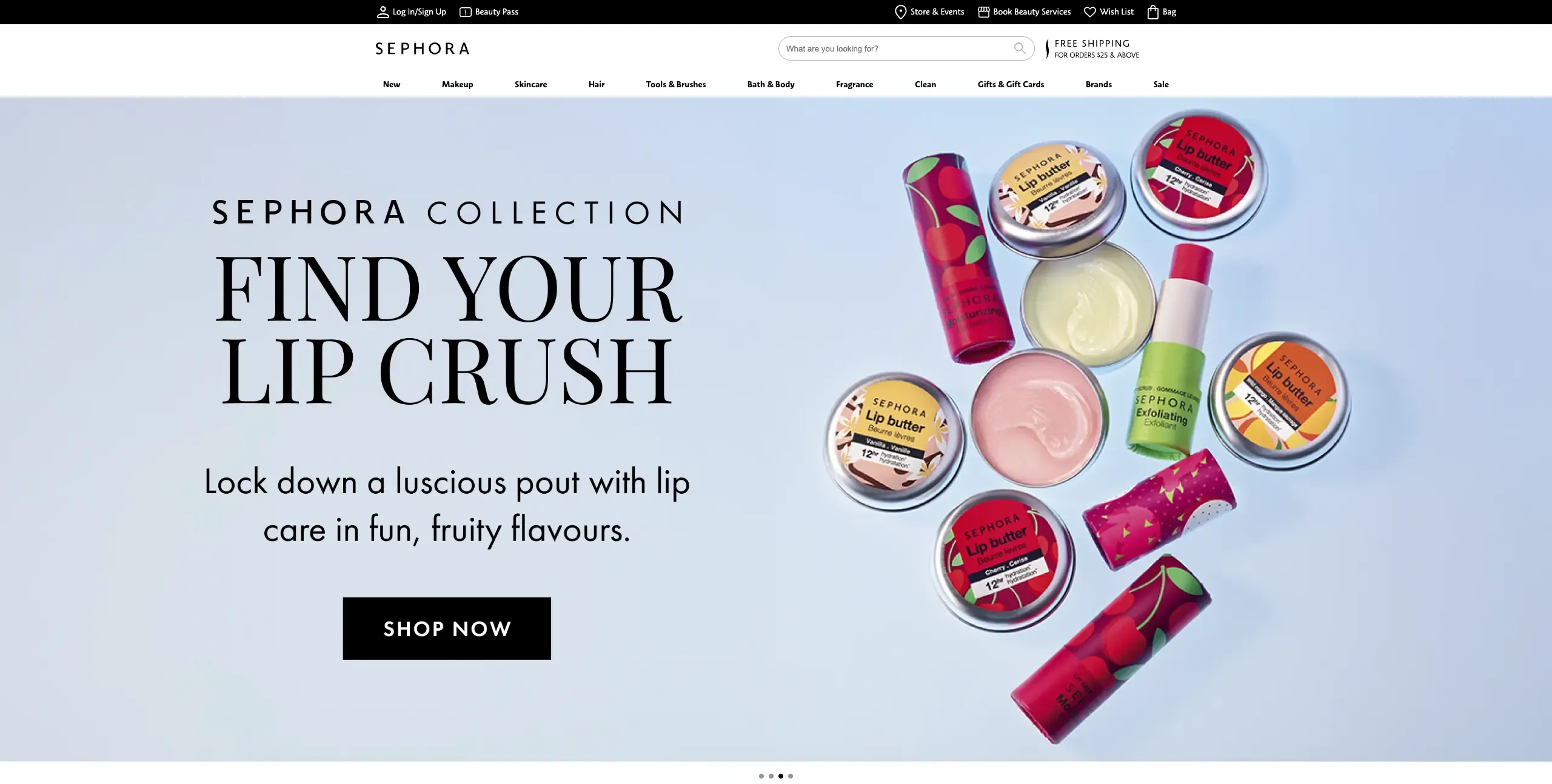
Sephora has successfully bridged online and offline experiences, creating a cohesive beauty shopping journey that uses technology to enhance rather than replace personal service.
Sephora's customer-focused innovations:
Virtual try-on tools using augmented reality for makeup testing.
Beauty advisor chat for personalized product recommendations.
Loyalty program integration that works seamlessly across all channels.
Educational content including tutorials and expert advice.
Social proof through customer photos and detailed reviews.
What this means for you: Sephora demonstrates how technology can enhance customer service rather than replacing human connection. They show that the best digital experiences often combine convenience with expertise.
Key takeaways for your business
These successful sites share common principles you can adapt for your own store:
Put customer needs first – every decision should make shopping easier for your specific audience.
Invest in performance over fancy features – speed and reliability matter more than visual complexity.
Test and optimize continuously – use preference testing and user interviews to understand what works for your audience.
The most important lesson? These sites continuously test and optimize based on real customer behavior. Use methods like preference testing and user interviews to understand which strategies work best for your specific audience and products.
B2B ecommerce user experience
Is your B2B ecommerce experience truly designed for business buyers? If you're approaching B2B UX the same way you'd design a consumer site, you might be missing the mark entirely.
Business buyers have fundamentally different needs, constraints, and decision-making processes that require a specialized approach. Understanding these differences helps you design appropriate experiences:
Aspect | B2C Ecommerce | B2B Ecommerce |
|---|---|---|
Decision Makers | Individual consumers | Multiple stakeholders, committees |
Purchase Cycle | Minutes to days | Weeks to months |
Information Needs | Basic features, reviews, price | Technical specs, ROI, integration details |
Pricing | Fixed pricing, simple discounts | Volume pricing, custom quotes, contracts |
Account Features | Personal profiles, wishlists | User roles, approval workflows, procurement integration |
Support Needs | Self-service, basic chat | Dedicated account management, technical support |
Content Focus | Emotional appeal, lifestyle | Business value, efficiency, compliance |
Key differences between B2B and B2C UX
Decision-making complexity: B2B purchases typically involve multiple stakeholders with different priorities. Your UX needs to serve both the person researching solutions and the executive who approves budgets.
Extended purchase cycles: B2B sales cycles are longer and more deliberate, often hinging on customer experience rather than price alone, making UX a true competitive differentiator.
Information requirements: Business buyers need detailed technical specifications, compatibility information, integration details, and comprehensive documentation that consumer sites rarely provide.
Risk considerations: B2B purchases often represent significant investments with company-wide impact, making buyers naturally more cautious and thorough in their evaluation process.
Essential B2B ecommerce features
B2B platforms need specialized functionality that goes far beyond consumer sites:
Account management and user roles: Support complex organizational structures with different permission levels for purchasing managers, end-users, and approvers.
Sophisticated pricing: Handle volume discounts, customer-specific pricing agreements, quote-based pricing, and multiple currencies.
Advanced catalog management: Provide technical specifications, detailed documentation, integration guides, and custom product configurations.
Procurement integration: Connect with existing procurement systems through API connections and standardized data formats.
Best practices for B2B platforms
Streamline information architecture by organizing products around business use cases rather than marketing categories. Use card sorting to understand how business customers naturally organize and search.
Provide comprehensive self-service options because B2B buyers prefer to research independently. Offer detailed product information, transparent pricing, real-time availability, and extensive support resources.
Design for repeat usage with features like saved lists, quick reorder options, customizable dashboards, and bulk ordering tools that improve efficiency for frequent users.
Support complex decision-making with comparison tools, detailed specifications, downloadable documentation, and case studies that help buyers evaluate options and justify purchases to stakeholders.
Implement robust search and filtering that supports how business buyers actually search – by part numbers, technical specifications, compatibility requirements, or budget constraints.
Use live website testing and user interviews to understand how B2B customers navigate your platform in real work environments. B2B buyers want to feel confident in their decisions – provide all the information and tools they need to research thoroughly and purchase with confidence.

Ready to improve your ecommerce UX?
Put these strategies into action with Lyssna's ready-to-use templates:
Test the online shopping experience: Evaluate key aspects of your product discovery and customer support.
Test product visibility and navigation: Identify barriers in the user journey and improve conversions.
Get first impressions of your home page: Capture whether your home page engages users within the critical first five seconds.
These templates provide structured approaches to the research methods discussed throughout this guide, helping you implement user-centered design improvements with confidence.
Start testing now
Ready to optimize your ecommerce experience? Get real customer insights with Lyssna.
FAQs

Diane Leyman
Senior Content Marketing Manager
Diane Leyman is the Senior Content Marketing Manager at Lyssna. She brings extensive experience in content strategy and management within the SaaS industry, along with editorial and content roles in publishing and the not-for-profit sector
You may also like these articles


Try for free today
Join over 320,000+ marketers, designers, researchers, and product leaders who use Lyssna to make data-driven decisions.
No credit card required
