This template is for:
Usability testing
Conversion rate optimization (CRO)
Message testing
Design
Marketing
Five second testing
Created by:
Lyssna
Overview
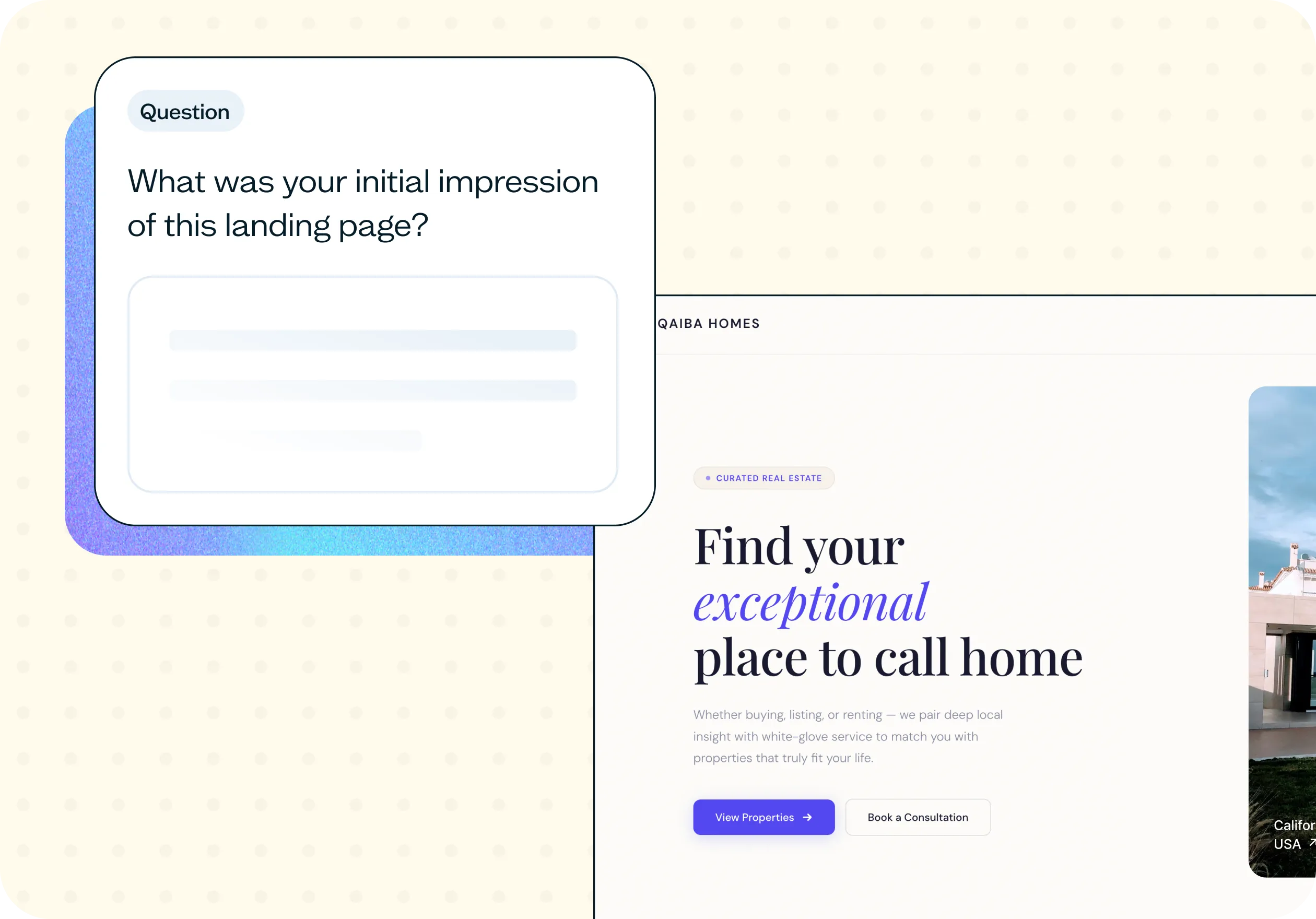
Find out whether your landing page communicates its value before users decide to leave. Using a five second test, this template captures immediate reactions to your page's design, messaging, and visual hierarchy – revealing what registers instantly and what gets missed entirely.
The problem with untested landing pages
Users form an opinion about a landing page in seconds. If your message doesn't land in that window, they're gone – regardless of how good the product behind it is.
The challenge is that most teams evaluate landing pages through their own familiarity with the product. What feels obvious to the person who built it often isn't obvious to someone encountering it for the first time. Teams end up debating design opinions instead of testing real user reactions.
Without first-impression testing, landing pages tend to share a set of predictable problems:
Users don't understand what the product does.
Key messages are missed entirely.
Design looks polished but doesn't convert.
Important elements go unnoticed.
Teams rely on internal opinion instead of real feedback.
First-impression testing replaces those debates with evidence – showing you what users actually take away from your page in the moments that matter most.
This template will help you discover
First-impression testing surfaces the gap between what your page intends to communicate and what users actually walk away with. Run this template to find out:
What users notice first on the page.
What they think the page is about after a few seconds.
Whether your value proposition reads as clear and compelling.
Which elements create confusion or uncertainty.
What feels trustworthy – and what doesn't.
What makes users want to keep reading.
These insights show whether your page is doing its job in the moments that determine whether someone stays or leaves.
What you'll test
This template is structured around the dimensions that most affect whether a landing page converts:
Clarity: Do users understand what the product or service is without reading every word on the page?
Visual hierarchy: What draws the eye first – and does that match your intention?
Message strength: Is your value proposition obvious, or does it require effort to decode?
Trust signals: Does the overall design and tone make the page feel credible?
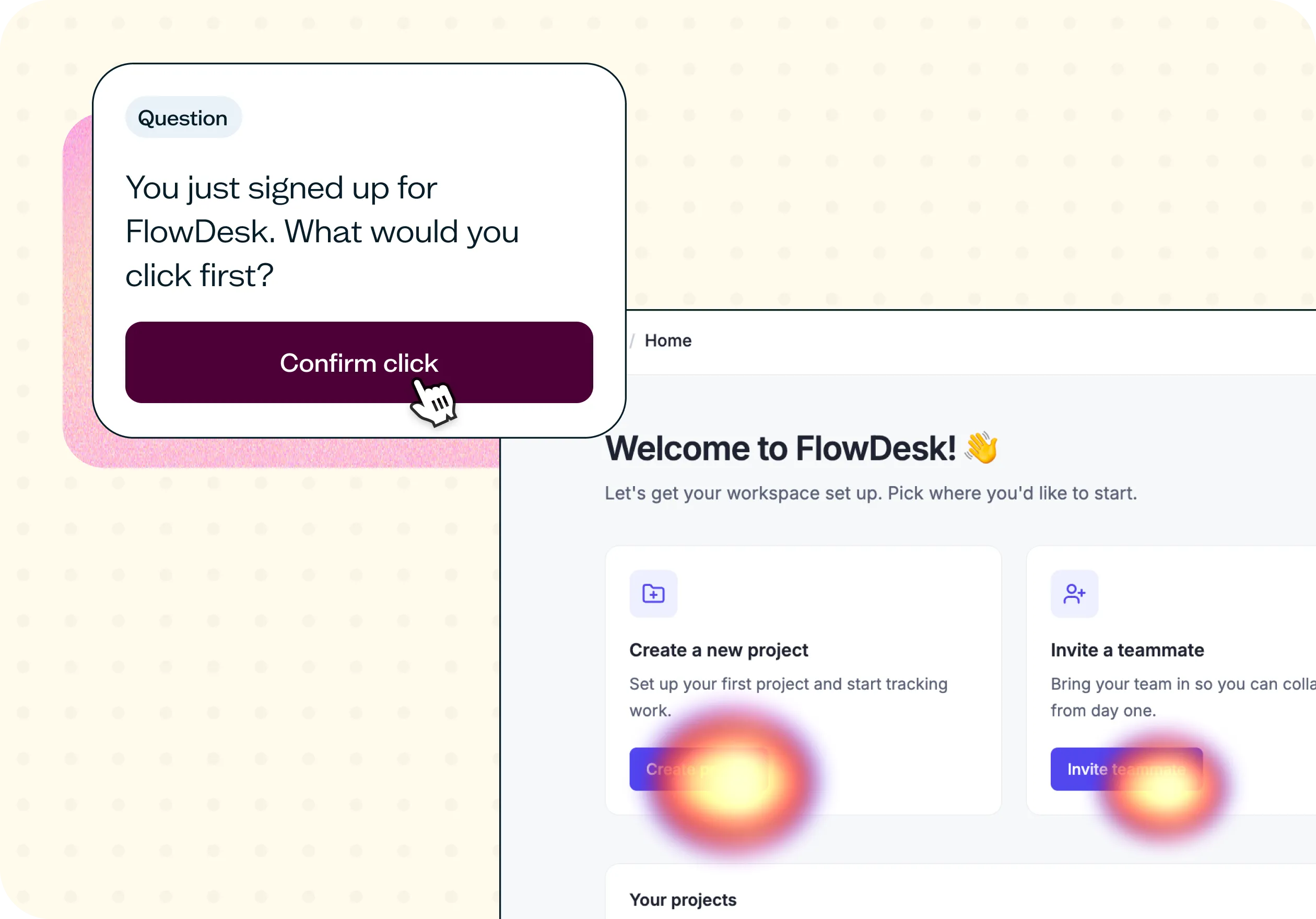
Attention focus: Which elements stand out, and which ones get overlooked entirely?
How the research works
This template uses a five second test paired with open follow-up questions to capture both immediate reactions and recalled impressions.
Five second test: Participants see your landing page briefly, then the image disappears. This mirrors the real conditions of a first visit – before users have had time to read or explore.
Open recall questions: After the image is removed, participants are asked what they remember, what they think the page was about, and what their initial reaction was. These questions surface clarity problems that visual heatmaps alone can't reveal. You might see responses like "modern and simple" alongside "I don't remember" for the headline – a clear signal about what's registering and what isn't.
Message recall: A targeted question checks whether users retained the main message of the page. If responses vary widely – some saying "housing solutions," others saying "I'm not sure" – you'll know the message needs sharpening.
Preference and detail questions: Final questions ask what else users remember and what made an impression. Responses here often flag specific elements – a color scheme, a CTA button, a headline – that are either working well or adding noise.
Results appear as open-text responses you can scan for patterns, alongside a word cloud that surfaces the most common language users associated with your page.
When to use this template
This template fits any stage where you need fast, honest feedback on how a landing page performs with fresh eyes:
Before launching a new landing page.
When conversion rate is lower than expected.
During a redesign or refresh project.
Before running paid ads to a page.
When testing new positioning or messaging.
When improving a home page or campaign landing page.
Who this template is for
First-impression testing is useful across teams who have a stake in how a landing page performs:
Marketing teams optimizing for conversion.
UX designers working on clarity and visual hierarchy.
Product teams validating how positioning lands with users.
Growth teams testing ad landing pages before scaling spend.
Founders launching a new product or offer.
FAQs about landing page testing
You may also like these templates

The navigation test is god's gift to UI designers. It probably has the best power-to-simplicity ratio of any software, ever.

Nick Franklin
CEO at ChartMogul


Try for free today
Join over 320,000+ marketers, designers, researchers, and product leaders who use Lyssna to make data-driven decisions.
No credit card required