Overview
Test your checkout flow with real users to discover where confidence breaks down. Use this template to understand how users are feeling at the point of purchase – what's building trust, what's creating doubt, and what they need before they can commit.
Why checkout abandonment is hard to diagnose
Getting users to your checkout page is only half the job. If they're leaving before they complete their purchase, you're losing people who were already interested – and without the right research, you'll never know why.
The problem isn't always what you'd expect. There might not be a broken button, a confusing layout, or a missing CTA. In many cases, users hesitate not because something went wrong, but because something isn't clear enough. They have unanswered questions. They're not yet confident that your product will actually deliver on what it's promising.
When teams try to diagnose checkout drop-off from analytics alone, they end up chasing symptoms. They make assumptions, run A/B tests on surface changes, and still can't explain why people who wanted the product didn't follow through.
This template uses live website testing – where participants move through your real checkout flow using a think-aloud protocol – sharing what they're noticing, what they're considering, and where they're losing confidence – paired with targeted follow-up questions to reveal exactly where hesitation comes from and what's driving it.
This template will help you discover
What users are thinking and feeling as they move through your checkout flow.
Whether your core value propositions are landing clearly enough to build confidence before the purchase decision.
Which specific questions or doubts are unresolved at the point of checkout.
What information users need before they feel ready to commit – and whether it's present on the page.
Whether hesitation is driven by your product, your messaging, or prior experiences users bring with them.
What you'll test
Purchase confidence
Do users believe your product will actually deliver on its core promises? This isn't about whether they like what they see – it's about whether they feel certain enough to hand over their payment details. A confident user buys. A curious one leaves.
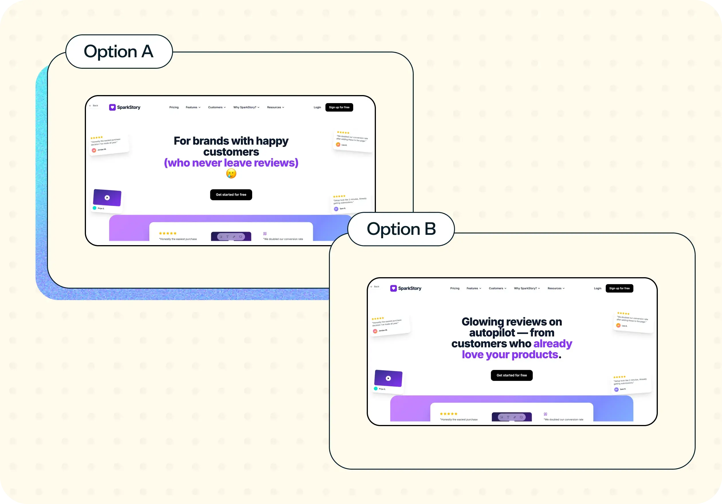
Value proposition clarity
Are the things that make your product worth the price clear and specific at the point of checkout? Vague or general claims – "flexible," "convenient," "easy" – can feel reassuring early in the journey but create doubt at the moment of commitment, when users need concrete answers.
Unanswered questions
What are users still wondering about when they reach checkout? Common questions around delivery logistics, cancellation policies, and scheduling specifics often go unaddressed in checkout flows, precisely because teams assume they've been covered earlier. These gaps are frequently the difference between a completed purchase and a drop-off.
Prior experience bias
Are users filtering your product through bad experiences with similar products? Particularly in competitive categories, users arrive with scepticism built up from past frustrations. Understanding whether your checkout flow addresses those concerns – or ignores them – is key to building trust with the most hesitant segment of your audience.
Friction points
What's creating doubt at the critical moment? This could be pricing that feels uncertain, flexibility claims that aren't backed up with specifics, or social proof that speaks to a different type of customer. These are often invisible in analytics but surface clearly in open-ended responses.
How the research works
This template uses a live website test paired with targeted follow-up questions – the live test lets you observe real behavior through your actual checkout flow, while the follow-up questions surface the thinking and feeling behind it.
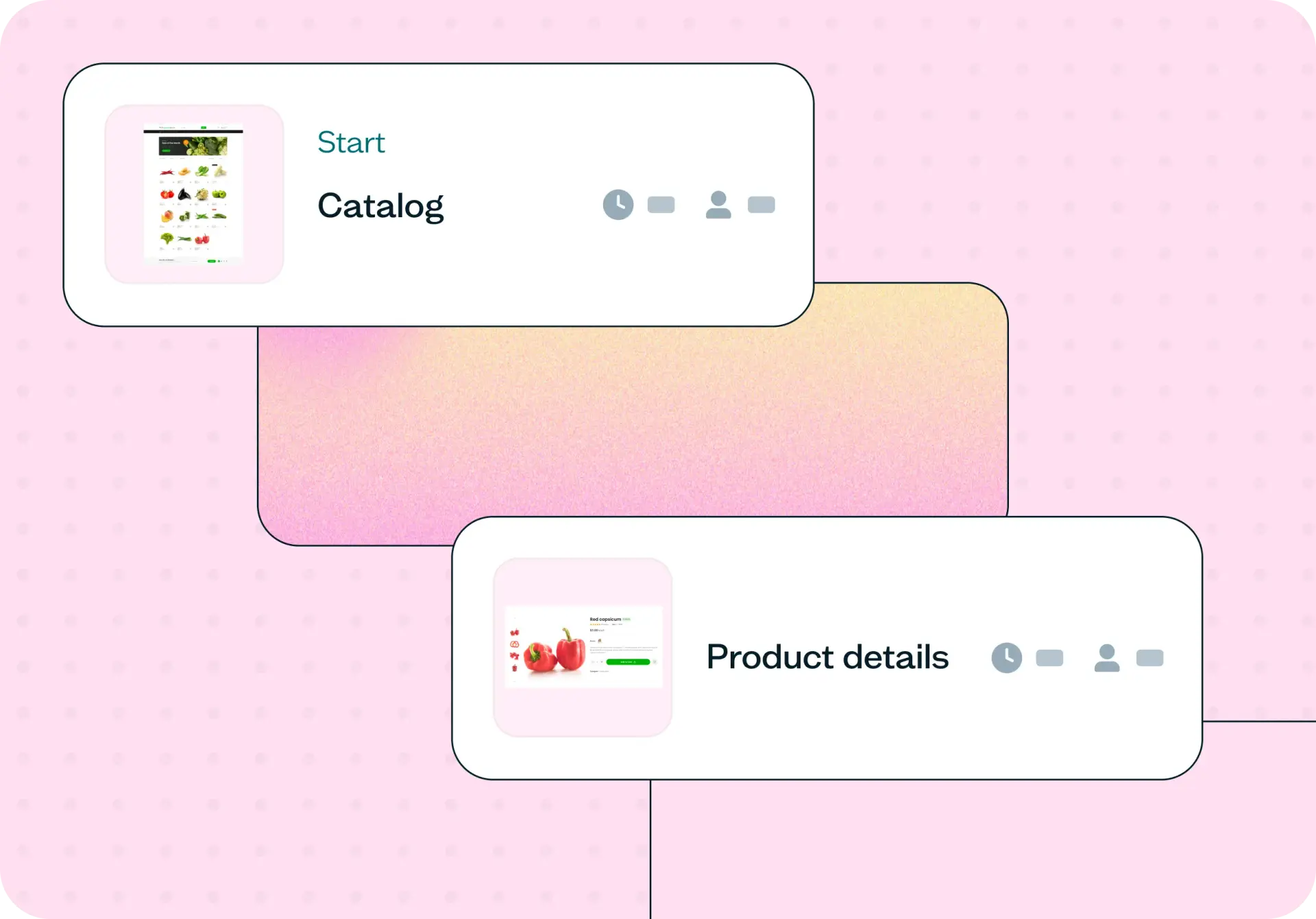
Live website test
Participants are dropped onto your starting URL – a homepage, a product page, or anywhere that naturally leads into your checkout flow – and given a realistic task that mirrors a genuine purchase scenario. Their screen and, where enabled, their camera and mic are recorded using Lyssna's Recordings feature, so you can see exactly where they slow down, pause, or change direction.
This captures behavioral data that no survey can replicate. You're not asking users to imagine or recall a checkout experience – you're watching them have one in real time.
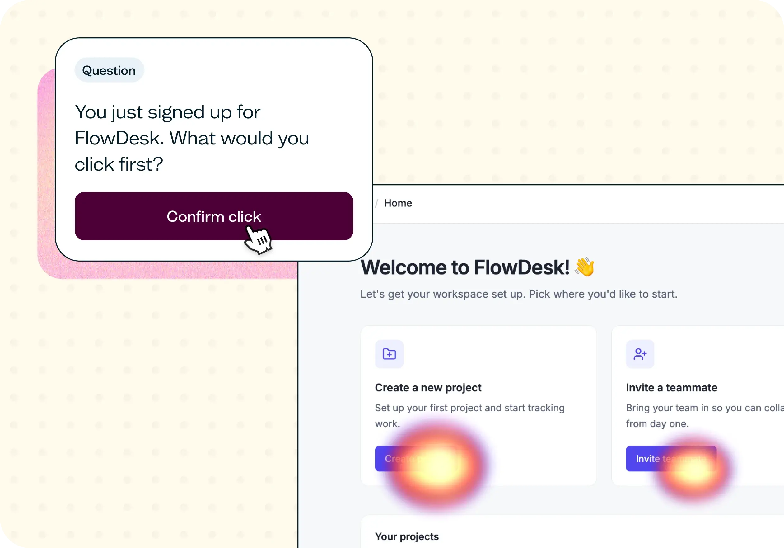
Task scenario design gives participants a believable job to be done (finding something that fits their preferences, for example) rather than asking them to "test" the checkout – keeping the experience as close to a real purchase decision as possible.
A defined stopping point – typically the "Review your order" or payment screen – signals the moment to transition from observation to reflection.
Follow-up questions
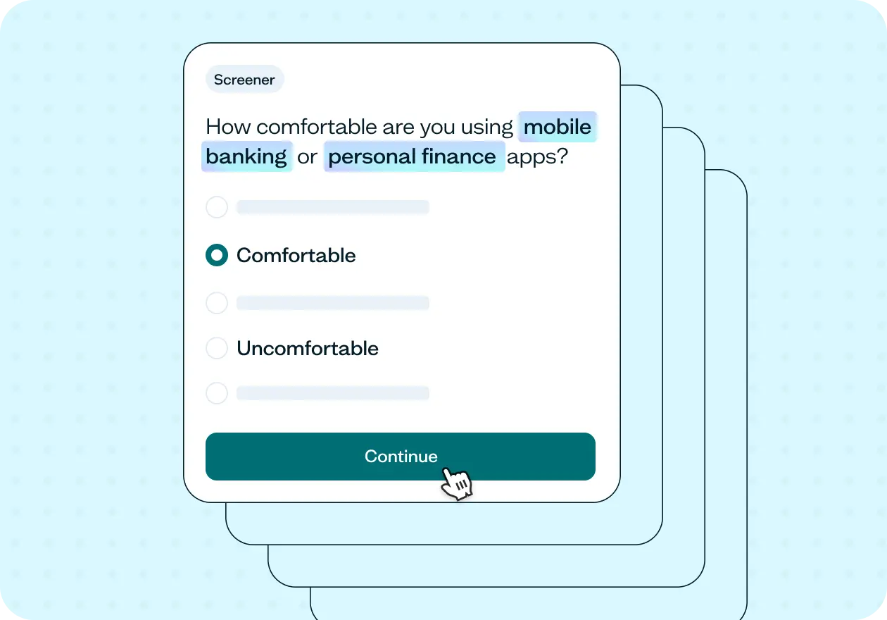
Once participants reach the checkout screen, the follow-up questions shift from observation to direct feedback. The key move here is to ask confidence-based questions rather than purchase intent questions. Self-reported intent ("would you buy this?") is an unreliable signal. Confidence questions ("how confident are you that this product will meet your needs?") surface the gaps that drive hesitation far more accurately.
Linear scale questions measure confidence in each of your core value propositions, revealing which promises feel solid and which feel uncertain at the moment of commitment.
A purchase intent question – framed around readiness to move forward rather than a binary yes/no – shows how many users are close to converting but blocked by unanswered questions.
Open-ended questions ask participants to explain their reasoning in their own words, and this is where the richest insights come from: the specific language users use to describe what's missing, the comparisons they make to past experiences, and the questions they have that your flow didn't answer.
Together, the live test and follow-up questions connect behavioral observation with attitudinal insight – you see what users do and understand why they did it.
How to use this template
The best way to see this template in action is to watch it applied to a real product challenge. In the video below, we walk through a working example using Weeknight – a meal delivery service designed to make busy weeknights easier with ready-to-enjoy meals. Weeknight had a clean signup and plan selection flow, no obvious usability issues, but users were reaching checkout and not completing their purchase. The question was what was happening at that moment, and why.
The walkthrough covers how to adapt the template to your own checkout flow, how to set up a live website test with a realistic task scenario that drives genuine behavior, and how to write confidence-based follow-up questions tied to your specific value propositions. You'll also see how to recruit participants using the Lyssna panel, how to interpret your results question by question, and how to turn what you learn into a clear picture of what's causing hesitation and what needs to change.
Whether you're investigating a specific drop-off you've spotted in your analytics or trying to understand why a well-designed flow isn't converting, you'll come away with a practical process for getting real answers fast.
When to use this template
When checkout drop-off is visible in your analytics but the cause isn't clear.
When you've made changes to your checkout flow and want to validate whether they've improved user confidence.
When stakeholders disagree on what's causing conversion issues and you need evidence to move forward.
When you're launching a new product or pricing structure and want to understand how users respond at the point of purchase.
When user interviews or surveys have pointed to hesitation or uncertainty at checkout, and you want to investigate further.
When a competitor's negative reputation might be affecting how users approach your product.
Who this template is for
Whether you're a UX researcher running a formal study or a product manager trying to understand a conversion problem you can't diagnose from data alone, this template gives you a structured, fast way to find out what's really happening at checkout.
It's designed for:
UX researchers evaluating checkout flow performance.
Product designers testing the impact of messaging or flow changes on user confidence.
Conversion rate optimization teams looking for qualitative signal to complement quantitative data.
Ecommerce and SaaS teams investigating checkout drop-off.
Marketing teams validating whether value proposition copy is landing at the point of purchase.
Anyone who has ever watched their analytics show users leaving at check–out and wondered what was going through their minds.
FAQs about checkout testing
You may also like these templates

The navigation test is god's gift to UI designers. It probably has the best power-to-simplicity ratio of any software, ever.

Nick Franklin
CEO at ChartMogul