19 Feb 2026
|31 min
What is a user interface?
Learn what a user interface (UI) is, explore its key components, types and best practices for designing intuitive digital experiences.
Share on


Share on
When we press the preset timer button on a microwave to pop a bag of popcorn, tap the plus symbol to add our favorite songs to a Spotify playlist, or hit the "next episode" button while watching Netflix, we're using user interfaces to make things happen.
Every digital interaction you have throughout your day involves a user interface (UI) – the bridge between human intention and computer action. From the moment you unlock your smartphone to the final click that submits an online order, user interfaces shape how we experience and interact with technology.
Understanding what makes a user interface effective matters for everyone involved in building digital products. Whether you're a product manager evaluating design decisions, a UX researcher testing interface concepts, or a business owner trying to improve your digital presence, knowing the fundamentals of UI design helps you create better experiences for your users.
This guide explores what user interfaces are, how they work, and how to design them effectively to create intuitive digital experiences.
Key takeaways
A user interface (UI) is the bridge between human intention and computer action, encompassing everything users see, touch, or hear when interacting with digital products.
Effective user interfaces share five core characteristics: intuitive navigation, clear visual hierarchy, consistent interaction patterns, immediate feedback, and graceful error prevention and recovery.
Different interface types serve different needs. GUIs work best for general computing, touch interfaces excel on mobile devices, voice UIs enable hands-free interaction, and CLIs provide speed and precision for power users.
Clarity, consistency, and accessibility are the foundation of good UI design. Following established patterns reduces cognitive load and ensures your interface works for users with diverse abilities and contexts.
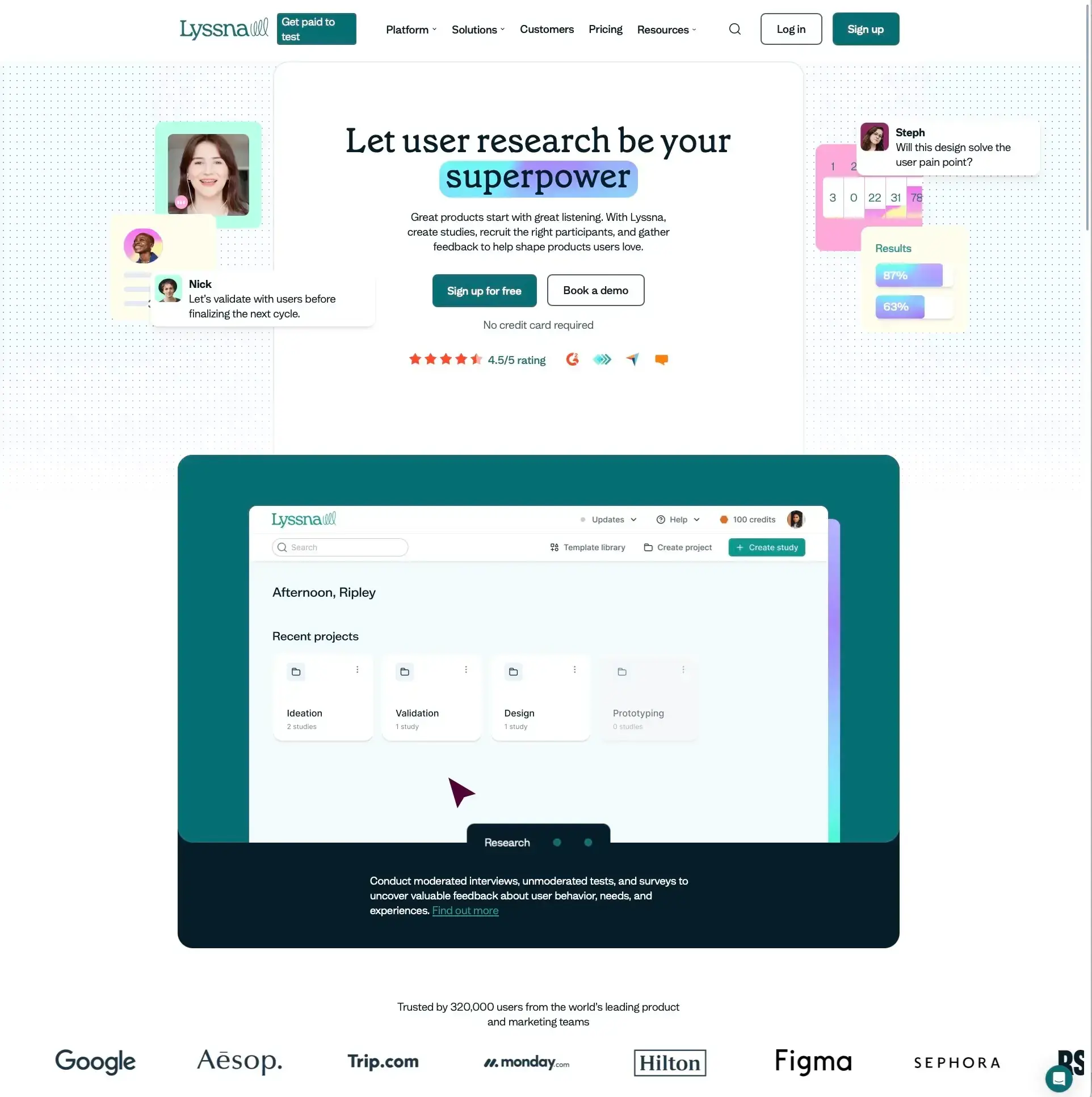
Testing with real users is essential for creating effective interfaces. User research platforms like Lyssna help you validate UI decisions through methods like first click testing, preference testing, five second testing, and prototype testing before investing in development.
UI and UX are complementary disciplines. UI focuses on how the interface looks and feels, while UX focuses on how it works and flows. The best products come from integrating both throughout the design process.
Definition and purpose of a user interface
A user interface serves as the point of interaction between humans and digital systems, enabling people to communicate with computers, applications, and devices through visual, auditory, and tactile elements.
What "user interface (UI)" means
A user interface (UI) is the collection of elements that allow users to interact with a digital product or system. It encompasses everything users see, touch, or hear when using software, websites, mobile apps, or any digital device.
The UI includes visual components like buttons, menus, and icons, as well as interactive elements such as forms, sliders, and navigation systems. It also covers the layout, typography, colors, and overall visual design that guides users through their digital experience.
Think of a user interface as a translator between human language and computer language. When you click a "Save" button, the UI translates that action into commands the computer understands, then provides feedback to confirm the action was completed.
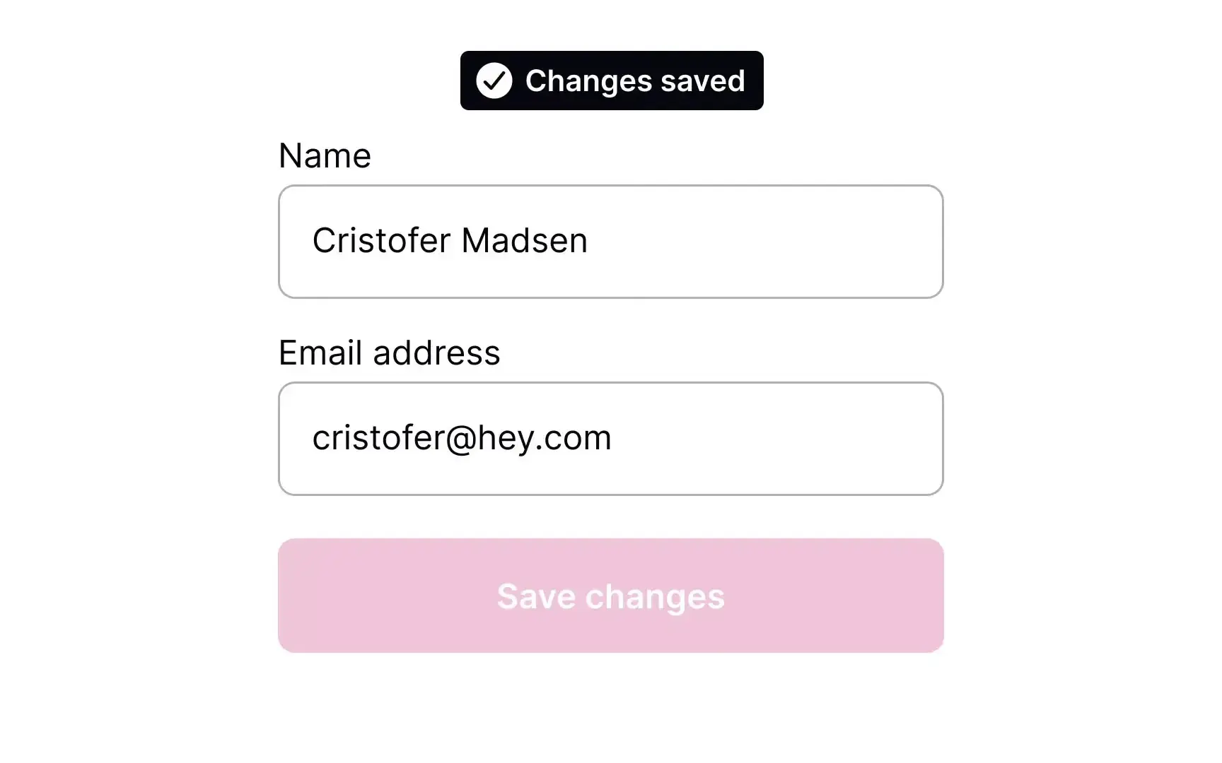
A simple UI showing a "Save" button with a confirmation message, such as a toast notification or checkmark. This illustrates the concept of UI feedback in action.
Key characteristics of effective user interfaces
Effective user interfaces share several core characteristics that make them easy and enjoyable to use:
Characteristics | What it means | Example |
|---|---|---|
Intuitive navigation | Users can easily find what they're looking for | Clear menu labels, logical page hierarchy |
Clear visual hierarchy | Important elements stand out and guide attention | Primary buttons are larger and more prominent than secondary ones |
Consistent interaction patterns | Similar actions work the same way throughout | All "delete" actions use the same confirmation dialog |
Immediate feedback | Users understand the results of their actions quickly | A checkmark appears after saving, buttons change state on hover |
Error prevention and recovery | The interface helps users avoid mistakes and recover gracefully | Form validation before submission, undo options |
The role of UI in human-computer interaction
User interfaces play a crucial role in human-computer interaction (HCI) by making complex technology accessible and usable for people with varying levels of technical expertise.
The evolution of human-computer interaction
Before graphical user interfaces, people interacted with computers through command-line interfaces that required memorizing specific text commands. The introduction of visual interfaces with windows, icons, menus, and pointing devices (WIMP) revolutionized how we use technology.
Modern UI design continues this evolution in several ways:
Reducing cognitive load: Well-designed interfaces minimize the mental effort required to complete tasks.
Accommodating different user needs: Interfaces adapt to various abilities, preferences, and contexts.
Enabling complex functionality: Sophisticated features become accessible through simple, intuitive controls.
Building user confidence: Clear feedback and predictable behavior help users feel comfortable exploring and using digital tools.
The psychology behind effective UI design
Understanding how people process information and make decisions is fundamental to creating successful user interfaces. Effective UIs leverage psychological principles such as:
Recognition over recall: Users find it easier to recognize options than remember commands.
Consistency and standards: Following established conventions reduces learning time.
Visibility of system status: Users need to understand what's happening and what options are available.
User control and freedom: People want to feel in control of their interactions and able to undo mistakes.
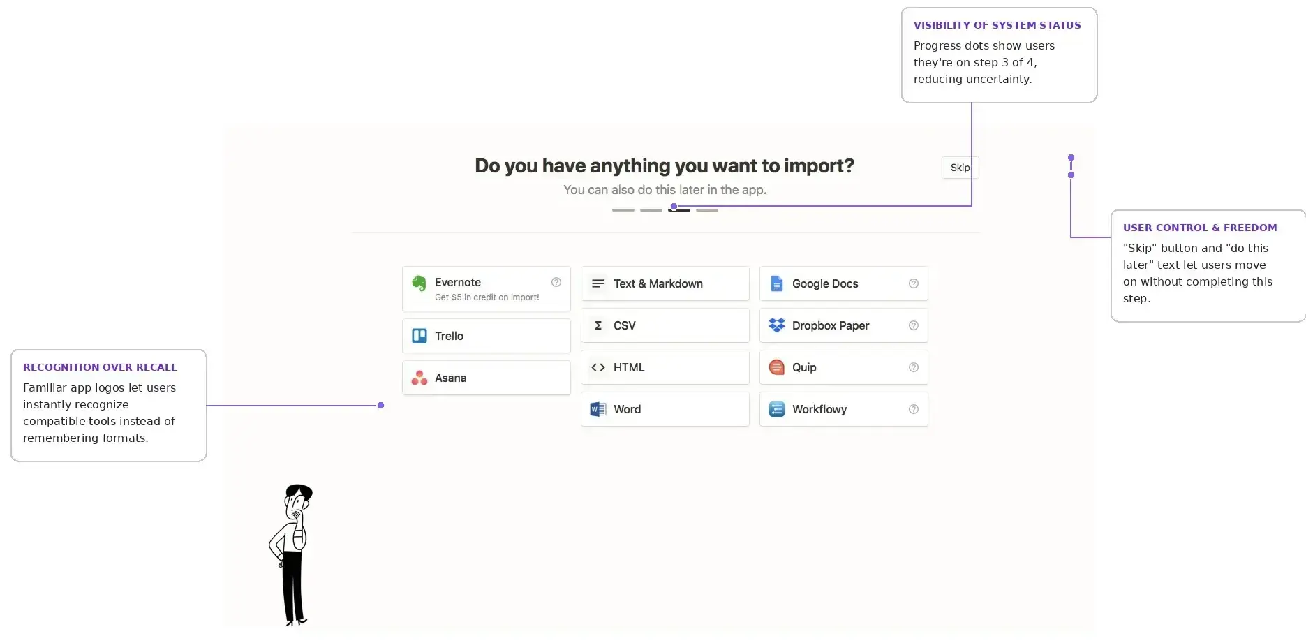
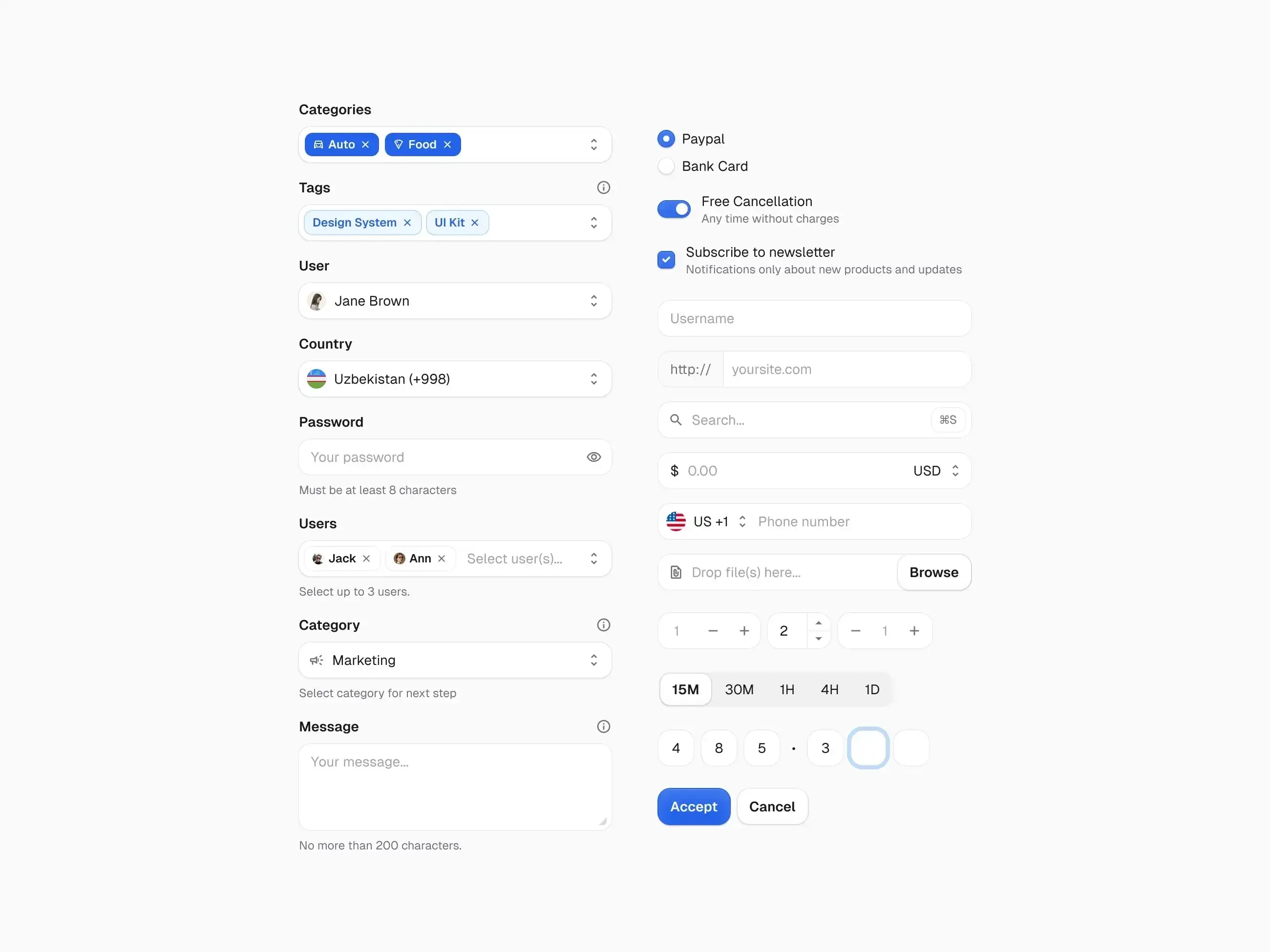
An annotated screenshot of a well-designed interface (e.g. a checkout flow, sign-up form, or dashboard) with callouts pointing to examples of recognition over recall, visibility of system status, and user control. This demonstrates multiple principles in one real-world example.
Key components of a user interface
Every user interface consists of fundamental components that work together to create a cohesive and functional experience. Understanding these building blocks helps you evaluate and improve interface design.
Input controls (buttons, fields, etc.)
Input controls are the interactive elements that allow users to provide information, make selections, and trigger actions within an interface. Here's an overview of the primary types:
Control | Purpose | When to use |
|---|---|---|
Buttons | Trigger immediate actions | Submitting forms, opening menus, navigating to new pages |
Text fields | Allow users to enter information | Names, email addresses, search queries |
Checkboxes | Enable multiple selections | Selecting multiple options from a list |
Radio buttons | Provide single selection | Choosing one option from mutually exclusive choices |
Dropdown menus | Offer space-efficient selection | Longer lists of options where space is limited |
Sliders | Select values within a range | Adjusting volume, price ranges, or other continuous values |
Toggle switches | Provide binary functionality | On/off or enable/disable settings |
Screenshot showing buttons, text fields, checkboxes, and dropdowns in action.
Best practices for input controls
Clear labeling: Every input should have a descriptive label that explains its purpose, helping users understand what information is needed.
Appropriate sizing: Controls should be large enough to interact with easily, especially on touch devices where smaller targets lead to frustration.
Visual feedback: Provide immediate response when users interact with controls, such as a button changing color when clicked.
Logical grouping: Related inputs should be visually grouped together, making forms easier to scan and complete.
Error handling: Clearly indicate when inputs contain errors and provide specific guidance on how to fix them.
Navigation and layout (menus, breadcrumbs, search)
Navigation systems help users understand where they are, where they can go, and how to get there efficiently within a digital product. Here are the essential navigation components:
Component | Purpose | Use cases |
|---|---|---|
Primary navigation | Main menu for top-level sections | Websites, web applications |
Breadcrumbs | Show current location in site hierarchy | Deep content structures |
Search functionality | Direct access to specific content | Large content libraries |
Pagination | Navigate through multiple pages of content | Search results, product listings |
Filters and sorting | Refine and organize displayed content | Ecommerce, data tables |
Footer navigation | Secondary links and utility pages | Contact info, legal pages |
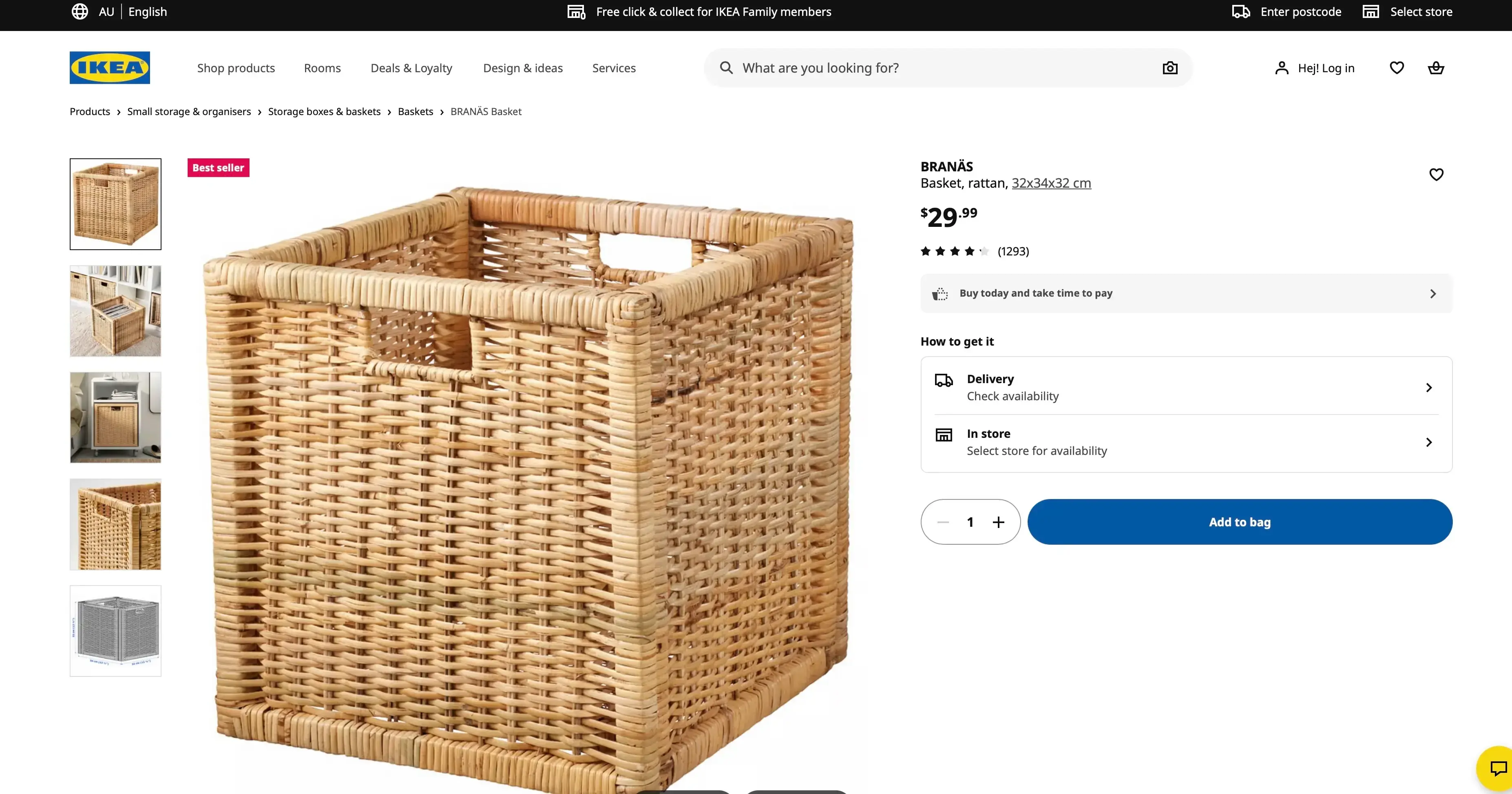
Example of IKEA’s website with breadcrumbs, primary navigation, and search visible.
Layout principles for effective navigation
Predictable placement: Navigation elements should appear where users expect to find them, such as primary navigation at the top of the page.
Visual hierarchy: More important navigation options should be more prominent, helping users quickly identify their next steps.
Responsive design: Navigation must work effectively across different screen sizes, often transforming into hamburger menus on mobile devices.
Accessibility: All navigation elements should be usable with keyboard navigation and screen readers, ensuring everyone can move through your interface.
Practitioner insight: "Lyssna’s navigation test is God's gift to UI designers, it probably has the best power-to-simplicity ratio of any software, ever."
– Nick Franklin, CEO at ChartMogul
Visual and sensory feedback (icons, animations, haptics)
Feedback mechanisms communicate system status, confirm user actions, and guide users through their interactions with the interface. Here are the main types:
Feedback type | Description | Example |
|---|---|---|
Visual | Color changes, animations, progress indicators, and status messages | A button changing color on hover or a checkmark appearing after saving |
Auditory | Sounds, alerts, and voice responses | A notification chime or error sound |
Haptic | Vibrations and tactile responses on touch devices | A subtle vibration when toggling a switch |
Temporal | Loading states and transition animations | A progress bar or spinner indicating processing time |
Effective feedback design
Visual feedback should be immediate and clearly connected to user actions. For example, when users hover over a button, a subtle color change or shadow effect confirms the element is interactive. When they click, a brief animation or state change acknowledges the action.
In a case study about Instagram's brand evolution, Meta's design team explained their approach to visual design:
"Our refreshed visual system puts expression, inclusion, and creativity first, affirming Instagram's mission to support the creators and communities who are pushing culture forward."
The rebrand featured an illuminated gradient and custom typography developed with over 40 global typographers to serve different markets and script systems.
Animation and micro-interactions
Well-designed animations serve functional purposes beyond visual appeal:
Provide continuity: Smooth transitions help users understand relationships between interface states, like a sidebar sliding in rather than abruptly appearing.
Direct attention: Subtle animations can guide users toward important elements, such as a gentle pulse on a notification badge.
Communicate progress: Loading animations and progress bars manage user expectations during longer processes.
Add personality: Thoughtful micro-interactions can make interfaces feel more human and engaging, turning routine actions into satisfying moments.
Accessibility and responsiveness
Modern user interfaces must work effectively for users with diverse abilities and across various devices and contexts.
Accessibility fundamentals
Keyboard navigation: All interactive elements should be accessible without a mouse, allowing users to tab through the interface.
Screen reader compatibility: Proper semantic markup and alt text for images ensure that assistive technologies can interpret your interface.
Color contrast: Sufficient contrast ratios for text readability help users with visual impairments and those viewing screens in bright conditions.
Focus indicators: Clear visual indication of which element currently has focus helps keyboard users track their position.
Alternative text: Descriptive text for images and non-text content provides context for users who rely on screen readers.
In a case study about WhatsApp, Idit Yaniv, VP and Head of WhatsApp Design at Meta, explained their design philosophy: "I believe the way we approach change on WhatsApp is powerful, and it puts people at the heart of everything we do. When designing, we consider varying levels of connectivity and digital literacy to keep WhatsApp accessible."
Responsive design considerations
Flexible layouts: Interfaces should adapt to different screen sizes and orientations, ensuring content remains usable whether on a phone or desktop.
Touch-friendly interactions: Appropriately sized touch targets for mobile devices prevent frustration from missed taps.
Performance optimization: Fast loading times across various network conditions keep users engaged, especially on slower connections.
Content prioritization: The most important information should remain accessible on smaller screens, even when secondary content is hidden or reorganized.
Types of user interfaces
Different types of user interfaces serve various purposes and contexts, each with unique strengths and appropriate use cases. Here's a quick comparison:
Interface type | Best for | Key advantage | Key limitation |
|---|---|---|---|
Graphical (GUI) | General computing, everyday tasks | Intuitive for most users | Can be slower for expert tasks |
Touch and gesture | Mobile devices, tablets, kiosks | Direct, natural manipulation | Limited precision for complex tasks |
Voice (VUI) | Hands-free scenarios, accessibility | Natural interaction, multitasking | Ambient noise, privacy concerns |
Command line (CLI) | System administration, development | Speed and precision for experts | Steep learning curve |
Graphical user interface (GUI)
Graphical user interfaces use visual elements like windows, icons, menus, and pointers to enable user interaction with digital systems.
Key characteristics of GUIs
Visual metaphors: Icons and graphics represent real-world objects and concepts, making abstract computing functions feel familiar and approachable.
Direct manipulation: Users can interact with objects by clicking, dragging, and dropping, creating a sense of control over the digital environment.
Multiple windows: Different tasks can be managed simultaneously in separate windows, supporting complex workflows and multitasking.
WIMP paradigm: Windows, Icons, Menus, and Pointers form the foundation of GUI design, a model that has proven remarkably durable since its introduction in the 1980s.
Advantages of GUI design
Intuitive learning: Visual representations are often easier to understand than text commands, allowing new users to become productive quickly.
Reduced memory load: Users can recognize options rather than memorizing commands, which lowers cognitive effort and frustration.
Error reduction: Visual feedback helps prevent and correct mistakes, guiding users toward successful task completion.
Multitasking support: Multiple applications and tasks can be managed simultaneously, reflecting how people naturally work on varied responsibilities.
Common GUI applications
Desktop operating systems like Windows, macOS, and Linux distributions provide the foundation for personal computing experiences.
Web browsers and websites deliver content and interactive experiences through standardized visual interfaces.
Mobile applications bring GUI principles to smartphones and tablets, adapting to smaller screens and touch input.
Software applications and productivity tools like word processors, spreadsheets, and design programs rely on GUI conventions to support complex tasks.
Touch and gesture UIs
Touch and gesture interfaces enable direct manipulation of digital content through finger movements, taps, and gestures on touch-sensitive surfaces.
Fundamental touch interactions
Gesture | Action | Common Uses |
|---|---|---|
Tap | Single finger touch | Select, activate buttons |
Double-tap | Two quick taps | Zoom, open items |
Long press | Extended touch hold | Context menus, drag initiation |
Swipe | Finger slide across screen | Navigate, scroll, dismiss |
Pinch | Two fingers moving together/apart | Zoom in/out |
Rotate | Two fingers rotating | Rotate objects, images |
Design considerations for touch interfaces
Touch target size: According to Apple's Human Interface Guidelines, touch targets should be a minimum of 44x44 points. Google's Material Design recommends 48x48 dp. Research from MIT's Touch Lab found that the average fingertip measures 8–10mm, while the finger pad is 10–14mm – which is why these minimum sizes matter for usability.
Gesture discoverability: Users need to understand what gestures are available, which can be challenging since gestures are invisible until performed.
Feedback mechanisms: Visual, auditory, or haptic confirmation of touch actions helps users know their input was registered.
Accidental touch prevention: Careful layout and appropriate spacing between interactive elements prevents frustrating mis-taps.
Pro tip: When designing for touch, remember that the visual element doesn't need to fill the entire touch target. You can have a sleek 24-pixel icon with a 48-pixel touchable area around it, giving you design flexibility while maintaining usability.
Evolution of touch interfaces
Touch interfaces have evolved from simple button presses to sophisticated gesture recognition systems. Modern touch UIs support multi-touch interactions, pressure sensitivity, and even 3D touch capabilities that respond to varying levels of pressure. This evolution continues with haptic feedback becoming more nuanced, giving users tactile confirmation that makes digital interactions feel more physical.
Voice and natural language UIs (VUI)
Voice user interfaces allow users to interact with systems through spoken commands and natural language processing.
Components of voice interfaces
Component | Function | Example |
|---|---|---|
Speech recognition | Converting spoken words into text | Understanding "Set a timer for 10 minutes" |
Natural language processing | Understanding intent and context from user speech | Recognizing that "What's the weather like?" and "Is it going to rain?" seek similar information |
Response generation | Creating appropriate verbal or text responses | Formulating a helpful answer based on user intent |
Text-to-speech | Converting system responses back to spoken audio | Reading the weather forecast alou |
Advantages of voice interfaces
Hands-free operation: Voice control is invaluable when visual attention is needed elsewhere, such as while driving or cooking.
Natural interaction: Speaking feels more intuitive than typing for many users, especially for quick queries or commands.
Accessibility benefits: Voice interfaces are helpful for users with visual impairments, motor difficulties, or situational limitations.
Multitasking support: Users can interact with devices while performing other activities, making voice a powerful secondary input method.
Design challenges for VUIs
Ambiguity handling: Natural language can be imprecise or have multiple meanings, requiring systems to make intelligent assumptions or ask clarifying questions.
Error recovery: Helping users when the system misunderstands commands requires graceful fallbacks and clear repair strategies.
Context awareness: Understanding user intent based on conversation history and situational context remains a significant technical challenge.
Privacy concerns: Managing sensitive information in voice interactions requires careful consideration, especially in shared or public spaces.
Pro tip: When designing voice interactions, always provide an alternative way to complete the same task. Not everyone can or wants to speak aloud, especially in quiet offices or public spaces.
Command line interface (CLI) and others
Command line interfaces require users to type specific text commands to interact with systems, while other specialized interfaces serve particular use cases.
Command line interface characteristics
Text-based interaction: All communication happens through typed commands, requiring users to learn specific syntax and vocabulary.
Precise control: Exact commands produce predictable results, giving experienced users fine-grained control over system behavior.
Efficiency for experts: Once learned, CLIs allow experienced users to work very quickly, often faster than navigating through menus.
Scripting capabilities: Commands can be automated and combined into scripts, enabling powerful workflows and batch processing.
When CLIs remain valuable
System administration: Managing servers and complex configurations often requires the precision and scriptability that CLIs provide.
Development tools: Programming environments, version control systems, and build tools frequently rely on command-line interaction.
Power user features: Advanced functionality not available in GUIs is often accessible through command-line options.
Automation: Scripting repetitive tasks saves time and reduces human error, making CLIs essential for DevOps and IT operations.
Pro tip: Even if your product has a polished GUI, consider offering CLI access for power users and automation scenarios. Many developers and system administrators prefer the speed and scriptability of command-line tools.
Other specialized interface types
Interface type | Description | Example use cases |
|---|---|---|
Brain-computer interfaces | Direct neural control of digital systems through sensors that detect brain activity | Assistive technology for users with severe motor impairments, experimental gaming |
Augmented reality (AR) | Digital overlays on real-world environments viewed through devices or glasses | Navigation apps, furniture placement tools, industrial maintenance guides |
Virtual reality (VR) | Immersive 3D interaction environments that replace the user's view of the physical world | Training simulations, immersive gaming, virtual collaboration spaces |
Gesture recognition systems | Camera-based motion detection and interpretation without touch | Gaming (e.g., Xbox Kinect), smart home control, accessibility features |
Best practices for designing a great UI
Creating effective user interfaces requires following established principles while adapting to specific user needs and contexts.
Clarity and consistency
Clear and consistent interface design reduces cognitive load and helps users build mental models of how the system works.
Achieving visual clarity
Typography hierarchy: Use font sizes, weights, and spacing to establish clear information hierarchy, guiding users' eyes to the most important content first.
Color purpose: Each color should have a specific meaning and be used consistently throughout the interface, such as red for errors and green for success states.
White space utilization: Adequate spacing between elements improves readability and reduces visual clutter, giving content room to breathe.
Content organization: Group related information and separate distinct concepts using visual boundaries, headings, and consistent spacing patterns.
Maintaining consistency
Interaction patterns: Similar actions should work the same way across the entire interface, so users can transfer their learning from one area to another.
Visual language: Consistent use of colors, fonts, icons, and spacing throughout the product builds familiarity and reduces the mental effort required to navigate.
Terminology: Use the same words for the same concepts across all interface elements, avoiding synonyms that might confuse users.
Layout patterns: Establish and maintain consistent page layouts and component placement, so users always know where to look for key information.
Example of strong visual hierarchy showing clear typography levels, purposeful color use, and effective white space (e.g. a well-designed dashboard or landing page).
Pro tip: Create a simple design checklist for your team that covers your core visual patterns. Even a one-page reference showing your typography scale, color meanings, and spacing units can dramatically improve consistency across contributors.
Minimizing user effort and friction
Effective interfaces reduce the work users must do to accomplish their goals while eliminating unnecessary obstacles.
Reducing cognitive load
Progressive disclosure: Present information in manageable chunks, revealing details only when needed rather than overwhelming users with everything at once.
Smart defaults: Provide sensible default values that work for most users, reducing the number of decisions they need to make.
Contextual help: Offer assistance exactly when and where users need it, such as tooltips near complex fields or inline guidance during onboarding.
Clear error messages: Explain what went wrong and how to fix it in plain language, avoiding technical jargon or vague descriptions like "An error occurred."
Streamlining user flows
Minimize steps: Reduce the number of actions required to complete tasks by eliminating unnecessary screens, clicks, and confirmations.
Eliminate redundancy: Don't ask for information the system already knows, such as requesting an email address when the user is already logged in.
Provide shortcuts: Offer faster paths for experienced users, like keyboard shortcuts, recent items, or saved preferences.
Save progress: Allow users to pause and resume complex tasks, especially for multi-step forms or lengthy processes.
Form design best practices
Logical field order: Arrange form fields in a natural, expected sequence that matches users' mental models, such as name before email before password.
Inline validation: Provide immediate feedback as users complete fields, like a checkmark when an email format is valid, rather than waiting until submission to flag errors.
Optional field indicators: Clearly mark which fields are required vs. optional. Labeling optional fields with "(optional)" is often clearer than marking required fields with asterisks.
Auto-completion: Help users complete common inputs faster and more accurately with features like address lookup or email domain suggestions.
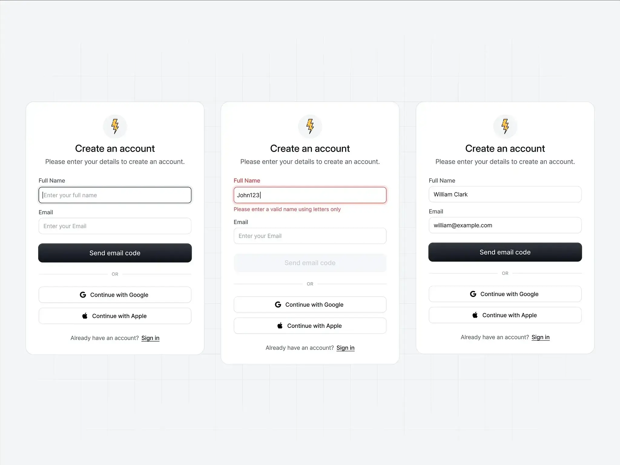
A well-designed form with inline validation, clear labels, and logical grouping (e.g. a checkout or sign-up form).
Pro tip: Test your forms with real users and measure completion rates. Often, removing just one unnecessary field can significantly improve conversion. If you're not sure whether a field is essential, try making it optional and see how many users fill it in.
Designing for accessibility and inclusive use
Inclusive design ensures that interfaces work effectively for users with diverse abilities, technologies, and contexts.
Core accessibility principles
The Web Content Accessibility Guidelines (WCAG) define four core principles, often remembered by the acronym POUR:
Principle | What it means | Example implementation |
|---|---|---|
Perceivable | Information must be presentable in ways users can perceive | Alt text for images, captions for videos, sufficient color contrast |
Operable | Interface components must be usable by all users | Keyboard navigation, no time limits, clear focus indicators |
Understandable | Information and UI operation must be understandable | Consistent navigation, clear labels, helpful error messages |
Robust | Content must work with various assistive technologies | Semantic HTML, ARIA (Accessible Rich Internet Applications) labels, tested with screen readers |
Practical accessibility implementation
Semantic HTML: Use proper heading structures (H1, H2, H3) and form labels to give assistive technologies the context they need to interpret your interface.
Keyboard navigation: Ensure all functionality is accessible via keyboard alone, allowing users who can't use a mouse to navigate your entire interface.
Screen reader support: Provide alternative text for images and proper ARIA markup so screen readers can convey your interface accurately.
Color accessibility: Don't rely solely on color to convey information; always pair color cues with text labels or icons for users with color blindness.
Focus management: Maintain clear focus indicators and a logical tab order so keyboard users always know where they are in the interface.
Inclusive design considerations
Language complexity: Use clear, simple language appropriate for your audience, avoiding jargon and unnecessarily complex sentence structures.
Cultural sensitivity: Consider how design choices like colors, icons, and imagery might be interpreted across different cultures and regions.
Technology constraints: Account for older devices, slower connections, and limited data plans that many users around the world still rely on.
Situational disabilities: Design for temporary impairments like bright sunlight making screens hard to read, or noisy environments where audio cues are inaudible.
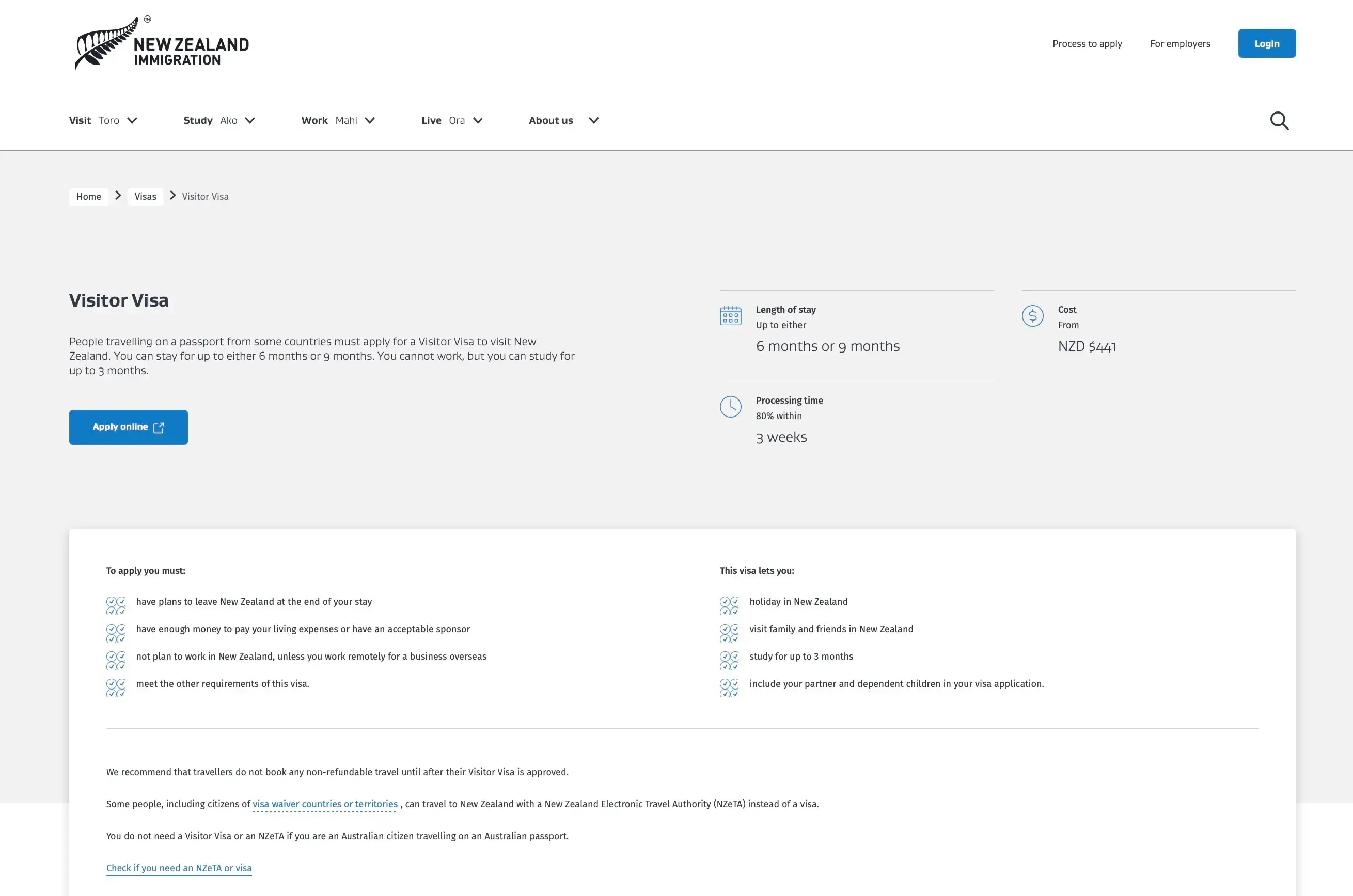
New Zealand Immigration website showing accessible design: high contrast text, clear labels with icons, logical content grouping, and visible link styling.
Pro tip: The best way to understand accessibility challenges is to experience them yourself. Try navigating your interface using only a keyboard, or turn on your device's screen reader and close your eyes. Even a few minutes of testing this way reveals issues you'd never notice otherwise.
Ensuring responsiveness and mobile-first design
Modern interfaces must work effectively across a wide range of devices and screen sizes.
Mobile-first approach
Start with constraints: Design for the smallest screen first, then enhance for larger displays. This forces you to prioritize what truly matters.
Touch-optimized interactions: Ensure all interactive elements are appropriately sized for finger navigation, with adequate spacing to prevent mis-taps.
Performance priority: Optimize for slower mobile networks and limited processing power, since mobile users often face connectivity challenges.
Content prioritization: Identify and emphasize the most important information and actions, hiding or minimizing secondary content on smaller screens.
Responsive design techniques
Technique | How it works | When to use |
|---|---|---|
Flexible grid systems | Use percentage-based layouts that adapt to different screen widths | Most layout situations; foundation of responsive design |
Scalable images | Implement responsive images that load appropriately for each device | Any interface with images; improves performance and appearance |
Breakpoint strategy | Define specific screen sizes where layout changes occur | When content needs to reflow significantly between device sizes |
Progressive enhancement | Build a solid foundation that works everywhere, then add enhancements | Complex interfaces; ensures baseline functionality for all users |
Cross-device consistency
Synchronized experiences: Ensure user data and progress sync across devices, so users can start a task on their phone and finish it on their laptop.
Adapted interactions: Modify interaction patterns appropriately for different input methods, such as hover states on desktop and long-press on mobile.
Contextual optimization: Consider how usage context differs between devices. Mobile users are often on the go, while desktop users may have more time and attention.
Performance optimization: Maintain fast loading times across all devices and network conditions, as slow performance frustrates users regardless of screen size.
Pro tip: When designing for mobile, pay attention to the "thumb zone" – the areas of the screen that are easy to reach with one hand. Place primary actions within comfortable thumb reach, typically the bottom center and sides of the screen.
UI vs UX: Understanding the difference
While user interface (UI) and user experience (UX) are closely related disciplines, they focus on different aspects of product design and serve distinct but complementary roles.
What UI focuses on vs what UX covers
Understanding where each discipline focuses helps clarify how they contribute to the overall product design process.
User interface (UI) focus areas
Visual design: UI designers work with colors, typography, spacing, and overall aesthetic appearance to create interfaces that are visually appealing and on-brand.
Interactive elements: Buttons, forms, menus, and other interface components are carefully designed to be clear, consistent, and easy to interact with.
Layout and composition: How elements are arranged and organized on screen affects both usability and visual appeal, guiding users through the interface.
Brand expression: The interface reflects and reinforces brand identity through visual choices like color palettes, typography, and imagery style.
Micro-interactions: Small animations and feedback mechanisms enhance usability by confirming actions, guiding attention, and adding moments of delight.
User experience (UX) focus areas
User research: UX professionals understand user needs, behaviors, and pain points through research methods like interviews, surveys, and usability testing.
Information architecture: Organizing and structuring content for optimal findability ensures users can navigate complex products without getting lost.
User journey mapping: Designing complete end-to-end experiences across touchpoints helps teams understand how users move through a product over time.
Usability testing: Validating design decisions through user testing and feedback reveals problems that internal teams might miss.
Strategy and planning: Aligning design decisions with business goals and user needs ensures the product serves both the company and its customers.
Key differences in approach
Aspect | UI design | UX design |
|---|---|---|
Primary concern | How it looks and feels | How it works and flows |
Tools and methods | Design software, style guides | Research tools, wireframes, prototypes |
Success metrics | Visual appeal, brand consistency | Task completion, user satisfaction |
Deliverables | High-fidelity mockups, style guides | User personas, journey maps, wireframes |
Timeline focus | Interface creation and refinement | Entire product development lifecycle |
Pro tip: If you're new to design, think of UX as the blueprint of a house (layout, flow, function) and UI as the interior design (colors, furniture, finishes). Both are essential, and the best results come from considering them together.
How they work together in product design
UI and UX design are most effective when they work together as part of an integrated design process that puts user needs at the center of decision-making.
Collaborative workflow
UX research and strategy: The process begins with understanding user needs and defining product requirements through interviews, surveys, and competitive analysis.
Information architecture: Next, teams organize content and define user flows, creating the structural foundation for the product.
Wireframing and prototyping: Low-fidelity representations of the interface allow teams to test ideas quickly before investing in visual design.
UI design: With structure validated, UI designers develop the visual design and interactive elements that bring the product to life.
Testing and iteration: Finally, teams validate designs with real users and refine based on feedback, often cycling back through earlier stages as needed.
Shared responsibilities
User advocacy: Both disciplines prioritize user needs in design decisions, ensuring the product serves the people who will actually use it.
Usability: UI and UX both contribute to creating intuitive, easy-to-use interfaces, though they approach usability from different angles.
Accessibility: Ensuring products work for users with diverse abilities and contexts is a shared concern that spans visual design and interaction patterns.
Business alignment: Balancing user needs with business goals and technical constraints requires collaboration between UI, UX, and other team members.
The importance of cross-functional collaboration
Effective product design requires close collaboration between UI designers, UX researchers, product managers, developers, and other stakeholders. When teams work together effectively, they can create products that are both beautiful and functional, meeting user needs while achieving business objectives.
Pro tip: In smaller teams, one person often handles both UI and UX responsibilities. If that's you, resist the temptation to jump straight into visual design. Spending time on research and structure first will save you from costly redesigns later.
Real-world examples and case studies
Examining real-world examples helps illustrate the principles of effective UI design and demonstrates the impact of design decisions on user behavior.
Example: Mobile app with excellent UI design
Spotify's mobile interface exemplifies many UI design best practices through its intuitive navigation, consistent visual language, and user-centered feature design.
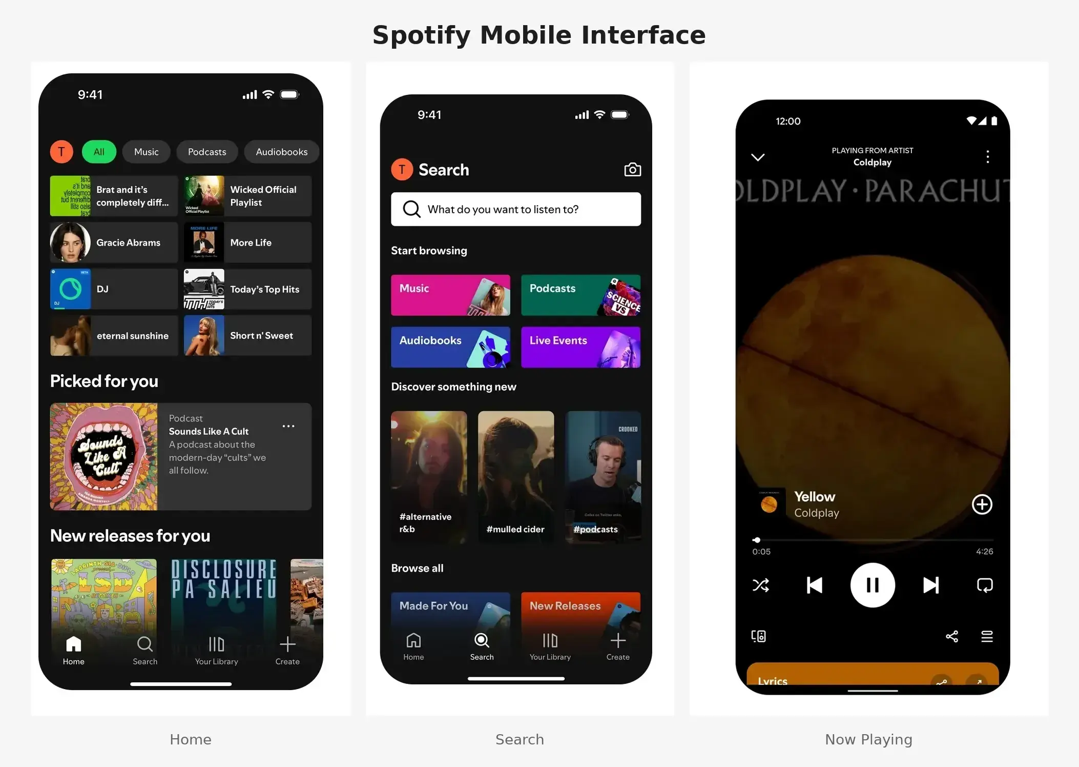
Spotify's mobile interface showing the home screen, Now Playing view, and search functionality to illustrate the consistent visual language and clear hierarchy.
What makes Spotify's UI effective
Clear visual hierarchy: Album artwork, song titles, and artist names are clearly prioritized, making it easy to scan and find what you're looking for.
Consistent interaction patterns: Swipe gestures, tap actions, and navigation work predictably throughout the app, so users can transfer their learning from one area to another.
Contextual controls: Playback controls appear when needed without cluttering the interface, keeping the focus on content while ensuring functionality is always accessible.
Personalization integration: The UI adapts to show relevant content based on user listening habits, making the experience feel tailored without requiring manual configuration.
Accessibility features: Support for screen readers, keyboard navigation, and high contrast modes ensures the app works for users with diverse abilities and preferences.
Specific design elements that work well
Bottom navigation: Primary features are easily accessible with thumb navigation, placing the most important actions within the natural reach zone for one-handed use.
Search functionality: Prominent search with smart suggestions and filtering options helps users find specific songs, artists, or playlists quickly.
Now Playing screen: A clean, focused design emphasizes the current track with essential controls, avoiding distraction while providing all necessary playback options.
Playlist management: Intuitive drag-and-drop reordering and easy sharing options make organizing and sharing music feel effortless.
Results of good UI design
Spotify's thoughtful interface design contributes to high user engagement and retention. Users can quickly find and play music, discover new content, and manage their libraries without friction. The consistent, polished interface builds trust and encourages exploration of premium features.
Pro tip: Notice how Spotify maintains visual consistency across all three screens – the same dark theme, typography scale, and green accent color. The bottom navigation stays fixed while content above changes, helping users always know where they are.
Example: Poor UI and the impact on user behavior
The initial launch of Healthcare.gov in October 2013 provides a valuable lesson in how poor UI design and technical failures can severely impact user behavior and business outcomes.
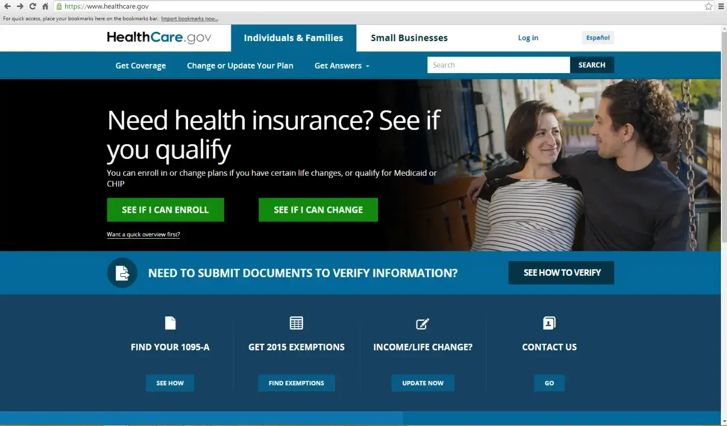
A screenshot of healthcare.gov’s old UI before it was redesigned.
According to a case study by the U.S. Department of Health and Human Services Office of Inspector General, "At its launch on October 1, 2013, and for some time after, Healthcare.gov users were met with website outages and technical malfunctions."
UI problems that created user friction
Complex navigation: Users struggled to find basic information and complete essential tasks, with no clear path through the enrolment process.
Inconsistent interaction patterns: Similar actions worked differently across different pages, forcing users to relearn how to use the interface in each section.
Poor error handling: Cryptic error messages like database exceptions appeared without explaining what went wrong or how to fix the problem.
Overwhelming forms: Long, complex forms without clear progress indicators left users uncertain about how much work remained.
Performance issues: Slow loading times and frequent system failures meant users often lost their progress and had to start over.
Impact on user behavior
High abandonment rates: Users left the site without completing enrollment. On launch day, only six people successfully enrolled despite millions of visitors.
Increased support burden: Poor UI design led to a surge in customer service calls, overwhelming support systems that weren't prepared for the volume.
Negative public perception: UI problems became a significant political and media issue, damaging trust in the broader healthcare initiative.
Reduced trust: Users lost confidence in the system's reliability and security, making them hesitant to enter personal information.
Lessons learned
User testing is essential: Regular testing with real users can identify problems before launch. Healthcare.gov had received 18 written warnings about mismanagement, but testing with actual users at scale never occurred.
Iterative design matters: Complex interfaces require multiple rounds of testing and refinement rather than a single "big bang" launch.
Performance is part of UI: UI design must account for technical performance and reliability. A beautiful interface means nothing if users can't load it.
Clear communication prevents frustration: Error messages and instructions must be written in plain language that helps users understand what happened and what to do next.
Accessibility compliance is required: Government interfaces must work for all citizens, including those using assistive technologies or slower internet connections.
According to the U.S. Digital Service, the eventual redesign of Healthcare.gov addressed many of these issues through simplified navigation, clearer language, improved error handling, and extensive user testing. A team of private sector engineers joined the project in late 2013, and by March 2014, over eight million Americans had successfully enrolled. The improved interface led to higher completion rates and better user satisfaction.
Pro tip: Before any major launch, conduct load testing that simulates real-world traffic patterns. Many of Healthcare.gov's problems only appeared under actual user load – issues that could have been caught with proper stress testing.
How Lyssna can help
Creating effective user interfaces requires understanding how real users interact with your designs. Lyssna provides the tools and insights you need to validate UI decisions and continuously improve user experiences.
Using Lyssna to test UI designs with real users
With Lyssna, you can test prototypes, interactivity, and flows, and gather user feedback through multiple research methods that help you understand how users actually experience your interface.
Method | What it helps you learn | Best for |
|---|---|---|
First click testing | Where users naturally expect to find information or complete tasks | Validating navigation and layout against user mental models |
Preference testing | Which design approaches resonate best with your target audience | Comparing color schemes, typography, layouts, and interaction patterns |
Five second testing | Whether your interface communicates key information quickly | Evaluating first impressions and visual hierarchy |
Prototype testing | How users navigate through flows and respond to interactions | Validating complete user journeys before development |
Design surveys | What users think about specific design elements and their experiences | Gathering detailed qualitative feedback on UI decisions |
Practitioner insight: "The ability for us to design a quick mockup, run it on Lyssna and receive feedback within an hour has helped us reach definitive design decisions much sooner than before."
– Chris Taylor, Senior UX/UI Designer at Canstar
First click testing helps you understand where users naturally expect to find information or complete tasks. By analyzing where users click first, you can identify whether your navigation and layout align with user mental models – or where adjustments are needed.
Preference testing allows you to compare different UI design options and understand which approaches resonate best with your target audience. You can test everything from color schemes and typography to layout variations and interaction patterns, getting clear data to support your design decisions.
Five second testing evaluates first impressions of your interface design. Users view your design for five seconds, then answer questions about what they remember and understood. This method helps ensure your UI communicates key information quickly and effectively – essential for landing pages and onboarding screens.
Prototype testing enables you to validate complete user flows and interactions before development begins. Test how users navigate through your interface, complete tasks, and respond to different design elements, catching usability issues early when they're easier to fix.
Pro tip: Combine multiple testing methods for deeper insights. For example, run a five second test to check first impressions, then follow up with prototype testing to validate the complete user flow.
Improving your interface through actionable insights
Lyssna transforms user feedback into specific, actionable recommendations for improving your UI design.
Turning research into design improvements
Identify usability issues: Understand where users struggle with your current interface so you can prioritize fixes that have the greatest impact on user experience.
Validate design decisions: Test whether new design approaches actually improve user experience before investing development resources in building them.
Optimize conversion paths: Ensure critical user flows work effectively for your target audience by identifying and removing friction points.
Measure design impact: Track how interface changes affect user behavior and satisfaction, building a clear case for the value of user-centered design.
Research-driven design process
Apply human-centered design: User interfaces should be easy to use, and you can make them better by doing research, creating user personas, and understanding user preferences. Testing designs with real people ensures they're intuitive and natural.
Devise a distinct and cohesive visual system: The placement of UI elements, as well as the choice of fonts, colors, and other visual aspects, greatly impact functionality and user-friendliness. Consistent visual language builds trust and reduces cognitive load.
Create a design system: A design system gathers together elements like text, colors, and styles, offering guidelines that your brand can use across all its web applications. Having a design system in place leads to user interfaces that are more uniform and easier to maintain.
FAQs about what is a user interface

Jeff Cardello
Freelance SaaS content writer
Jeff Cardello is a freelance writer who loves all things tech and design. Outside of being a word nerd, he enjoys playing bass guitar, riding his bike long distances, and recently started learning about data science and how to code with Python.
You may also like these articles