01 Jun 2026
|8 min
Flight search UX: Booking.com vs Expedia
We put Booking.com and Expedia in front of real users with one task: find a flight and feel confident booking it. Here's what the data revealed about clarity, trust, and decision-making.

When you're booking a flight, finding options isn't the hard part. Choosing one is.
Users are faced with dozens of flights at any given time and need to quickly narrow them down, understand what's included, and compare without second-guessing themselves. If they can't do that easily, they hesitate. And hesitation costs conversions.
Booking.com and Expedia are two of the biggest names in online travel. Both give users access to hundreds of flight options, but the user experience of getting from search to decision varies more than you might expect. So we put them head-to-head with a real task and real users to find out where the difference actually lives.
Key takeaways
Booking.com participants completed the task around 50 seconds faster on average.
80% of Booking.com participants were very satisfied with the flight they selected, compared to 70% on Expedia.
70% of Booking.com participants said the task was easier than expected; Expedia users were more neutral.
Booking.com's clear bag icons and consolidated information reduced hesitation, with 70% of participants reporting no friction.
Expedia's filter issues and price confusion created more steps between intent and confidence.
Lyssna's Live website testing feature lets you run the same kind of head-to-head study – putting real users in front of real products to surface friction before it costs you customers.
Test your own UX assumptions
See how real users experience your product – run a Live website test with Lyssna to uncover friction before it costs you customers.
Why flight search UX is worth testing
Booking a flight is a high-effort decision. Users are managing multiple variables at once – price, baggage, departure time, layovers – and they need to feel confident they've understood everything correctly before they commit. That confidence doesn't just depend on what information is available; it depends on how clearly that information is surfaced.
When a platform makes users work to understand what's included, or leaves them unsure whether they've found the right fare, they slow down. They double-check. Some drop off entirely. The question worth asking isn't whether one platform has better flights – it's whether users can actually make a decision with confidence.
That's the experience we wanted to test.
How we set up the test
We recruited 20 participants who were Australia-based, aged 30–65, and planning to book a flight in the next six to twelve months. We split them into two groups of 10, with each group testing one platform only.
The method was a live website test task followed by a short survey. The task was:
You're looking for a one-way flight from Sydney to Vancouver. You have a budget of $2,500 AUD or less. You need to include one checked bag and one carry-on, and you prefer a morning departure. Find a flight that meets your needs and stop when you feel confident booking it.
We tracked five things:
How long it took to complete the task
How satisfied participants were with the flight they selected
How easy they found the task compared to their expectations
What helped or hindered clarity
What friction points slowed them down
Participants' screens and audio were recorded throughout, and they were asked to think out loud (using the think-aloud protocol) as they completed the task – giving us both behavioral data and real-time commentary on what they were experiencing.
Writing a good test task: The best tasks are specific, grounded in a realistic context, and goal-oriented rather than instruction-oriented. This task doesn't say "find the cheapest flight" or "click the filters" – it gives participants real constraints and a clear end state. That distinction matters: goal-oriented tasks reveal how users actually navigate, rather than how they follow instructions.
What the results showed
Round 1: Speed
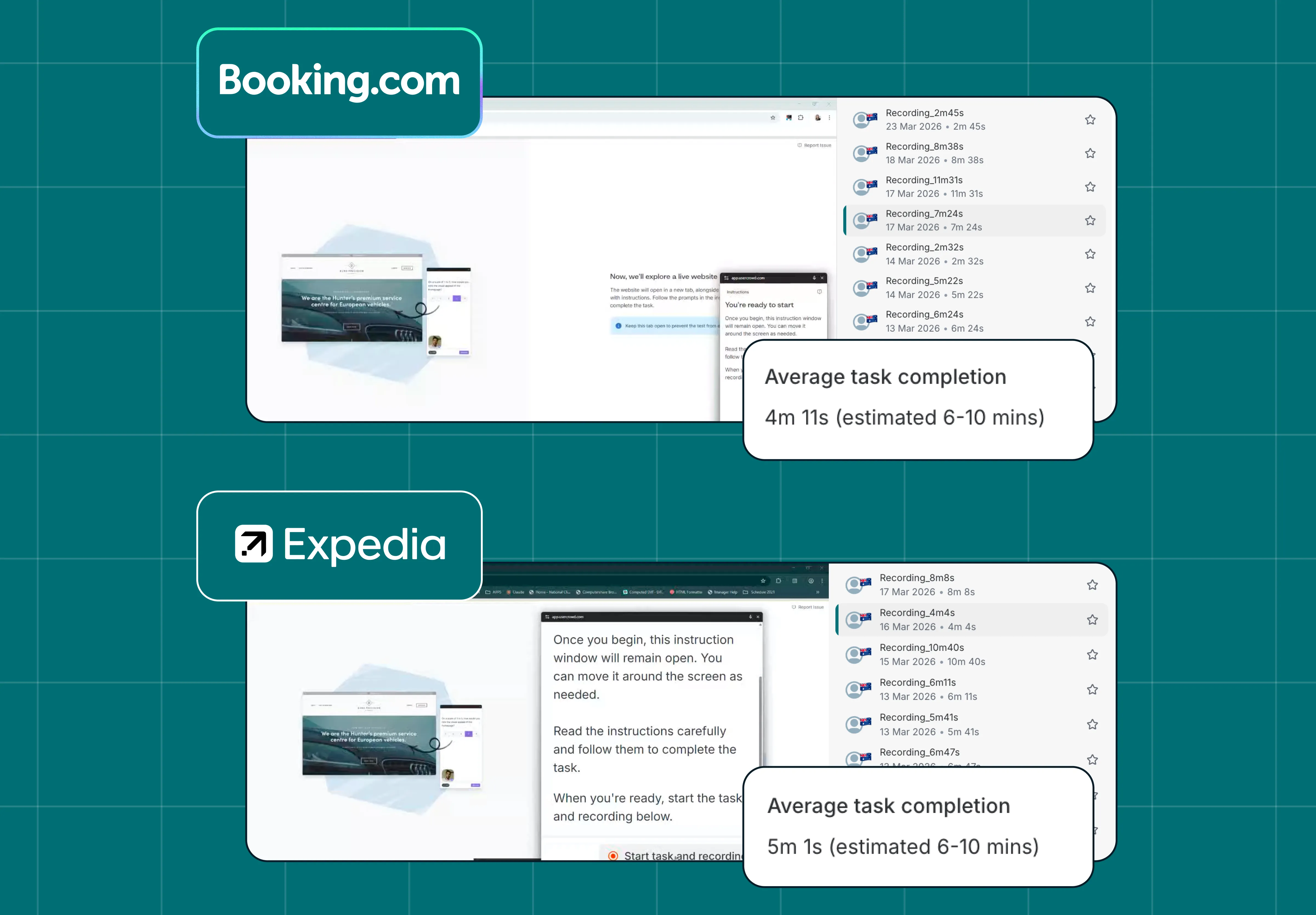
Booking.com participants completed the task around 50 seconds faster on average. Booking.com's average task time was 6 minutes 11 seconds; Expedia's was around 7 minutes 1 second. Both platforms fell within the estimated task time of 6–10 minutes, but the gap in speed reflects something meaningful: Booking.com users reached a confident decision faster, with less friction along the way.
When a user takes longer to complete a straightforward task like selecting a flight, the experience itself is the story – regardless of whether the right flight was available.
Rounds 2: Satisfaction
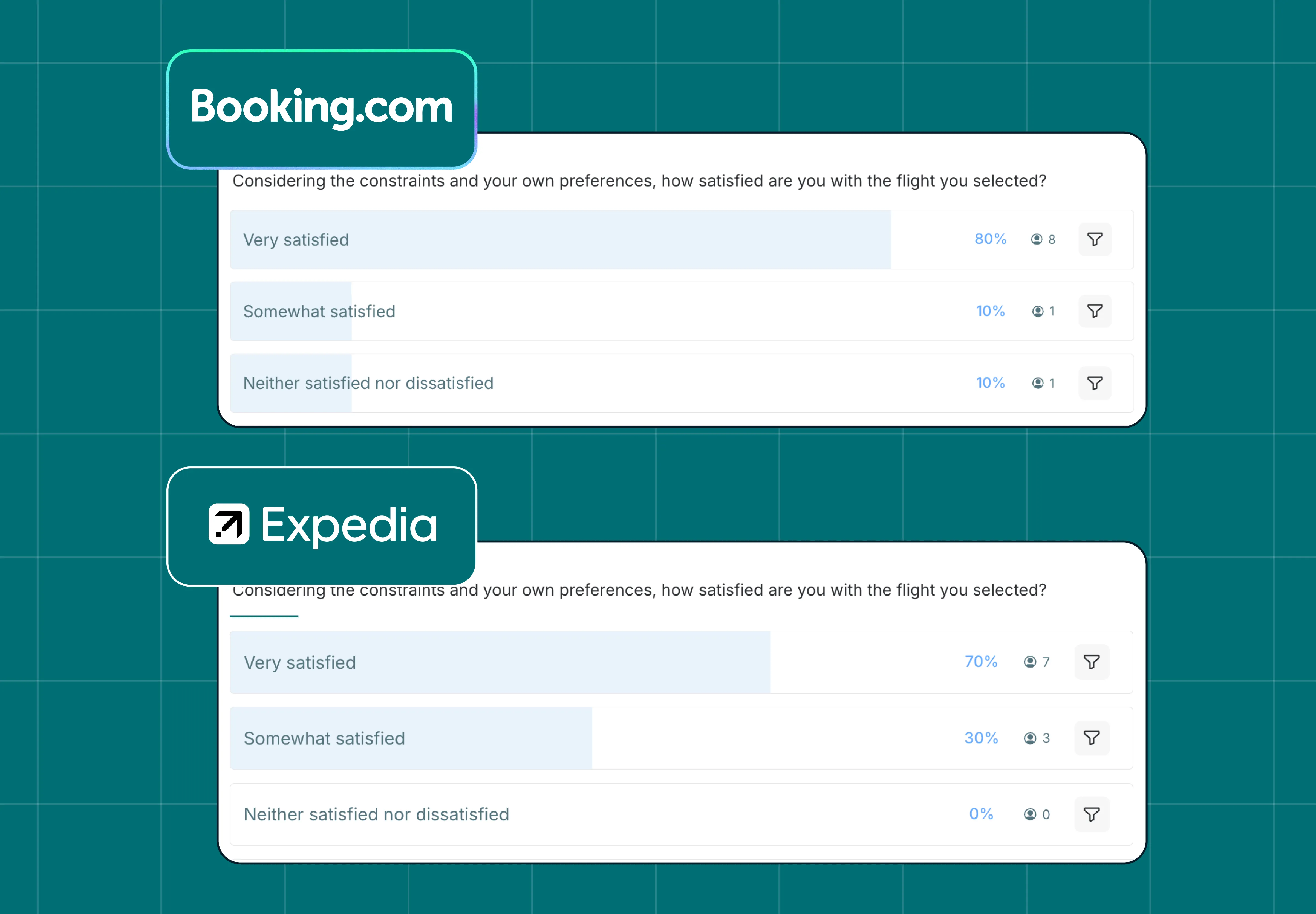
80% of Booking.com participants said they were very satisfied with the flight they selected. On Expedia, that figure dropped to 70%, with a larger share landing at "somewhat satisfied."
Satisfaction here isn't just a measure of the outcome – it's a measure of how confident users felt in their choice. A user who lands on "somewhat satisfied" may have found a flight, but the experience left them with lingering doubt. In a competitive market where users can open another tab in seconds, that doubt is a risk.
Round 3: Ease of use
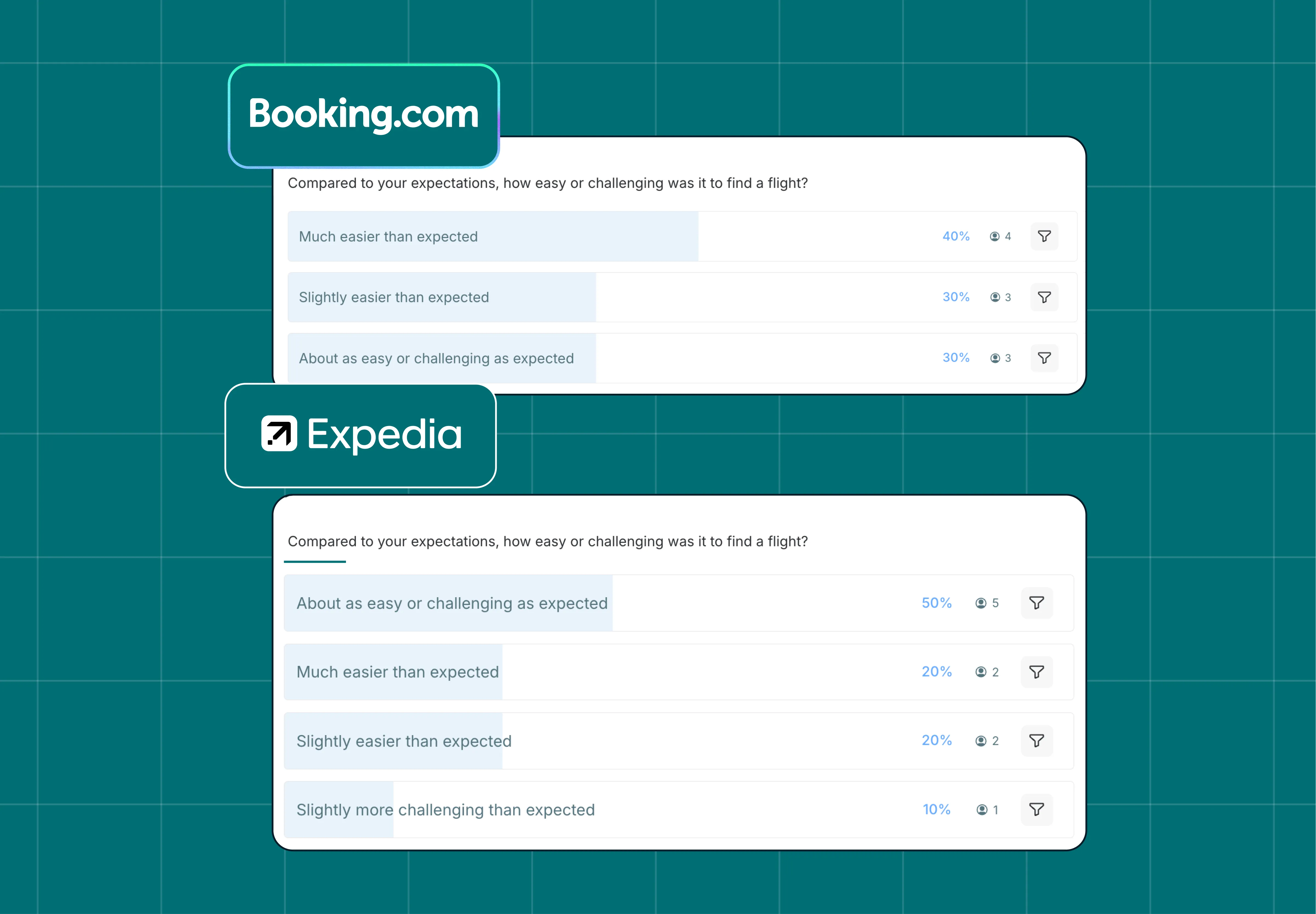
70% of Booking.com participants said the task was easier than expected. On Expedia, users were more neutral – the most common response was "about as easy or challenging as expected," with a meaningful share finding it slightly more challenging than anticipated.
The follow-up responses explain the gap. Booking.com participants pointed to clear bag icons, key information consolidated in one place, and easy scanning as the things that helped them move quickly. Expedia participants cited issues with filters – specifically, that the filters weren't working as expected for around 30% of participants – and price confusion for around 10%.
Rounds 4 and 5: Clarity and friction
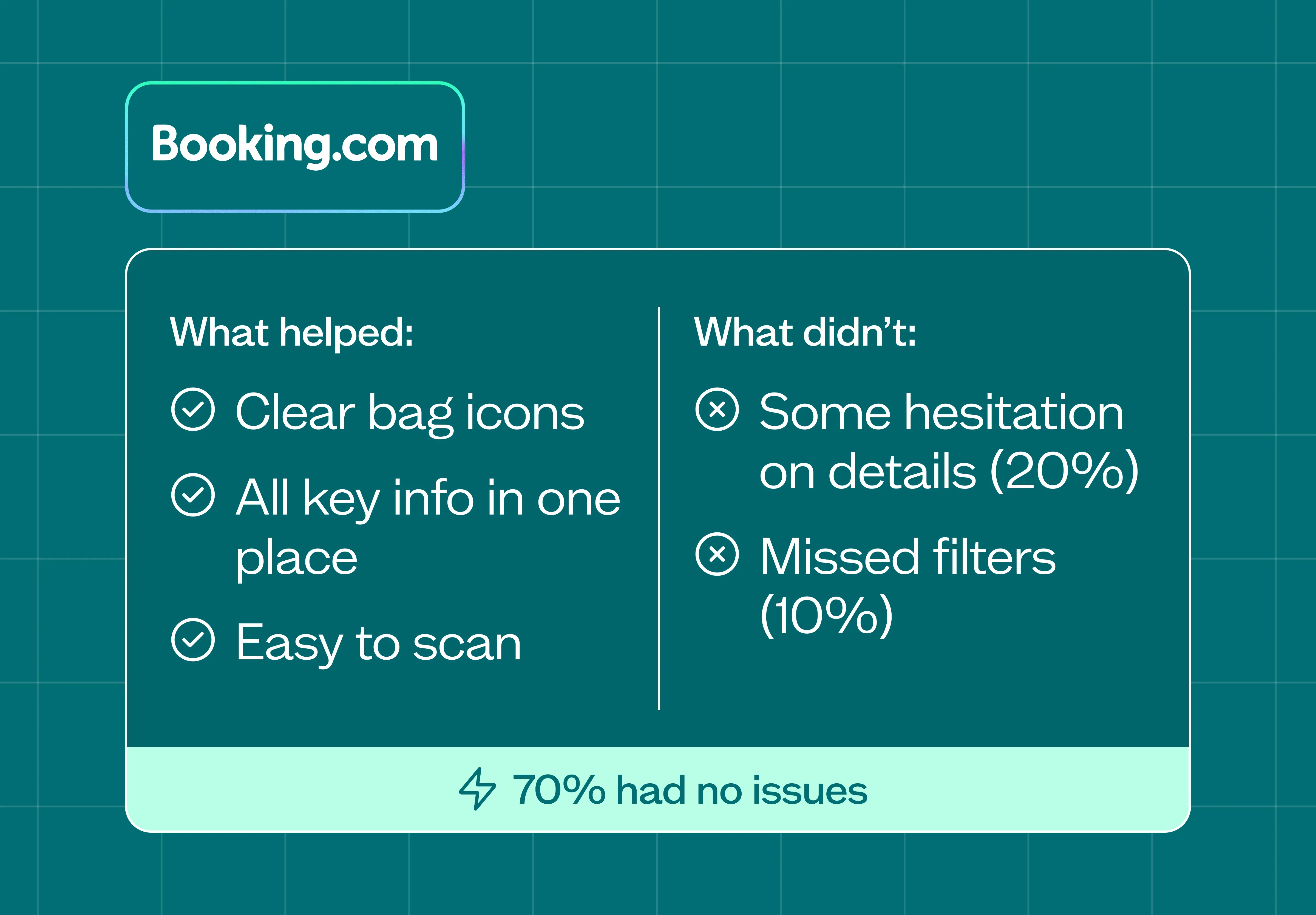
Booking.com's edge came down to usability. Users reached a decision faster, felt more satisfied with their choice, and reported a smoother experience overall. 70% of Booking.com participants reported no friction at all. Some noted minor hesitation around details and a small number missed filters, but the overall picture was clear: the platform reduced the effort required to choose.
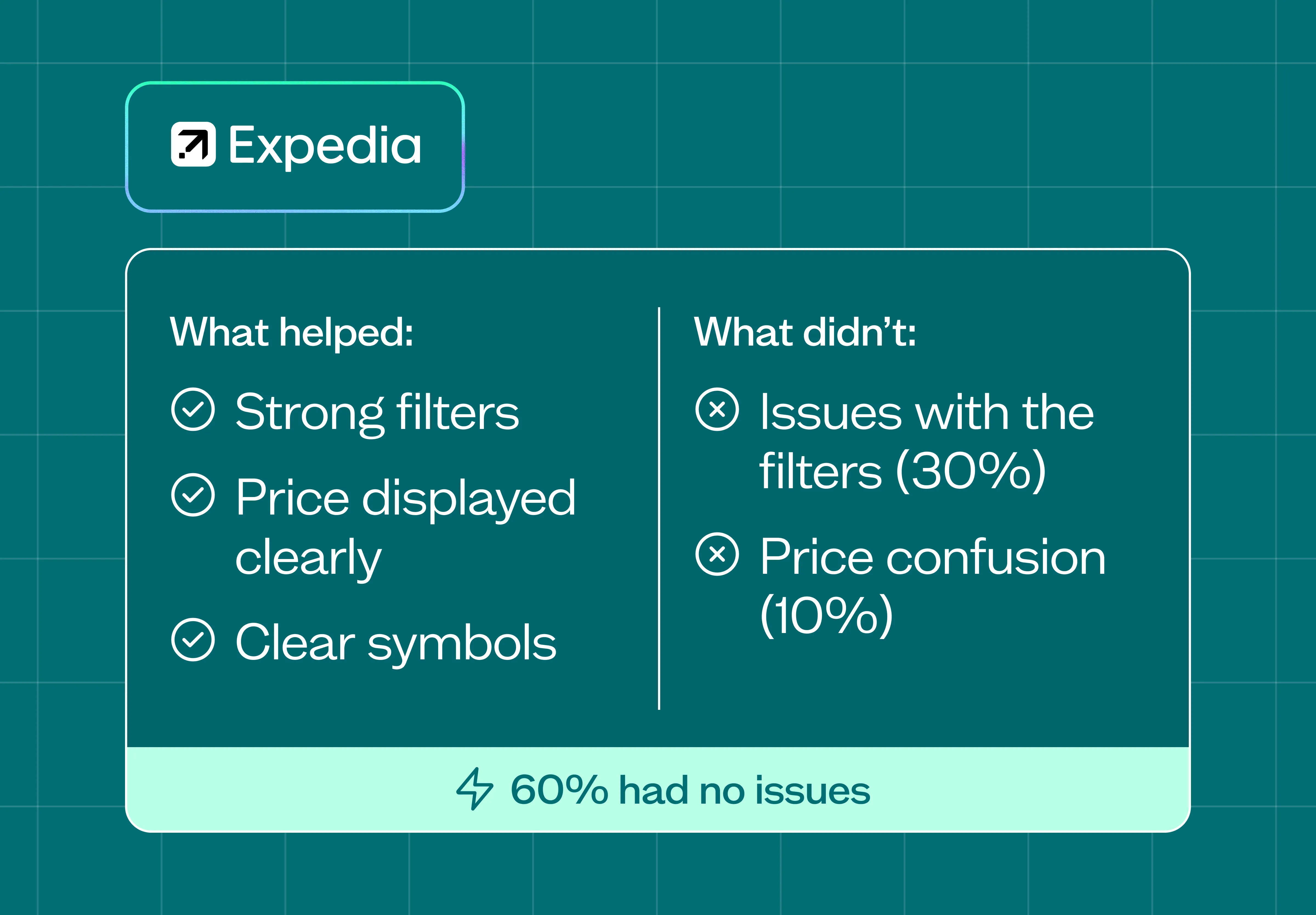
Expedia delivers functionality – users could find flights that met their needs – but they had to work harder to confirm details and felt less confident at the end. Filter issues slowed a significant portion of participants, and price confusion added unnecessary steps to the process.
Lyssna's Design Advocate Joe Formica put it plainly: "When testing – start with usefulness. It doesn't matter if it's a smooth, seamless experience if it doesn't help solve a problem for users." Both platforms solved the core problem. The difference was in how much effort that took.
Want to dig into the data yourself? You can view the complete test results – including session recordings, response breakdowns, and survey data – directly in Lyssna:
What this means for flight search UX – and product teams more broadly
The difference between Booking.com and Expedia in this test wasn't dramatic, but it was consistent. Booking.com made it a little easier. Users reached a decision faster, felt more satisfied in their choice, and reported a smoother experience overall.
Expedia delivers comparable functionality – users could find flights that met their needs – but had to work harder to confirm details and felt less confident. Every extra step required to check details adds hesitation, and clear information and easy comparison help users move forward faster.
For any product team operating in a competitive space: the experience of finding information is part of the product. When users have to work harder than expected to compare options or confirm what's included, that friction shows up in satisfaction scores, completion rates, and ultimately in conversions.
How Lyssna can help
This study used Lyssna's Live website testing feature to watch real users navigate live platforms under real conditions. Combined with follow-up survey questions on satisfaction, ease, and friction, it gives a much richer picture than analytics or review data alone.
Live website testing is well-suited to this kind of head-to-head study because it captures what users actually do – not what they say they'd do. You can see where people hesitate, what they re-read, and where they give up – alongside their commentary on why.
If you want to benchmark your experience against a competitor, or understand where your own interface might be creating friction, live website testing is a good place to start. Lyssna's research panel gives you access to 690,000+ vetted participants across 124 countries, so you can recruit exactly who you need and start testing within hours.
FAQs about flight search UX
You may also like these articles
.webp&w=3840&q=75)


Try for free today
Join over 320,000+ marketers, designers, researchers, and product leaders who use Lyssna to make data-driven decisions.
No credit card required