11 Feb 2026
|27 min
Affinity diagram
Learn how to create affinity diagrams to organize user research and identify patterns. Includes step-by-step instructions, examples, and best practices.
Share on


Share on
When you're surrounded by sticky notes, interview transcripts, and scattered user feedback, making sense of it all can feel like a challenge. That's where affinity diagrams come in – they're one of the most powerful tools for transforming chaos into clarity.
Originally developed in the 1960s by Japanese anthropologist Jiro Kawakita, this technique was first known as the "KJ Method." Kawakita used it to analyze ethnographic data, realizing that spatially grouping information revealed meaningful connections that weren't obvious when looking at individual data points.
Today, affinity diagrams have become essential for UX researchers, product teams, and anyone who needs to make sense of qualitative data quickly. Whether you're analyzing user interviews, organizing brainstorming sessions, or synthesizing research findings, affinity diagrams help you discover patterns, identify themes, and turn insights into actionable next steps.
This guide will walk you through everything you need to know about creating and using affinity diagrams effectively, from basic definitions to advanced techniques that can transform how your team approaches data analysis.

Key takeaways
Affinity diagrams organize qualitative data into meaningful patterns. By grouping related ideas, observations, or feedback, you can transform scattered information into clear themes that guide decision-making.
The bottom-up approach is what makes them effective. Unlike other methods that impose categories from the start, affinity diagrams let patterns emerge naturally from the data, helping you discover unexpected insights and avoid confirmation bias.
They work across many contexts. User research synthesis, product feature prioritization, sprint retrospectives, customer feedback analysis, and cross-study research all benefit from affinity mapping.
Quality data is the foundation. Your affinity diagram is only as valuable as the insights you feed it. Tools like Lyssna help you collect the user interviews, usability tests, and survey responses that make affinity mapping worthwhile.
Both physical and digital formats work well. Co-located teams may prefer sticky notes on a wall, while remote teams benefit from tools like Miro, FigJam, or Mural. The technique matters more than the technology.
Plan for iteration. First groupings are rarely optimal. Build in time for 2–3 rounds of refinement as your understanding develops and themes become clearer.

Affinity diagram definition
An affinity diagram is a visual method for organizing and grouping related ideas, observations, or data points to identify patterns and themes. Also known as affinity mapping or the KJ method, this technique involves clustering similar pieces of information together based on their natural relationships.
The core principle is simple: when you group related items together, patterns emerge that help you understand the bigger picture. Instead of looking at hundreds of individual data points, you can see themes, relationships, and insights that guide decision-making.
Key characteristics of affinity diagrams
Characteristic | Description |
|---|---|
Bottom-up approach | Patterns emerge naturally from the data rather than being imposed from the top down. |
Collaborative process | Teams work together to identify relationships and build shared understanding. |
Visual organization | Physical or digital clustering makes relationships immediately apparent. |
Iterative refinement | Groups can be adjusted and refined as your understanding develops. |
When to use affinity diagrams
Affinity diagrams are particularly useful in these situations:
After user research sessions: When you need to make sense of interview notes, observations, and participant feedback.
Following brainstorming workshops: When your team has generated a large volume of ideas that need structure.
When analyzing customer feedback: When support tickets, survey responses, or reviews need to be organized into themes.
During problem-solving sessions: When you're trying to understand the root causes of a complex issue.
When synthesizing data from multiple sources: When you need to combine findings from different research methods or teams.
What makes affinity diagrams so valuable is their simplicity and flexibility. They work equally well for organizing user research findings, planning product features, or solving complex business problems.

Affinity diagram examples
Understanding how affinity diagrams work in practice helps you apply them effectively to your own projects. These real-world examples demonstrate their versatility across different research and collaboration scenarios.
User research synthesis
Imagine you've conducted 12 user interviews for a fitness tracking app. After transcribing the conversations, you're left with pages of unstructured feedback covering everything from feature requests to frustrations with the current design. With a tool like Lyssna, you can run these interviews remotely and gather all your recordings and notes in one place, making it easier to pull out key quotes for your affinity mapping session.
Using an affinity diagram, you begin grouping individual quotes and observations onto sticky notes. As patterns emerge, distinct themes take shape:
Theme | Sample findings |
|---|---|
Motivation and goals | "I want to see my progress over time" "Competing with friends keeps me accountable” "I need reminders to stay on track" |
Navigation challenges | "I couldn't find where to log my meals" "Too many taps to start a workout" "The menu structure is confusing" |
Trust and data concerns | "I'm not sure if my steps are accurate" "I want to know how my data is being used” “The sync with my watch doesn't always work" |
Feature requests | "I wish I could set custom goals” “Need better sleep tracking” “Want integration with my nutrition app" |
By the end of the session, what started as 150+ scattered observations becomes five clear themes that guide your design priorities. You can see at a glance that navigation issues appear most frequently, signaling where to focus your next design iteration.
Product feature prioritization
During a design sprint, your product team generates 40+ ideas for improving an ecommerce checkout flow. Rather than debating each idea individually, you use an affinity diagram to find natural groupings.
After silent sorting, four themes emerge:
Trust and security: Badge displays, payment icons, money-back guarantees, secure checkout messaging, privacy reassurances
Reducing friction: Guest checkout option, address autofill, fewer form fields, progress indicators, saved payment methods
Recovery and support: Cart abandonment emails, live chat integration, clear error messages, order modification options
Personalization: Recommended products, recently viewed items, loyalty point displays, personalized discounts
With ideas organized this way, the team can prioritize entire themes rather than individual features. They decide to tackle "reducing friction" first, since those improvements align most closely with their goal of decreasing cart abandonment.
Sprint retrospective analysis
After a challenging two-week sprint, your Agile team gathers to reflect on what happened. Each team member writes observations on sticky notes, and you facilitate an affinity mapping session to make sense of the feedback.
The groupings reveal:
What went well: Daily standups kept everyone aligned, pair programming caught bugs early, clear sprint goal helped prioritize
What needs improvement: Scope creep mid-sprint, unclear acceptance criteria on several tickets, too many meetings on Wednesdays
Team dynamics: Good collaboration between design and dev, but QA felt looped in too late
Process gaps: No clear escalation path when blockers arose, documentation lagged behind development
Instead of a scattered list of complaints and compliments, you now have actionable categories. The team votes on which themes to address first, deciding to focus on "process gaps" by establishing a clearer escalation protocol before the next sprint.

Customer feedback analysis
Your support team has collected 300+ customer comments from surveys, support tickets, and app store reviews. The volume is overwhelming, but patterns need to emerge to inform the product roadmap.
Working through the feedback with affinity mapping, you identify recurring themes:
Theme | Frequency | Example feedback |
|---|---|---|
Onboarding confusion | High | "Took me 20 minutes to figure out how to set up my first project" |
Billing and subscription | Medium | "I didn't realize I'd be charged after the trial ended" |
Missing integrations | Medium | "Please add Slack integration," "Need to connect with Google Calendar" |
Performance issues | Low | “The app crashes when I upload large files” |
The frequency column helps prioritize: onboarding confusion appears in nearly a third of all feedback, making it the clear priority for the next quarter. You also notice that "missing integrations" comments cluster around three specific tools, giving the product team a focused list to evaluate.
Pro tip: Lyssna's survey and usability testing features let you collect qualitative feedback at scale. When you're ready to analyze, you can export responses and begin grouping them into themes using affinity mapping.

Cross-study research synthesis
When analyzing findings from multiple research studies, teams often discover patterns that span different user segments or time periods. An affinity diagram helps you consolidate insights from various sources into a unified view.
After combining data from user interviews, usability tests, and survey responses, your research themes might include:
Consistent pain points: Issues that appear across all user segments and research methods, signaling systemic problems worth prioritizing
Segment-specific needs: Patterns unique to particular user groups, such as power users wanting keyboard shortcuts while new users need more guidance
Emerging behaviors: New patterns that weren't present in earlier research, indicating shifting user expectations
Validation points: Findings that confirm existing hypotheses, strengthening the case for planned improvements
This cross-study approach transforms isolated research projects into a cumulative knowledge base that grows more valuable over time.
Affinity mapping use cases
Affinity diagrams prove valuable across numerous scenarios and industries. Understanding these diverse applications helps you recognize opportunities to use this technique in your own work.
UX research and design
Affinity diagrams are a natural fit for making sense of qualitative user data:
User interview synthesis: After conducting user interviews, you can use affinity diagrams to identify common themes, pain points, and user needs. This process transforms individual quotes and observations into broader insights about user behavior and preferences.
Usability testing analysis: Group your usability testing observations to understand which interface elements cause confusion, what works well, and where improvements are needed.
Journey mapping: When creating user journey maps, affinity diagrams help you organize touchpoints, emotions, and opportunities across the entire user experience.
Persona development: Group research findings about different user types to identify distinct user personas and their unique characteristics, goals, and challenges.
Product management and strategy
Product teams use affinity diagrams to bring structure to strategic planning:
Feature prioritization: Group feature requests by theme to understand which areas of your product need the most attention and where user demand is highest.
Competitive analysis: When analyzing competitor products, group your findings by feature categories, pricing strategies, or user experience approaches to spot gaps and opportunities.
Roadmap planning: Organize strategic initiatives and product goals using affinity diagrams to ensure alignment across teams and identify dependencies between workstreams.
Stakeholder feedback: Group input from various stakeholders to understand different perspectives and find common ground before making decisions.
Business operations and process improvement
Affinity diagrams help teams tackle complex organizational challenges:
Problem identification: When analyzing business processes, group issues by root cause, impact area, or potential solution approach to focus your improvement efforts.
Workshop facilitation: During problem-solving sessions, affinity diagrams help participants organize ideas and build consensus around priorities.
Change management: When implementing organizational changes, use affinity mapping to identify concerns, opportunities, and implementation strategies across different teams.
Marketing and customer insights
Marketing teams rely on affinity diagrams to make sense of customer data:
Customer feedback analysis: Group feedback from surveys, reviews, and social media to understand sentiment patterns and identify improvement opportunities.
Campaign planning: Organize ideas for marketing campaigns by channel, audience segment, or message theme to develop cohesive strategies.
Brand positioning: Group research about brand perception to understand how customers view your brand compared to competitors and where you can differentiate.
Quality assurance and testing
QA teams use affinity diagrams to organize and prioritize their work:
Bug categorization: Group bugs by severity, component, or root cause to prioritize fixes and identify systemic issues that need architectural solutions.
Test case organization: Group test scenarios by feature area, user type, or testing approach to ensure comprehensive coverage and spot gaps in your test suite.
Research and development
R&D teams apply affinity diagrams to manage complex information:
Literature review: When analyzing academic papers or industry reports, group findings by theme, methodology, or conclusion to identify patterns and gaps in existing knowledge.
Innovation workshops: Use affinity mapping to organize breakthrough ideas and identify the most promising research directions worth pursuing.
Practitioner insight: "Lyssna helps me quickly validate design decisions and collect real user feedback without needing to recruit participants manually. This saves a huge amount of time and gives me reliable insights that I can share with my team to support product and UX improvements."
– Verified User in Information Technology and Services (via G2)

How to create an affinity diagram
Follow these steps to transform scattered data into organized, actionable insights.
Step 1: Gather and prepare your data
Collect all relevant information. Start by assembling all the data you want to analyze. This might include interview transcripts, survey responses, observation notes, brainstorming ideas, or feedback comments. If you're using Lyssna to run user interviews or surveys, you can export your responses and recordings to have everything in one place before you begin.
Break down into individual insights. Transform your data into discrete, manageable pieces. Each insight should represent one clear idea, observation, or piece of feedback. Write each item on a separate sticky note or digital card.
Keep items specific and actionable. Instead of "users had problems," write "users couldn't find the search button on the homepage." Specific insights lead to more meaningful groupings and clearer next steps.
Practitioner insight: "We used to spend days collecting the data we can now get in an hour with Lyssna. We're able to get a sneak preview of our campaigns' performance before they even go live."
– Aaron Shishler, Copywriter Team Lead at monday.com
Step 2: Set up your workspace
Choose your format. Decide whether you'll work physically (with sticky notes on a wall or whiteboard) or digitally (using collaboration tools). Each approach has trade-offs:
Format | Best for | Pros | Cons |
|---|---|---|---|
Physical (sticky notes, whiteboard) | Co-located teams, tactile thinkers | Tangible and easy to move items, encourages physical movement, feels more spontaneous | Hard to save and share, not accessible remotely, limited wall space |
Digital (Miro, FigJam, Mural) | Remote/hybrid teams, large datasets | Easy to save and share, unlimited canvas space, supports async collaboration | Less tactile, requires tool familiarity, can feel less engaging |
Prepare your team. If working collaboratively, make sure all participants understand the process and have access to the data. Aim for 3–7 participants for optimal collaboration – large enough for diverse perspectives, small enough for productive discussion.
Create a neutral space. Start with a blank workspace where you can freely move and group items without predetermined categories. Resist the urge to create headers or labels before you've started sorting.
Step 3: Begin the grouping process
Start with silent sorting. Have team members individually place related items together without discussing their reasoning. This prevents groupthink and encourages diverse perspectives to emerge before anyone anchors the conversation.
Look for natural relationships. Group items that seem to belong together based on similarity, causation, or shared themes. Don't force items into groups if they don't naturally fit – it's okay to leave some items ungrouped initially.
Let themes emerge organically. One of the biggest mistakes is forcing categories too soon. Instead of imposing a structure from the start, let patterns reveal themselves as you sort. You'll often discover unexpected connections this way.
Create loose clusters. Begin with broad groupings that can be refined later. It's easier to split large groups than to merge overly specific ones, so err on the side of bigger clusters in early rounds.
Step 4: Refine and organize
Discuss groupings as a team. Once initial sorting is complete, have the team discuss why items were grouped together and whether the groupings make sense. This is where shared understanding develops.
Adjust and iterate. Move items between groups as understanding develops. Some items might belong in multiple groups or need their own category – that's a sign you're thinking critically about the data.
Identify outliers. Some insights might not fit into any group. These outliers can be valuable – they might represent unique opportunities, edge cases worth exploring, or signals of emerging trends.
Step 5: Label and prioritize
Create descriptive headers. Once groups are stable, create clear, descriptive labels that capture the essence of each cluster. Good headers help others quickly understand the theme without reading every item in the group.
Add supporting details. Include brief descriptions or key quotes that illustrate each theme. This context helps when presenting findings to stakeholders who weren't part of the session.
Prioritize themes. Rank groups by importance, frequency, or impact. This prioritization guides where to focus attention and resources, and helps you communicate which findings matter most.
Step 6: Document and share
Capture the final diagram. Take photos of physical diagrams or export digital versions. Include both the overall view and detailed shots of individual groups so you have documentation at multiple levels.
Create summary insights. Write brief summaries of key findings, including the most important themes and their implications. A one-page summary makes it easier to share with stakeholders who need the highlights.
Plan next steps. Identify specific actions or decisions that should result from the affinity mapping exercise. The best affinity diagrams don't just organize information – they drive action.
Affinity diagram templates to get started
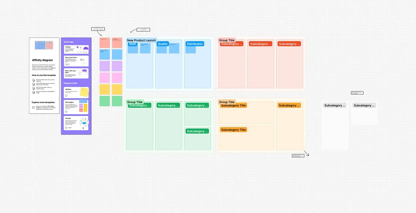
If you're new to affinity mapping or want to save time on setup, templates can help you get started quickly. These resources provide pre-built frameworks you can customize for your specific needs:
Figma community templates: Browse free affinity diagram templates created by the design community, many specifically built for UX research synthesis.
Canva affinity diagrams: Simple, visual templates that work well for quick sessions or teams new to the technique.
Miro affinity diagram template: A structured affinity diagram template, ideal for remote workshops.
Templates work best when you understand the principles behind affinity mapping. Use them as a starting point, but adapt the structure based on what emerges from your data rather than forcing insights into predetermined categories.
Best practices for effective affinity mapping
These tips will help you get the most out of your affinity mapping sessions, whether you're working solo or facilitating a team workshop.
Encourage open participation. Affinity mapping works best when everyone feels comfortable contributing. If team members seem hesitant to share, try setting a minimum quota for ideas during brainstorming (e.g. "everyone contributes at least five sticky notes").
Work in iterations. Don't expect to get it right the first time. Plan for multiple rounds of grouping and refinement as understanding develops. It's normal for themes to shift as you dig deeper into the data.
Stay focused on goals. Keep your research questions or project objectives in mind to ensure the groupings serve your ultimate purpose. It's easy to get lost in the sorting process and lose sight of why you're doing it.
Document decisions. Note why certain groupings were made, especially for controversial or unclear categorizations. This context helps during later analysis and when explaining your rationale to others.
Pro tip: If you're running an in-person session, set a time limit to stay productive. A typical structure might look like: 15 minutes for brainstorming, 15 minutes for grouping, 15 minutes for discussion, with a buffer for refinements. Adjust based on the complexity of your data.

Affinity diagrams for UX research
UX research generates vast amounts of qualitative data that can be challenging to synthesize and communicate effectively. Affinity diagrams provide a structured approach to transform your research findings into actionable insights that drive design decisions.
Synthesizing user interview data
User interviews produce rich, complex data that reveals user motivations, pain points, and behaviors. Affinity diagrams help you identify patterns across multiple interviews and extract meaningful insights.
When synthesizing interview data, focus on these key areas:
What to extract | What to look for | Example |
|---|---|---|
Key quotes and observations | Significant statements that reveal user thinking | "I always check reviews before buying anything over $50" |
User needs | Common goals, frustrations, or desires | Users want faster checkout but won't sacrifice security |
Behavioral patterns | Recurring actions or decision-making processes | Most users try search before browsing categories |
Emotional responses | Attitudes or feelings about the experience | Frustration when forms don’t save progress |
Pro tip: If you're using Lyssna to run your user interviews, you can pull transcripts and recordings directly to identify quotes worth extracting for your affinity mapping session.
Organizing usability testing results
Usability testing generates specific, actionable feedback about interface design and user interactions. Affinity diagrams help you prioritize issues and understand their broader implications.
Common categories that emerge from usability testing include:
Navigation issues: Problems with menu structure, information architecture, or wayfinding that prevent users from finding what they need.
Content clarity: Confusion about labels, instructions, or information presentation that slows users down or leads to errors.
Interaction design: Difficulties with buttons, forms, or interactive elements that create friction in task completion.
Performance problems: Issues with loading times, responsiveness, or system reliability that frustrate users and erode trust.
Turning research into design decisions
One of the most valuable applications of affinity diagrams is connecting research findings to specific design opportunities. This table shows how you might move from insight to action:
Research finding | Design implication | Potential solution |
|---|---|---|
Users abandon forms with too many fields | Reduce cognitive load | Progressive disclosure, smart defaults |
Users don't trust checkout without security indicators | Increase trust signals | SSL badges, security messaging, reviews |
Users can't find key features in complex navigation | Simplify information architecture | Card sorting, tree testing to validate structure |
Users struggle with error recovery | Improve feedback and guidance | Clearer error messages, inline validation |
Users miss important information in dense layouts | Improve visual hierarchy | Better spacing, typography, content prioritization |
This framework helps you translate qualitative findings into concrete design recommendations you can share with stakeholders.
Validating design concepts
When testing design concepts or prototypes, affinity diagrams help you understand which aspects resonate with users and which need improvement. Group your findings into these categories:
Positive reactions: Features users find valuable, intuitive, or appealing. These are your strengths to preserve and build on.
Confusion points: Elements that cause misunderstanding or hesitation. These need clarification or redesign.
Missing elements: Functionality or information users expect but don't find. These represent gaps to address.
Competitive advantages: Aspects that differentiate your design from alternatives. These are worth highlighting in positioning.
Communicating findings to stakeholders
Affinity diagrams make research findings more accessible and compelling for stakeholders who weren't involved in the research process. When presenting your organized insights, consider these strategies:
Start with themes. Lead with high-level patterns before diving into specific details, so stakeholders understand the big picture first.
Use participant quotes. Direct quotes bring insights to life and add credibility – they're harder to dismiss than summaries.
Connect to business goals. Frame findings in terms of metrics stakeholders care about, like conversion rates, retention, or support costs.
Provide clear recommendations. Don't just present problems. Offer actionable next steps based on your organized insights.
Building cumulative research knowledge
For teams practicing continuous research, affinity diagrams help you integrate new findings with existing knowledge and track how user needs evolve over time.
Benefit | How it helps |
|---|---|
Pattern recognition | Identify trends and changes in user behavior across studies |
Validation tracking | Confirm whether design changes actually address identified needs |
Knowledge building | Create cumulative understanding that compounds over time |
Team alignment | Make sure everyone shares the same understanding of user insights |
By applying affinity diagrams systematically to your UX research, you can transform individual user insights into comprehensive understanding that drives better design decisions and improved user experiences.
Practitioner insight: "A full-blown research project can take a lot of time and energy, but you can have meaningful early results from Lyssna in a single day. I think that's one of the best benefits I've seen: faster and better iteration."
– Alan Dennis, Product Design Manager at YNAB
Affinity diagram tips
Creating effective affinity diagrams requires more than just grouping related items together. These proven strategies will help you maximize the value of your affinity mapping sessions and avoid common pitfalls.
Facilitation best practices
If you're leading an affinity mapping session, your role as facilitator is critical to the quality of the outcomes.
Establish clear objectives. Before starting, make sure everyone understands what you're trying to achieve. Are you identifying user pain points, prioritizing features, or synthesizing research findings? Clear goals keep the session focused.
Create psychological safety. Encourage all participants to contribute without fear of judgment. Emphasize that there are no wrong answers during the initial grouping phase, and all perspectives are valuable.
Manage group dynamics. Watch for dominant voices that might overshadow quieter participants. Use techniques like silent sorting or round-robin sharing to ensure everyone has space to contribute.
Stay neutral. Avoid pushing your own agenda or preferred groupings. Your role is to guide the process, not influence the outcomes.
Data quality considerations
The quality of your affinity diagram depends entirely on the quality of your inputs. Keep these principles in mind when preparing your data:
Maintain consistent granularity. Ensure all items are at a similar level of detail. Mixing high-level concepts with specific observations leads to confusing groupings that are hard to act on.
Write neutral statements. Use objective language rather than interpretive conclusions. Let the grouping process reveal the insights rather than building them into individual items.
Include diverse perspectives. If your data comes from a narrow source, acknowledge this limitation and consider how it might affect your conclusions.
Common mistakes and how to avoid them
Even experienced practitioners fall into these traps. Here's how to recognize and avoid them:
Mistake | Why it’s a problem | How to avoid it |
|---|---|---|
Forcing predetermined categories | You miss unexpected patterns and confirm existing biases | Start with a blank canvas and let themes emerge from the data |
Creating too many small groups | Dozens of tiny groups obscure broader themes | Aim for 5–9 major categories, then add subcategories if needed |
Ignoring outliers | Edge cases often represent emerging trends or opportunities | Create an "outliers" group and revisit it at the end |
Stopping after one round | First groupings are rarely optimal | Plan for 2–3 iterations as understanding develops |
Skipping the labeling step | Unnamed groups are hard to communicate and act on | Create clear, descriptive headers that capture each theme's essence |

Choosing between physical and digital formats
We covered the basic trade-offs earlier, but choosing the right format also depends on your session goals and team context.
Choose physical when:
You want to encourage movement and energy in the room
Participants are unfamiliar with digital collaboration tools
You're working with a smaller dataset (under 100 items)
You have a co-located team and dedicated wall space
Choose digital when:
Your team is remote or distributed across time zones
You need to save and revisit the diagram over time
You're working with a large dataset that requires search or filtering
You want to link items directly to source materials
Consider a hybrid approach when:
You want the energy of physical sorting with the documentation benefits of digital
You're running a workshop where some participants are remote
You need to quickly digitize physical outputs for sharing
Quality assurance techniques
Before finalizing your affinity diagram, use these techniques to validate your groupings:
Cross-validation. Have different team members independently group the same data and compare results. Significant differences might indicate unclear items or biased interpretations.
Stakeholder review. Share preliminary groupings with people who weren't involved in the process. Fresh eyes often spot blind spots or suggest alternative framings.
Source traceability. Maintain clear connections between grouped items and their original sources. This lets you verify interpretations and provide context when questions arise.
Planning your session timeline
Affinity mapping can be mentally taxing, so plan your session structure carefully.
Session type | Recommended duration | Structure |
|---|---|---|
Quick synthesis (under 50 items) | 45–60 minutes | 10 min brainstorm, 20 min sorting, 15 min discussion |
Standard session (50–150 items) | 90–120 minutes | Include a 10-minute break halfway through |
Large dataset (150+ items) | Split across 2 sessions | First session for initial grouping, second for refinement |
Pro tip: If energy starts to dip, take a short break and have participants physically step back from the board. A change in perspective often sparks new connections.
Measuring success
How do you know if your affinity mapping session was effective? Look for these indicators:
Clear insights emerged. You can articulate 3–5 key themes that weren't obvious before the session.
Actionable next steps. The groupings inform specific decisions, design changes, or follow-up research.
Team alignment. Participants leave with a shared understanding of the findings and their implications.
Stakeholder resonance. When you present the results, stakeholders find the themes credible and useful.
If your groupings don't inform decisions or spark new understanding, revisit your approach. Sometimes the issue is data quality; other times, it's how the session was facilitated.
By applying these tips, you'll create affinity diagrams that provide genuine value to your team and drive better decision-making based on organized, thoughtful analysis.
Affinity mapping tools
The right tools can significantly enhance your affinity mapping process, whether you're working with a co-located team or collaborating remotely. Here's an overview of the best options available.
Physical tools
For many teams, there's still no substitute for sticky notes on a wall. Physical tools work well for co-located teams, initial brainstorming sessions, and anyone who thinks better with tactile materials. The main trade-off is that physical diagrams are difficult to save, share, and revisit later.
Tips for physical sessions:
Use different colored sticky notes for different data sources or participant groups.
Take photos throughout the session (not just at the end) to capture how groupings evolved.
Have a dedicated note-taker document the rationale behind key groupings.
Keep a stack of blank notes handy for splitting or adding items during discussion.
Digital collaboration platforms
Digital tools make it easier to save, share, and iterate on your affinity diagrams. They're especially valuable for remote teams or when you need to revisit and refine groupings over time.
Tool | Best for | Key features | Free tier | Paid plans (annual) |
|---|---|---|---|---|
Miro | Large teams, complex projects | Templates, integrations with Slack/Jira, infinite canvas, video chat | 3 boards | Starter from $8/user/month |
FigJam | Design teams, Figma users | Seamless Figma integration, audio chat, voting, timers | 3 files | Collab seat from $3/editor/month |
Mural | Facilitated workshops, enterprise teams | Facilitation features, enterprise security, template library | 3 murals | Team+ from $9.99/user/month |
Whimsical | Simple projects, quick collaboration | Clean interface, mind mapping, flowcharts, wireframes | 3 boards | Pro from $10/editor/month |
Note: Pricing shown is accurate as of January 2026 and reflects annual billing where available. Check each tool's website for current rates.
Simple alternatives
If you don't need a full-featured collaboration platform, these simpler tools can work for basic affinity mapping:
Google Jamboard: Free for Google Workspace users, integrates with other Google tools, but has basic features and limited customization.
Microsoft Whiteboard: Integrated with Teams, good for quick sessions within Microsoft 365, but less sophisticated than dedicated tools.
Notion: Not purpose-built for affinity mapping, but its flexible database and page structure can work for organizing and grouping insights.
Choosing the right tool
Factor | What to consider |
|---|---|
Team structure | Co-located teams can use physical tools; remote teams need digital platforms with real-time collaboration |
Data complexity | Simple datasets work fine with basic tools; large or complex research projects benefit from search, filtering, and linking capabilities |
Budget | Free tiers are sufficient for occasional use; regular users benefit from paid features like unlimited boards and better organization |
Integration needs | Design teams may prefer FigJam for Figma integration; teams using Jira or Asana may want Miro's connectors |
Getting your data into the tool
Before you can organize insights in any affinity mapping tool, you need quality data to work with. If you're using Lyssna to run user interviews, usability tests, or surveys, you can export your results and bring them directly into your tool of choice. Starting with well-documented research makes the grouping process faster and more productive.
Pro tip: Start simple. Learn the affinity mapping process with basic tools before investing time in mastering a sophisticated platform. The technique matters more than the technology.
Make affinity mapping easier with Lyssna
Affinity diagrams are only as good as the data you feed them. Without quality insights to organize, even the most carefully facilitated session won't deliver actionable results.
Lyssna helps you build that foundation. With remote user interviews, unmoderated usability tests, and surveys with open-ended questions, you can collect the qualitative data that makes affinity mapping worthwhile. A targeted research panel and quick turnaround times mean you're not waiting weeks to start your analysis.
Once your research is complete, the workflow is straightforward: export your findings from Lyssna, extract key quotes and observations, and apply the affinity mapping techniques covered in this guide. The result is a continuous cycle where fresh research feeds into organized insights, and those insights inform your next round of questions.
FAQs about affinity diagrams

Diane Leyman
Senior Content Marketing Manager
Diane Leyman is the Senior Content Marketing Manager at Lyssna. She brings extensive experience in content strategy and management within the SaaS industry, along with editorial and content roles in publishing and the not-for-profit sector
You may also like these articles