This template is for:
Conversion rate optimization (CRO)
Message testing
Design
Marketing
Five second testing
Usability testing
Surveys
Created by:
Lyssna
Overview
Your home page has seconds to tell the right person: this is for you.
If your messaging doesn't connect with your target audience immediately, they'll leave – even if your product is exactly what they need. It doesn't matter how much time you spent on the copy, the layout, or the headline. If the message isn't landing, users won't stick around to find out more.
This template helps you test whether your home page messaging is reaching the right users – what they understand, who they think the product is for, and what's getting in the way.
First-impression testing reveals whether your messaging is connecting with your target audience within the first few seconds of landing on your page.
The problem with untested home page messaging
Your home page is usually the most visited page on your site – and the one where first impressions form fastest. Research suggests users decide whether to stay or leave within just a few seconds. That's not much time for your messaging to do its job.
The challenge is that when you're close to your own product, it's easy to assume your messaging is clearer than it actually is. The language that feels obvious to your team can be genuinely confusing to someone encountering your product for the first time. And when your messaging is trying to reach a specific audience – say, beginners rather than advanced users, or a new segment you've recently expanded into – the gap between what you intended to communicate and what users actually take away can be significant.
Without testing, that gap stays hidden. Teams end up making copy and design decisions based on internal debate rather than real user feedback, and the home page gets tweaked endlessly without anyone knowing whether the changes are actually helping.
Common signs your home page messaging needs testing:
Users don't recognize the product is for someone like them.
Key positioning messages are missed or misread in the first few seconds.
The page is attracting the wrong audience.
Newer or niche audiences feel excluded by advanced or technical messaging.
Conversion is underperforming but it's not clear why.
This template will help you discover
Whether you're launching a new home page or trying to figure out why your current one isn't converting, this template gives you a clear picture of what's actually landing – and what isn't.
You'll find out:
What users think the product is and who it's for.
Whether your positioning is reaching your target audience.
Which messages stand out – and which get overlooked.
What's building confidence and what's creating hesitation.
What users would add or change to feel more connected to the product.
What you'll test
Audience fit – Do users immediately recognize that this product is for someone like them? This goes beyond whether they understand what the product does – it's about whether they see themselves as the intended audience.
Message clarity – Is your core value proposition obvious within the first few seconds? Or does it take reading, scrolling, or working to understand what makes your product worth their time?
Positioning strength – When users describe your product back in their own words, does it match how you'd describe it? Mismatches here often point to messaging that's technically accurate but not landing the way you intended.
Confidence signals – What on the page makes users feel like this product is a good fit for them? Testimonials, specific language, and certain design elements can all build or erode that sense of confidence – and it's not always the ones you'd expect.
Friction points – What creates hesitation or doubt? This could be terminology that feels too advanced, a feature list that's overwhelming, or social proof that speaks to the wrong audience.
How the research works
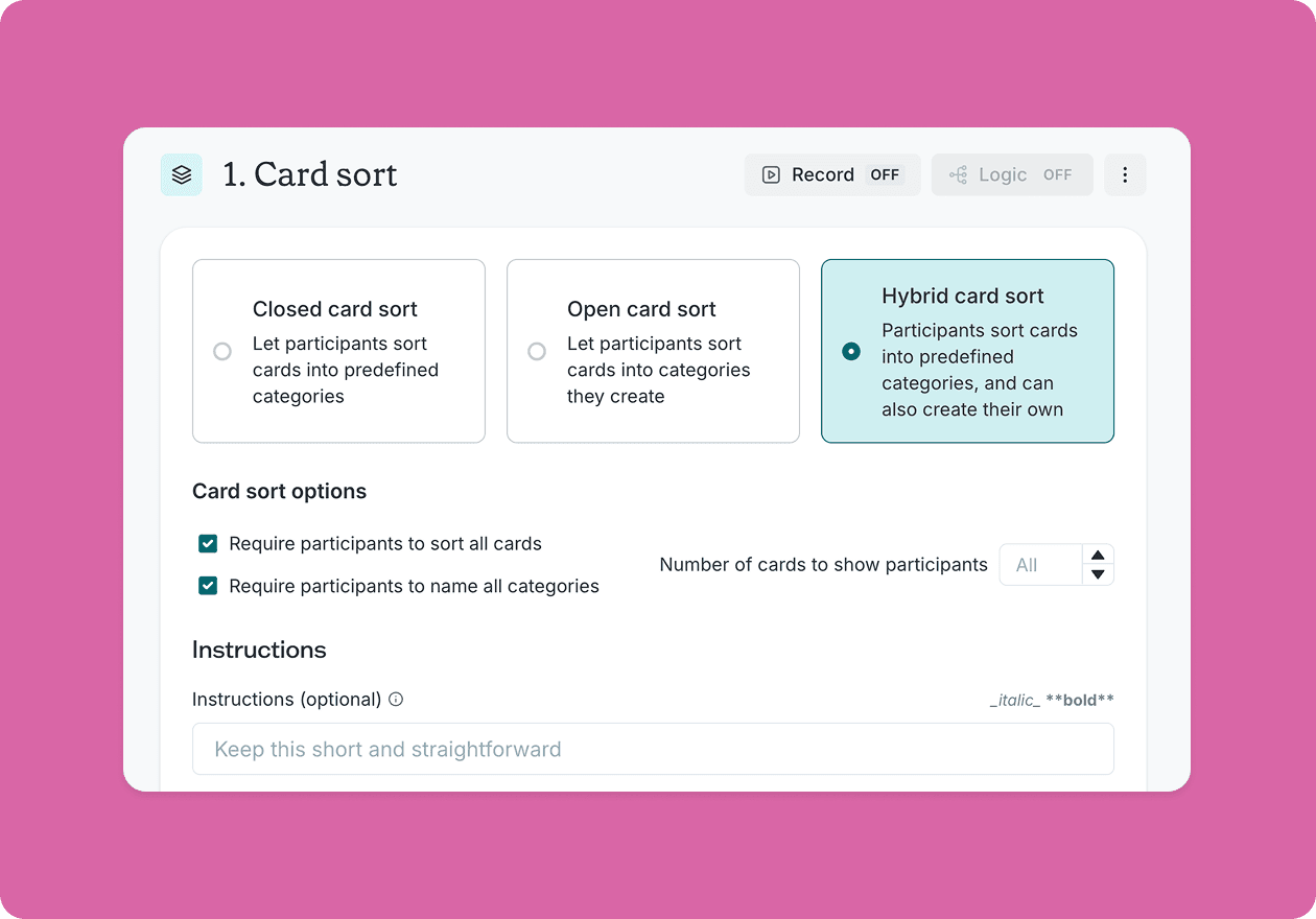
This template combines two study types – a five second test and a design survey – each with follow-up questions that dig into different aspects of your messaging.
Five second test
Show participants your home page for a short window of time, then ask them to describe what they saw. This captures raw, unfiltered first impressions before they've had time to analyze anything – revealing what your page communicates instantly.
Open questions ask users to describe what the product is and who it's for in their own words, revealing whether your positioning is actually landing.
Message selection asks which messages stood out most, helping you identify what's prominent on the page versus what's there but effectively invisible.
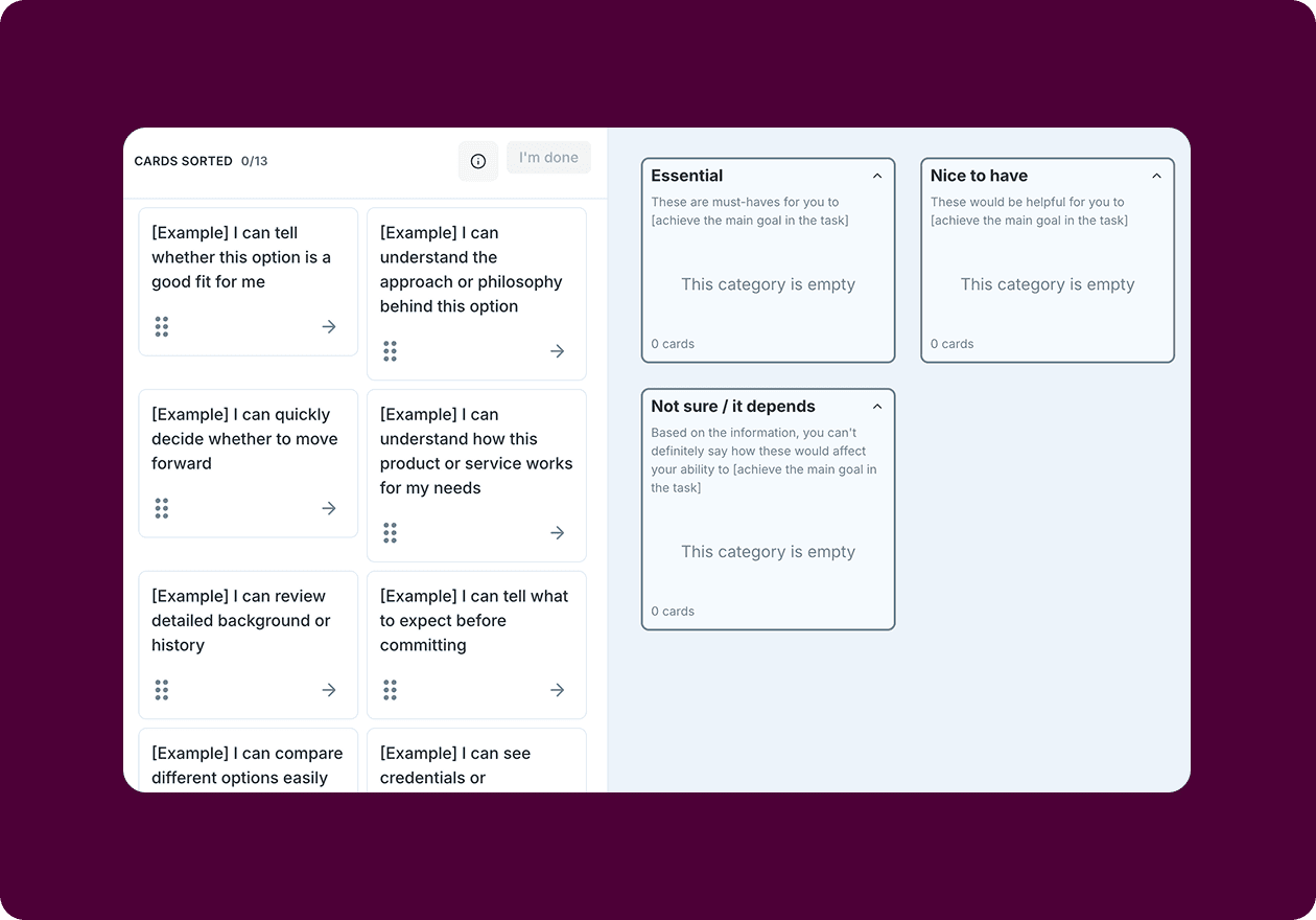
Design survey
Let users explore the full page and dig deeper. This is where you uncover the confidence signals that are working, the friction points that are creating hesitation, and the ideas for improvement you might not have thought of yet.
Follow-up questions ask users what they'd add or change – opening the door to ideas you might not have considered.
Together, these two study types separate what users actually take away from what you intended to communicate.
How to use this template
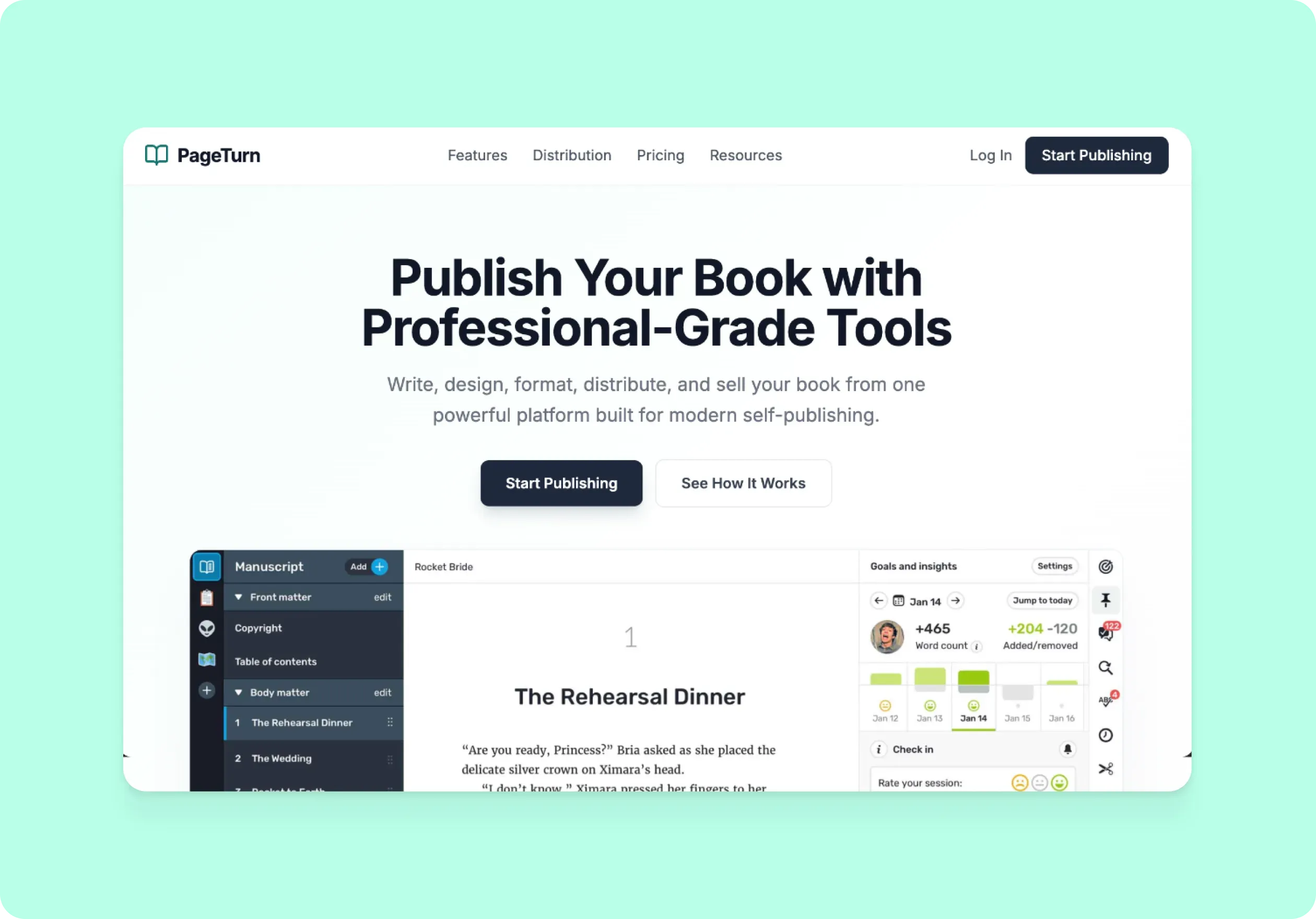
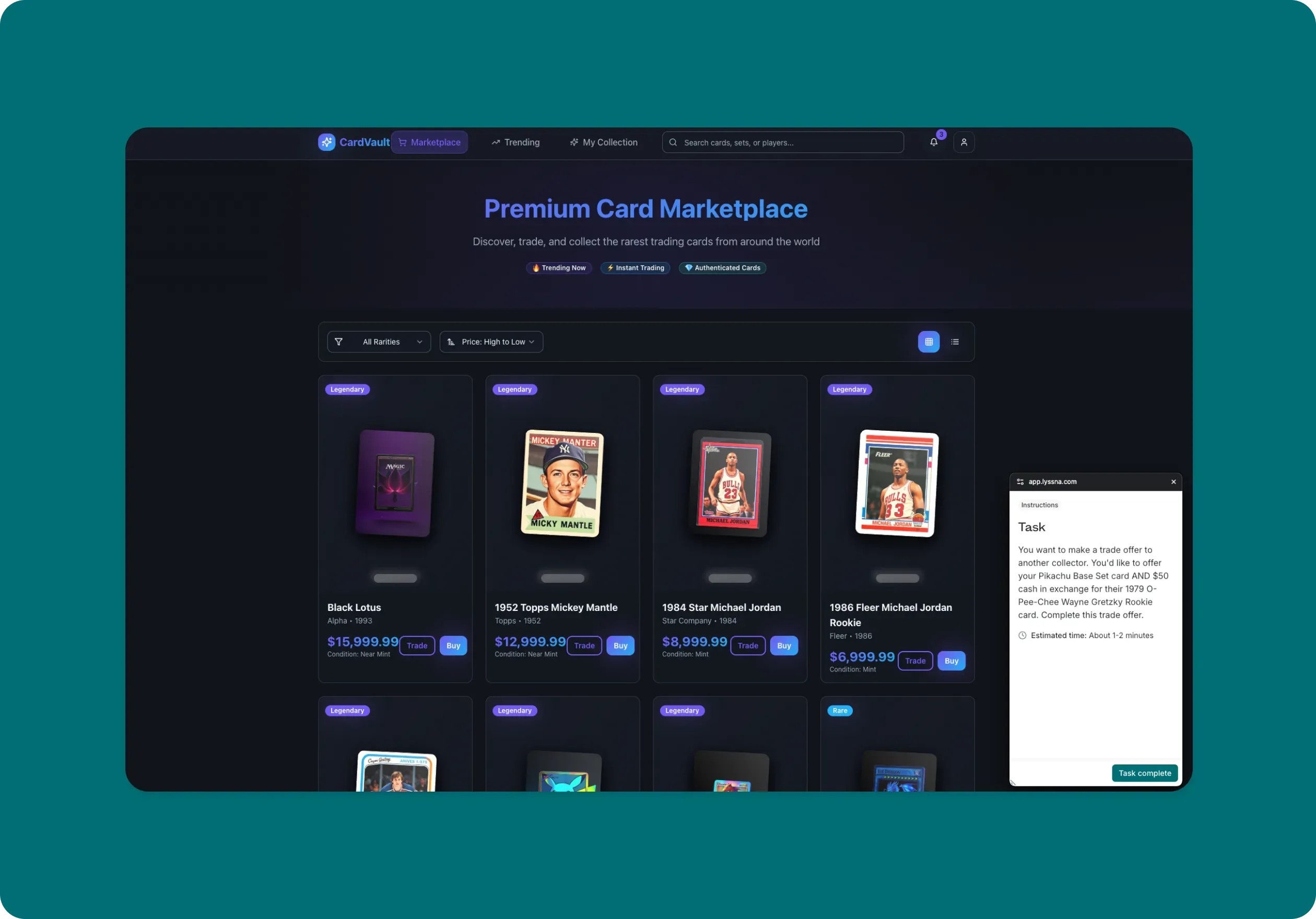
The best way to see this template in action is to watch it applied to a real product challenge. In the video below, we walk through a working example using PageTurn – a self-publishing platform that had built its reputation on powerful tools for experienced authors, but had recently expanded to appeal to beginners and first-time publishers. They'd updated their home page to reflect that shift. The question was whether it was actually working.
The walkthrough covers how to adapt the template to your own home page goals, set up a five second test to capture immediate first impressions, and build a design survey to go deeper on what's helping users feel confident – and what's getting in the way. You'll also see how to recruit targeted participants using the Lyssna panel, how to interpret your results, and how to turn what you learn into a clear set of next steps. Whether you're launching a new home page or trying to figure out why your current messaging isn't connecting with the right audience, you'll come away with a practical process for getting real answers fast.
When to use this template
When launching or redesigning a home page.
When expanding to a new audience segment.
When messaging has been updated and needs validation.
When conversion or engagement metrics are underperforming.
When stakeholders disagree on positioning or copy direction.
Who this template is for
Whether you're a UX researcher running a formal study or a founder who just wants to know if their messaging makes sense to a stranger, this template gives you a fast, structured way to find out.
It's designed for:
UX researchers evaluating home page effectiveness.
Product designers testing new messaging directions.
Marketing teams validating audience positioning.
Founders and product teams launching to a new segment.
Anyone who has ever tweaked their home page copy and wondered if it's actually working.
FAQs about how to test home page messaging
You may also like these templates

The navigation test is god's gift to UI designers. It probably has the best power-to-simplicity ratio of any software, ever.

Nick Franklin
CEO at ChartMogul


Try for free today
Join over 320,000+ marketers, designers, researchers, and product leaders who use Lyssna to make data-driven decisions.
No credit card required