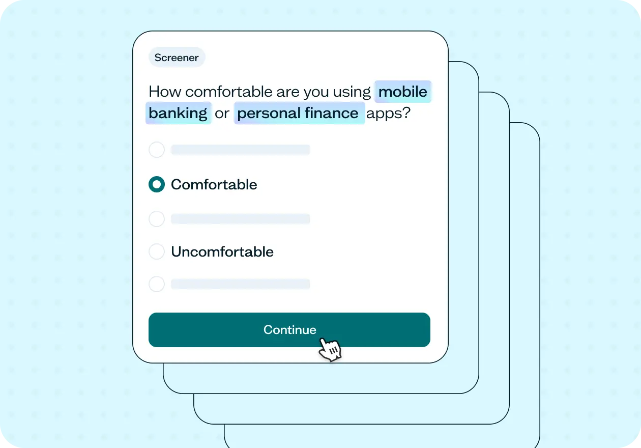
Overview
This template helps you validate your site's navigation structure with real users before any design decisions are locked in. It uses tree testing to measure findability and directness across your proposed information architecture, so you can fix structural issues before they become expensive to change.
Why untested site structure is a problem
Navigation failures are silent. Users don't tell you when they can't find something – they just leave.
Even a well-organized site structure can fail the moment real users interact with it. The categories that feel logical to your team often reflect how you think about your product, not how your users expect to find things. Those misalignments are almost impossible to spot from the inside.
Without testing, navigation decisions get resolved through internal debate, stakeholder opinion, or best guesses. Teams ship structures they believe in, only to discover through support tickets, low engagement, or post-launch analytics that users were struggling from the start.
The problem with untested site structure
Findability failures happen in seconds, and by the time your analytics surface the problem, the damage is already done. A confusing navigation doesn't just frustrate users; it buries the content, features, and actions you most want them to reach.
The challenge is that most site structures are built by people who know the product too well. When you understand the product deeply, the categories feel obvious. But the labels your team uses internally, the groupings that match your mental model, and the hierarchy that reflects your org chart are rarely the same ones that match how users think. A tree test closes that gap by putting your structure in front of the people it's designed for before you've committed to it.
Common signs your site structure needs testing:
Users report difficulty finding specific content, features, or information.
Support volume spikes around "where is X" questions.
High drop-off rates from navigation pages suggest users aren't going where you expect.
Analytics show unpredictable paths through the site, with significant backtracking.
Stakeholders disagree on the right category structure or labels with no evidence to resolve it.
A previous navigation redesign didn't solve the findability problems it was meant to fix.
This template will help you discover
Whether you're building a new site structure from scratch or rethinking an existing one, this template gives you a clear picture of what's actually working for users – and where they're getting lost.
You'll find out:
Whether users can complete realistic tasks on your proposed structure on their first attempt.
What percentage of users find the right answer confidently, versus finding it only after backtracking.
Which category labels are ambiguous, jargon-heavy, or being misread by your target audience.
Where users go when they're looking for something – and whether that matches where you put it.
Which parts of your structure are causing confusion or competition between categories.
How your navigation aligns with – or diverges from – how users naturally think about your content.
What you'll test
Findability
Can users locate specific content within your structure on the first try? Findability measures whether users reach the correct location in your hierarchy, as defined by where that content actually lives. Low findability on key tasks is the clearest signal that your structure needs adjustment.
Label clarity
Are your category names matching the words and mental models your users bring to the task? Internal terminology, product-specific jargon, or labels borrowed from your org chart can all create invisible barriers. When labels don't match user language, users confidently go to the wrong place.
Navigation paths
What route do users take to find something, and where do they change direction? Path data reveals whether users are hesitating, exploring multiple branches, or backtracking before arriving at the correct answer. High success paired with low directness is a warning sign: users can find it, but it's not where they expect it to be.
Structural alignment
Do users expect content to live where you've put it? When tasks consistently reveal that users look in a different section before finding the right one, that's a signal the structure reflects internal logic rather than user expectations. This is where tree testing is most valuable – surfacing misalignments before they become expensive to fix.
How the research works
This template uses tree testing – a method that evaluates your site structure through realistic tasks and scenarios, without any visual design to guide or distract.
Tree testing
Participants see your site structure as a text-based hierarchy – labels and nesting only, no visual design, no color, no icons. They're given a task scenario and asked to navigate the structure to find where they'd complete that task or locate that information. Because there's nothing visual to anchor their decisions, their choices reflect how well your labels and hierarchy match their expectations.
The key metrics are:
Success rate reveals the percentage of participants who selected the correct location – giving you a clear baseline for how findable each item is.
Directness reveals the percentage of participants who found the correct answer without backtracking – showing how confident and intuitive the path is, not just whether users can get there eventually.
Together, these two metrics tell you whether your structure works, and where it works well versus where it creates friction. A task with high success and high directness validates your structure. High success with low directness means users can recover, but they're losing time and confidence along the way. Low success signals a structural or labeling problem that needs to be fixed before design begins.
How to use this template
The best way to see this template in action is to watch it applied to a real navigation challenge. In the video below, we walk through a working example using Demo University – a fictional school whose site had grown over time to include a complex mix of prospective student content, student portals, academic resources, and administrative tools. The team had decided to rebuild their site structure from the ground up. The question was whether their proposed structure matched how students actually expected to find things.
The walkthrough covers how to add your site structure to the tree test (either by uploading a CSV or building it directly in Lyssna), how to write task scenarios that reveal the real failure points in your navigation, and how to set correct answers for each task. You'll see how to recruit targeted participants quickly using the Lyssna panel, how to read success rate and directness scores across multiple tasks, and how to identify the difference between a structure that works, a structure users can recover from, and a structure that's fundamentally misaligned with user expectations.
Whether you're validating a brand-new information architecture before a single wireframe is built or trying to fix a navigation that's already causing problems, you'll come away with a clear process for getting real answers before you commit to design.
When to use this template
When redesigning or rebuilding your site's navigation from scratch.
When adding a new product line, content section, or audience segment to an existing structure.
When migrating to a new platform and restructuring your information architecture.
When analytics or user feedback suggest people are struggling to find specific content.
When stakeholders disagree on category structure or labeling and you need evidence to move forward.
When preparing for an SEO site architecture review and want to align structure with how users search.
Who this template is for
Whether you're a UX researcher running a formal IA study or a product designer who needs to make a navigation decision before the sprint ends, this template gives you a fast, structured way to validate your structure with real users.
It's designed for:
UX researchers validating information architecture before design and development begin.
Product designers deciding between competing navigation structures or labels.
Content strategists mapping taxonomy to how users actually think and search.
SEO leads improving crawl efficiency and aligning site structure with search intent.
Product managers preparing for a platform migration or site redesign.
Anyone who has ever shipped a navigation and later discovered users couldn't find what they needed.
FAQs about how to improve information architecture with tree testing
You may also like these templates

We used to spend days collecting the data we can now get in an hour with Lyssna. We're able to get a sneak preview of our campaigns' performance before they even go live.

Aaron Shishler
Copywriter Team Lead at monday.com