Tree testing guide
Learn what tree testing is, how it works, and why it’s essential for improving information architecture. Discover benefits, challenges, and step-by-step examples.
Tree testing guide
Finding information on a website shouldn't feel like solving a puzzle. Yet 88% of online consumers abandon sites after a bad experience, with navigation frustration being a leading cause. When users can't find what they need, they leave and take their business with them.
Here's the challenge: Users form first impressions in just 50 milliseconds, and confusing navigation instantly signals that your site isn't worth their time.
The solution? Test your information architecture before users encounter these problems.
Tree testing offers a simple, cost-effective method to validate whether your site's navigation structure actually makes sense to real people. By stripping away visual design and focusing purely on organizational logic, you can identify and fix navigation problems before investing in development.
This guide covers everything you need to run effective tree tests that improve both user experience and business outcomes.
Key takeaways
Tree testing validates your information architecture by stripping away visual design to focus purely on whether your navigation structure makes logical sense.
The method catches structural flaws when they're cheap to fix – changing category labels in testing costs nothing compared to post-launch navigation redesigns.
30-60 participants provide reliable insights, with success rates above 60% considered acceptable and above 80% considered very good.
Results reveal specific problems: confusing labels, buried content, ambiguous categories, and where users actually expect to find information.
Early validation prevents the compound effect where fixing bugs found during implementation costs 6x more than catching them in the design phase.
Validate your navigation structure
Test your information architecture before you build. Use Lyssna to run your first tree test today.

A brief introduction to tree testing
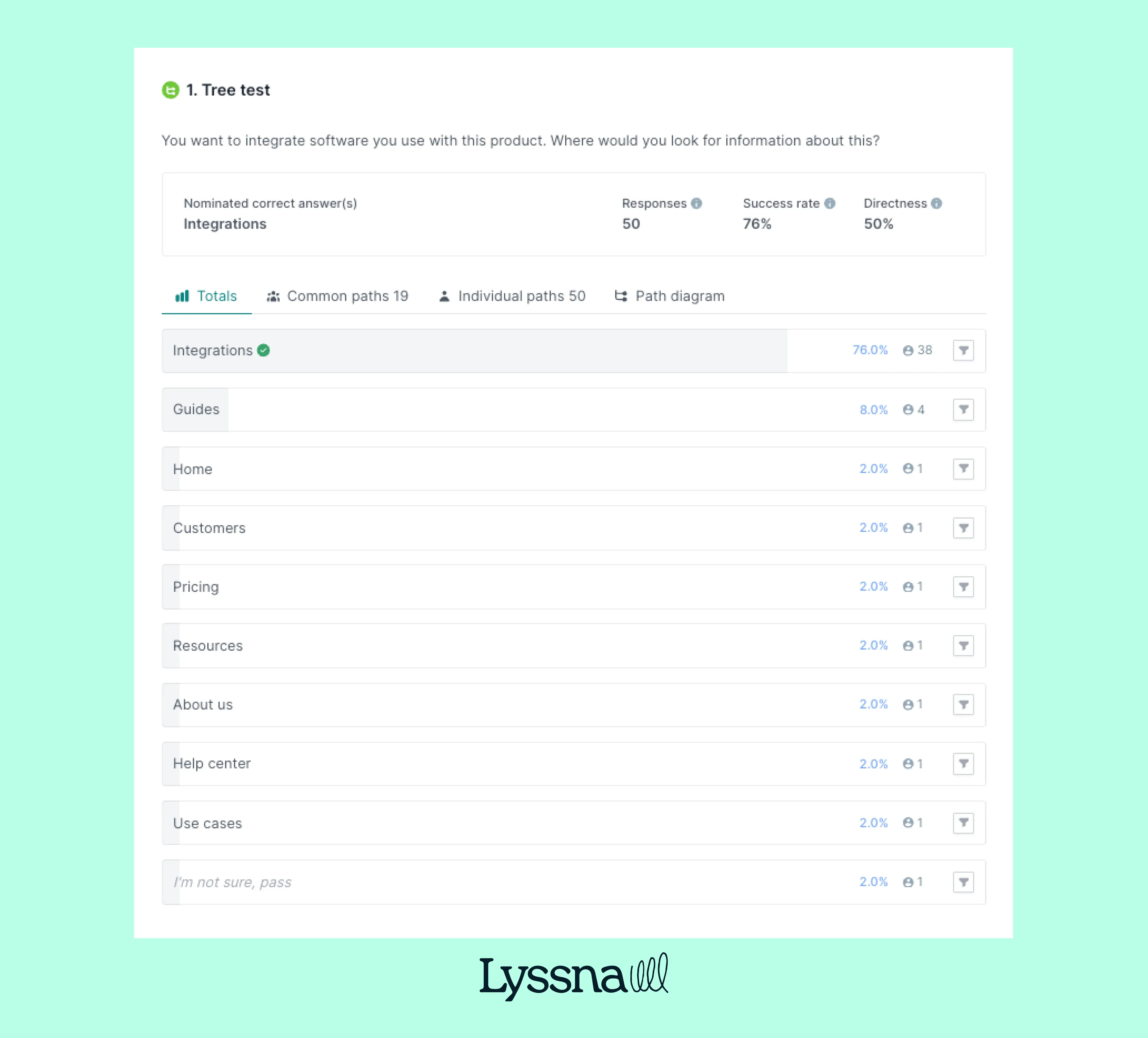
Tree testing is a usability research method that evaluates whether your website or app's information architecture actually makes sense to users. By presenting participants with a simplified, text-only version of your navigation structure, you can discover if people can find what they're looking for without the influence of visual design.
How it works
Participants see a text-only menu structure (the "tree") and complete real-world tasks:
"Where would you check your order status?"
"Find information about enterprise pricing"
"Look for the return policy"
They click through your categories and subcategories while the tool tracks:
Did they succeed?
How long did it take?
Where did they get lost?
Tree testing validates navigation for any digital product:
Websites – From ecommerce to corporate sites
Mobile apps – Ensure thumb-friendly navigation paths
Software interfaces – Validate complex menu structures
Intranets – Test employee information finding
If users navigate through it, tree testing can validate it.
Why it matters
Tree testing helps teams identify navigation problems before investing time and money in visual design or development. When you discover that only 40% of users can find your contact information, you can fix that structural issue immediately – not after you've already built the entire interface.
This early validation saves significant resources. Changing a few category labels in a text outline takes minutes. Restructuring a fully designed website takes weeks. By testing the information architecture first, teams ensure their foundation is solid before building on top of it.
As Louis Patterson from the British Red Cross explains, "This is another reason why we use Lyssna, because we can build a test, send it out the same day, and often get results back within a couple of hours." This speed enables teams to validate structures without disrupting development timelines.
The proof is in the numbers. Research shows that good navigation achieves 61-80% success rates.
The role of tree testing in optimizing information architecture
Tree testing serves as a critical validation step in the information architecture design process, helping teams create navigation structures that truly work for their users.
Quick overview
What tree testing does | Key benefit | What you'll discover |
|---|---|---|
Validates navigation | Ensures labels match user mental models | Categories that confuse users, jargon that needs simplifying |
Reduces frustration | Prevents users from getting lost or stuck | Dead ends, ambiguous categories, missing pathways |
Improves findability | Increases task success rates to 80%+ | Optimal content placement, streamlined navigation paths |
Diagnoses early | Fixes cost 10x less than post-launch changes | Structural flaws while they're still easy to fix |
Validating navigation structures
Tree testing reveals whether your categories and labels make intuitive sense by observing how users naturally navigate through your proposed structure. When participants consistently choose the wrong path or struggle to find information, it signals that your categorization doesn't match their mental models.
Common validation insights:
Category confusion – Users look for "Storage & organization" under "Home improvement" instead of "Housekeeping"
Label misalignment – Technical jargon that makes sense internally confuses your actual audience
Hierarchy issues – Important items buried too deep in the structure
The method exposes the gap between internal logic ("how we organize things") and user expectations ("where I'd look for things").
Reducing user frustration
Poor navigation creates cognitive overload that damages brand perception. Tree testing identifies these friction points before they impact real users:
What causes frustration:
Dead ends that force backtracking
Ambiguous categories with overlapping content
Missing pathways to critical information
Confusing terminology that doesn't match user vocabulary
By addressing these issues during the IA phase, you create smoother experiences that support task completion and positive brand interactions.
Improving findability and task success
According to research by Bill Albert and Tom Tullis, task success rates between 61-80% are considered "good," 80–90% "very good," and above 90% "excellent".
Tree testing helps you achieve these benchmarks by:
Measuring clear paths – Tracking whether users find information directly or through trial and error
Identifying optimal placement – Discovering where users naturally expect to find specific content
Reducing clicks to destination – Streamlining navigation depth for critical tasks
Success isn't just about users eventually finding what they need. It's about creating logical paths that feel intuitive and require minimal effort.
Early diagnosis of IA problems
Tree testing catches structural flaws when they're still easy to fix. According to the Systems Sciences Institute at IBM, the cost to fix a bug found during implementation is about 6 times higher than one identified during design, 15 times more during testing, and up to 100 times more during the maintenance phase.
Here's what this means for your navigation structure:
When you fix it | Time required | Cost impact |
|---|---|---|
During tree testing (design phase) | 1x | Fix in hours, not weeks |
After design mockups (implementation) | 6x | Redesign multiple screens |
During user testing | 15x | Recode navigation logic |
After launch (maintenance) | 100x | Lost users + rebuild costs |
Early diagnosis prevents the compound effect of IA problems. When navigation structure is flawed, it affects every subsequent design decision. By validating the foundation first, teams ensure all later work builds on solid, user-tested structure.
Pro tip: Run a quick tree test with just five participants before your stakeholder presentation. Even this small sample can reveal major issues and give you data to support your IA recommendations.
What is tree testing?
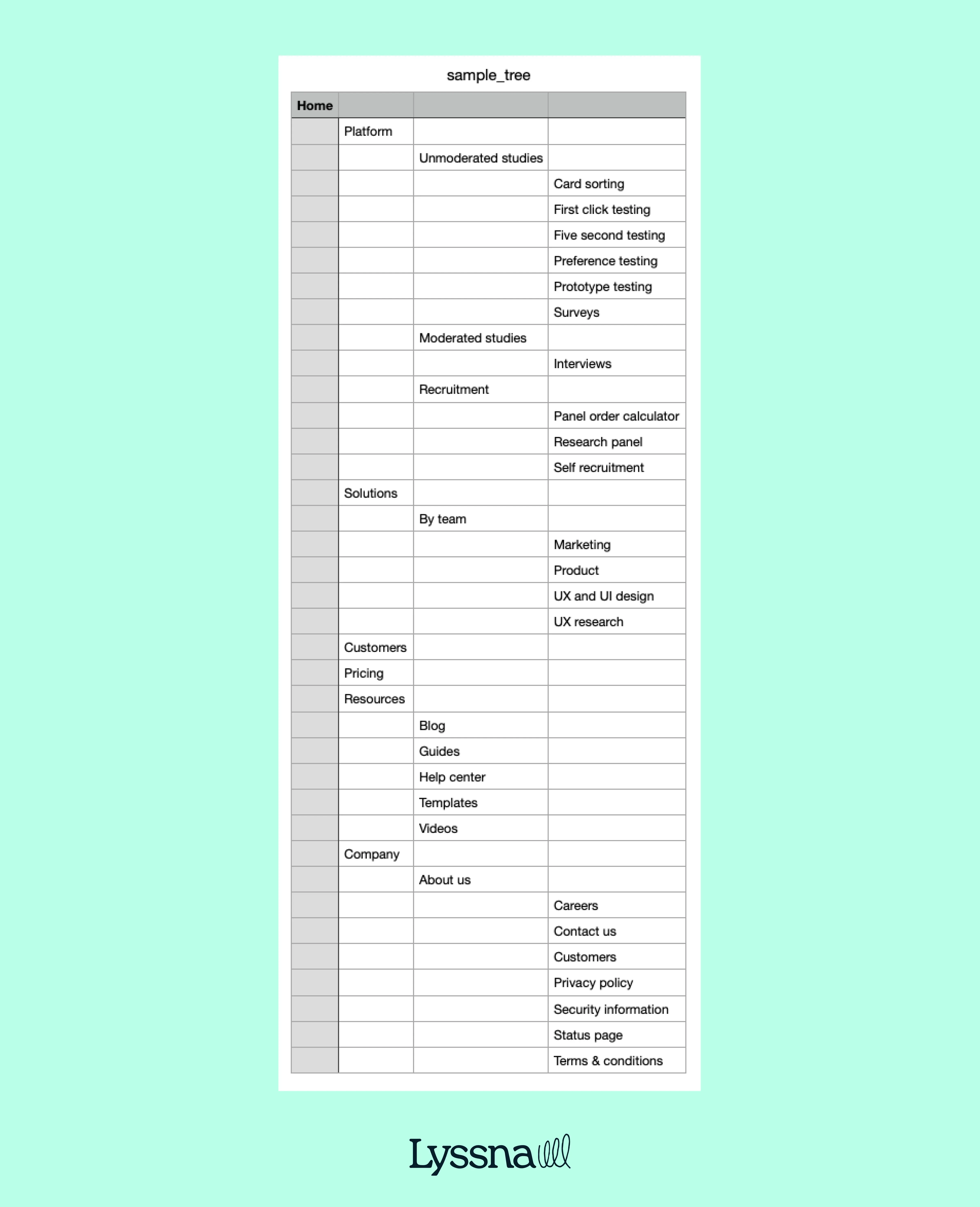
Tree testing is a research method where users complete tasks using only a simplified text version of your site's hierarchy. No visual design, no colors, just your organizational structure laid bare.
During a tree test, participants navigate through a text-based "tree" of your navigation categories to find specific information. They see only category names organized in a hierarchical list, similar to a folder structure on a computer.
Participants receive specific tasks like:
"Where would you go to find information about returning a product?"
"You want to contact customer support about a billing question – where would you look?"
Researchers track their paths, success rates, and decision-making patterns to understand whether the navigation logic actually works.
Key elements of tree testing
The core components of tree testing include several essential elements that work together to provide meaningful insights about navigation effectiveness.
The tree structure
Your site's hierarchy is shown as nested text labels: parent categories containing child categories, typically 3–4 levels deep maximum.
Realistic tasks
Goal-driven scenarios written in natural language that reflect what users actually need to accomplish. Aim for 5-10 tasks per test.
For example, "You're dreaming of a vacation in Europe but haven't decided on a destination yet. Where would you go to explore flight options for your European adventure?" provides context and motivation while testing navigation effectiveness.
Data collection
Researchers track multiple usability metrics including task success rates, the path participants take through the tree, time spent on each decision, and instances where users backtrack or change direction. This quantitative data reveals both whether users can complete tasks and how efficiently they navigate the structure.
Metric | What it measures | Target |
|---|---|---|
Success rate | % who found the right answer | >60% minimum |
Directness | % who went straight there | >75% ideal |
Time on task | Seconds to complete | Task-dependent |
Backtrack rate | % who changed direction | <20% ideal |
How it differs from other methods
Tree testing vs card sorting
Card sorting helps you create structure based on user mental models. On the other hand, tree testing proves whether that structure actually works.
Card sorting | Tree testing | |
|---|---|---|
Purpose | Build IA from scratch | Validate existing IA |
When to implement | Early design phase | After structure is proposed |
Output | Category groupings | Navigation metrics |
Question | "How would users organize this?" | "Can users find this?" |
Learn more: Tree testing vs card sorting (A detailed comparison)
Pro tip: Consider combining methods in a single study. As one hospitality industry researcher discovered: "Previously, a lot of UX tools would only let you run one study type at a time - Lyssna changed the game here. Being able to run a card sort and a tree test within a single study helps to get to navigation insights much quicker at a lower cost."
Tree testing vs usability testing
Traditional usability testing evaluates the complete experience – visual design, interactions, and content. Tree testing strips everything away to focus purely on navigation structure.
Think of it this way:
Tree testing = Testing the skeleton
Usability testing = Testing the whole body
Both are essential, but tree testing catches structural problems before you invest in visual design.
Pro tip: Run card sorting first to understand how users think, then tree testing to validate your structure, then usability testing to confirm everything works together. This three-step approach prevents expensive navigation redesigns.
Tree testing benefits
Tree testing delivers concrete advantages that directly impact your bottom line and user satisfaction.
Quick wins overview
Benefit | Impact | Result |
|---|---|---|
Clearer navigation | Users understand labels instantly | Fewer support tickets |
Data-driven decisions | Replace opinions with evidence | Faster stakeholder buy-in |
Cost-effective testing | Test with text, not designs | Save weeks of design time |
Reduced risk | Catch problems early | Avoid expensive redesigns |
1. Improves navigation clarity
Tree testing reveals how users actually interpret your navigation language. When participants consistently misinterpret "Resources" as "Support" or can't distinguish between "Products" and "Solutions," you know exactly what needs fixing.
What you'll discover:
Which labels confuse users (even ones that seem obvious internally)
Where category boundaries blur together
When jargon excludes your audience
Why users expect information in different places
As a result, you have navigation that speaks your users' language, not your org chart.
2. Data-driven decisions
Tree testing quantifies task success rates and user paths, providing concrete evidence to support information architecture decisions. Rather than relying on opinions or internal preferences, teams can make structural changes based on actual user behavior data.
The quantitative nature of tree testing results makes them particularly valuable for stakeholder discussions. When data shows that only 45% of users can successfully find pricing information in the current structure, it provides compelling evidence for reorganization that's hard to argue against.
Target benchmark: Aim for a directness rate of at least 75% for good navigational clarity. This metric measures how often users take the most direct path to their destination without backtracking or exploring incorrect branches.
3. Cost-effective testing
Tree testing is quick to set up with a text-only tree, requiring minimal time and resources compared to other usability research methods. You don't need visual designs, interactive prototypes, or complex testing environments – just a clear hierarchy and realistic tasks.
This efficiency makes tree testing accessible for teams with limited research budgets or tight timelines. You can test multiple structural approaches rapidly and inexpensively, iterating on the information architecture until you find an approach that works well for users.
Traditional usability testing:
Design mockups (2–3 weeks)
Interactive prototypes (1–2 weeks)
Visual design (2–4 weeks)
Total: 5–9 weeks before testing
Tree testing:
Create text hierarchy (2–4 hours)
Write tasks (1–2 hours)
Run test (2–3 days)
Total: 3 days to actionable insights
You can test multiple navigation approaches for less than the cost of designing one homepage.
Pro tip: You can use a platform like Lyssna to create and facilitate your test. We have a ready-made tree testing template you can adapt to get started quickly. In Lyssna, you can add parent and child nodes manually or import a tree as a CSV file. You can also download our sample tree CSV file and use it as a template.
4. Reduces development risk
Tree testing catches information architecture flaws early, before expensive design and development work begins. Making structural changes to a text-based hierarchy costs virtually nothing, while reorganizing a fully designed and developed website can require significant time and resources.
This early validation approach also aligns with lean development principles, where teams validate assumptions before making major investments. By confirming that your information architecture works for users, you reduce the risk of discovering fundamental navigation problems after launch.
The method also helps teams avoid the costly cycle of designing, building, testing, and redesigning. When you validate the structure first, subsequent design and development work builds on a foundation you know works for users.

How tree testing works
Tree testing follows a systematic five-step process that transforms your navigation structure into actionable insights.
Process overview
Step | Action | Time needed | Key output |
|---|---|---|---|
1. Build the tree | Create text-only hierarchy | 1–2 hours | Navigation structure |
2. Define tasks | Write 5–10 realistic scenarios | 2–3 hours | Test script |
3. Recruit participants | Find 30–60 target users | 1–2 weeks | Test panel |
4. Run the test | Execute online testing | 3–5 days | Raw data |
5. Analyze results | Review metrics & patterns | 2–4 hours | Action items |
Step 1: Build the tree
Create a text-only version of your site's navigation structure and add this to your tree testing tool (if you’re conducting unmoderated testing). Include all major categories and subcategories users will encounter, organized exactly as they'll appear.
Tree-building checklist
Map your complete structure (main nav + footer links)
Include 3–5 main categories
Limit depth to 3–4 levels
Use exact labels from your site
Remove visual elements and marketing copy
Common mistakes to avoid:
Don't simplify labels "for testing" – use real terminology
Don't exclude important sections because they're "obvious"
Don't create a deeper structure than users will actually navigate
Step 2: Define tasks
Write realistic scenarios that reflect actual user goals. Good tasks tell a story without giving away the answer.
Avoid using the exact language from your category names in task descriptions, as this can bias participants toward specific navigation paths. Instead, describe the user's goal or situation in natural language that someone might use when explaining their need to a friend.
Task-writing formula:
Instead of this | Write this |
|---|---|
"Find the returns policy" | "You bought shoes that don't fit and want to send them back. Where would you look for help?" |
"Locate enterprise pricing" | "Your company needs software for 500 employees. Where would you find cost information?" |
"Navigate to support" | "You can't log into your account and need help. Where would you go?" |
Pro tip: We recommend including no more than 10 tasks in a tree test. This allows your participants to engage with different aspects of the navigation and provides enough data for analysis without overwhelming them. Focus on the most critical user journeys and information-seeking behaviors that directly impact your business goals.
Step 3: Recruit participants
Recruiting participants that match your target personas ensures that tree testing results reflect how your actual audience will interact with your navigation structure. The wrong participants can lead to insights that don't apply to your real users.
We recommend aiming to recruit around 40 to 60 participants, with 30 as a minimum for reliable results. This sample size provides sufficient data to identify clear patterns while remaining manageable for analysis and budget considerations.
Participant screening criteria:
Match your primary user personas
No familiarity with your internal structure
Represent diverse user segments
Include both novices and experienced users
Pro tip: Consider using Lyssna's research panel to recruit participants who match your target demographics and behaviors. This approach ensures you're testing with people who genuinely represent your intended audience rather than convenience samples that might not reflect real user patterns.
Chris Taylor from Canstar found that "It's fast, easy, and flexible to recruit on Lyssna. We've found the users on the panel are also very generous with their feedback and have given us some really useful feedback." This quality of participant feedback can make the difference between surface-level insights and truly actionable findings.
Step 4: Run the test
Launch your test and let participants work through tasks at their own pace.
During testing:
Participants see tasks one at a time
They click through your tree to find answers
The platform tracks every click and movement
Optional: Include confidence ratings after each task
Optional: Add open-ended feedback questions
Pro tip: For more comprehensive data, add these follow-up questions:
"How confident were you in your answer?" (Linear 1–5 scale)
"What made this task difficult?" (when success rate <70%)
While tree testing is primarily a quantitative method, these qualitative insights can provide valuable context for understanding user behavior patterns.
Step 5: Analyze results
Transform raw data into actionable improvements by examining success rates, navigation paths, and user behavior patterns.
Quick assessment:
Tasks with <60% success need immediate attention
Look for patterns across multiple tasks
Identify your "popular wrong answers"
Compare performance between user segments
The below demo video goes into more detail about how tree testing works in Lyssna.
Understanding your tree testing results
Raw tree testing data only becomes valuable when you know how to interpret patterns and prioritize fixes.
Key metrics explained
Success rate
The percentage of participants who found the correct answer. As mentioned above, according to research by Bill Albert and Tom Tullis, benchmarks are: 61-80% (good), 80–90% (very good), >90% (excellent). Tasks with success rates below 60% indicate significant structural problems that need attention.
Directness
How efficiently users navigate to their destination. Target a directness rate of at least 75% for good navigational clarity. This metric reveals whether users can intuitively find the right path, even if they eventually succeed through trial and error.
Time on task
How long participants spend completing each task. While faster isn't always better, excessive time combined with low success rates suggests users are struggling. Compare time across tasks to identify which navigation decisions cause the most hesitation.
Backtrack rate
How often users change direction after exploring a category. High backtrack rates indicate uncertainty or misleading category labels that pull users down the wrong path before they realize their mistake
Reading patterns in your data
The relationship between your metrics tells a more complete story than any single number:
What you see | What it means | Action needed |
|---|---|---|
High success + high directness | Well-structured navigation | No changes needed |
High success + low directness | Users find it eventually but work too hard | Streamline paths |
Low success + diverse paths | Unclear labeling or ambiguous categories | Clarify labels and structure |
Low success + concentrated wrong answers | Content is organized against user expectations | Move content or rename categories |
When multiple participants select incorrect answers without backtracking, it indicates structural flaws in your tree. These "attractive distractors" seem relevant to users but lead to dead ends.
Prioritizing what to fix
Focus your redesign efforts where they'll have the most impact:
Priority level | Success rate | What it means | Action needed |
|---|---|---|---|
🔴 Critical | Below 60% | Fundamental failures where most users cannot complete essential tasks | Fix these first – they're actively preventing users from finding important information |
🟡 Moderate concerns | 60–80% with low directness | Users eventually succeed but work too hard to find information | Address these inefficiencies that create unnecessary friction |
🟢 Minor improvements | Above 80% | Good navigation that could be excellent | Optimize if time allows, especially if directness is low |
Turning insights into action
For each problem task, examine the following.
Where users went instead
This reveals what seemed intuitive to them and where their mental models diverge from your structure. Consider whether moving content to these more intuitive locations would serve users better.
Categories with high backtrack rates
Test clearer labels or additional context that helps users understand what they'll find inside. Sometimes adding a few descriptive words to a category name eliminates ambiguity.
Tasks where directness is low despite good success rates
Look for opportunities to create more intuitive paths. Can important information move higher in your hierarchy? Should certain categories be promoted or combined?
Spotting patterns across tasks
If users consistently struggle with a particular section of your tree across different scenarios, it suggests fundamental organizational problems with that category.
Pay attention to categories that frequently attract incorrect clicks. These need clearer category distinctions, more specific labels, or reorganization that moves content to where users naturally look for it.
Look for tasks where participants spend excessive time hovering or clicking between options before making a decision. This hesitation reveals uncertainty about category meanings or frustration with ambiguous choices.
Pro tip: Focus on fixing your worst-performing tasks first. Often, solving one major categorization problem improves multiple task success rates simultaneously, as the clearer structure helps users build a better mental model of your entire site.

Common tree testing challenges
While tree testing is a relatively straightforward research method, several common pitfalls can compromise the quality and usefulness of your results.
Challenge | Impact | Quick fix |
|---|---|---|
Poorly written tasks | Biased results from leading questions | Use natural language, avoid category names |
Wrong participants | Irrelevant data | Screen for target audience match |
Over-simplification | Missing real-world complexity | Include context users would have |
Small sample size | Unreliable patterns | Recruit 30–60 participants minimum |
Crafting clear tasks
Poorly written tasks may confuse participants and skew results by introducing ambiguity or bias that doesn't reflect real user behavior.
Mistake | Example | Better approach |
|---|---|---|
Using category names | "Find resources for small businesses" (when "Resources" is a nav label) | "Your startup needs accounting software recommendations" |
Too vague | "Find product information" | "You want to know if the laptop has USB-C ports" |
Too complex | Long paragraph with multiple goals | One clear goal in 1–2 sentences |
Leading language | "Navigate to our excellent support section" | "You need help resetting your password" |
Test your task wording with a colleague before launching. If they ask clarifying questions or interpret tasks differently than intended, revise the language.

Recruiting the right users
Wrong audience equals irrelevant data. Testing with people who don't represent your actual users won't help you create navigation that works for your real audience.
Recruitment best practices:
Be specific about criteria – "Uses financial software" not just "works in finance"
Screen for relevance – Include qualifying questions about their needs and behaviors
Avoid insider knowledge – Exclude anyone familiar with your organization
Match your user mix – If 70% of users are mobile-first, reflect that in recruitment
Consider the context in which your real users typically access your site. Mobile users may have different navigation preferences and constraints than desktop users.
Tree testing strips away design context, which may affect real-world behavior differently than pure structural testing suggests.
What gets lost:
Visual cues that guide navigation
Related content that provides context
Search functionality users rely on
Breadcrumbs and other wayfinding aids
How to account for this:
Run follow-up studies with prototype testing
Ask participants about missing context in follow-up questions
Consider tree testing as one input, not the only validation
Test your highest-risk assumptions with additional methods
Balancing sample size
Too few participants can miss important patterns, while too many wastes resources without providing better insights.
According to research, 30–60 participants provide sufficient data to identify clear patterns. With fewer than 30, you risk missing important trends or seeing false patterns in random variation.
Sample size guidelines:
Simple structure (5–10 pages): 30 participants sufficient
Complex structure (50+ pages): Target 50–60 participants
Multiple user types: 30 per distinct segment
A/B testing structures: 30 per version minimum
Monitor results as data comes in. If clear patterns emerge early and additional responses aren't changing findings, you may reach saturation before your target.

Pro tip: Run a pilot test with five participants first. This catches confusing task wording or technical issues before your full study. Better to waste five responses than 50 on a flawed test setup.
Ready to fix navigation problems early?
Catch structural flaws when they're cheap to fix. Start testing with Lyssna and get results in days, not weeks – try it free.