28 Aug 2025
|19 min
How to validate your Lovable prototype
Learn how to validate your Lovable AI prototype with real users using Lyssna in just 2-3 hours.
You just built a working prototype in 30 minutes using Lovable.dev. It looks great, functions perfectly, and you're excited to share it with your target users. But there's one crucial step before you move to development: do they actually need it?
AI-powered prototyping tools like Lovable have made it easier than ever to bring our ideas to life quickly. But speed in building doesn't guarantee product-market fit. Just because you can build fast doesn't mean you should skip validation.
In this article, we'll show you how to bridge the gap between a functional Lovable prototype and a user-validated concept that people actually want to use. By combining rapid prototyping with smart validation, you can turn your AI-generated app into something users truly connect with – all within a few hours.
Key takeaways:
Speed without validation is risky: Building fast with tools like Lovable is powerful, but without user validation, you risk creating solutions nobody wants. The fastest path to success combines rapid prototyping with smart testing.
Test assumptions, not just functionality: Sometimes, your biggest assumptions about user needs and behavior are often wrong. Validation helps you discover what users actually want versus what you think they want.
Start testing early and often: Don't wait for a perfect prototype. Test core concepts and workflows as soon as they're interactive. Early feedback prevents costly pivots later.
Focus on three validation areas: Test usability (can users complete tasks), desirability (do they want this solution), and viability (does it solve meaningful problems).
Small tests provide big insights: You don't need large studies to validate concepts. Testing with 15-20 targeted users across multiple methods can reveal critical insights about product-market fit.
Why Lovable prototypes need user validation
The ability to create functional prototypes in minutes has transformed product development. With Lovable AI, you can turn an idea into an interactive app faster than ever before. But this speed creates a new challenge: the temptation to "build first, ask later."
When prototyping was slow and expensive, teams naturally included validation steps because they couldn't afford to build the wrong thing. Now that building is becoming faster and cheaper, it's tempting to skip straight to development without understanding if users actually want what you're creating.
Gathering user feedback offers a competitive advantage – building what your users actually need. It helps you:
Identify problems users didn't know they had.
Uncover gaps between user expectations and your solution.
Discover which features matter most to your audience.
Avoid costly pivots after launch.
Pitfalls of rapid prototype development
Building at speed can lead to assumptions about your users. Here are the most common pitfalls we see teams fall into:
Assuming you know what users want: Your internal team might love a feature, but that doesn't mean your target audience will. What seems obvious to you might be confusing to someone using your product for the first time.
Skipping user research because the prototype "feels right": A prototype that works well in controlled conditions might fail when real users interact with it in their natural environment. Different users have different mental models, expectations, and workflows.
Confusing functionality with desirability: Just because something works doesn't mean people want to use it. A prototype can be technically perfect but solve the wrong problem, or solve the right problem in a way users don't prefer.

How to validate your Lovable prototype
To validate whether your prototype resonates with real users, you need to test three distinct pillars:
Pillar | What it measures | Key questions |
|---|---|---|
Usability | Can users actually navigate and use it? | Do users understand how to complete tasks? Are there friction points in the user journey? |
Desirability | Do users want this solution? | Would they choose this over alternatives? What would make them recommend it to others? |
Viability | Does it solve a meaningful problem? | Is this a priority problem for users? How often would they use this solution? |
These three validation areas build on each other – usability checks that people can use your solution, desirability confirms they want to, and viability validates it solves problems they actually prioritize.
The Lovable + Lyssna validation workflow
Here's how to validate your Lovable dev prototype with real users using Lyssna. This five-step process helps you move from assumptions to evidence-based decisions about what to build next.
Step 1: Define your validation goals
Start by documenting what you're trying to learn. Clear goals help you design better tests and interpret your results more effectively.
What assumptions are you testing? Write down your key assumptions about user behavior, needs, and preferences. Examples:
"Small business owners will understand our inventory dashboard without training."
"Users will prefer our one-click checkout over a multi-step process."
"Freelancers will find our time-tracking feature more intuitive than existing tools."
Who is your target audience? Define specific user segments rather than broad categories. Instead of "mobile app users," specify:
"Freelance graphic designers who work with 5+ clients simultaneously."
"Restaurant managers who handle staff scheduling and inventory."
"Parents managing multiple children's sports team communications."
What success metrics matter most? Decide how you'll measure validation success, for example:
Task completion rates above 80%.
Average task completion time under 2 minutes.
User satisfaction scores of 4+ out of 5.
70% of users saying they'd recommend the solution.
Step 2: Set up your Lovable prototype for testing
Best practices for testing-ready prototypes
Your Lovable AI prototype doesn't need to be perfect, but it should be realistic enough to generate meaningful feedback. Here are some tips:
Include realistic content: Use actual product names, realistic pricing, and authentic-looking data rather than placeholder text. Users respond differently to Lorem Ipsum than to content that feels real.
Focus on core workflows: Don't try to build every feature. Focus on the primary user journey you want to validate. A deep prototype of one key flow is more valuable than a shallow prototype covering everything.
Make it feel interactive: Users should be able to click through the main actions, even if some features are simplified. The goal is to create a realistic sense of using the actual product.
What to include vs what to leave out
Include | Leave out |
|---|---|
Core user workflows | Complex error states |
Realistic data and content | Advanced settings/preferences |
Key decision points | Secondary features |
Primary navigation | Detailed help documentation |

Step 3: Recruit the right users
The quality of your validation depends entirely on testing with the right people.
Using Lyssna's research panel vs your own network
Lyssna's research panel works well when you need:
Specific demographics or user characteristics.
Unbiased feedback from people unfamiliar with your company.
Quick access to qualified participants.
Diverse geographic representation.
Your own network is better when you need:
Deep domain expertise.
Existing customers familiar with your product category.
Long-term relationship building.
Industry-specific knowledge.
Sample size recommendations for concept testing
Test type | Recommended participants | Why this number |
|---|---|---|
Usability testing | 5-8 users | Uncovers 80% of usability issues |
Concept validation | 15-20 users | Provides reliable pattern identification |
Feature prioritization | 20-30 users | Ensures statistical significance |
Step 4: Design validation tasks
Testing usability flow
Create tasks that mirror real-world usage. Instead of saying "Click the submit button," try "You need to send your project proposal to a client by the end of the day. Show me how you would do that using this app."
Good task characteristics:
Based on realistic scenarios.
Don't give away the solution.
Focus on user goals, not interface elements.
Include context about user motivation.
Gauging desirability and interest
Go beyond functionality testing by exploring emotional responses and purchase intent.
Effective desirability questions:
"How excited would you be to use this product?"
"How likely are you to recommend this to a colleague?"
"How does this compare to your current solution?"
"What would convince you to switch to this product/service?"
Understanding user mental models
Ask users to explain their expectations before they interact with features. This reveals gaps between how you've designed something and how users expect it to work.
Expectation-setting questions:
"What do you expect to happen when you click this?"
"What information would you want to see on this page?"
"How would you expect this process to work?"
Step 5: Analyze and iterate
Identify patterns in user feedback
Look for consistent themes across multiple participants rather than focusing on individual opinions. Pay attention to:
Consistent confusion points: Where multiple users struggled.
Unexpected behaviors: Actions users took that you didn't anticipate.
Strong emotional reactions: Features that excited or frustrated users.
Language differences: How users describe features vs how you describe them.
With multiple testing methods and participants, this step can become overwhelming. Lyssna's AI-powered Synthesize feature helps you identify patterns across follow-up question results automatically, surfacing key themes without manually analyzing responses.
Prioritizing changes based on user feedback
Priority level | Change type | Example |
|---|---|---|
High | Blocks task completion | Users can't find the main navigation |
Medium | Causes friction but users adapt | Confusing button labels that users eventually figure out |
Low | Nice-to-have improvements | Visual preferences that don't impact usability |
Planning your next iteration
Use your findings to guide the next version of your prototype. Focus on addressing high-priority issues first, then test again to validate that your solutions worked.
When validation reveals bigger issues
Sometimes, testing uncovers problems that can't be fixed with simple iterations. If users consistently struggle to understand your core value proposition or don't see the need for your solution, you might need to:
Pivot your approach
Reframe the problem you're solving based on user feedback.
Adjust your target audience to better match who finds value in your solution.
Modify core features based on what users actually prioritize.
Go back to the drawing board
Use insights to build a different solution to the same problem.
Explore adjacent problems that users care more about.
Consider whether your assumptions about the market were incorrect.
Validate before you rebuild. Don't immediately start building a new version – use what you learn to form new hypotheses, then test those assumptions before investing more development time.
Remember, discovering that users don't need your current approach is valuable feedback – it's not a failure. It's much better to learn this from a quick prototype built in an AI tool than after months of full development.
Real-world example: CardVault trading marketplace
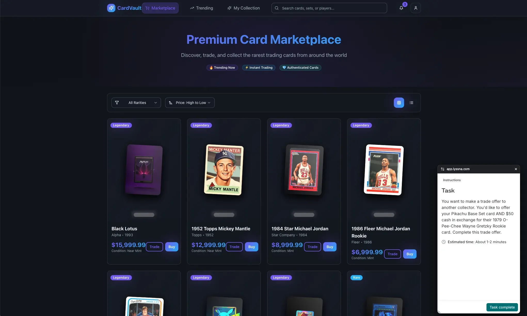
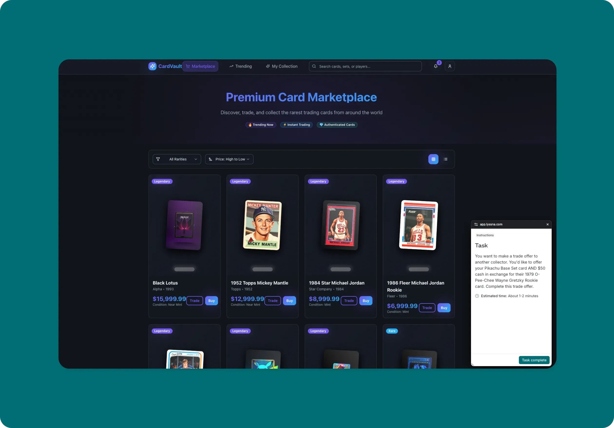
We built a collectible card marketplace called CardVault using Lovable, featuring a new card trading system where users can exchange collectible cards (think Pokémon, sports cards, etc). The prototype includes a trading interface with card selection, offer creation, and trade management.
Our assumption was straightforward: "Trading cards is intuitive – users just need to select cards and hit trade." The interface looks clean, the functionality works (to a degree – it is a basic prototype, after all!), and our team found it easy to use.
But rather than building out the full trading system based on assumptions, we decided to validate the concept and user experience first.
The testing process
We used three different validation approaches to test different aspects of the trading feature with 15 collectible card enthusiasts.
Here's a video walkthrough showing our process – you can also view the test results if you'd like to dig deeper.
Phase 1: Basic usability with first click testing
Goal: Test if the "Offer a trade" button placement and labeling made sense
Method: First click testing
Task: "You're browsing this marketplace and you see a 1984 Star Michael Jordan card that you'd like to trade for. You want to make a trade offer to the owner. Where would you click first?"
Results:
93% recognized trading as a core platform function, with 73% also identifying buying/selling capabilities.
33% highlighted trading functionality as the key differentiator from buy/sell-only competitors.
73% expected robust trade proposal workflows with forms for entering trade information and selecting cards as a next step.
20% expected communication features like messaging to negotiate with owners.
Users valued expanding access beyond limited friend circles to a broader marketplace with quality verification.
Phase 2: Feature prioritization study using card sorting
Goal: Understand which trading features collectors actually need vs nice-to-haves
Method: Card sorting exercise to prioritize features
Features tested: Multi-card trades, adding cash to balance trades, countering offers, trade history, market value indicators, trade chat, etc.
Results:
60% found the current feature list comprehensive with no major gaps.
80% prioritized security features (secure payments, trade protection, dispute resolution).
47% specifically wanted card authenticity verification and accurate condition assessment.
40% required social proof through reviews, large user bases, and transaction history.
Key missing features: customer service support, shipping details, return policies, authenticity guarantees.
Phase 3: Complete flow testing with live website testing
Goal: Identify pain points in the full trading workflow
Method: Live website testing with the working Lovable prototype
Task: “You want to make a trade offer to another collector. You'd like to offer your Pikachu Base Set card AND $50 cash in exchange for their 1979 O-Pee-Chee Wayne Gretzky Rookie card. Complete this trade offer.”
Results:
Average ease-of-use rating: 3.9 out of 5, indicating some improvement opportunities.
80% would recommend the platform, citing ease of use and straightforward trading process.
Multiple users want third-party reviews and validation.
Key concerns: difficulty finding own cards, authenticity verification, platform feeling "too new."
Users need market values and price history to evaluate trade fairness effectively.
Visual verification through quality photos and actual card images are essential for trade confidence.

What we'd prioritize next
Based on the validation results, here's how we’d prioritize our product development roadmap in order of user impact.
Priority 1: Market value integration
With users specifically requesting pricing context, we'd build market value indicators. Users need to see recent comparable trades and estimated card values before making offers. This addresses one of the core problems that emerged.
Priority 2: Trust and transparency features
Users emphasized trade history and user reviews as decision factors. We'd implement user rating systems, trade history displays, and comparable trade lookups. These features directly address the conditional recommendations we received: users want to recommend the platform "once there are reviews."
Priority 3: Trading workflow improvements
The 3.9/5 ease rating shows some UX friction. We'd focus on:
Clearer trade balance indicators showing fairness.
Improved card selection interface for user's own inventory.
Better card photography and verification features.
Streamlined multi-step trade proposal process.
Priority 4: Flexible interaction models
Since user expectations varied between direct trading forms and communication features, we'd test hybrid approaches that accommodate both preferences – perhaps starting with structured forms but allowing message exchanges during negotiation.
The value of validating early prototypes
This process revealed several benefits of testing our simple AI-generated prototype early on in the development process.
Prevents building the wrong features
Our original roadmap prioritized a multi-card trading feature. User feedback showed that market transparency tools and trust indicators would provide much more value than advanced trading mechanics.
Identifies critical UX gaps
The moderate ease rating and user feedback revealed specific pain points that would have caused drop-offs: lack of market context, insufficient trust signals, and confusing trade balance displays.
Validates the core concept
Despite the UX issues, users were interested in the trading concept. However, recommendations were conditional: "I would, it seems easy and secure" but also "I wouldn't right now just because it feels too new. I would need reviews from other people."
Provides specific design direction
Instead of guessing what to build next, we were able to come up with clear priorities based on actual user needs:
Market value indicators.
Trade history and user reviews.
Better card photography and verification.
Clearer trade fairness indicators.
Time investment payoff: We spent 2-3 hours validating our prototype versus weeks building features users don't prioritize. The data shows we would have built the wrong things first – focusing on complex multi-card features instead of fundamental trust and transparency capabilities that users actually need.

Getting started with prototype validation
Below are a few things to help you get started with validating your AI prototypes.
Quick validation checklist
Before you start testing your Lovable prototype, make sure you have:
Clear testing objectives - What specific questions are you trying to answer?
Target audience identified - Who exactly needs to use this product?
Key assumptions documented - What are you assuming about user behavior and needs?
Success metrics established - How will you know if validation was successful?
Realistic prototype content - Does your prototype feel authentic enough to generate meaningful feedback?
Tools and templates for Lovable prototype validation
Lyssna prototype testing features:
Live website testing for complete user journey validation.
First click testing for navigation and discoverability issues.
Card sorting for feature prioritization.
Surveys for desirability and intent measurement.
Free template
Use our pre-built Lovable prototype test template to jumpstart your validation process. It includes questions and tasks designed specifically for testing your Lovable prototype – just adapt it depending on your goals.
Making the most of your testing budget
Start small and iterate: You don't need to test everything at once. Start with your biggest assumptions and most critical user flows.
Combine testing methods: Use behavioral testing (like first click tests) to identify what problems occur, then use observational methods (like live website testing) to understand how and why those problems happen.
Test early and often: Small, frequent validation sessions provide more value than large, comprehensive studies done less frequently.
What to do with your results
Prioritize feedback effectively
Not all feedback is equally important. Focus on:
Issues that block task completion - Fix these immediately.
Patterns across multiple users - Address consistent confusion points.
Misaligned expectations - Bridge gaps between user mental models and your design.
Feature priority conflicts - Understand what users actually need vs what you think they need.
Plan your next iteration
Use validation insights to guide your next Lovable prototype iteration:
Address high-priority usability issues first.
Incorporate language changes that match user expectations.
Add or remove features based on actual user priorities.
Test your solutions to make sure they resolve the problems you identified.
Building validation into your development cycle
Make user validation a standard part of your development process:
Validate concepts before building detailed features.
Test prototypes before committing to development.
Continue gathering user feedback after launch.
Use insights to inform your product roadmap.

Turn your prototype into something users love
Your Lovable prototype is only as good as the problem it solves for real users. The combination of rapid AI-powered prototyping and smart user validation creates a powerful development approach: you can build fast and validate faster.
In just a few hours, you can transform your Lovable prototype from a demo into a user-validated concept that people actually want to use. The key is treating validation not as a bottleneck, but as an accelerator that helps you build the right thing from the start.
Whether you're testing a simple feature or a complex user flow, the validation process helps you understand not just whether your prototype works, but whether it works for the people who matter most: your target users.
Ready to validate your Lovable prototype?
Start testing with real users today and turn your rapid prototype into something users truly love.
FAQs

Diane Leyman
Senior Content Marketing Manager
Diane Leyman is the Senior Content Marketing Manager at Lyssna. She brings extensive experience in content strategy and management within the SaaS industry, along with editorial and content roles in publishing and the not-for-profit sector
You may also like these articles


Try for free today
Join over 320,000+ marketers, designers, researchers, and product leaders who use Lyssna to make data-driven decisions.
No credit card required
