12 Mar 2026
|9 min
Fee transparency in UX: How Wise and Revolut compare
Fee transparency in UX: We tested how Wise and Revolut communicate transfer costs to real users. Here's what the data revealed about clarity, trust, and speed.

When you're sending money abroad, the last thing you want is to get to the end of the flow and discover the total cost wasn't what you expected. You want to see exactly what you'll pay – upfront, clearly, before you commit.
That's a reasonable expectation. But it's not always the experience people get – and in a crowded market, how clearly a platform communicates cost can be the difference between winning and losing a customer.
We decided to put two of the biggest names in international transfers head-to-head: Wise and Revolut. Wise had been showing up in online reviews with customers flagging "hidden" fees. Revolut, a fast-growing competitor in the same space, was entering more conversations as an alternative. Rather than take the reviews at face value, we tested the actual experience – putting both platforms in front of real users with a simple task: find the true cost of sending $500 from the US to Spain.
Key takeaways
Wise participants completed the task 3 minutes and 45 seconds faster than Revolut participants on average.
70% of Wise participants correctly identified the total cost; Revolut participants showed significantly higher uncertainty.
Wise consistently rated higher on pricing clarity, with participants describing it as "transparent" and "trustworthy."
Revolut participants frequently mentioned confusion, difficulty locating a combined fee total, and frustration with repeated prompts to download the app.
The reviews flagging Wise for "hidden" fees didn't hold up when tested – the actual experience told a different story.
Test your own UX assumptions
See how real users experience your product – run a live website test with Lyssna to uncover friction before it costs you customers.
Why fee transparency is a UX problem worth testing
International money transfers are high-stakes. People want to know what they're paying before they commit – not after. And the tricky thing is that "total cost" is rarely a single number. It's fees plus an exchange rate margin, and how clearly those two things are surfaced has a direct impact on whether someone moves forward or drops off.
When users can't quickly find a clear total, they slow down. They second-guess themselves. Some start to wonder if something is being obscured on purpose. That uncertainty doesn't just affect completion rates – it affects how people feel about the brand.
So the question we wanted to answer wasn't whether Wise or Revolut charge more. It was whether users can actually find out what they'll pay – and whether that experience feels honest.
How we set up the test
We recruited 20 participants who were USA-based, aged 35–65, had used digital banking, and had sent money internationally before – but not through Wise or Revolut. We split them into two groups of 10, with each group testing one platform only.
The method was a live website test followed by a short survey. The task was:
Imagine you want to send $500 USD to a friend in Spain. Before sending, you want to understand the total cost of the transaction. Please use the site to determine, as closely as you can, the final cost (including any fees). And please take note of this amount.
Once you feel confident that you've found or calculated the total cost, stop and mark the task as complete.
We tracked five things:
How long it took to complete the task
Whether participants correctly identified the total cost
How confident they felt in their answer
How clearly they felt pricing was communicated
Whether the experience felt trustworthy
Participants' screens and audio were recorded throughout, and they were asked to think out loud as they completed the task – giving us both behavioral data and real-time commentary on what they were experiencing.
Writing a good test task: The best tasks are specific, grounded in a realistic context, and goal-oriented rather than instruction-oriented. Notice that this task doesn't say "find the fees page" – it gives participants a real-world reason to look. That distinction is important: goal-oriented tasks reveal how users actually navigate, rather than how they follow instructions.
What the results showed
Round 1 – Speed
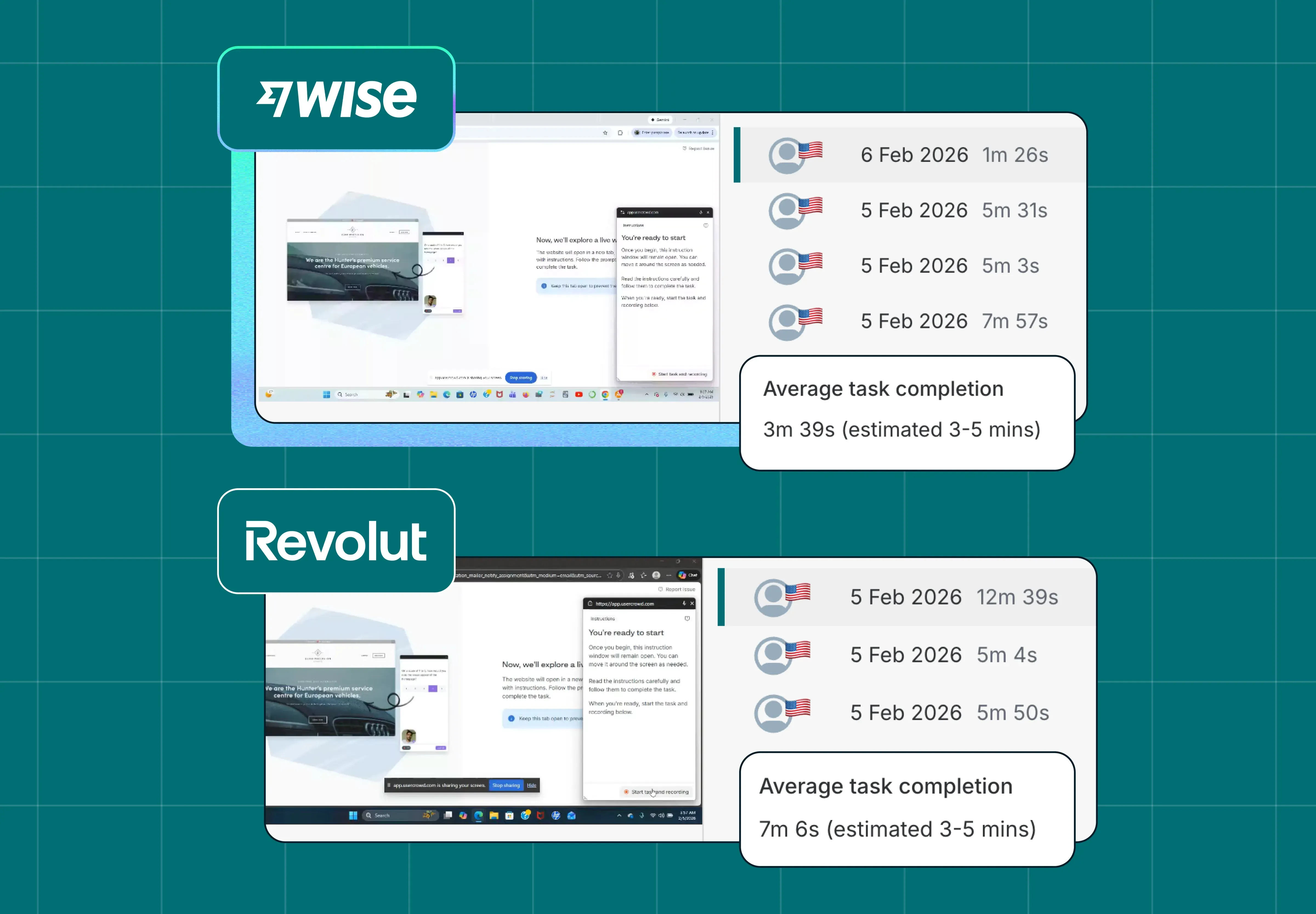
On average, participants completed the task 3 minutes and 45 seconds faster on Wise. Wise's average was 3 minutes 39 seconds; Revolut's was 7 minutes 6 seconds – more than double. The estimated task time was 3–5 minutes, so Wise participants came in comfortably within range while Revolut participants significantly exceeded it.
Finding a basic piece of pricing information shouldn't take seven minutes. When it does, the experience itself is the problem – regardless of what the fees actually are.
Rounds 2 & 3 – Confidence and accuracy
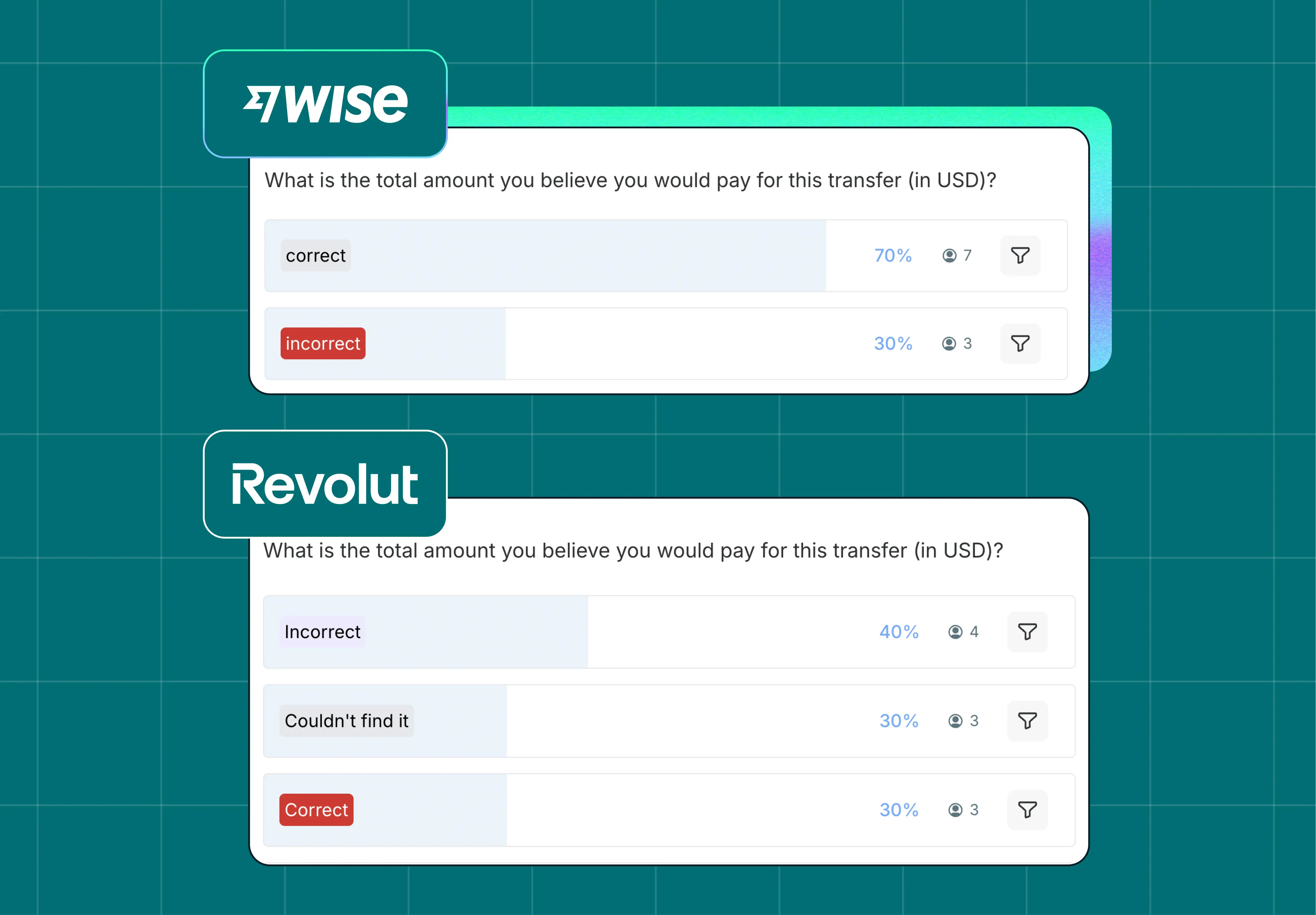
70% of Wise participants correctly identified the total cost. The remaining 30% were incorrect, but they still had an answer – they weren't lost.
Revolut participants had a harder time. We spread their responses across three categories – incorrect, couldn't find it, and correct – with 30% of participants correctly identifying the total cost. A meaningful proportion either arrived at the wrong number or gave up looking entirely.
If a user isn't confident they've found the right figure, they're not going to hit confirm. They'll pause, look elsewhere, or drop off. The Revolut results suggest that's the kind of hesitation their pricing experience is creating.
Round 4 – Clarity
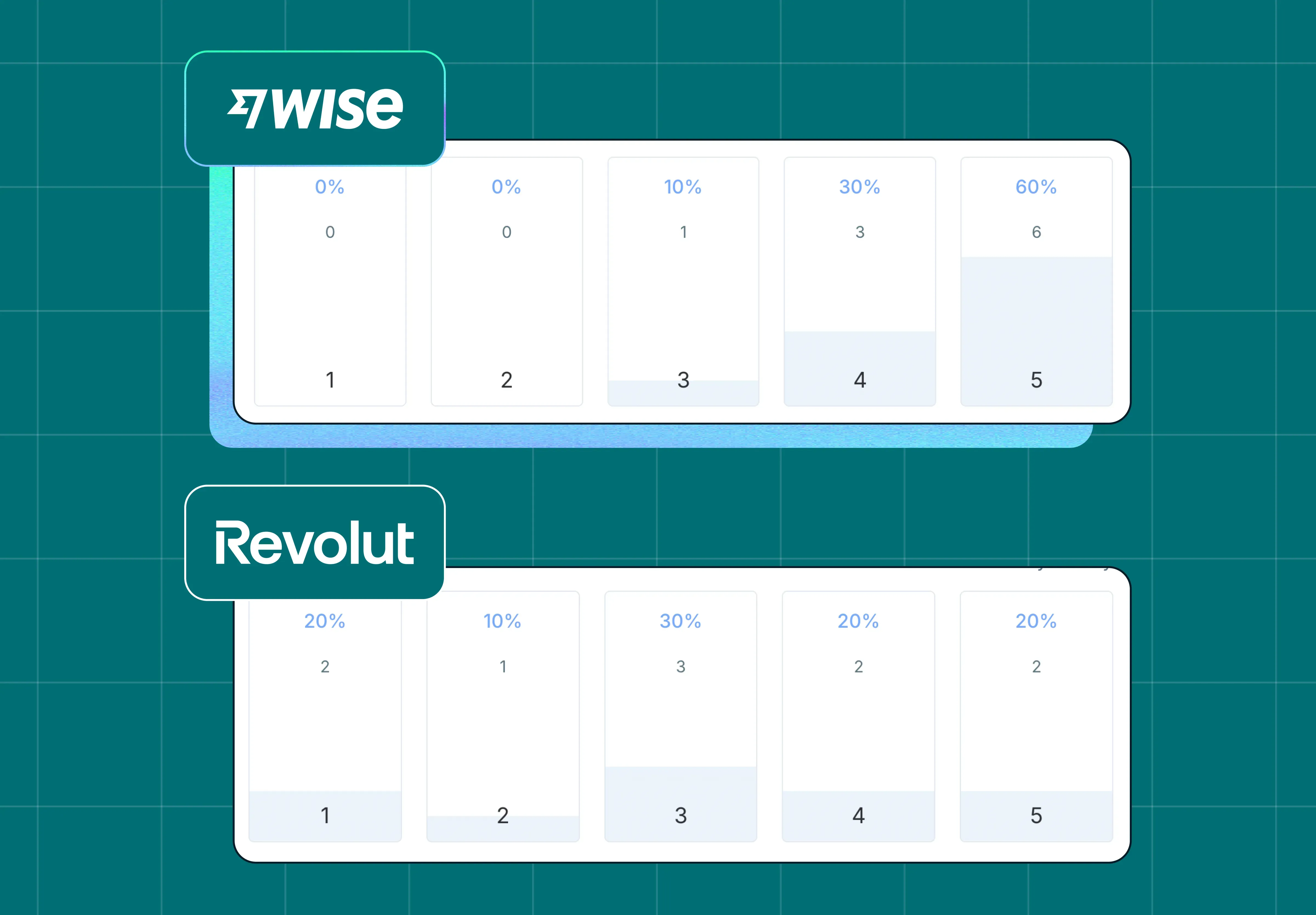
We asked participants to rate, on a scale of 1–5, how clearly the provider communicated the total cost. Wise participants clustered at the top – scores were heavily weighted toward 4 and 5, with very few low ratings. Revolut's distribution was much flatter, spread more evenly across the scale, with a notable proportion rating clarity at 1 or 2.
The follow-up responses explain why. Participants described struggling to find a single number that combined fees and exchange rate. One wrote: "I don't see an easy calculator to include exchange fees and transaction fees together, which makes me trust the site less. I feel like the transaction fee is hidden on purpose."
That last part is important. The perception of intent – even if unwarranted – is part of the user experience.
Round 5 – Trust
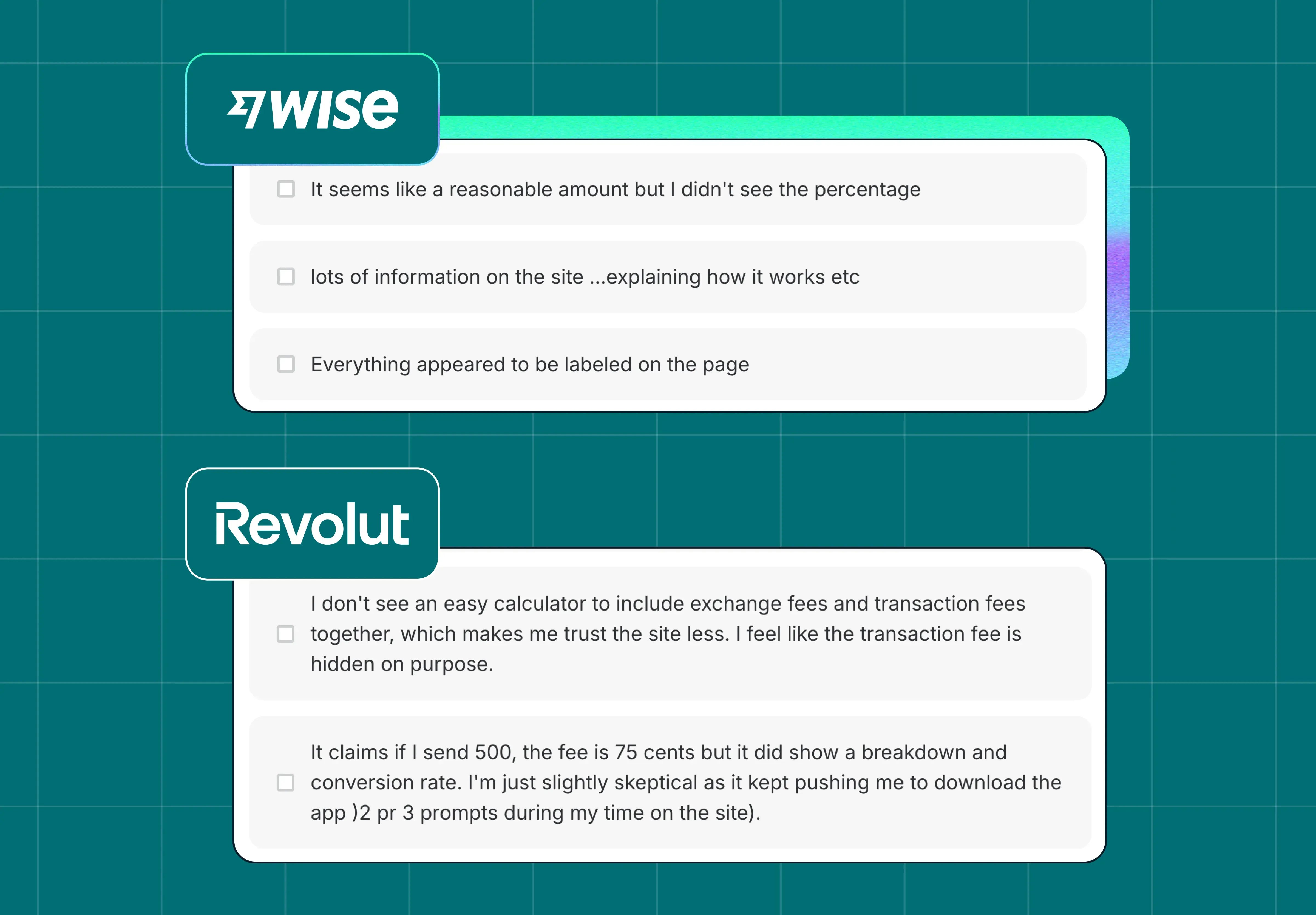
We ended the test by asking participants an open-ended question: “What made the cost feel clear or unclear?” Wise participants consistently described the experience in positive terms – “everything appeared to be labeled on the page,” “lots of information on the site explaining how it works.”
Revolut participants mentioned confusion, uncertainty about whether they'd found the final amount, and frustration at being repeatedly prompted to download the app. One participant put it plainly: "I'm just slightly skeptical as it kept pushing me to download the app (2 or 3 prompts during my time on the site)."
Once a user starts to doubt whether the information they're seeing is the full picture, that doubt is hard to shake.
Want to dig into the data yourself? You can view the complete test results – including session recordings, response breakdowns, and survey data – directly in Lyssna:
What fee transparency means for UX and conversion
The reviews flagging Wise for "hidden" fees didn't hold up in practice. But the study does reveal something worth taking seriously: fee transparency isn't just a pricing question – it's a design and communication challenge. How you surface cost information shapes whether users feel confident, and whether they complete the transaction.
Wise's approach – a clear combined total early in the flow, with context about how it's calculated – gave users what they needed to feel certain. That certainty showed up across every measure: speed, accuracy, clarity, and trust.
For Revolut, the issue isn't necessarily the fees. It's that finding them takes too long, leaves too much uncertainty, and in some cases actively erodes trust. In a category where the main thing users want to know is "what will this cost me," that's a meaningful gap.
For any product team operating in a competitive market: the experience of finding information is part of the product. If it's slow, unclear, or feels like it's working against the user, they'll notice – and they'll draw their own conclusions.
Combining behavioral and attitudinal data: This study paired behavioral measures (task time, accuracy) with attitudinal ones (clarity ratings, open-ended trust responses). Behavioral data tells you what happened; attitudinal data tells you why. Using both together is what makes the findings actionable – without the survey responses, the speed and accuracy gaps would be harder to explain and harder to fix.
Run your own competitive UX study
This study used Lyssna's live website testing feature to watch real users navigate live platforms in real conditions. Combined with follow-up survey questions on confidence, clarity, and trust, it gives you a much richer picture than analytics or review data alone.
If you want to benchmark your experience against a competitor – or understand where your own pricing communication might be creating friction – live website testing is a good place to start.
FAQs about fee transparency in UX
You may also like these articles


Try for free today
Join over 320,000+ marketers, designers, researchers, and product leaders who use Lyssna to make data-driven decisions.
No credit card required